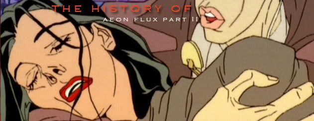
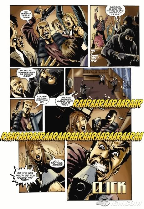
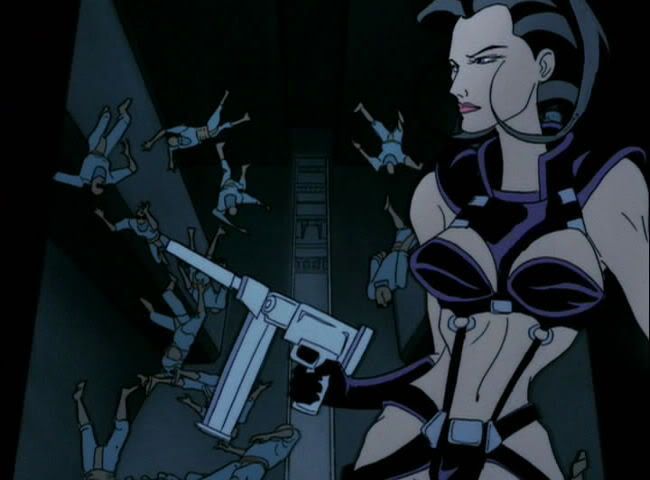
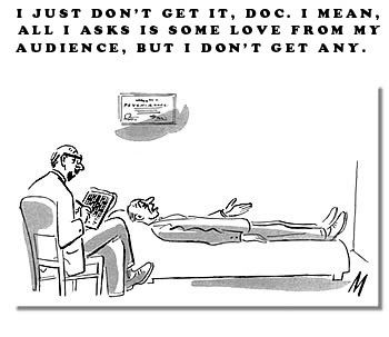
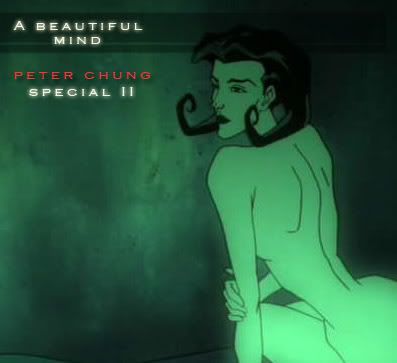
 Talking about Peter Chung's career based on his past interviews is tough. But this is probably the best way to get to know the guy. You think you can know someone based on his or her work, but no, there truly is something amazingly different about this guy. About the only person I can think of with a creative thinking that's just as unconventional and controversial as this guy is John Kricfalusi, of Ren & Stimply fame. Peter Chung and John K. are guys whose cartoons made waves in the 90's, pushing envelopes and crap.
Regardless of whether you like any of these guys or not, their works are still... unique. I mean, gosh, look at this episode. This is an Æon Flux episode starring Æon, her female partner, and the bleached-hair dude Trevor Goodchild tryign to escape this off-shore oilrig. You may have to watch it several times to at least get the story because there is no frickin' dialogue. Peter Chung actually told these crazy stories without any dialogue! Watch:
Anybody got that? Crazy, huh? I may have just begun unearthing a lot of classic and weird American and Japanese animation, but never have I seen something as wicked or as intellectual as this. In animation, no doubt. I like it when directors tear down preconceived notions about stuff.
An old interview by Emru Townsend and Peter Chung:
Emru Townsend:
"I liked that undercurrent of people always being watched by somebody. There's always some camera, some person, some... thing floating around just looking at people all the time..."
Peter Chung:
"..obviously, and I was interested in making the dialogue somewhat mysterious. And the idea of people knowing that what they were saying was being observed, and recorded, and monitored, made them say things which weren't necessarily what they were thinking.
They say things that they want other people to hear. In other words, you sort of have to interpret what people are saying, as well as what they're doing visually. So dialogue became another layer of stuff that you had to figure out."
Eh? An American cartoon that wants me to think? Wants me to interpret things visually? But I am so used to directors spoiling things for the audience! So used to villains spelling out their intentions, for heroes to speak as if he or she is talking down on the audience! Blashphemy!
Emru Townsend:
Æon Flux was one of those shorts that I found you could look at one way--you know, people can just look at it and say, "Wow! People shooting each other!"--this is in the first and second seasons, of course--but you can look at it another way, and really look at what's happening, and say, "Ah, okay!", like the one with the elevator running between five different floors. That one's great. (episode posted above this post)
...You sit there the first time, saying, "What? What?!" And you get the obvious joke at the end with the plug, but when you watch it a second time, you catch all the little details, you go, "Ooh, I see!" Or the one with the video camera where she goes to assassinate the guy in his house.(episode found in the bottom of the first part of Peter Chung Special) It took me three times to watch it before I really paid attention to the time on the camera, on the videocassette, and on the clock. Then I realized, okay, this is what she's doing now, this is what happened a few minutes ago, and so on and so on. And after all that it fits together perfectly."
I will have to rewatch that actually... But Peter's next reply is a sensible one. One that many people in the creative industry also struggle to maintain.
Peter Chung:
"It's a delicate balance to get, because you can turn people off by confusing them, and just get them to disengage totally, which is not what I want. The strategy really is to get them to feel encouraged to pay closer attention. So far the response has been pretty good... I mean, the idea with the series was that MTV wanted to reach more of a mass audience as opposed to sort of the cult following that the shorts had had. But I wasn't really interested in doing something formulaic in the way most shows are. I..."
So there. You can see how this turned out... The trend never caught on. A lot of mainstream American animation (Remember: Æon Flux was being marketed as mainstream) is still catered to simpletons and pre-teens. Stuff like this 'Robotech: The Shadow Chronicles' movie perhaps. You know, kids stuff. The kind of adult-style visual narrative, audience-participation kinda thing usual exists only in that indie/underground stuff I have no idea about. It's a shame really, but yeah, that's how the market works. No wonder the ads of the anime Paprika were mocking this 'preconceived notion'.
Here's how Peter Chung combated that 'notion'. Peter Chung:
Well, you know, I'm fairly realistic about that kind of thing, I've worked in the animation industry for about fifteen years, and, well, the character was really designed and conceived to be appealing, to be appealing on a visceral level, so that even if you didn't understand what was going on in the story, she'd be fun and entertaining to watch...
Emru Townsend:
The skimpy outfit doesn't hurt, I suppose.
Peter Chung:
Yeah, exactly. It's just very loaded, visually, to anyone who's even paying even a casual glance at it. And that was my strategy all along, to tell extremely abstruse and kind of bizarre stories that were fairly non-commercial, fairly personal, with a character and a surface that was very appealing and accessible. I think a great deal of the time, MTV didn't really know what it was that they were buying [laughs]. But the fact that it looked neat and was fun to watch was enough.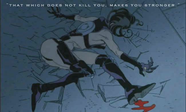 "..the consistent thread throughout all of those shorts in the second season was that she dies in each one. And she not only dies, but she fails to accomplish what she set out to accomplish in each one. In part, it was a response to my frustration to always seeing it being taken for granted that the protagonist would succeed in what they were doing and also survive in the end, which I think makes a lot of shows or films very... well, dishonest I guess is the word. Because they play this game of putting the hero in this life-or-death situation where you know they're not going to die, but the filmmakers sort of play this game of, "Well, he could die, at any moment...
What I was interested in doing was exploring different aspects of a character's death, and each one of the episodes was really about different aspects of death. That's what I was interested in dealing with.
The elevator episode, for example, was really--to me--about how she sets out to do something, she dies in the middle of doing it, without having finished, and somebody else picks up the thread, and not understanding what she was trying to do, kind of screws things up. Sort of a nightmare scenario for anyone who's engaged in some kind of ongoing project, to think they're going to die in the middle of it without finishing it, and somebody else is going to finish it for them."
It's statements like this that can turn a man, into a fan. (or a disgruntled jerk) Would they allow it if Spongebob kept getting whacked in each episode by a murderous jellyfish? Probably not.
"The look of Æon Flux is very much along the lines of Heavy Metal, other European comics, and whatnot. One thing that I've heard often from people who watch it is that it's very Japanese animation-influenced. Personally, I don't see that at all, I tend to see it more along the lines of European stuff. Which do you figure influenced the design more? Or is it just a synthesis of all the things that have been percolating in your head?" (More on Heavy Metal in the future)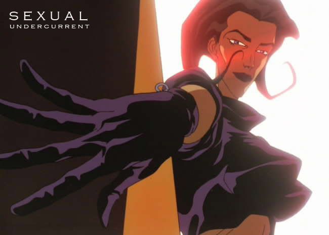 Well, that aspect of her was fairly vaguely defined in the first series of shorts. In the new episodes, which is really where my mind is at the moment, she's been defined in the series bible as a dominatrix. In the first episode that you saw, she receives a client who comes and gives her a pedicure and starts licking her feet...
That's what she does in her spare time. She receives clients and dominates them. Otherwise, the way that that works in the show is that we're not allowed to show hardcore genital penetration shots [laughs] so to get the sexual element into the show we sort of have to use a more kinky approach to sex.
I mean things that wouldn't normally be sexual take on sexual innuendo. I try to come up with substitutes for sex organs. Obviously, something like a gun is a sexual symbol. But in episode three of the new shows, one of the characters has a spinal injury, in which one of her vertebrae is removed, and there's a gap in the middle of her back and it becomes a sexual orifice.
Yum-yum!
Emru Townsend:
Man. Is this in any way related to... In the "alien egg" episode in the second season, Æon is walking around and she goes to the closet and she finds Trevor in this gear licking something. Now that, to me, looked like he was in some kind of bondage game. Is that what's supposed to be happening, or is it just far too weird for me to comprehend?
Peter Chung:
Yeah, well, if you notice, her kitchen is lined with a lot of different cabinets.
Emru Townsend:
Oh, God. There's a different person in each one, isn't there? [laughs]
Peter Chung:
Yeah.
I feel sick. You know that? Did you see that episode? Refer to my first post on this. Jeeezus. So that's the end of Part II of the Peter Chung special. If you enjoyed this post, please tell me! If not, then I will begrudgingly continue with a post on the irrelevance of Robotech in the modern world. Again! Hahaha!
I close with this commercial work by Peter Chung. Will she, or won't she?
 Peter Chung. He’s the kinda guy that thinks out of the box. The guy who does stuff that has ‘unmarketable’ written all over it. Okay, I was kidding about that last bit. But honestly, did anybody besides Peter Chung fans enjoy the extremely underrated Animatrix’ animated feature ‘Matriculated’? (Animatrix is the animated tie-in to the Matrix Trilogy franchise)
Well, I liked it. At first, I thought it was the weakest (or weirdest) of all the features in the Animatrix series, but I realized it was the one with the most… depth. Multiple viewings afforded me a better understanding and appreciation with the characters and the setting. That’s the beauty of this whole ‘multi-layered’ narrative. If done right, you get achieve mainstream hits like Robotech (the original 1985 animation) and Half-Life. Works like Matriculated are of the same narrative fold, but in my opinion have a more acquired taste.
So lets talk a look a look at Peter Chung. His career started way,waaay back in the 1990’s, with his breakout hit ‘Aeon Flux’, but like his works, the story is much deeper than that.
A brief background about Peter, straight from the horses’ mouth.
Peter Chung:
"I was always into animation. I studied animation at CalArts [California Institute of the Arts]. I've actually been making animated films since I was 16. It was always what I wanted to do and I got my first job when I was 20 and I've been doing it ever since. I always knew that what I wanted to do was to create characters and write stories - do the whole thing, you know, write, design and direct. It took a while. It took about ten years of working in the industry doing other things like learning the craft, doing storyboards and designing characters, before I finally got to write and direct my own character which was Aeon Flux."
Wow. And I’m 22 and I have a career that is nowhere near art-related, and I continuously talk about modern visual culture in a place where... err… moving on.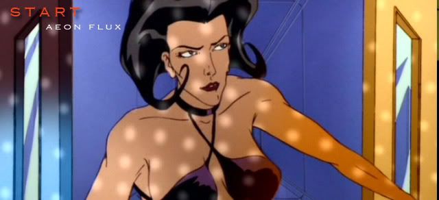 Peter Chung's has had a long, successful, though frustrating career. Based on what little I could read about the guy, it almost seems as if he hasn't worked on anything he really enjoyed since his breakout hit Aeon Flux. Oh sure, he's done the occasional commercial work and animation jobs for big Hollywood and Animation studios, but I wonder if, given the opportunity, he could create something as amazing as Aeon Flux.
Alrighty then, what the hell is Aeon Flux? Is it some character played by Charlize Theron? (Hell, no) I'm assuming you don't know, reader person. While I would be glad to reference Wikipedia again, as I always had in the past, I want you, dear... person... to experience it. What is Aeon Flux? Aside from being a show back in the 1990's, what exactly was it? Here's the intro:
Amazing, huh? Take note that Season Two of the show moved towards stand-alone stories. It is unique in that it takes the regular speaking characters of the earlier episodes like that bleached-hair guy in the First Season (the video above shows this) and twists them and their relationship to Aeon. This show is really one of a kind!
In an interview a long, long time ago, Peter Chung explained the effect of multiple viewings, which would lead to a newfound understanding in what the heck is going on.
"It's a delicate balance to get, because you can turn people off by confusing them, and just get them to disengage totally, which is not what I want. The strategy really is to get them to feel encouraged to pay closer attention. So far the response has been pretty good, but we'll have to see... I mean, the idea with the new series was that MTV wanted to reach more of a mass audience as opposed to sort of the cult following that the shorts had had. But I wasn't really interested in doing something formulaic in the way most shows are..."
It is interesting to note that this is the sort of narrative technique Mr. Chung has been trying to let people approach and appreciate for years. His article sort of dealt with that hope that people would love this type of storytelling.
I will delve into Peter Chung's mind a little more in a future post. I just wanted you to be acquainted with Aeon Flux, and how big an impact it had, at least to this blogger. I'll also post a few more interesting crap that you might find relevant to your life. So stay tuned.
I close another... wonderful episode of Aeon Flux.
She's a well-built little thing, but honestly, I do pity the girl.
Life never goes in a straight line. It's not like in media where we see life having a beginning, middle and end. It's just one chaotic mess after another... If you're one of the lucky few who has achieved a life of simple, uncomplicated beauty, then I either envy you, or wonder why you wish to further complicate your life by going around the net. Isn't life complicated enough without messing up your brain with the Facebooks, the Myspaces, blogs, etc?
Rambling again. Brain is going in all directions. Need order (at least, the idea of it). Art is a release, as explained in previous post. Need that passion back. Personal hangups aside, I think its high time I began talking about creative people again, don't you think, Void? For a primer to my upcoming articles, I will be putting Peter Chung in the spotlight. The man behind the 90's unorthodox animated series Aeon Flux.
The topic for the day is: film and comics - are they a good match? This article was written by Mr. Chung, and was written way, waaay back in 1998! But a recent interview with Mr. Chung stated that he really had nothing to change in that article he wrote - which means the industry is still facing the problems it did almost a decade ago.
As a writer and director of animated films, I've often been inspired and influenced by the great comic book artists. But even while I take in their pleasures with quiet gratitude, I've always felt that the very qualities which enthrall me are probably too elusive, too rarefied, to ever be appreciated by the mainstream public. For me, it is that deeply personal sense of discovering something hidden, something which might be missed by too casual a glance, that is the reward offered by art in any medium. Yet the current atmosphere of commercialized production of visual media, works against this from happening.
 I've only read Alan Moore's Watchmen so far, because I never
really cared so much about comics (until now) and it's the kind of book
you have to read multiple times to get all the ideas the author was trying
to convey. Each panel is a story within itself. I kind of touched upon this in
my post on Multi-layered Narratives
Comics And Hollywood: An Unhappy Marriage
The dismal state of comics in the U.S., both as an industry and as an art form, gives little hope that it can break through as a medium with an influence beyond the closed subculture it now occupies. I rarely pick up comics any more. I'd rather watch an old movie on video to satisfy my retinal needs. As for reading, I prefer an actual book than to suffer trying to decipher the incoherent page layouts of today's comics.
Ironically, the wide dissemination of comics-derived films and TV. programs can be blamed for the decline in both the level of public interest in comics, and in the quality of the output of comics creators. That is, the success that comics enjoy by their acceptance in the more mainstream media of film and TV. is the very thing which is suppressing their artistic evolution.
When Hollywood adapts comic characters to the big screen, there is an emasculation effect whereby producers and directors, refusing to acknowledge serious themes present in the original work, exploit only the "high-recognition/high concept" aspects for their own commercial ends. Comics are regarded as trafficking in stereotypes, and thus, as a source, provide an easy excuse for directors unequipped or unwilling to handle complex characterization. Mainstream audiences, seeing only the bastardized movie version of a comics character, have their preconceptions confirmed, thus inhibiting their desire to consider picking up a comic book to read.
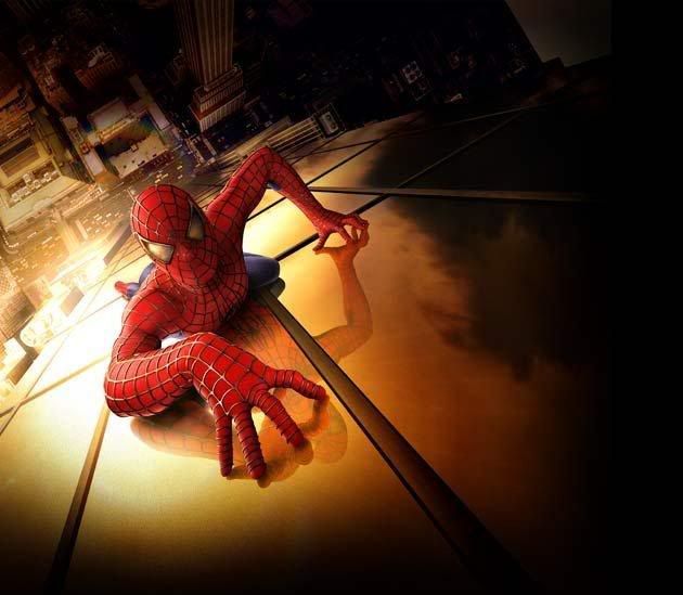 In fairness, 2001's Spiderman did open comics to Hollywood. The series
did well enough to warrant plenty of sequels (2 being a lot already)
Comic soon: Ironman! (At the time of this writing)
Also forgot to mention the Watchmen film adaptation. You won't
find Alan Moore anywhere in the theatres when that finally
happens. Honestly, it can't be done without dumbing a lot of
things down, unless a really great director is at the helm.
Comics creators are only too eager to perpetuate this cycle by offering characters tailored with an obvious eye toward movie deals and merchandising licenses. These characters can be recognized by their flashier costumes, bigger muscles, bigger breasts, wider array of props, weapons, and vehicles, and most importantly, their pre-stripped down personalities (mostly consisting of a single facial expression), ready for easy portrayal by untalented athletes/models. Hardly a comic book character appears today without this aim in mind, and the trend is effectively dumbing down the readership.
Text ss. Image: The Unresolved Problem
There is very little care or interest on the part of today's comics artists in the craft of storytelling. The readers are not demanding (those who are have long left the store), therefore the artists feel no need to learn the brass tacks of visual continuity. The truth is that making a good comic book is a lot harder than most artists realize. (Knowing the difficulty has kept me from entering the field, in spite of occasional requests by editors for me to join in. Mostly, I'm dissuaded by witnessing the poor public response to artistically worthy comics.)
Recent American comics seem to fall into two camps:
1. The writer-oriented type, characterized by a narrative laden with running commentary (often the interior monologue of the main character) which makes the drawings seem gratuitous-- in fact, a hindrance to smooth reading, since the text seems complete without them-- and which makes me wonder why I don't just read a real book instead. To me, this style is antithetical to the nature of visual narrative. A comics writer who relies heavily on self-analyzing his own story as he tells it: a. doesn't trust the reader to get the point; and b. hasn't figured out how to stage events so that their meaning is revealed through clues of behavior, rather than direct pronouncements of a character's thoughts.
2. The artist-oriented type, characterized by nonstop action/glamour posing, a fetishistic emphasis on anatomy, unclear geography (due to the near absence of backgrounds), confusing chronology (due to the total absence of pacing), and the sense in the reader that the pages have been contrived to allow the artist to draw only what he enjoys drawing and leaving out what he does not, regardless of its function in the story being told. Many young artists aspire to work in comics because they enjoy drawing the human figure. Typically, they collect comics to study and copy the techniques of their favorite artists. The mastery of illustration technique is laborious in itself and they have no time or inclination to read the stories in the comics they buy. Then they eventually become working professionals, drawing comics which are bought only for their flashy artwork.
 Sin City had a lot of narration between scenes, proving why these kind of overbearing narratives don't really work. However, if you liked Sin City, then good for you. I actually liked it myself, but this flaw results in redudancy in the way the story was told...
 What is rare to find is a work marked by the good integration of art and story; of form and content. I've found through working alongside comic book artists, that they have little awareness of the principles of film grammar. While I believe that the comics medium is more forgiving than film in the allowance for "cheated" continuity, I have no doubt that the legibility, and thus accessibility, of comics by a mainstream public would be improved greatly by the application of filmic language.
In order to approach a critical method of judging comics' value as visual narrative, we must first decide where they belong in the scale between visual media and literature. Because they are printed on paper, we refer to them in literary terms-- comic book; graphic novel. In practice, the fact that comics stories convey scenes through images rather than through description, make them work on the reader more like film. Still, I wouldn't insist that comics be judged according to the criteria we use on film, since no one seems to agree on what those are either.
Literature vs. Film
People often repeat the fallacy that "film is a passive medium". The statement is usually elaborated like this: "When I read a story in a book, I have to use my imagination to conjure up what the characters look like, the sound of their voices, the appearance of their surroundings, the house, the landscape. When I see a movie, those things are all nailed down for me, so I don't feel as involved." What the person is describing are the most obvious aspects of a given story, that is, its physical properties. They are, in fact, the least interesting and least important components of a story. I do not read books in order to imagine the physical appearance of things.
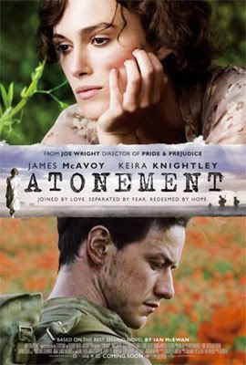 This is a great book, but does it translate well as a movie?
It's conundrums like this that has plagued the industry for decades.
Conversely, there are things which are typically spelled out in a book, but which must be imagined in a film. These are the intangibles, the important stuff; what are the characters thinking and feeling? Novelists have the advantage of being very explicit about the internal experience, and they indulge it, often to the detriment of the reader's power to infer. Good writers are the ones who maneuver around this pitfall. A book's ability to describe thoughts and feelings is a liability, not an advantage, if used to declaim its themes rather than evoke the desired consciousness in the reader.
Unfortunately, in practice, a great many mainstream filmmakers regard it as their job to inhibit interpretation by the viewer. No doubt, this is due to the increasing commercial pressures of the movie industry. Coming out of the theater after a thought-provoking film, I've heard viewers comment, "I was confused because I didn't know who I was supposed to be rooting for." Doesn't it occur to them that maybe that decision was being left up to them? That the exercise of our interpretive faculties is what makes our minds free? These people are usually the same ones who complain that movies don't let them use their imaginations.
In a review of Aeon Flux in the L.A. Times, the reviewer remarked that the director (me) wasn't doing his job in defining who in the story was good and who was bad, and thereby accused said director (me) of being "lazy". The presumptuousness of such an attitude would make me laugh, if only it weren't so prevalent.
A good film is one that requires the viewer to create, through an orchestration of impressions, the meaning of its events. It is, in the end, our ability to create meaning out of the raw experience of life that makes us human. It is the exercise of our faculty to discover meaning which is the purpose of art. The didactic imparting of moral or political messages is emphatically not the purpose of art-- that is what we call propaganda.
The inevitable challenge for anyone working in narrative film or comics is how to convey the internal states of the characters. Understanding this issue is the key to discerning visual versus literary storytelling. Resorting to the use of voice-over narration or thought balloons is a literary solution that undermines the power of images (the exception is in cases where narration is used ironically in counterpoint to what is being shown, e.g. A Clockwork Orange). For certain subjects, strict realism, where the mental realm of others is impenetrable, can be effective (e.g. Henry: Portrait of a Serial Killer). However, I would find it depressingly limiting as a filmmaker to be restricted to physical reality to express the world of ideas. Realism has the effect of granting primary status to the external, whereas in our experience, the internal is often the more important. The great filmmakers understand this trap -- that strict "realism" is, in fact, the least true interpretation of our experience of life; that a work springing from the imagination which adopts the guise of objective reality can only be a lie.
To hear me ramble on and on regarding the whole Robotech thing (which by now you're probably sick of) head on over to my journal. I also make it clear the distinctions of holding a blog like this and a Deviantart journal. Come on, don't be scared ==> StudioMMG Journal, Nov. 20, 2007
I've stumbled upon a really interesting blog post by Koshime, CEO and founder of Opus Arts Limited, Creative Vizualization and CGPAD.org (creative knowledgebase for digital artists). I really liked what he had to say about a topic as heady as 'The Philosophy of Art'. I am now posting most of Koshime's musings here, the original can be found here: Musings
I know I have 'mused' over such things in the past but for some inane reason, I feel that this one is really affecting me, you know? I think its like, a good way to like, start off any kind of training I want for myself. What do you think? Does this guy's thoughts make any sense to you? Tell me what you think. Post feedback if you want, there is no charge, and I'm less strict about moderating comments too.
 "Metaphorically, you are young (and thus seen to have unlimited energy and enthusiasm. keep this with you for all your life, and Art will be life, not a job, not a hobby but a lifelong passionate affair and part of your fibre) and thus, are in the most perfect place to become exceptional.
Everyone can paint and draw. The technical aspect can be learnt at any age. The young adapt faster. Once you adapt, and learn the basics....to become a great master at art, it is applying that simple basics into perfect basics.
From what i understand, a pro has mastered his basics. Every square inch and pixel. It is there, perfect in the mind, poise and ready to leap out, onto the hand that draws and paints it into life.
Another analogy, is like a warrior who aspires to be a perfect swordsman. When first learning the way of the sword, 70% of the stroke comes from honing your repetition of 100 strokes, and 30% derived from the focus of the mind.
In his mid to advanced stage, perhaps there is a balance of 50% power and mind
As a master, 90% of that killing perfect stroke is purely mental. And only the barest and most economical of effort, the 10% is derived from years of muscle memory, and training of the body as a superb fighting machine.
This pure single minded drive, is NO great secret. people may not like to hear it but really, its pure hardwork, and daily devotion to the task you have in hand....and applying yourself.
Hard and Soft
To reach this state of oneness...and this apply to any field, a artist is in a state of looseness and detail.
A piece of cloth is soft, and thus it is flexible and supple. A brick is hard, and when i throw it at someone it hits hard, but lacks finesse.
A wet cloth, is as strong as steel, and retains its suppleness.
I try to achieve this state of being between supple and firm.
Translated into art, one strives to have a painting that is loose (energy and the right strokes provide for the mind, immense pleasure at every subtle nuance) and yet sufficiently detailed (tight/hard at just the right amount, in the right spot) due to experience of lighting, composition, exceptional colour handling and knowledge.
For the beginner, you must learn from yourself.
Take no one's advice as knowledge, take no training as the truth.
This is not contrary to taking a formal education in art, but just keep in mind the rules, the theory..are simple that. They broaden your horizons, but the ultimate truth of how to paint, is ENTIRELY yours..and the art you produce uniquely your own.
The Practical Stuff
So, you want to start somewhere.
Lets formalise a small exercise. Lots o f them.
1. Draw at least 10 images a day
2. Try to produce some loose quick images
3. Try to produce a single good illustration a week.
Explanation:
1. Repetition - teaches muscle memory. Like the swordsman, your first 10 strokes may feel heavy. They maybe take a lot of brute force even. You must question why. Perhaps, when you're tired...and can draw the same tenth sphere...it will look better and better. I guarantee you now. If you apply yourself, honestly. your tenth character drawing will be better than your first...and your twentieth better than your tenth, and so on...
2. The quick strokes are called gestures. These capture the essence of a person, a creature, the air, the wind, the smell, the ambience of something. It can help teach you fluidity and looseness. It is what makes an artist's loose almost lazy stroke...great art to see and behold. With one stroke, you paint a mountain, with one dab, a multitude of stars appear, with a tiniest scrape, a single focal point of light is made. This teaches efficiency and greatness in one simple stroke
3. In this illustration, you must take it as a personal challenge to produce your best understanding of all you understand and have practised to make that single painting - a perfect painting of your skill. It is almost akin to life and death. There is no victor or loser, and at the end of it all, it marks your progress and growth.
All these, may be hard to read, digest or understand. But hopefully the gist of, may aid some. Feel free to partake of these thoughts, I believe these can make anyone an exceptional artist. The rest is up to your own unique genius. Because anyone can paint...but not everyone should.
Create greatness in your own living image."
And that's that. I love great, informative articles like this, but forgive me if I say that this s*** can get boring! Ah, but nobody said learning and being good at anything would be a piece of cake. But that's precisely why I would like to mix things after these long, informative posts with decidedly irrelevant and trivial things such as "Why this artist matters to me" or "Why Southern Cross sucks to a lot of people" Fun stuff.
So what do I say... now? Hmmm... Oh forget it. Like anyone gives a hoot.
Blank slate. Not the Richard Garriot MMORPG game that has just been released at the time of this writing. Just... a blank slate. Robotech gone. Med moving on.
But wait, you're thinking, I'm still doing that Robotech comic for a certain Jonathan (see post prior to this) Well yes. I already have the initial script available written on a notebook. But now I'm looking at the damn script, and if it weren't for references to "Protoculture" or "Robotech Masters", I would think this is a comic for Games Workshops' Warhammer 40K or something!
 Early Robotech fan art. I've actually made a lot of the years in the RT fandom,
 but more than half were deleted by the equally neurotic Steve Yun when I
was kicked out of the Official Robotech Site
Good times.
This comic is a great way to learn "Sequential Art", or 'comic' as people seemed to have stop calling the damn thing. It's a artistic challenge I haven't taken on since I first drew a Veritech Alpha Figher (a aircraft in Robotech) Here's the dilemma for what I'm doing though... I don't want my work to feel... amateurish. I mean, yeah, okay, first of all its a fan comic - which already gives off a certain negative stigma. We all know that. But what I want is for my comic to exhibit that trait of "professionalism". It's that profound feeling when you forget you're reading/viewing a fan-made work. It's pretty hard to define, especially to cynics who believe these iffy situations can only be seen in black or white (fan-made amateur effort, as opposed to officially sanctioned crap).
Again. I ramble. I've been rambling a lot lately because I've got a lot going on in my mind now. I've sorta begun life drawings. Sorta. That's a good start. I hope I can sustain my enthusiasm for this 'learning period' I've set for myself. I also noticed my greatest flaw here - proportions and foreshortening. I will work on that.
Ah, I want to get to the ol' blog routine. Because that's also why I started one in the first place! This place ain't all about silly fan projects! Not all of it. You might wonder, now what? Ya' still interested in videogames and space marines now with your project dead in the water? Well, yes. But lets go beyond that. Anybody interested in 'fantasy' art? Thought so. I don't really like it either. But I will be exploring it soon, and I'll also start talking more about art tips, getting ideas, and other junk that is more or less irrelevant to our daily lives.
Hey, my audience is small. Hell, that's because my perspective has been small all this time. And yet the Void is indifferent to all this. No comments. No reaction. Waiting. Watching. Laughing.
Now that Robotech is you know... dead and all, my perspective... It's almost kinda like two atoms. You know? Two atoms waiting for a reaction that'll cause a supernova of creative ideas. Corny, huh? I know, sorry. Watch this.
Excerpts from professional animator Michel Gagne's website:
"Prelude to Eden was my great animation experiment. At the time I started this project, I’d been working for Bluth for over 4 years. Although being there was a tremendous learning experience, I wasn’t that thrilled with the kind of animation I was doing. The Bluth style is fine, but what I really wanted to do was the "Gagné" style, or at least find out what the Gagné style was. Prelude to Eden was the film that helped me find my own sense of storytelling, timing, motion and design. It was total artistic self-exploration.
At first, I wasn’t sure what story I was going to tell. I just started. I'd always wanted to animate an atom with electrons spinning around over a black background. I don’t know why. It’s an image that's been stuck in my mind ever since I saw "Our Friend the Atom" back in high school. So the film starts with an energy blast from which a spinning atom is created. From there, a basic premise emerge: Before there was life on Earth, or before there was even an Earth in the galaxy, or before there was even a galaxy in the universe, or, indeed, before there was even a universe at all, there was an epic battle between opposite forces. The outcome of this epic clash created the spark, which triggered the explosion known as The Big Bang."
Robotech is dead! Long live Robotech! Damn I can be really weird, huh?
 "An Artist’s Perspective" was written by Jeremy Cantor, Character Animation Supervisor for Sony Imageworks. It's weird but this guy's iMdb page reveals he hasn't worked on any film project in a while. He did however make that lousy ol' Kevin Bacon craptastic 'Hollow Man', but I guess he moved on to be something else. Please note that the guy's a 3D animation-type guy, but I think his advice is still sound for savants like myself.
Anyway, I think I will post a bulk of this article he made, just for reference sake in differentiating the different mindset involved in designing for either a game, or film. Keep in mind that the ideas and opinions below are merely based on the experiences of a single artist and are not meant to be regarded as hard and fast rules. Remember that all rules have exceptions.
Variety vs Focus
During the course of a game production, you often get to wear many hats. You might find yourself doing any number of the following: character & vehicle design, modeling, texture mapping, background painting, character setup, FX animation, character animation and perhaps even level design and box cover art.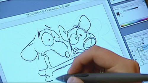 In the films industry, you are usually pigeon-holed into a single discipline for the duration of a production. This singular focus has the advantage of accelerating your improvement in a specific skill- set, but the lack of variety can become tedious.
Many VFX companies offer their employees the opportunity to “try out” for different departments between projects.
And of course, the variety in your work very often depends on the size of the company and production. Smaller companies and productions tend to expect wider skill-sets from their artists.
In general, working on a game will give an individual artist more creative input than that of a film production.
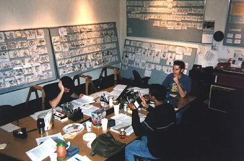
On the higher-profile film productions, individual artists usually have very little if any creative input.
In games, the opinions of even the most junior members of a team will usually be given as much consideration as the lead designers or company presidents.
On a film production, however, an animator’s great idea often gets lost in a hierarchical maze once it gets filtered through the sequence lead, the animation supervisor, the visual effects supervisor, the producers, the director, and the director’s on-set psychic advisor.
The last game company I worked for had a great saying:
“The idea doesn’t care where it came from”.
I rarely see such a philosophy in the film industry.
Who’s Leading the Charge?
When an artist works on a visual effects shot, he is basically leading the charge. It is a VISUAL effects shot after all. The technicians are generally there to support the art on such shots. Many times, it’s the character performance that is telling the story of the shot. Modelers, physiquers, programmers, cloth/hair/particle FX artists, lighters, compositors, rotoscopers more or less follow the lead of the animator.
In games, however, the art/animation always plays second fiddle to the design & programming. When a game artist has an aesthetic reason for wanting to make an asset larger, but the programmer has game-play and memory reasons for wanting it smaller, guess who wins? Many games contain some really outstanding visuals, but when you get right down to it, the art/animation in a video game is really just a glorified status report. It is pretty much there to tell you the condition of your character and whether or not you’re wining. Simply improving the art in a game rarely improves the game experience, unless doing so directly adds to the realism and immersive quality of the experience.
Is Tetris more fun when the blocks are 3-dimensional and cast shadows?
The visuals in games are indeed very important, but they always take a back seat to game-play.
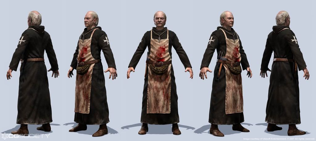 In games, the artist will work within a box of technical restrictions, including polygon count, number of joints, frame rate, texture resolution and memory. Film artists have less technical restrictions (but often more creative restrictions). These technical restrictions force game artists to tackle what we call constraint-based-design, which often demands a higher level of creative problem solving prowess.
Technical Knowledge
Game artists are generally expected to be technically savvy.
It’s easier to get away with being 100% right-brained in the films industry.
Innovation
The science of interactivity is still in its infancy. Knowing just what makes a game fun is still an evasive target. A good plot with well developed characters, solid acting, strong cinematography, intelligent directing, appropriate music, and decent FX will result in a good movie. The same rules do not apply in games. Make a strong plot and interesting characters for a video game, and junior will usually just ask you which buttons to press. A game must be easy enough to be fun yet difficult enough to be challenging. This is a fine line to walk and there are no formulas that can be implemented to arrive at a perfect balance between these two extremes. Game-play must be constantly tested and evaluated. Games offer more opportunities for experimentation. However, they also offer a lot of opportunities for failure. Films often fail as well, but it’s generally easier to figure out why.
 Film work tends to demand a higher level of attention to detail. However, a game artist will finish a production with a larger quantity of work.
An animator on a film production is usually given on average two weeks to complete a shot. A game animation is usually expected to be delivered in a matter of hours.
When working on a composite film shot (where a CG element is combined with a filmed background plate), a great deal of attention must be paid to matching the lighting and physics between the real and the invented elements. Games are rarely assembled this way, therefore, it’s usually more acceptable to bend the rules. However, internal consistency is an important element in both mediums.
Playing to Camera
In film, we have a saying:
“It doesn’t have to BE right, it just has to LOOK right.”
An animator can cheat a pose so that it looks perfect in the camera view, even though it might be totally off-balance if seen from a different POV. Most games are 3D these days, therefore the animations need to look good from every possible angle.
Global Fixes
A film animator’s favorite two words are “paint fix”. This means he doesn’t have to go in and fix that technical glitch. Rather, a 2D artist will touch up the final image later. No matter how many complex elements it takes to get there, the end result of a visual effects pipeline is a series of 2 dimensional images. There are many different opportunities along the pipeline to repair and improve a given shot. Furthermore, specific puppet setups and technical solutions can be applied to individual shots. A game, however, is an interactive experience. If you make a puppet change, it had better work for every animation in every scenario. And of course, there is no such thing as a “paint fix”.
Learning Potential
The film industry has been around a lot longer so there are more “seasoned” veterans around to learn from. However the potential to wear more hats in the games industry opens up a wider spectrum of potential instructors. Both industries can suffer from politics and ego problems.
 Film work tends to be more expensive than game work. The fact that more money is at stake is often the reason why there tends to be less opportunities for creativity and experimentation. However, the larger budgets in film productions often provide the artists with newer and better tools.
Scheduling
Games are very difficult to schedule because they are new, innovative and the work is cumulative.
Scheduling a film FX production is usually much more straightforward. When a shot is done, it’s done.
 An average game production team is usually smaller than an average film FX team. This generally supports a more collaborative atmosphere.
Films tend to have a wider audience. Most of the general public will recognize your work. Being a game artist will make you a hero to your kids and their friends, but your Grandmother probably won’t think you have a real job.
Job Security
At present time, the games industry seems a bit more stable.
Most game artists are hired into staff positions where they expect to be employed at the same company long after the current production wraps. Many film artists, on the other hand, are “production hires”, where they expect to be looking for work during the final stages of their current project. Many film artists prefer the variety of bouncing around this way.
The Finish Line
A broken film can still be released, even if nothing works. The story elements can be weak, the acting can be horrible, the effects can be less than believable, the music can be inconsistent with the action, etc. It might get panned by the critics or go straight to video but it can still be released. If a game has even a single crash bug, however, it can’t be put on the shelf. It can be very frustrating for an artist to see his work sit and wait for months and months while the technical glitches are addressed. Of course, it can be equally painful for a film artist to pour his heart and soul and the highest level of his aesthetic skills into a production during a year of 14-hour days only to find his work attached to a poor story that gets reamed by the critics and falls out of the theaters after only a few days.
Bottom line
In games the journey is more satisfying, in film, it’s the destination. In games, you have more creative input, more variety in the work, generally less (and more flexible) hours, however, the end product is often very small, with limited detail, low poly-count, lower resolution texture mapping, and is often only seen by 14 year old boys. In film, you’re often pigeon-holed into a single discipline, you have very little if any creative input, the hours can be very long and structured. However, the end product is on a forty-foot screen, and a much wider section of the general public will recognize your work.
And thus ends a long, yet informative article. At least its good to be able to distinguish between the two types. And you know what would also be great after reading such a long and serious article? Eating Rap Snacks. From Japan. Nothing can be cooler.
 I especially like my chip bags that have great life lessons. It's like having the Ten Commandments on your Coke can or something. This stuff will make you rethink your life.
 And speaking of rethinking my life, I've got some... well, "sad" stuff to announce in my next post. I'm not so sure how many of you would actually care, but well, it matters to me, so I guess you should care. I mean, there are at least a dozen of you who go here, right? That means you care?
Shutting up now.
How could you? How could you, Void?! I take you in, I treat you like family, and this... this is how you repay me?! By... by treating me like a lampost?! A dead stump?! A discarded tissue paper with your leavings?!
Anyway, I've been feeling weird lately - partly because I haven't entered anything in Justy Ueki's Robotech Photo Contest (my fault) and because Robot: The Digital Manga just looks so f**king beautiful.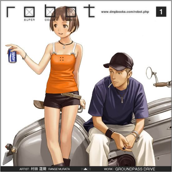 Yes! I know, you damn Void, its another post where I put up a series of really beautiful screenshots! So what?! I like to surround myself with purty looking things! And everytime I go to a comic shop or a high-end bookstore, I see this Robot manga thing, and its priced at 3,000.00 Philippine pesos! Yes! That's far too much! It's murder! Not with the money I'm earning now!
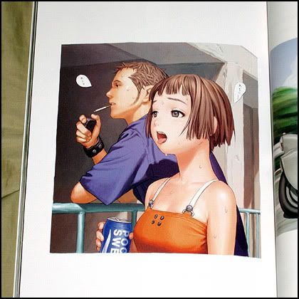
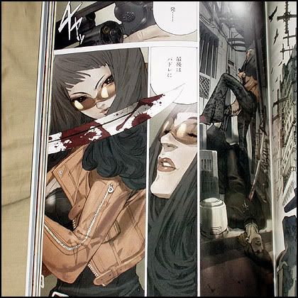 I don't care if it's in Japanse! I'll make the story line up! You see that panel up there? It's about a girl and a guy about to indulge in some S&M!
Gosh. So okay, what the hell is robot manga anyway? Here's Wikipedia again! To solve all my problems.
robot is a series of books containing the art of various Asian artists. The series was created by Range Murata as a way for upcoming artists to get their work published. Volume 1 was released on the October 21, 2004. The series is currently at 8 volumes.
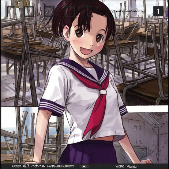 Digital Manga Publishing is responsible for the North American release. The first volume was released August 6th, 2005. Due to recent developments in talks over publishing negotiations breaking down, DMP will not be publishing any future volumes past volume three. Rights to publish at least Volume 4 have been picked up by Udon Entertainment according to amazon.com preorder info.No wonder its overpriced. I might as well buy that highly acclaimed book by Ashley Wood.
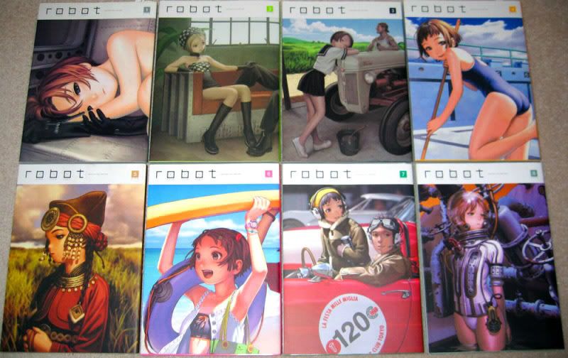 "Stunning, dark, exhilarating and disturbing, Murata's collection of contemporary Japanese comic art gives an inside view of the explosive work happening there today."
Do I dare believe the hype? Moving on, I also want to ogle at the impossibly, insanely, whatever-adjective-you-can-think-of art by Imperial Boy. An artist whose amazing use of perspective should be admired by all. I don't care why, it should happen.
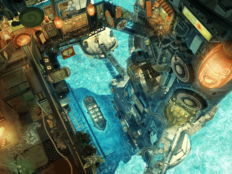 C'mon, this piece is just oozing with atmosphere, brilliant color palette and unique composition. All the essential elements in digital art today.
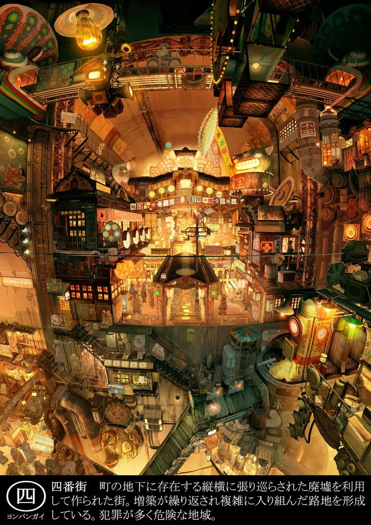 Beautiful, eh? Well, shut it. Gaddamnit. I knew I shoulda named this blog 'The Angry Artist'. Oh well. To close out this post, and to open the gates for a full-scale invasion of manhwa and all that other Korean art stuff, I present to you the amazingly disturbing, funny and brilliantly animated Achi-wa Ssipak. A Korean film that kicks Robotech: Shadow Chronicles nuts. Hard. (If you have a thing for that Robotech movie, erm... well, tough luck - I didn't like it)
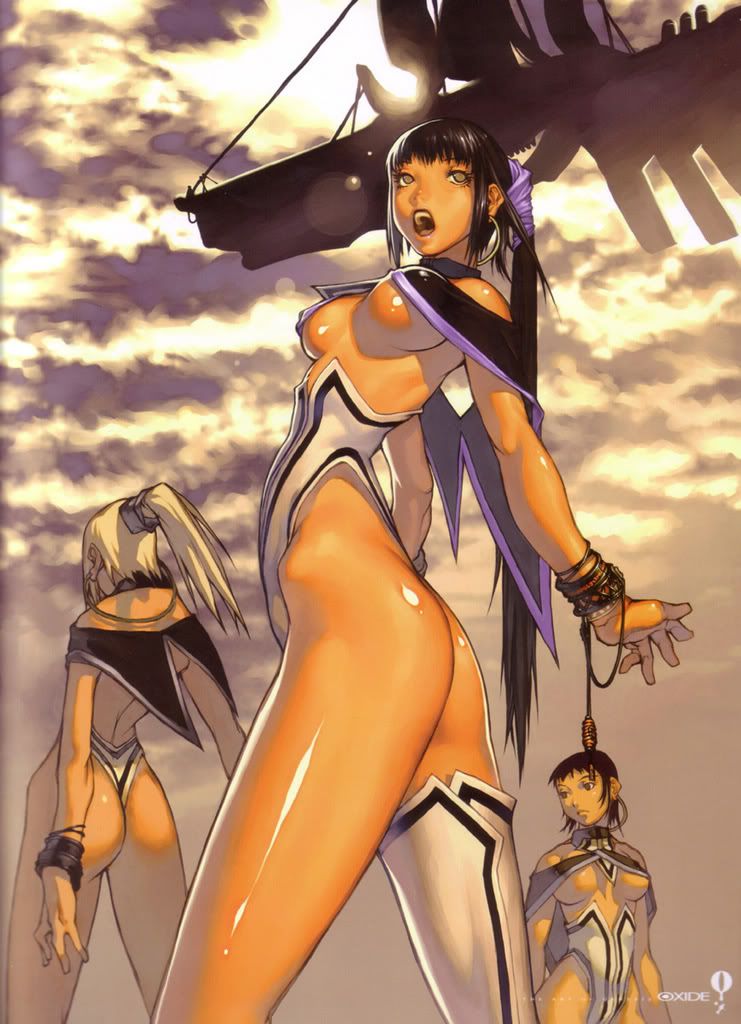
My search for my manhwa madness has led me to galleries filled with the most beautiful creatures not of this life. Yeah, they ain't real. But hey, who said another post where I post impossibly beautiful creatures is bad? In fact, there's your concept right there - hot women. Sheesh.
Most of this stuff are done by artists such as Victoria Frances, or Hyung Tae Kim, Shunya Yamashita, Ugetsu Hagua and some artist named Shingo.
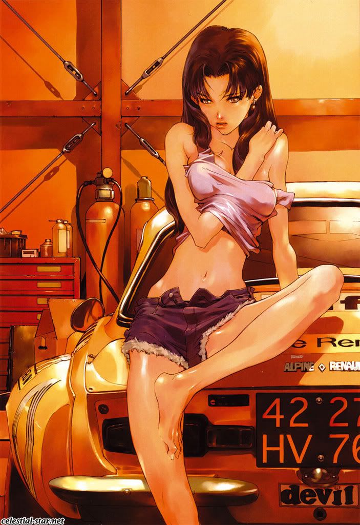 You might be wondering why put up all these incredibly sexy images (at least for some) Well, it's because I hope to achieve that style. And I know, as an artist, that talking about your inadequacies of your talent does not make you an artist. It makes you a hack. That's why I type this post as a blogger. A blogger, people. So shut it!
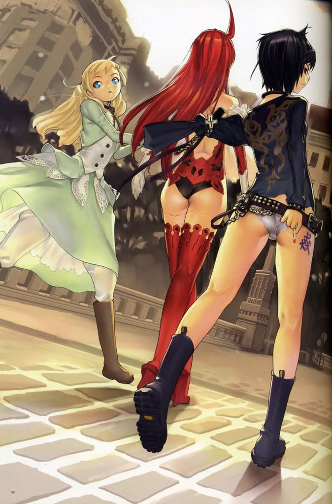
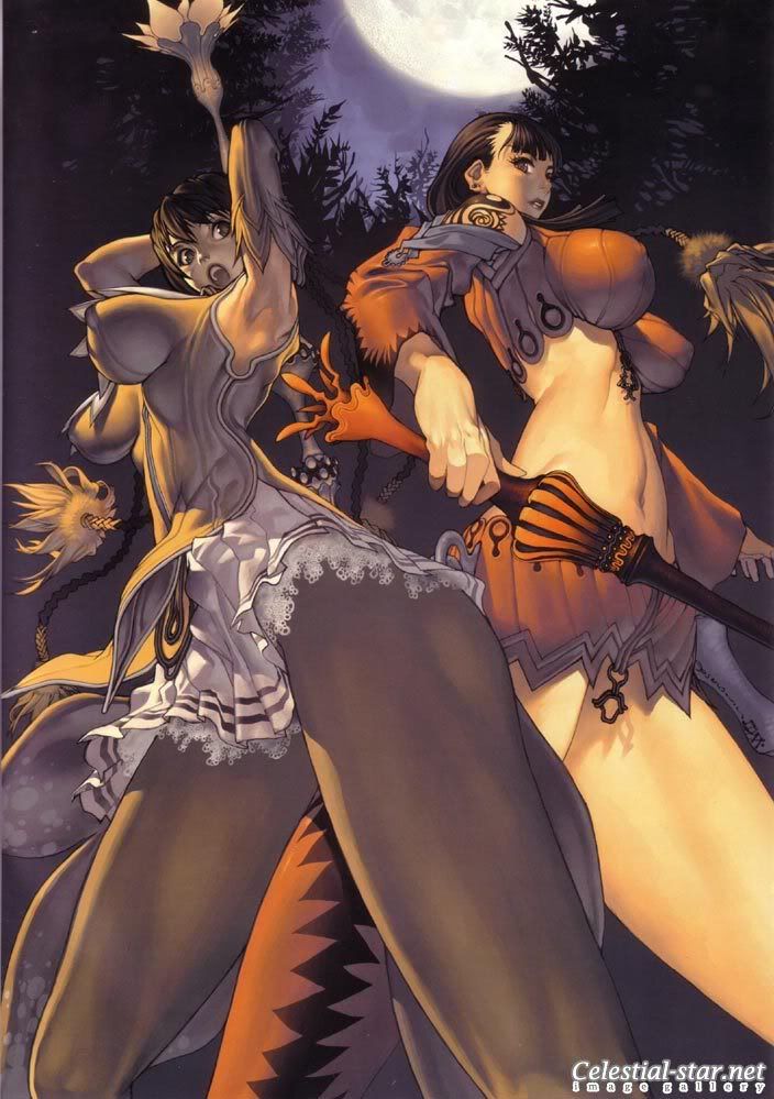
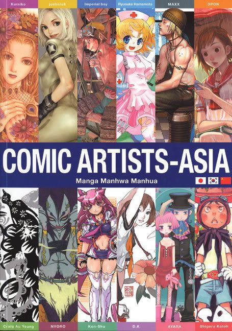 I've always admired that manhwa and its version of the traditional 'manga-style' of drawing. There was always something beautiful and artistic about this whole manhwa thing (which I believe covers the art-style as well as its very own version of "manga-ish" books), despite being harshly critiqued as another clone of japan's manga. As far as I know, Manhwa is only beginning (at the time of this writing) to get international recognition, thanks to forward-thinking publishers from other countries.
 Still wondering what I'm talking about? Well, Wikipedia describes it pretty well:
Manhwa has been influenced by the dramatic modern history of Korea and resulted in diversity of forms and genre[1], but including a mainstream style similar to manga. Distinctive manhwa can be found in editorial comic strips, artistically-oriented works, and webcomics serials.
Typical characteristics of manhwa:
- the style of character designs - manhwa aimed at teenage girls (which make up the majority of English-translated series) have a distinctively angular style of abstraction which contrasts with the more "cute" and rounded style of their Japanese, Chinese and western equivalents. This is the most obvious difference at a glance, but does not necessarily apply to manhwa aimed at boys or adults.
- The face and eyes are often exaggerated in a cartoon style while the figure is more realistic in proportion. [2]
- the left->to->right direction of the book (still quite obvious, but not very reliable, as some manga and manhua are 'flipped' around to the western way)
- the Korean name of the author/artist - usually double-barreled and with syllables that do not exist in Japanese (usually the most reliable method, the only exceptions being when a culturally-neutral pseudonym is used, or when the artist is of Korean ethnicity but resides in another country such as the USA)
- the untranslated sound effects (not always present) are in hangul, not kana or hanzi.
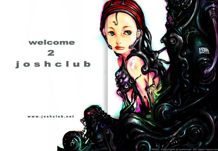
For now, I will talk about one such Manhwa artist by the name of 'joshclub'. Joshclub's characters have been described as a combination of photographic realism and a soft painterly touch. For some reason, I have found this to be more in common in Manhwa than anime. And there's that weird nose thing they got going on. I dunno, I wish a real manhwa artist would correct me on this.
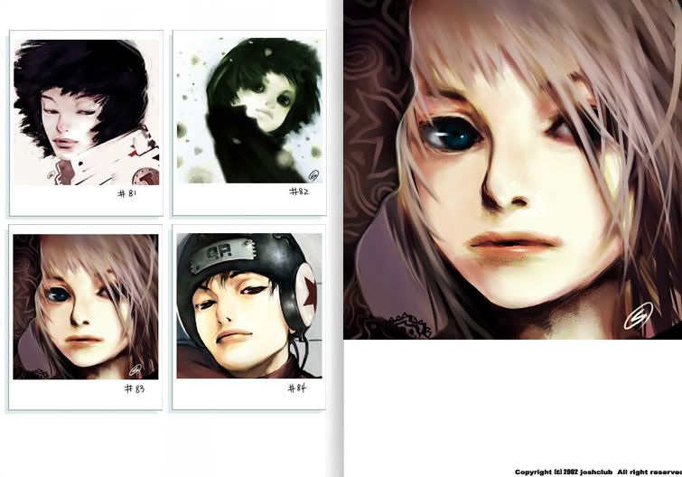
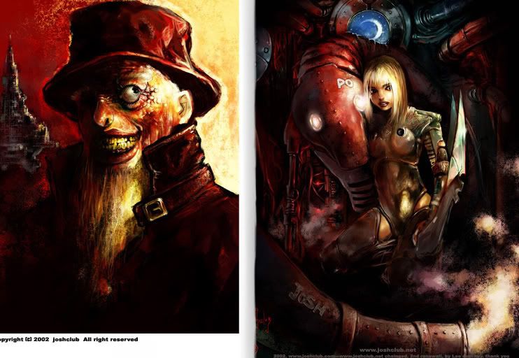 One thing I can say is that (although I know its wrong to generalize like this) many of the Manhwa artist I've seen have always adopted a more muted color palette, whearas Japan-based artist use more... wild colors?? I don't know. I could be wrong on this, but like you give a flying f**k.
 Wow. I think I'll ogle at this guy's art in the near future again. And more manhwa stuff too if you like, Void. What's that? Cat got your tongue? Yeah, I thought so.
 With the bulk of gamers still reeling from the marketing beast of the Halo franchise, I find myself wondering if there will still be a market for the whole "genetically-modified supersoldier" thing - whether it be for that one guy people call Master Chief, or a whole platoon of em' like Gears of War. Who cares what the frickin' market thinks. The "genetically-modified supersoldier" genre will never get old.
If you wanted to hear me yak about these steroid-pumped prima donnas, you should check out the rest of this blog. Today, however, I'm going to make this post, about game intros. Yes, you heard me right, Void. I will yak about the coolest science-fiction game intros I have seen in my life.
Some of these videos I will show have made quite an impact on my creative direction now. Some of these games may be bad, while others are classics and I want to share
First up, Homeworld. The first Homeworld.
It's really one of the coolest intros ever, in my opinion, and yet it almost has no whiz-bang action whatsoever. It's the kind of prologue that really immerses you in its 'home-made' universe (no fancy commercial sci-fi license here!) The visual style is clearly inspired by anime, using the whole "Moving Picture Style" with a bunch of 3D elements thrown in for good measure.
The Homeworld sequel continues that tradition with an even deeper and more epic universe. I know, the whole series isn't for everyone, but if you enjoy a good ol' science fiction yarn mixed with religious undertones / mysticism then this series is definitely a treat. And that mothership. Sheer beauty.
Next, Freelancer.
This is a more traditional science fiction story, with many ideas mixed from various science fiction scribes. It's still a good watch, because the developer of this game is none other than Chris Roberts, the guy behind those Wing Commander games - and that atrocious movie. So be my guess if you like your sci-fi chock-full of aliens, galaxies blowing up, and all that hooey.
Now, the Killzone series (one that I have admired for a while...)
Remember my post on the whole CAPO thing, and Helghast stuff? (I can't find it in my own blog, weird...) How I found the idea of incorporating the evil Nazi behavior and design with science fiction sensibilities intriguing? Yeah, here I go again, totally enthralled by this series - which now, more than ever, is blatantly ripping-off World War II on a universal scale. You may not agree these are like, the best sci-fi intros and all that, but I don't care because you won't tell me what you think is a good sci-fi intro anyway, huh, Void? I thought so.
Enjoy these two cutscenes - I've already shown you the trailers earlier in this blog, weren't those nice as well?
Liberation - sort of a typical army/shogo watching over his precious army slaughter millions in his name (another wonderful idea taken by this developer) and its also a goodie, isn't it?
Look forward for more of my "game intro specials" like this in the future! C'mon! They're fun, aren't they? (Do not respond to this rhetorical question, but I suggest you give feedback or constructive ideas, Void)

“I approach illustration from the position of an aid to communicate something,” says Daniel. “That something can be more or less abstract.” An object, an idea or an emotion.
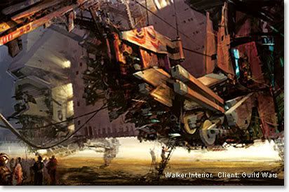 Excerpts from Daniel Docui's interview from ImagineFX. Something any budding artist should take into consideration. That means at least one of the half-dozen of you reading this might want to listen up for once.
- As an industrial designer, Daniel is trained to see three-dimensional objects, visual and do crap to em'. This also means working with a project and overseeing its many aspects.
And this brings us to something that Daniel feels very strongly about: diversity. As an art director, it’s crucial to see the big picture. “I strongly believe that diversity is the most important quality in a team… We are a lot more different than we are similar in our ways of thinking.” And Daniel believes this should be a source of strength.
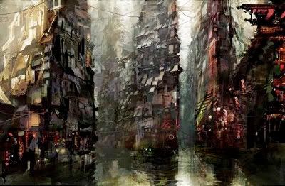
- True style is the result of all those influences that you’ve allowed to simmer over years and years,” he says. You must gather them and “distil all those fumes into something that’s representative of who you are.” The crucial thing is that it should come naturally. Affecting style in the name of cool won’t cut it with Daniel. “I think that is very shallow. I discourage that.
"You should not look for a style of your own just to be different, it should evolve over time as the result of where your true interests are.”
Example: “I’m definitely fascinated by the human figure,” he says. “But you don’t really reinvent anything. It’s just the take or the approach or angle.”
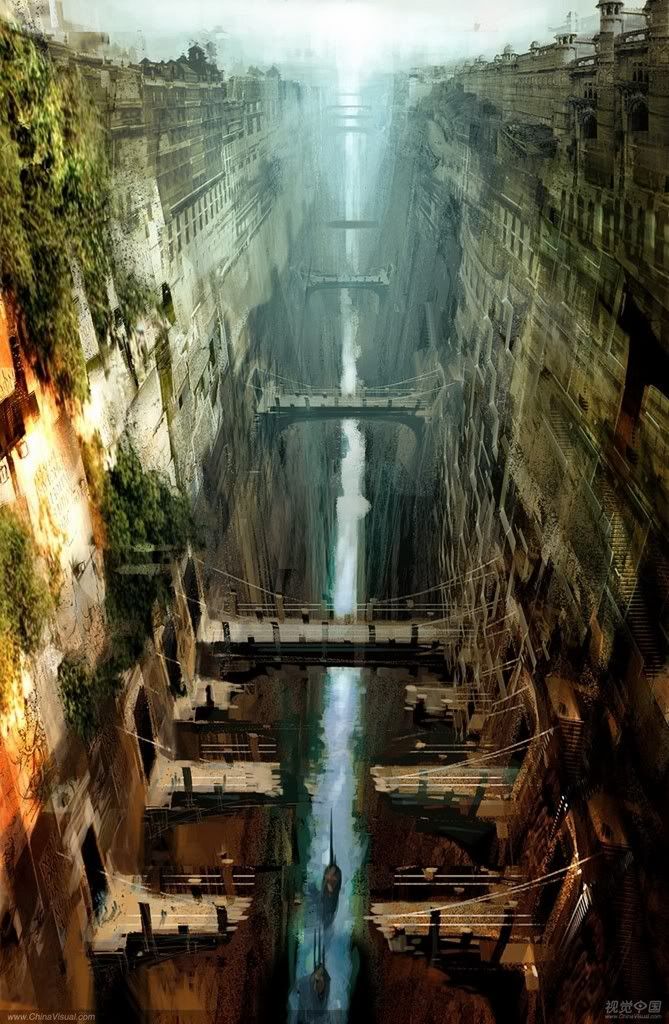
- “I think that what we perceive as talent is simply a person who has found a way to connect point A and point Z in their brain by a very convoluted path that we don’t relate to and can’t understand.”
Real talent, according to Daniel, is “effort, work and sweat.”
He thinks the regular definition is just a convenient shorthand, and backs this up with the observation that, “Talented people don’t use that excuse as much as people who lack it who say ‘I wish I had his talent’.” (Isn't that the point of this blog?? To say that I want to learn this or that?? What do you think, Void?) - However, laziness is beginning to trouble the creative industries. “Good-calibre talent is hard to find,” says Daniel. “It’s really hard to get through the hordes of people who have no business being near a pencil."
- Video games, comic books, animation – all of these are fighting a tide of graphical convergence. “The more unique or ‘far out’ your style, the more you restrict your audience,” Daniel observes.
How many of today’s artists had developed a mature style before they opened their first comic book?

- Somewhere along the line the goal ceased to be individual and became public property. It stopped being about perfecting your own style and became about who could do this style or that style the best. “I hope we are not falling into that trap,” says Daniel, adding, “Everyone says ‘yeah, diversity is good’, but I truly believe it.” Art directors should be guardians of the only weapon we have against uniformity – difference.
