Art Exhibitions in Tokyo – Spring/Summer 2026.
7 hours ago
Yeah, yeah. Nobody really bothers with this blog. But hey, I'll keep posting until Robotech actually becomes RELEVANT in today's fast-paced, attention-deficit facebook/ myspace/ blogger-based society. Anyway, I stumbled upon this really great interview by a certain blogger by the name of Donata Giancola. The article discusses something that has interested me for quite a while - and its these novel/series things. You know, like the Dune Chronicles or all those other more-hardcore sci-fi geekery stuff I said I wanted to learn more about.
 Long Excerpts from the article
 "Series are cool because it gives you a chance to fill out the world you're building in some more detail. I also feel more connected to my character after several portrayals. It can be a shackle when the marketing crew is sure that a particular portrayal is responsible for selling the book. It's best when the AD gives you latitude to be able to show the world from a different view each time. I also think that the tendency to "brand" authors with a single artist can make the biz of illustration tougher. Instead of book assignments, you have series assignments, and that makes the ebb and flow of work more extreme. Your flow is also greatly effected by how prolific your authors are, and that can vary enormously." DAVE SEELEY
 “A series is a good thing if you're an artist. You want the books to look good and do well, so you'll get the next one--that's the pragmatic, economic reason--but you're challenged to keep the series fresh, which forces you to think about the approach, to try to see things from different perspectives. Even a series has to have variety and flow. It's a restraint that can help you to grow. It also lets you explore a direction more than once. A series of books can become a collection of paintings, each with a slightly different flavor.” TODD LOCKWOOD
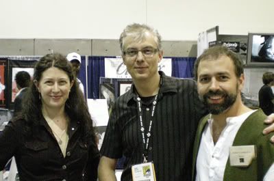 Kristina, Stephan Martiniere, and Donato Giancola at SDCC 07 Just thought you'd like to know what this Donato looks like


 Title: The blues singer leaves town
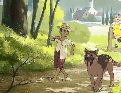 The artist described this piece:
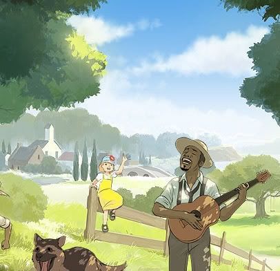 What's made me so interested in this piece is the colors. It's almost like from a Hayao Miyazaki flick or something. And the overall pleasantness of it is actually a refreshing change from all the grim and dark fantasy/dark fantasy/ science fiction pieces I see all over the net.
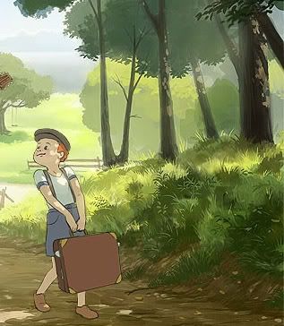 Every area is so lovingly detailed... I hope the artist pursues more subjects such as this. Oh, before I forget, he also did a piece this other piece on August 2007, called Like Summer.
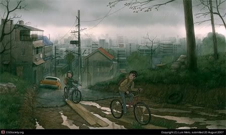 In his own words:
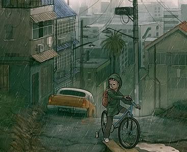 From this piece alone, taking a closer look at the fine details of Mr. Melo's works, they can almost tell you a story. They're beautiful that way, especially with his current cartoon style.
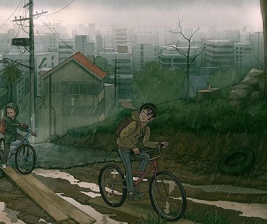 I need not tell you that this trip through the rain isn't going to end well for these two punks. Hey, how about some feedback or comments, eh?
Why are you so cruel, Void? Why can't you offer any words of encouragement, or feedback or anything? Well, I'll be waiting, dear Void. Sooner or later, your heart will soften, and you will see that yes, I will... no, I must give good constructive feedback! For I am here, sticking it out, reading this fool's words. I am here to see this idiot make a spectacle of himself, as he has done so in the past!
But for now, let us all gaze at the beauty that digital art age has offered us. This ugliness, the raw evil of the real world - as well as this virtual world, has made the likes of me... somewhat tired, somewhat... disenfranchised. Mine eyes long for the sight of this calming beauty of art and grace - to forget for a moment that, you, don't care, Void. I present, the awardees of the CG Choice Awards. May you enjoy it, and in turn, make your own art. Why? You didn't think this damn blog was catering to the handful of Robotech fans/friends I've made in the past? What are ya, crazy?? I mean, this blog is like, for anyone who likes to hear fools like me ramble about... well, art! And all that junk in between. And now I ramble. On with the art! Calming beauty... Calming beau...
 This piece is called "Empire Total War: Grenadier" by Michael Kutschie -
"GameStar cover-artwork for the SEGA/ Creative Assembly game "Empire: Total War". Completely done in Photoshop and Painter. I got some reference for the costume by CA's art department. Used myself as a reference for the pose and face (I did some poses with a hoovertube :)"
A bold piece, with a very classic pose, and the cool colors add so much to the overall atmosphere. The strong silhouettes of the infantry help give a nice tense atmosphere. You just have to say, aaaaah. Oh, and that guy's face is super detailed. I forgot to check if this guy merged CG work with Photoshop. Maybe he did - then that's cheating! Hah! No, just kidding. Crap, I feel like I took too much coffee now.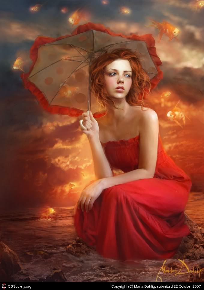 "Umbrella Sky" by Marta Dahlig
"Well, that's a quite old piece originally done for ImagineFX Issue 22. It can also be seen in the upcoming Exotique 3. :) This version, however is quite different, as I came back to the painting after a longer while and reworked it a LOT. Overall, it took many hours in Painter and Photoshop. I also used some references (especially for the fish and the sea)."
Now If only I can paint like that! While talking about it won't improve my skill, I like to whine, so there! This is a blog remember? A place where I can put in my innermost thoughts and desires... Okay, shutting up.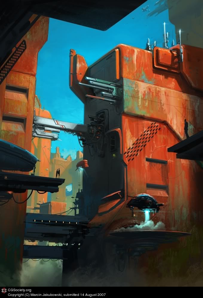 "Outpost" by Marcin Jakubowski
"hello, I'd like to present my attempt in the sci-fi environment field. I wanted it look like a cover illustration for some classic s-f book. Strong colours are intended. One of the forum mates called it "a big sewing machine" :) Photoshop and about 12 hours of work."
Whatever this man's inspiration, is - this piece is certainly... inspired! Brilliantly warm use of colors, with great composition as well to tie the image together.
"Oiran" by Srisuan Skan
"OIRAN" was created for S magazine japan in oiran theme issue, Oiran is high class prostitude in EDO that wearing a georgeos clothes. This piece was done photoshop 7 and ball mouse as I used to do for long.... this piece make me think of further progress for my works and make me decide to use wacom. welcome for any comments and notice, thank you."
This piece was created by an artist based on Thailand. Wow. I don't live anywhere near the States, so like... cool. The girl's face isn't the focal point of this picture, which I find odd - it is a bit of a mess but whatever - if I ever had a technique like that...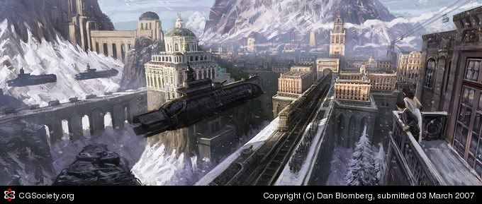
This, you damn Void, is "Iron Grip: The Invasion"
"Here's a piece I did for the Iron Grip project by Isotx.
The scene takes place in a baroque/industrial like world yet with with powerful "next gen(?)": ) ww2-inspired machinery. Props goes out to Keith Thompson who did the airship-design. He's been doing some great concept work so it wasnt a problem working after this design at all. But I wouldnt mind doing my own take on this myself. As refreshing it might be doing all sorts of freelance projects, sometimes I wish I could spend more time with certain projects following them from beginning to end.
Hope you like!"
Oh, I like floating subs! Sort of reminds me of a show called "The Southern Cross"! Hell yeah! A unique and refreshing take, especially for this particular era, which is kind of languishing or something... "Waterfall City" by Luis Melo
"A sudden idea, which resulted in a combination of references. Some slummy architecture on a cloudy day in a dream place. Took a long time, considering my attention span capacity :\ hehe"
Oh, I love Photoshop/Painter pieces about cities that make me feel like the insignificant insect that I am. Beautiful, I feel so small right now, and you Void. Oh, why do you do this to me?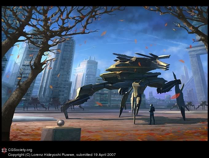 Ominous Winds by Lorenz Hideyoshi Ruwwe
"Heyho, I haven't been active on CGtalk for quite a while so I reckoned it was time to change that! :) This was started back in autumn last year, hence the theme of the image.
I had been practising 3D modelling in the hiding, so this is one of my first combinations of 3D modelling and painting. The tank was modelled in Wings3D which is a very powerful but free tool! All the rest and overpainting was done in Photoshop. I like the pilot... :)
- around 15-20 hours maybe, no reference"
You hear that? A true German-based artist! No visual reference to help him out in perspective or texturing of this piece! I wonder... can I achieve that? Huh, can I?
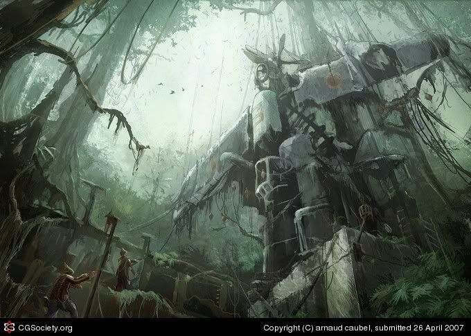 "The Plane Idol" by Arnaud Caubel
"Hi! This one comes from my WIP called "An Improbable Travel". I had fun with the jungle 'trip'... I hope you 'll like it! Pencil sketch, Psd, approx 7 hours.."
This is what you get if you spend your whole life just making art. While you wither away, something beautiful or grand appears on screen or on canvas. That is the beauty of art - And I have no idea what made me think of it that way.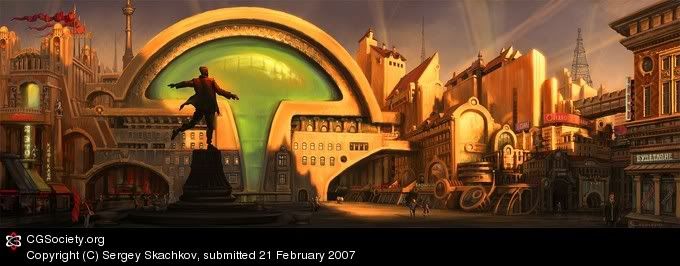 "Poet's Square" by Sergey Skachkov
"This piece is my new image from "Utopias" series. It is my free interpretation of one of Moscow's squares. All legends on the buildings are composition names of the poet-futurist who has poetized at the beginning of the twentieth century. I created the image in Photoshop CS with custom brushes."
His interpretation? This beautifully made piece of s**t? How I envy you! Your warm use of colors, your grand use of perspective, its all come together, so well - and this - this is it. I have no idea what the f**k am I saying. Is nothing sacred? Can art heal the labored mind? Can it calm frazzled nerves?
So okay, that's just a small set - of art that I found most striking around the net. I ask you again, Void. I asks you'z nicely now - do you want more posts like this? Do you want anything from me? ANYTHING?! Huh?!? Answer me! (StudioMMG apologizes over this tirade, but I blame the Void anyway for this blogger's condition)
Thank you, and have a good day. Oh, and here's the old Final Fantasy XII intro. I don't play PS games so I place it here because it's pretty. So there!
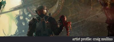 If there's one artist that I've been admiring for quite a while, its this guy. He's good. He's really good. I may have talked about him before, but I don't care. He's such an inspiration for my work, because he does that whole space marine thing so well. In fact, you may not know it, but this guy is the concept artist for Bungie - a.k.a. The Guys Who Made Halo. Yep. He's the one. But while Halo is his crowning achievement, he's also worked in other high-profile commercial projects such as the Need For Speed Underground series, the Wolfenstein remake, as well as film productions as well.
The 39 year old Californian native attended Pitzer College in Claremont for two years before studying product design at the Art Center College of Design. Mullins soon found that he was better at drawing cars, which led to 6 months at Ford in Detroit. He also discovered that his design sense was a little too weird to be of value to the car design industry and returned to Art Center to study illustration, where he finally finished his degree in 1990.
 In 2002, while working for Bungie, Mr. Mullins produced art for the cult-classic PC shooter Marathon's spinoff comic/novel thing - and as you can see in these two shot (top and bottom), it has a lot of his later Halo concept work touches (Halo 1 was released 2001)
 To this. Behold, Master Chief looks better than ever. The following concept art were made around 2006, so you can see how big a difference four years made in Mullin's style - the muted colors are fantastic, the strokes are bolder and more confident - there's a beautiful painterly feel to his work for Halo - and its really a great evolution in style. (This might sound like the simplification of a lot of factors, but I will focus on his works for these two properties for now)

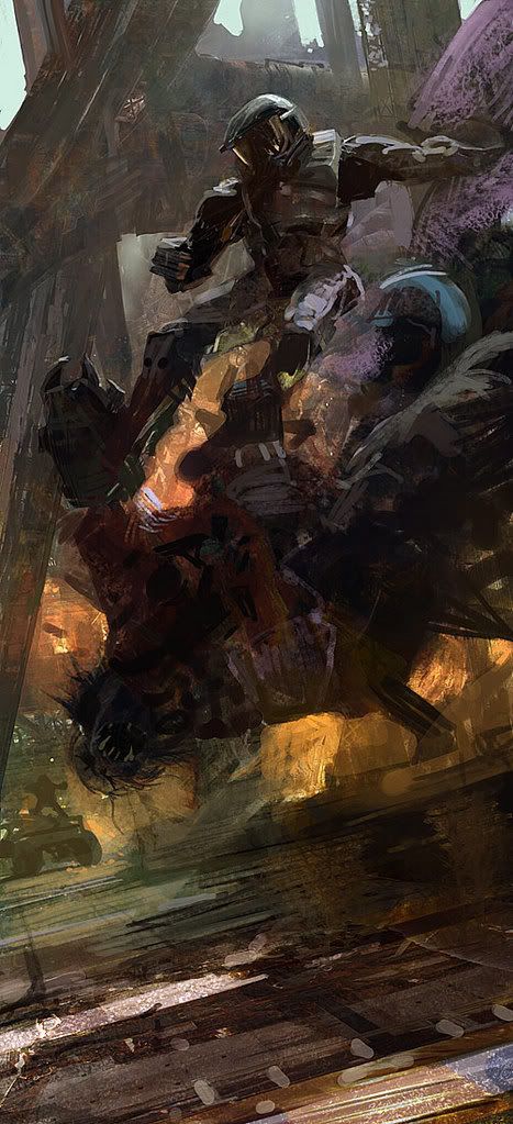 Many of these pieces were for promotional purposes, but as you can see from these concept pieces, even the overall stylings of the original Halo have been vastly improved, with more depth and focus in the designs for the Covenant aliens, the Marines, the settings - Fantastic!
 Straight from the Horse's Mouth
Craig Mullins: "I had first used Photoshop to touch up some physical mattes for a British Petroleum commercial, and remarking what a cool program Photoshop was. John Knoll (the co-creator of Photoshop) suggested that I try to do the whole thing in Photoshop. Just having started with it, I had no idea of how to paint with it, or even if you could. It was an experiment for all concerned. It was pretty much kluged photos, but it worked OK.
I bought a 33MHz Apple Quadra 700 with 36 MB RAM back in 1993. My idea was to scan in color roughs (I did little paintings before committing to blocking in a huge final piece) and play with them in Photoshop. You can try so many variations so quickly.
Eventually, the computer took over more and more of the task. At first it was very hard convincing clients to accept digital illustration work. I think they had visions of a contrasty mess of procedural textures, but I kept at them. I remember driving into town to set up a clients AOL account so I could send them works in progress.
Now I am trying to stay in as many areas of illustration that I can. I think it is better for me as an illustrator and it makes good business sense as well. There is a lot of mutually supporting aspects to the different areas of work that I do."
 While I admire this artist sooo much, it also helps that he was commissioned by Bandai to do this piece (Below). Man, this is one artist I aspire to be - and will probably never end up being.
 Do you want more artist profiles? Comment! Give feedback!
![]() This is a companion post to my previous one on the 'Drawbacks in Drawing Anime'
This is a companion post to my previous one on the 'Drawbacks in Drawing Anime'
Please bear in mind that I did not write this. It is a post by some frustrated anime fan, whose name I stupidly forgot to remember. While these articles are hardly related to conceptual art, I don't really care. Bleah!! It's not like this blog is popular enough to garner outrage!
So why does he say their is still a pervading 'ignorance' among the population regarding anime? While I, ChrisK doesn't really agree with a lot of points here, its food for thought by Mr. Know-it-all here. So let's go! (I will be inserting my own thoughts from time to time like this)
 Element A - anime has an emphasis on being there in that moment, where the work has a ton of "aspect to aspect" illustrations. This is a aesthetic 'pioneered' by the Japanese. It occurs more frequently than in western animation. (uh...)
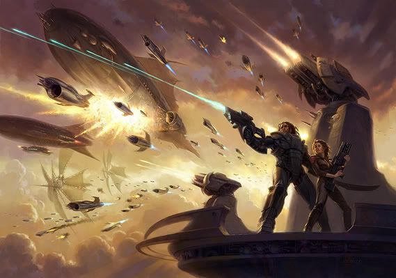
 Similar to an old thread someone started before, I bring up this 'eye candy' thread. It's based on the theme "Grand Space Opera". By observing these images, it gives you a little idea on what makes a space opera a space opera. What are the elements of making one? Perhaps I shall leave it to you, Void.
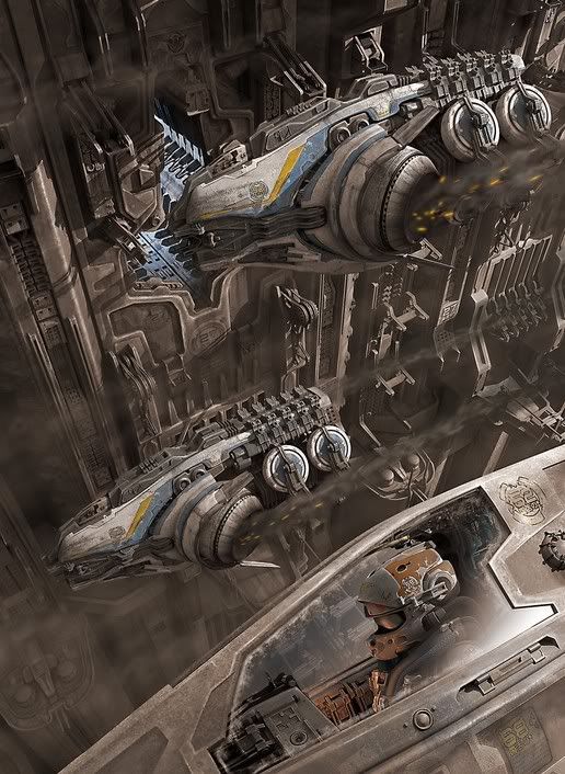 Does more spaceships mean more epic? Or is it how they are composited to a scene that makes it memorable?
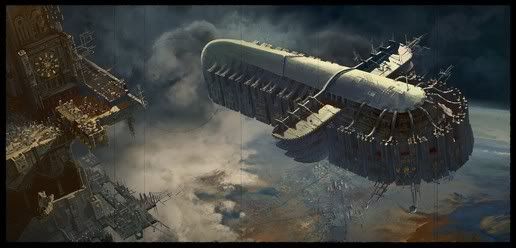 The classic ideas have always been some spaceship floating serenely high above a planet. Is this the key ingredient?
 Is it it all about perspective? The main idea? Do explosions make for an 'epic' scene?
 By adding something mundane, or something of our world, and dumping it to space (oh say... stupid whales) does that make it epic?? Does that make you the best damn science fiction writer/artist in the world because of your wildly imaginative mind??
I ask myself these questions when looking at these visually stimulating images. You can find out more about these images and the art book that was released quite some time ago...
http://www.ballisticpublishing.com/books/grand_space_opera/


