For me, half the enjoyment in researching these old and modern science fiction productions is that they expose me to things that I normally wouldn’t seek out. Thanks to this blog, I’m really trying my best to take each western and eastern properties and see how they would inspire me for my original and fan productions.
However, I sometimes get caught up in this aspect that I fail to see why I am doing it. I sometimes have to pull myself back to the basics and see why I have made this blog – which is to refine my technique, and hopefully, get The Void (my supposed audience) who is reading this inspiration as well to take up a pen and start doing your own stuff.
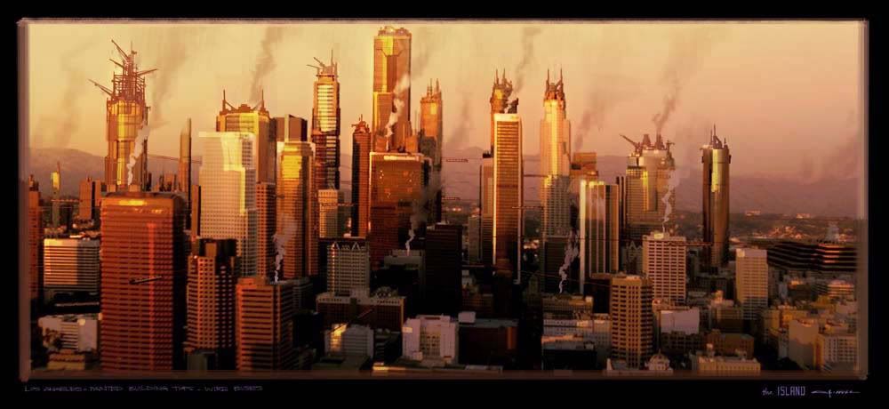
I recently purchased a really great ‘how to' books on design called “d’artiste”. The book contains a lot of material on how a conceptual artist must think in terms of forms and design. For this post, I will focus on George Hull, an artist who has distinguished himself in some notable productions such as the Matrix sequels. However crappy that franchise has become to some, the book or this post isn’t going to be about that, so keep yer' trap shut. Here are some of George’s design philosophies that hopefully everyone reading this could adhere to.
As a concept artist in the industry, George states that a director is always looking for points in the script and asks for ideas. This fact can be frustrating or rewarding in the creative process. The director would sometimes give a brief description and the artist should know where to take it. The concept artist should know the genre well or else his or her work would fall within the typical trappings of it and look generic and stuff.
The Call of a Concept Artist
When starting off with an art piece, focus with value composition first. Try producing multiple ‘thumbnails’ (small sketches) before starting on a big canvas. The point on this is to have an idea of how the overall image would look lest you wastev too much time fixing and tweaking it. This will also help in determining where the light would and dark values are for the image, so that it would look more ‘solid’ in the final product.
George Hull emphasizes that you have to have images that are bold enough to make a point in a few seconds, yet subtle enough to have depth and emotion. Note that I have shown some examples throughout this blog, yet I haven’t really tackled the subject matter itself.
Provide an art direction which helps people clearly decipher the qualities of a strong imagery. George Hull provides three basic principles in that aspect:
- Knowing the essential controlling idea of a shot
- Deciding on the focal point which will express that idea
- Designing everything in the color lighting and value composition to support that idea.
Attention paid to these steps can be the difference between dramatic, captivating imagery, and a muddy composite of great detail but poor design. This is a crucial aspect in visual effects. I think this is where my art suffers the most.
Looking at the portfolios on deviantART and Conceptart.org, and so many other sites dedicated to amateur and professional artists, you can see just how massive an impact digital art has had on so many young, talented artists and aficionados. A lot of them are pretty good at it which is why it is of utmost importance to differentiate yourself.
George Hull states that a lot of young artists can paint an image and make it "look dramatic, colourful and maybe realistic", but the market is saturated in that end. He emphasizes how having a refined drawing and design ability can help separate your work from the thousands of amateurs in the world.
Forms, architecture, design details and how to draw all of them well are key. Mr. Hull stresses that you can only do this by going beyond digital art, and spreading to more traditional means. Sketching things around you will provide you the kind of training he speaks of.
In Mr Hull’s concluding statement, it would be best to take a look at the pre-production art departments in films and games. Ah. It's a good buy. Now to apply his damn lessons.
Inspirations of George Hull:
Despite the majority of his work being based on science fiction, Mr. Hull finds inspiration in fine artists as well as photography. Among his idols are Sebastian Salgado, Steve Mc Curry, Edwin Church, Kent Willliam, Bill Henson.
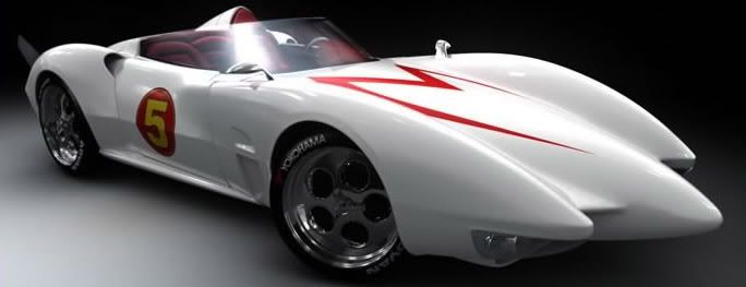
I do hope you actually learned something in this post! I suppose I'll probably gush over another science fiction property very soon. Anyway, I hear George Hull worked on some racing movie... I forget the name, but it involves this retro racer... Doh!


George Hull's work is great !!!
It sure is. I must reach that level of art! Hehe...
George, your works are awesome. I am a artist working in India. Your works are inspiration for me...