I have a bit of a soft spot on the gaming industry. Over the decades, the gaming industry has been glamorizing itself, and becoming more (as some would say) 'risk adverse' by refraining from unconventional concepts and sticking to well-worn gaming genres. Despite this setback, there will always be the few powerful developers who would be given a little leeway to come up with something brilliant - so to speak.
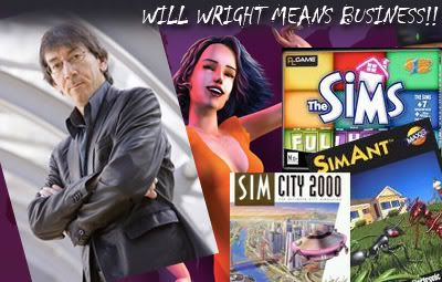 Will Wright, creator of the 'Sims' brand of games, is one of those creative visionaries that has tried to push the boundaries with his kooky and off-the-wall ideas.
Example of Will's amazingly creative ideas over the years:
Who wants to be mayor of his or her own city?
Who wants to live the life of an ant colony? A farmer?
Who wants to control the evolution of a specie?
Who wants to control someone's life 24/7, as he or she eat, sleep, get a job, falls in love, etc??
Amazingly simple ideas that have eventually grown into the gaming world's most beloved, or better yet, biggest selling or franchises.
So now that you have an inkling to the 'brilliance' of this Will Wright character, I want to refer you my dear, indifferent Void™ to an article written on Gamespy.com by a certain 'Dave Kosak', during a presentation by Will Wright himself during the 2008's Game Developer's Conference. The article is entitled "Why Worlds Work", and it 'takes a step back in the universe of gaming to look at why some franchises take root in our brains'. I'll post it here, and see if I can inject my own idiotic ideas to Mr. Wright's brilliance.
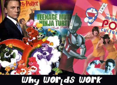 I said worlds - not franchises despite the image!
What do Gilligan, Godzilla, and James Bond have in common? Not much at first blush. But these iconic characters have immortality in popular culture. Why? What makes one world or franchise appealing? What gives it "legs?"
The Essential Ingredients of a World
When does a product become a world? At some point franchises take on a life of their own. Wright showed a pyramid with the points labeled:
Branding
Play
This spectrum can fill up with products. For example, the Teenage Mutant Ninja Turtles started as a comic book, a story product. Then it moved into collectables, or branded products. Suddenly the turtles became toys, games, a cartoon series, a movie... and the whole pyramid filled out.
The Care Bears took a similar journey from the most unusual of places: They started out as greeting card characters. Then they became a series of stuffed animals sold at greeting card stores, which before long turned into an animated kids' television show, a movie, and so on. It's not hard to find other examples that filled up the whole pyramid, including Star Wars, arguably one of the most popular worlds ever created.
 May the brand be with you
Branding is a particularly interesting point in the pyramid that Wright focused on for a few moments. People who identify with a world start to use branded products to express their own identity. I thought here of my wife, who brings a Wonder Woman coffee mug to her straight-laced job every day. The mug shows Wonder Woman in her suit and tie, twirling around to reveal her costume, presumably to fly off and kick some ass. The idea of Wonder Woman took root in my wife's mind and she uses that mug as a form of self expression.
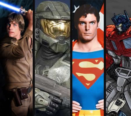 I personally didn't like Halo's Master Chief that much, but hey, the idea to play super space marine who spouts cheesy one liners and gets away with it is pretty cool in itself
So what makes a world sticky? Wright identified three things that help it to take root:
First, there are identifiable archetypes:
Characters whom we immediately understand at a deep level, whether it's the father-figure of Obi Wan Kenobi or the chilling mercilessness of Darth Vader.
Then there's exciting environments for the characters to interact in:
Imagine the snowy wastes of the planet Hoth or the mysterious intrigue of James Bond's cold-war Budapest.
Finally, there are cool actions that the characters in this world can do:
This is what Wright called the "verbs" of the world. James Bond has crazy gadgets. Harry Potter can use magic. Spider-man climbs and swings from buildings. Jedi Knights can use the Force... Even if the characters aren't super-heroic, they do things that people can fantasize about, creating stories in their heads.
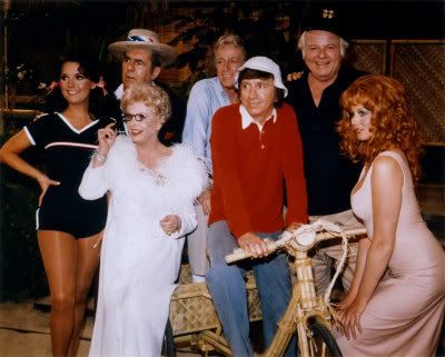 Guess which one is which from those mentioned below
Here's a world you probably haven't thought much about: Gilligan's Island. Wright pointed out that the seven castaways of the island are archetypes representing the seven deadly sins (Pride for the Professor, Greed for Thurston Howell III, Wrath for the Skipper...). Plop these archetypes in an exotic setting and suddenly everyone can start to relate to it in interesting ways. Personally, I can't count the number of times I've been asked the "Ginger or Mary-Ann?" question. (For the record, I always said Mary-Ann, but I was lying. And I married a redhead.)
My thoughts:
Cool. Seven deadly sins? I don't know a lot about Gilligan's Island though my dad loves it. Maybe he knows what Mr. Wright is talking about in the last part of the paragraph! About the show though... I did hear that the show ended with the kooky cast not getting rescued - but subsequently were in a bunch of made-for-TV movies... So you might ask - is that canon? Hardy-f**king har.
Gamespy:
Wright went back and emphasized his point about people putting themselves into the fantasy of the world, asking what-if questions. "What if Cylons attacked the Death Star?" "What house would I want to live in if I went to Hogwarts?"
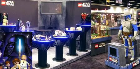 This inspires people to interact with the universe, and eventually to play, to build their own version of the world. Wright's always been fascinated by the Lego world, where you can literally play and build things. He points out how appealing it was to combine the Lego and Star Wars worlds -- how blending together all of the archetypes and verbs created a whole new experience that literally brought out the best of both worlds.
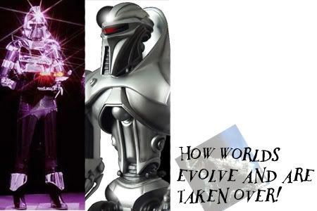 Is Intelligent Design involved here?
 The James Bond franchise is in many ways the perfect world: to the tune of 14 books, 24 movies, and $4.5 billion dollars. It's loaded with iconic characters, from the suave James Bond to the sexy vixens to the over-the-top supervillains and their unusually talented henchmen. It's got exotic environments and more verbs than you can shake a laser-beam buzzsaw bomb-detonating wristwatch at. The world has blossomed to incorporate not just books and movies but games and merchandise. Bond has seeped into (or maybe out of) our collective subconscious.
But 24 movies is nothing! The most prolific film series ever clocks in at 28 feature-length films: Godzilla. Wright described vividly how he first encountered Godzilla on the family TV when he was just a kid and how he hid behind the couch for the entire movie. (I couldn't help but note that Wright lovingly incorporated a Godzilla-like monster in the original SimCity). Godzilla has his own star on the Hollywood walk of fame. And audience interaction? Wright showed images of Japanese fan clubs that to this day still prepare contingency plans -- using actual topographical and military data -- so that they're ready for a Godzilla attack.
Franchises evolve over time. Godzilla started off as a city-devouring monster, but over the course of a dozen movies the filmmakers broadened his appeal to kids by making him cuter, friendlier -- sometimes the good guy. His eyes got bigger and his face rounder over time. By 1973 people saw the franchise as goofy entertainment for kids. After a decade hiatus, Godzilla was reborn -- as a scary monster once more -- in the 1984 remake.
Worlds change with the times. Battlestar Galactica was originally a goofy '70s space-opera with lots of lasers and exploding robots. The modern remake is darker, more believable, more morally gray: a better reflection of our confusing times. Wright pointed out that his own SimCity evolved as well: each successive game got more realistic and hardcore, until EA rebooted the franchise with SimCity Societies, a far more casual design.
 That remake shook up a lot of fans who expected hardcore city simulation. Their reaction isn't surprising: "There's an amount of ownership in these worlds," Wright explained. Lost is the perfect example of a world that the community at large can embrace. Wright described it as "a giant puzzle game," with millions of fans trying to piece it together. Information is shown on the television program that people can freeze-frame and analyze on the net. In many ways, the fan involvement around Lost is as much a part of the world as the story itself.
My thoughts:
Y'all didn't think I'd bring up fan entitlement? Well, being someone who came from a fandom as indifferent as Robotech, I have to agree with Mr. Wright here. Oh, and fan involvement sorta reminds me of my ol' favorite topic on this blog - Multi-layered Storytelling. Go on and read that! It's pretty cool if you keep an open mind.
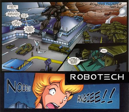 There was a time when Robotech's dynamic universe captivated me for months. The lack of any good merchandise over the years made me 'take measures into their own hands' - such is the allure of these pre-fabricated, fictional worlds
This interaction is key to what makes a world become more than a story, a comic book, a toy or a game. "Successful worlds are deconstructible," Wright theorizes. These iconic worlds take root inside your brain and, well after you finish the book or win the game or leave the movie theater, you find yourself asking: "What if...?" or "I wonder..."
What would it be like to swing from buildings like Spider-man? What would you do if you found out Darth Vader was your father? Could Captain Kirk's Enterprise take out the Battlestar Galactica? (Hold on while I stop writing to think about this one for a bit. At first blush I'm thinking no way, not with those vipers, but on the other hand -- it's Captain Kirk.)
Of course, games can be an essential part of any world, since they allow people to actually play out those fantasies.
Interestingly, Wright points out that this is a cyclical process. When you run across a good story, you can't help but deconstruct it in your head. Then you play around with it. From this play, you create new stories, and the process starts over. Story leads to deconstruction which leads to play which generates stories. Wright didn't say it, but it's clear to me that The Sims fits nicely into this feedback loop, allowing millions of people to play and create and share their stories, inspiring other people to make their own.
 Cool worlds are at the heart of modern storytelling. The act of deconstructing a world allows us to apply the fiction to reality. Few of us can claim to have Darth Vader as our dad, but as Wright points out, many of us have had to deal with an overbearing parent. The war between the cylons and humans in "Battlestar Galactica" has eerie (and intentional) parallels to the post-9/11 world. And of course the storytelling that emerges from taking apart a world leads to a communal experience, as anyone who's read a "Lost" fan forum or attended a "Star Trek" convention can attest.
My thoughts:
Aaah. Fictional worlds. Aren't they great? I hope you learned a lot from this, again, special thanks to Gamespy for such a great article.
You know what this article has forced me to do? Show another one of those wacky Star Wars. vs. Star Trek vs. whatever videos again. Oh well. Here you go. Remember: this is the product of people who dream up these fan what-ifs. Noooooooo. Thank you Will Wright!!!
I love a lot of the digital art-related stuff coming out of Korea. Perhaps you haven't heard of Tae Young Choi? He's currently living States-side, and once worked for the now defunct Midway Games, the people who brought you such properties as Aqua Teen Hunger Force: Zombie Ninja Pro-Am. Seriously. Oh, they also made the Unreal franchise.


"Tae's imagery is fused with dystopian sci-fi and classical mysticism. He sketches on paper first before painting." That's great! Y'see, it seems to have become a bragging right by many professional artists to paint straight away on the canvas. I'm not saying its bad.
I understand, I remember how Feng Zhu, emphasized to no end that everything is about speed. Having to draw it on paper, scan it, then paint is an excess to these folks. So damn! I'm pretty sure Mr. Choi's seriously sped up his pace, and forced himself to draw and paint digitally by now, but still... aww... who am I kidding?! I should learn to paint digitally straight!! Nobody uses paper anymore!

He has an advantage - he knows 3D. He fuses 3D into his works, to achieve incredible detail and accuracy. Again, a lot of artists seem to force themselves to learn this to help make them more 'marketable' to the creative industry. I myself would... love to... Again, I'm only kidding myself. I'm too lazy to learn 3D. I tried it once with Milkshape, and I ended up with a really screwed up sphere. Let me learn to paint first before I get ahead of myself.
A lot of Mr. Choi's inspirations have been MTV, classical art, Hollywood films. I think a lot of young artists would say the same thing... Or not. Who knows what young people think these days.
To add a sense of depth or another layer of visual communication, Mr. Choi adds codes and symbols to his works. I don't exactly know what he means by that - but obsessive people who enjoy this sort of thing might pick it up quickly. You know, like spotting a... uh... spotting the word 'sex' on the clouds of an animated feature. Stuff like that.
Th drawbacks to working professionally as a concept artist is that the public doesn't get to see your work until the project is released, and even then it may not be released at all. I know this, since I once saw this professional concept artist's laptop, and he was scrolling through dozens of folders of art for various projects. He kept muttering, "Oops... I can't show this to you yet... Oh, that's top secret.."

"So I try to spend as much times as I possibly could on personal works" Supposedly he works 2 or 3 hours, but given how slow he updates his personal portfolio, I guess he's busier than ever. He is currently working on a comic book which would be released on a major comic event.

Here is a CG demo reel of this vastly-improved tribute to a rip-off. Watch, and be amazed!
It loops twice. I don't know why. Finally folks, if you understand Korean, maybe you might have seen this already. If you don't understand, keep watching. You'll see some pretty cool CG-wizardry and fun test footage of TaekwonV.
So what ya'll think? Good?
"Hey medmapguy, just what the hell were you thinking? What is this Classicism crap? This isn't going to be grade-school level art discussion, will it?! Just... what part of 'modern visual culture' involves the works of the masters from a bygone era!?"
Everything! The works of the masters such as Da Vinci, Michelangelo, Rembrandt, Carravagio, Goya, and many more are what inspired a generation of concept artists working in the creative industry today! your sarcasm, I know you can easily search this stuff in a gazillion other websites, but I honestly learn more by typing my actual learnings on this blog, get it?
Its food for thought, people. I honestly can't tell what's baroque to a High Renaissance to a Post-Impressionism. I certainly don't plan to cover all these periods - just the very basics of those that I keep hearing about.
 A classic look? What the f**k is that supposed to mean?
All I know is the Dark Ages gave birth to the Renaissance!
Renaissance, the most fertile of all artistic eras. The time when Italy emerged as cultural leader of Europe. It was the creative hub / cultural leader in all of Europe. This era lasted from the 15th and 16th century, and introduced the world to classicism and naturalism.
 Sandro Boticelli, the guy who painted that Birth of Venus pic.
"The Mystical Nativity"
This was a time where there was a great upsurge of energy and belief in the human potential. Unlike the last period which sorta sucked. Renaissance art celebrated humanity and the visible world, abandoning the more spiritual approach of the Middle Ages.
 A lot of Middle Age art looked like this. And featured the same cast. Cool.
 Sandro Boticelli, La historia de Nastagio degli Onesti
The Rebirth of Antiquity became a new standard. Classical subjects and styles were adopted. A "rediscovery" of ancient techniques in architecture, building and sculpture developed the overall aesthetic. What the hell does that mean..?
 Classicism is the art movement founded on aesthetic attitudes based on the art, literature and culture of ancient Greece and Rome. (Painting above by Andrea Mantegna (1431-1506, I think!)
The Medicis, the big bosses of Italy composed of merchants and bankers, were patrons of the arts. They commissioned and required painters who could paint detailed and decorative work in brilliant colors. Sandro Boticelli (1445-1510), whose art can be seen here, is distinct in its firm outline, rich colors, and distinctive figures.
 The Adoration of the Magi by Boticelli, featured the Medicis, with their swaggering self absorbed poses, making curious contrast with the tenderly depicted figures of the Madonna and Child. Nice. Can you see those bastards?
 Another Sandro Boticelli classic. Nice coloring. Really tight. He's better than me... (Shut up)
 This is a battle scene depicted supposedly by Piero della Francesca.
 What came after this whole Renaissance bit was something even cooler. High Renaissance! This ones the winner, producing such artists as Michaelangelo, Raphael, and that geezer Leonardo Da Vinci. I think I'll delve into this in the near future since I feel I may boring the Void™ to death. Thanks to my good ol' World Book collection, and "Tree of Knowledge" binder encyclopedia. I finally found a use for that rotting thing!
At least I know now where to find more inspiration! Though it still doesn't give me the right to say crap when I visit real life art galleries.
Art Gallery Guide: Hey, who are you?
Medmapguy: M-my name is Chr--
Art Gallery Guide: Guard, get this vagrant out of the premises this instant.
But that won't happen. Anyway - since the Renaissance era doesn't have any cool videos, why not watch this animation brought to you by the awesome tool known as "Toon Boom". The film is by MathChoq, an animation student with an interesting... creative mind.
Shut up. I know this is a dumb title, but cut me some slack here. This latest news from the creative front is rather grim. Apparently, science fiction's reputation is a lot worse off than I previously imagined! The latest ImagineFX magazine reveals that "fantasy is back - in a big way". Damn! Maybe I underestimated the immense popularity of this genre. I was so caught up with giant robots beating the junk out of each other that completely missed this phenomenon.
ImagineFX:
"Fantasy is more popular now than its been since the last golden age of the 1960's and 1970's." says artists Steven Stone, who believes that the movie and book industries are the cause of turnaround.
 You wanna be an orc!?
My thoughts:
The article states that advancement of technology was the savior of bad fantasy. No longer is the genre synonymous with the usual hardcore geeky trappings - thanks to Hollywood, like Uwe Boll's Dungeon Siege... okay, scratch that - thanks to Peter Jackson's Lord of the Rings trilogy, the result has been an upsurge in commercial and critical interest.
 Lets not forget the immense popularity of online games (at the time of this writing) like Guild Wars, World of Warcraft, a game so popular that it actually earned a theatrical released sometime in 2009. TAKE THAT HALO!
Artists such as Daniel Dociu, according to the article, believe that these fantasy-based videogames are what really brought fantasy to the mainstream. "It's perfectly suited to realising fantasies", or so he says.
The article goes on to say that the advent of digital art has opened the gates for hordes of talented young artists to produce their own fantasy based art.
ImagineFX:
"The internet has really facilitated a coming together of the art world, providing artists with a lot of exposure, and giving the art community a new found sense of energy" says Daniel. "It's also enabled younger artists to rub shoulders with the big boys."
My thoughts:
That is true. Too bad my skills are still in the "In Ten Years, I Will Be Too Ashamed Too Look At My Art Phase" so I guess rubbing shoulders with the likes of Dave Seeley is still a far off experience.
Now this is where the article gets real interesting...
ImagineFX:
Fantasy art may be enjoying the best mainstream exposure its had in a long while, but there's little doubt science fiction lags some way behind. It remains a popular genre in the video games arena, and is still a TV mainstay, but on cinema screens, in bookshops, and other key areas its presence is minimal in comparison to that of fantasy fare.
My thoughts:
F**K! F**K! *ahem* Well, it's all true I'm afraid. If you look at the beginning of this blog, I was so caught up with videogames and its apparent fascination with sci-fi, with space marines, robots and icky aliens... but now... I don't know what to think. I don't mean to boycott it, but I think its time I look beyond the comfy confines of this science fiction thing.

Ah... now that I think about it, there's aisles and aisles of Dragon Lance, Forgotten Realms and all kinds of fantasy books in my local bookstore. However, the only sci-fi stuff you'll ever find are Starwars, a handful of Star Trek books, and a couple of the ol' classics like Frank Herbert and Orson Scott Card. Sheesh.
ImagineFX:
Chris Moore, a highly celebrated illustrator makes a comment: "The market certainly isn't as fertile as it used to be. I wouldn't say it necessarily happened at the expense of sci-fi, but fantasy does seem to have taken over."
 The most recent Starwars trilogy performed well at the box office, of course, but failed to connect with the audience unlike the first three, and crucially failed to inspire studio confidence in further sci-fi epics."
In the book world, there seems to be a lack of new sci-fi authors breaking through, and even diminished interest in classics."
My thoughts:
Well, what can I say? Starwars is actually a different sort of monster - its self-financed by Lucas... but still, it wasn't as influential as the original trilogy. *Sigh* So people don't like to read the ol' H.G. Wells stuff anymore? Ah, what can I say? With films like the Hobbit on the horizon, and a few others, I wonder if there will ever be a big sci-fi epic on screen... Unless it happens to be Transformers - but is that really sci-fi, or a big toy commercial? Bah!
ImagineFX:
In the publishing world there's also been a move away from the traditional book cover... Books with a more traditional kind of sci-fi art weren't perceived as something the average Joe wanted to read, so publishers started to package he books in a more anonymous way. I think that's backfired to a certain extent."
My thoughts:
That... I didn't notice. What I did notice however is that fantasy novels never followed that path. You know its a fantasy novel because there's always a dragon or a dwarf or elf or whatever on the cover. You know?
 Are the covers for the Warhammer 40k's Horus Heresy novel series could be a step in the right direction? They got rid of the whole "Warhammer 40,000" logo thing, and now it just says... well... the title. Is that good enough for the average Joe to pick it up?
I think the draw is the cover art itself. At least the guys who published this thing got a real talented artist. But without overtly saying its a sci-fi novel, is the cover effective? (Personally, I feel it gives the series class, just what the genre needs)
 A generic pic of a bunch of fantasy cosplayers! Cool?
ImagineFX:
"On the fan scene, go to a sci-fi convention and you might get 1000 people attending, whereas something like Fantasycon attracks 10,000. That says it all. People don't want to indulge in all the sci-fi technology."
My thoughts:
No comment. Although in my country, people go to cons primarily as anime characters. No fantasycons or whatever I'm afraid. Oh! People do dress up as stormtroopers...
ImagineFX:
Daniel Dociu's final words: "I hope that people wil start to look at the fantasy genre from a broader perspective, realising it can connect with audiences on a deeper level. It doesn't have to limit itself to elves in tights and orcs with bad teeth!"
My thoughts:
I suppose I could start writing about the weirder side of fantasy like Neil Gaiman or something... Nah. I'll let this thought simmer a bit. For now, I think I need a nice long break from all this. Lets all watch a short film based on the Halo franchise that failed to impress Hollywood execs. Doh!

Harlequin asks:
Can anyone advise me or point me to a tutorial on turning a color scan of a pencil sketch to a sharp looking inked lines in CS4? I hope that makes sense.
Emblee
Go to Adjustments > Desaturate.
Then go Adjustments > Levels. You should get a histogram with three triangles below it. Drag the triangle on the left across to the right and you should get thick dark lines. If not play with these until you get the affect you want. Curves will give you a bit more control with this if you need it.
Then it is up to you if you want a more stylised effect you can play with some of the filters but I would advise against this.
My thoughts:
This better work Emblee. My art is well known to sport dirty/messy lineart.
Funky asks:
Are Simon Bisley / Frank Frezetta styled art works possible digitally? All those rich colors and textures ?
Does anyone knows of any training materials on these ? Hope to hear from you soon.
fcomin:
Probably better to go with Painter instead of Photoshop if you're trying to achieve a Frazetta/Bisley look as Painter tends to look more like the real medium. Not saying it can't be done in Photoshop, only that it can be done more easily in Painter.
Baron Impossible:
I think the software is a few years off being able to emulate oils on board / canvas in the way masters like Frazetta used them, and that's not to mention the required skills of the artist! No digital artist I'm aware of can match Frazetta's oils and although I don't rate Bisley as highly I'm still not aware of anyone using digital well enough to emulate his use of traditional media.
That's not to say digital artists are less skilled - the digital works of Jon Foster, Justin Sweet and Craig Mullins are every bit as good as their traditional counterparts - just that when digital artists try to emulate top traditional artists the results are often less than convincing.
My thoughts:
I will have to seriously look at this 'Painter'.
Lanhao asks:
Hi there, I just started to get back into CG work, and one of my weakest points was blending with shading of pictures (well, it's the one thing that's been an issue for me recently ^^;). Are there any suggestions on blending colors on a picture? I am trying to smoothen out the image a bit, but i don't want it to look blotchy when I attempt it.
Kaber:
I find that the smudge tool works well for blending but you have to practice a bit, smudging back and forth and adding a bit of a blur to the area, maybe painting in a dab of color again. Then smudging some more. Also the bandaid tool works well if the contrast between colors is not strong, otherwise you get some odd effects.
Kazky:
My thoughts:
So I've basically address two of my greatest weakness in painting. These questions however, do not address my fugly color choices, awkward composition, and lack of emotional connection with the viewer.
Bob asks:
I'm trying to use the pen or straight line tool to draw straight lines (funnily enough), but every time I try it a vector mask(?) is created and the straight lines show through all my layers.
Kaber:
I think the fading over distance (as you draw straight lines in Photoshop using the SHIFT key) is caused by the Flow. Set it too 100% and you should have no problem. Then you can use pen pressure to adjust the opacity of the line or put it on a seperate layer and adjust the layers opacity.
When you use the "Pen Tool" you can make a straight line, then right click and add a stroke. You can then select the path and delete it leaving only the stroke.
My thoughts:
Ugh. Straight lines. I can never get this right. When... WHEN
I mean, look at this latest piece I made in my Deviantart account! I tried. I tried to get the palette right, the composition, the value, all that crap. And it still isn't good enough. When? Huh?
Yep. I am one of the few tech-savvy digital "artists" right now who doesn't know who the f**k is Frazetta. Should I be annoyed, or happy that I am actually TOO YOUNG to know this artistic master? Nah. I'm just ignorant. Thanks to my ignorance, I didn't know squat about this guy! All I heard is that Frazetta is quite known for his his amazing work in comics, calendars, CD covers and novel covers. What you see above is just a teeny, tiny sample of his immense body of work. A career that goes on for decades. Honestly, why haven't I heard of this guy??
 Believe it or not, this was revised version of the original cover for "Conan the Avenger" (Image somewhere in the bottom). Notice that a lot of digital artists have imitated his style.
His claim to fame is this "Conan" painting he did back then. He also did a jaw-droppig set of novel covers for some well known fantasy authors back in the day. So amazing was his work that publishers were scrambling to attach a Frazetta painting to their novels.
 "This accounts for the fact that there are a number of really bad books with wonderful Frazetta covers, a fact that he quickly put a stop to once he had the clout to be more selective about his work." (Carl V., 2006)
 He also dabbled into Hollywood, although I don't think I'll dabble into that. He worked with Ralph Bashki in the 80's for crying out!
Food for thought:
In the old days, he took a stand for creator rights, because back then, the original paintings used for novel covers, and even comic panels were destroyed by the company that commissioned them! Frank, who grew more influential around the industry, wouldn't stand for this, and decided not to work until creators were given rights to keep their works. Thanks to this prima donna attitude, a classic Frazetta painting now fetches a pretty penny. Good for you, Frank.
Extremely talented artists like Philip Straub and thousands others cite this dude as their influence.
 "To some aficionados, Frazetta is the Michelangelo of modern Fantasy Art. Frank’s romanticized versions of the human form, culled from men’s magazines and old children’s books, were lushly erotic and scantily clad. When his style coalesced a few decades ago, its highly-exploitive element was regarded as a necessary evil of the marketplace. But in these days of bulimic babes, are Frazetta’s big-bosomed broads still welcome?"
According to an old interview on HappyHomeLandStore, he described himself as a "Fine artist". Just who are this man's interest though..?
Frazetta: "Everyone. All the masters that ever lived, many illustrators, and certainly guys who did Comics. Foster would be my main influence. From the sublime to the ridiculous I go from Foster to Sega, who did design. Even though Foster did Popeye, I thought he was a brilliant artist. His ability to simplify and tell a story, that’s a great artist.
My thoughts:
Then you go to the masters who rendered and painted beautifully but told no story at all. It was contrived, it was obvious that they just posed models and weren’t very excited about it, in spite of the skillful approach. Sure it’s great but so what? It leaves me if I have to sit there and wonder about the application of paint.
 Goya's "The Third of May" 1808: The Execution of the Defenders of Madrid, 1814.
*Extremely influential piece of art - yeah, I watched a feature about Goya on BBC
Frank: It means nothing. I’d rather look at Harvey Kurtzman. On the other hand, certain classical artists like Goya had magic and power. That’s my own personal judgment. Unfortunately, there’s a million people in this world that have been brainwashed and have to be told what’s good and what isn’t."
My thoughts:
You see that?? His influence are fine artists too! You know what these blokes do? They convey "messages" and other intellectual junk around their painting so it would have significance! Isn't that beautiful? Frank seems to think so too with his work - despite it being in the dragons and chicks in metal bikini variety.
 "Barbarism is the natural state of mankind... Civilization is unnatural. It is the whim of circumstance. And barbarism must always ultimately triumph."
Frazetta: "The subject I do is so hokey and yet entertaining but some of my fanatical fans like Dave Winiewicz (A lifelong friend of Frank -ed) have looked beyond that. I was doing a lot of things. I tried to appeal to the masses and at the same time inject little subtleties that would appeal to the intellectuals around. They did see past the obvious. If you look at the background, that’s what makes my work go on and on."
My thoughts:
Man, this guy is amazing. Right? RIGHT? Everything he does, all comes from his mind. The human poses, the composition, all that! Of course, it came about through years of intensive practice - something I don't do that often, no thanks to my stinkin' day job (That doesn't mean I want to resign).
 Catgirl. Two blogs posted this same image on Google Image Search. I think I am the 1,000th to do so.
Now Frank discusses what his favorite, and most influential work was...
Frazetta: "Catgirl is certainly high on this list. Death Dealer, some of those. I’ve never seen a whole publishing place go crazy as the day I brought in the first Conan painting.
 The original gouache concept rough for the Conan the Buccanner cover
That was an interesting story. They commissioned me to do it and as usual I waited to the last minute. They called the day before it was due in and said, “Frank, how’s it coming?” At this point they had confidence in what I was doing. “By the way, what’s the concept?” I said, and I was being very facetious, “It’s a portrait.” There was silence at the other end. They had their own ideas, the obvious approach, a battle scene. They said, “A portrait?” In any event, I sat down and bashed it out in a day, brought it in, the place was in an uproar. They went crazy, they were drinking champagne. I even predicted it would turn the world of illustration upside down. Kind of arrogant, isn’t it? I knew it was a new look, nobody had ever seen something quite like it before. Maybe I just sensed the world was ready for something like that."
My thoughts:
How is this amazing? Just think about it. All this stuff was in done in a time when a lot of commercial paintings were crap. Crap with a capital K. Like all innovative artists then and now, he pushed the envelope, and elevated what was once considered a cheesy, niche medium into a fairly classy, yet still niche level. Wow. Such is the power of this man.
Frank also worked on the comic medium. He loved it in that he was able to craft his own stories - and what true artists doesn't want to do that? He lamented though at the modern comic industry, criticizing it for his overt use of special effects and lousy paneling. He described it just one "huge ego trip" - "Oooh! Look at my great coloring!" Ah, but anger has always been the source of nostalgia, hasn't it? Longing for the good ol' days. The "uncomplicated times" of our youth. Aaaah.
Well... That's all I'll say for now. Since you don't care to comment, Void, I won't say anything anymore. Just shut up and watch more Vampirella art. Sheesh.
CGSociety features some of the most amazing looking digital art on the planet. Here's a few of the more recent pieces that were featured by that site. Some food for creative thought and all that. Time to get crackin' withmy own art, damnit!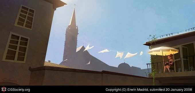
Title: Umbrella on Balcony
Name: Erwin Madrid
Country: USA
Software: Photoshop
Hi Everyone!
This is something that I saw when I was walking around the streets of Salzburg last year while on vacation. I thought that it would make a cool painting. I changed a lot of things like redesigning the buildings and adding the hanging clothes. In the end I also flipped the image to make it a better composition.
To View a closeup of the lady, visit my blog.
I tried adding a direct link but it wouldn't let me because the link has to many repeating letters therefore the Manage Gallery told me to many repeating characters:(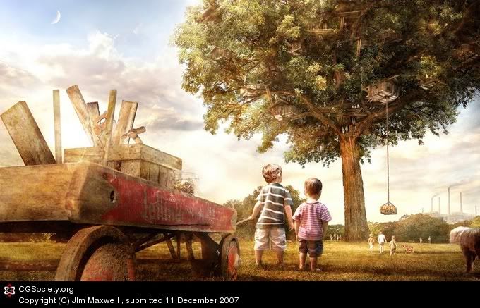 Title: The Treehouse
Name: JIm Maxwell
Country: Canada
Software:
This is a memory from my childhood of an actual massive treehouse that still partially exists today
Mainly painted in photoshop with geometry and some perspective worked out in Maya, the wagon and tree both had some geometry produced in 3d, and then I painted over them with details Title: The Greenwood Deep
Name: Phil McDarby
Country: Ireland
Software: Photoshop
Hey everyone,
This is a kind of follow-up to an image I did called 'Magic'.
This kid has wandered even deeper into the forest, and chanced upon The Greenwood Deep, the heart of the wood. I wanted to create a river of power, the forest's golden blood, surrounded by faery dwellings, all in the shadow of the ancient tree.
I took a long time on this one, three weeks at least - again a combination of many many hours of painting and photo texturing/manipulation. Any photos I used in the process are all mine, bar the little girl, who originated here -
http://thumbs.dreamstime.com/thumb_42/11407341516Om50Z.jpg
You can view my original plate here -
http://img211.imageshack.us/my.php?image=greenwoodplatecl6.jpg
- a photo I took in a wood called Ravensdale. I just loved the atmosphere and colour.
Anyway, hope everyone's well, thanks for looking and take care.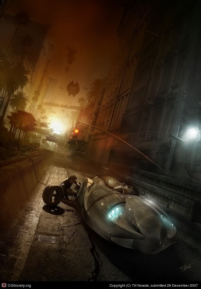 Title: Blowout at Exit 16A
Name: Till Nowak
Country: Germany
Software: 3ds max, Photoshop
This image was created for the CARNIVORA art show and book by Les Barany. It's based on a 3D rendering of a future city, but I spent two weeks in Photoshop to replace almost every pixel of the 3D rendering with 2D elements taken from photos, so I decided to put it in the 2D section. Here you can download a making-of-PDF: THE LINK. The art show will premiere in Detroits cPop-Gallery on January 12. The book will be released in spring 2008. (Missed that -ed) Title: Fallen Beauty
Name: David Edwards
Country: United Kingdom
Software: Photoshop
Back in May a few fellow painters took part in a small contest, I been the only one who couldn't enter :) decided to have a go all the same. I worked on it for a week or so then lost the original file, restarted and picked it up again over the weekend. To be honest losing the original file was a blessing in disguise, redoing the whole thing probably resulted in a more pleasing result. Always see the good in bad i guess :)
My thoughts:
You haven't made it as a digital artist if you haven't been featured in these major arts sites! I've still got a long, winding road ahead me of me...
I've been inspired by a handful of contemporary artists in my time. From the legendary Phil Straub, to Dave Seeley, 'Imperial Boy' and even Hyung Tae-Kim.
My recent experience in painting has led me to a kind of 'depression'. My paintings (many of which I have not posted on the net) are just too damn muddy. Is it because of the brushes I use? My lack of understanding the basic principles of art? My utter lack of creativity?? I practice, but am I practicing the RIGHT way? Oftentimes I try to find the answers by observing budding artists and seeing how they deal with these "growing pains". I was going through the various threads when I spotted this artist - James. He had a blog... "Scribble Pad" was its name. I thought, "Maybe its going to be another amateur's art blog... I could learn a thing or too..." That's when I saw this guy's art. I then said, "HOLY CRAP!!" There's really nothing that can be said about this man's art. Every color seems to be in the right place. The shadows, the perspective, the emotions are all beautifully composed in each of these paintings. As someone who was interested in environmental art for a long time, I can say nothing but... "Yipee! Horray! My muddy art looks like a piece of s**t compared to this guy!"
 Now that I think about it, I have seen this guy's art! I believe I used one of his paintings as the header for this blog. Oh well. All I can say is that he is the artist I aspire to be... one day.
 Like many great environmental artists, Mr. Paick's work is chock full of minute detail to enhance the realism. It simply isn't enough to stare at these thumbnails and not appreciate the amount of care and detail that was put in by the artist.
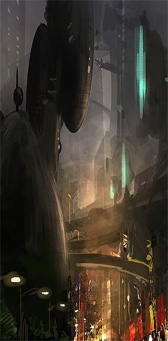
 This painting (above) to me is the most striking of the bunch. Not only does tilting the perspective offer a more dynamic composition, the detail and colors really help realize this place.
 As you can see in these closeups, everything, from the ground to the grand tower is jam-packed with detail that it makes my mind explode. How does he do it?? The strange, radar like residential/office building thingies in the back helps enhance the mystery of this place as well. It seems to go on forever, thus expanding the scope of this piece.
 Overall, this is one artist to watch. I salute you, James Paick!


