"No Art Director Ever Asked To See My Diploma"

Article by: Daniel Pelavin

The education of many a successful illustrator takes place quite handily outside the bounds of any certified program or academic course of study. The most important, perhaps only credentials of any significance in this field are the portfolio. While a portfolio of student samples may be quite handsome in presentation, it is rarely an accurate indicator of one's ability to effectively solve actual problems, under true deadlines while the exigencies of real life intervene. It is no wonder that school work is quickly purged and replaced by assignment work as soon as possible in the portfolios of those fortunate few to get work. If the ultimate goal is to distance oneself from all traces of "school," something more than a diploma must be offered to those who intend to work in the field rather than simply go back into teaching.

An online portfolio template. "There are thousands like it..."

An honest appraisal of the odds might be a good place to begin. Although it might not be the biggest boon to enrollment, letting people know just how competitive the field of illustration is would certainly help sort out those who potentially have other or better options. Illustration as a career is most successfully pursued by those to whom no other option is acceptable. It takes that kind of motivation to overcome the inevitable and constant stream of obstacles. Some frankness about the nature of the illustration market and the people an illustrator will have to work for would go a long way in discouraging all but the most foolhardy and desperate from pursuing this glamorous and enviable career.

Good luck! This artist gig better be what you want...

Every illustration student should know that even the most brilliant art director, say one who can dial an entire phone number including area code without having to look it up again, actually believes he could do your job if he wasn't so busy. While fostering the ideal of creativity, perhaps we could also foster the reality everybody remotely involved with your illustration feels perfectly comfortable taking credit for it.

This next item may seem like a very odd notion for institutions of higher learning but, how about showing some respect for students and some recognition for what they already know. Rarely will a nascent illustrator have arrived at college age without already having worn out his share of pencils. Don't treat him like he just hatched and for heaven's sake do your share to put an end to this myth of "artistic talent" which fosters such deep contempt among the lay public for those "gifted" souls who appear to have it so easy. True artistic talent is the ability to pursue your goals and not give up until you succeed, whether it is on the second or seventieth try.

"The Poor Poet" by Carl Spitzweg (1808 - 1885) Click the image to learn more about the hidden symbolisms that depicts the so-called "Starving Artist"

While we accept that most people can be more or less literate with enough effort, we are still rather behind in recognizing that the same thing applies to visual expression. A little less emphasis on inspiration and more on perspiration would seem to apply here. While it seems that working illustrators would be the obvious choice as illustration teachers, the axiom "those who can do and those who can't teach" may have actually been invented in the illustration field. Rarely do you find an illustrator who actually has teaching skills, can find the time and regards students as more than just potential studio interns. All too frequently what you get are semi-illustrators with too much time between jobs and underfed egos.

This image was taken from popular art blogger/critic Irene Gallo regarding one the 2007 Annual Scholarship Competition

The gruesome result of this ill-advised practice is the annual scholarship competition, where we honor the "best and brightest" for their pitiful imitations of illustration styles of the past. The crowning irony of this grotesque spectacle is the mention of these instructors in the exhibition credits, ostensibly, I guess for doing such a laudable job of helping students deny their own individuality. The next generation of great illustrators will come into being despite this circus but, it would be far less degrading if we didn't treat them like little monkeys.

Imitation may be the sincerest form of flattery but, ethics aside, it is primarily the province of bottom feeders in the illustration field. Give a student the ability to imitate Bernie Fuchs and you've given him a good shot at the CA Illustration Annual for 1974, give him skills to negotiate, promote and run a business, and he may actually be able to make a living. Enough with this baloney about oil washes and techniques of the "great masters."

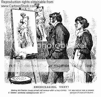
There is a great deal to learn from the history of illustration but, it ought not be confused with technique. True style comes from within not from copying someone else. It is not disposable nor a fad of the moment, ie. the fashion industry.

A good device for remembering what's really important here is the three "D's," drawing , drawing and drawing. Drawing from life, drawing from memory and drawing from inspiration are good. Tracing over photographs doesn't quite get it and plays you right into the hands of those who have no respect for honest effort in the first place. Illustration is a business, not to be confused with fine art, which is also a business (only a much more complicated and ugly one.) Those who commission illustration aren't "benefactors of the arts," they are skilled negotiators with a clear vision of the bottom line.

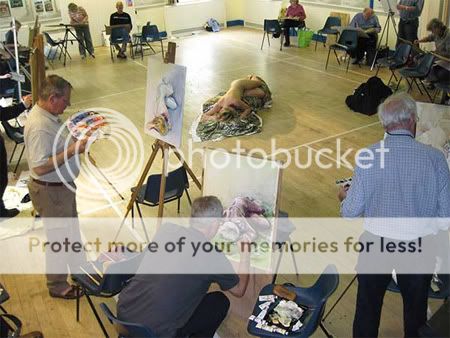
I gotta get me a life drawing class...

An understanding of usage, rights and how to determine fees does not hamper creativity, it gives an illustrator the freedom to be creative. Techniques in marketing and promotion change and evolve as quickly as illustration styles. You haven't taught promotion by telling students to send postcards. Ask any art buyer how many postcards he receives daily, before you suggest that direct mail even gets noticed any more.

Norman Rockwell's "Art Critic" (1955)

If you don't recognize illustration as a business and concentrate on the required skills, you are shortchanging those foolhardy enough to believe in you and after all, they don't really need that diploma to get assignments any more than Dumbo needed his lucky feather to fly.

My question:
Do you agree with this article?

Ralph Bakshi... Now there's a name I haven't heard in a long time.


I was introduced to Bakshi's work when I saw the 1978 animated version of
Lord of the Rings animation on VHS. All that rotoscoped animation (see: animation that is literally traced from live action movement) was a pretty cool gimmick, but it sort of wore thin. Since then I haven't paid much attention to the guy until recently.


Fire and Ice, a movie which where Ralph Bakshi collaborated with fantasy-art master Frank Frazetta

On a whim, I decided to check the Bakshi since I was getting tired of hearing folks reference his infamous 1972 animated feature 'Fritz the Cat'. I haven't seen Fritz yet, but I've seen some of his shorts, such as the 1981 animated short 'American Pop'. Try it, it's pretty interesting.


Youtube describes American Pop as "The story of four generations of a Russian Jewish family of musicians parallels the history of American popular music in the 20th century."


One video that really got me riled up was this passionate rant by Bakshi to the artists of 'this' generation. Meaning
US - the young, impressionable artists who possess all these fantastic tools at our disposal. Go out there and do something!


It doesn't matter what you're into - whether it's traditional, flash, or #D animation, digital art, game design, whatever. Ralph Bakshi tells it like it is. Get out there and get creative!!


ink everyone has said everything that could be said about the god-like landscape artist, Imperial Boy...


Face it, his work speaks for himself. I've said it before so I may as well shut up. Besides, I've spoken about the guy in the past. I probably said the same thing too.


This was the very first piece by Imperial Boy that I saw. I wasn't that into art as I am now, but this image certainly made an impression on me. I recall the book which had this image saying Imperial Boy wanted to evoke cramped avenues of Hong Kong or Japan, and give that weird rush people get when they go to these seedy joints.


He has a way of drawing his characters as well. They're not exactly the musclebound anatomically accurate human figures of Da Vinci, but they do the trick. They're kind of cute actually! :-)

If you click on this image, you will note just how painstakingly detailed every area of this image actually is. It's not just crappy photomanipulation and cheap Photoshop tricks, mind you. Every art trick in the book can be seen in his stuff.


It's got High Dynamic Range Lighting, perspective, cute anime characters, muted color palette, 3D references, and a whole lot of other technical jargon nobody cares about. A weird gimmick Imperial Boy uses in the Robot artbooks are these pieces, where they scream "Look at all my overly complicated detail!!!!!" or at least, something to that effect.


The guy likes making these fully realized fantasy worlds. Staring at some of his images makes you just
wish you were there. His beautiful cityscapes and impossible architecture defy any kind of sense, but who cares?


You don't think when you look at these images sometimes. They're cool and fun to watch, but inject any kind of logic to some of his stuff and you might as well just hit yourself with a sledgehammer. There's one image in one of the
Robot books which is literally a school, where each classroom is hung in one giant ferris wheel. Now that's... weird.


I am the last person you should ask about the Warhammer 40,000 universe. I haven't read the Horus Heresy novels, and was only mildly entertained by some of the comics I found on a bargain bin. I haven't played the pricey tabletop games, nor do I plan to any time soon and I unfortunately avoided all the PC games. Why?? I don't know!


But if there something I've always like about Warhammer 40K's universe, it's those blasted Space Marines, and nobody seems to illustrate them better than Clint Langley.


There's suprisingly very little that can be said about Clint Langley's work, other than than that he's superb when it comes to rendering the facial features of his subjects. I've browsed through "The Art of Clint Langley: Dark Visions from the Grim Worlds of Warhammer" and his stuff is pretty photorealistic. To a point where it's kind of creepy-looking. Think of renowned comic-book artist Alex Ross' stuff, where you can almost imagine some beefy model making a weird uncomfortable pose, while Clint's painting. Yeah... kind of like that.


The guy primarily works for role-playing game stuff, having done Battletech, the original Warhammer fantasy franchise. I did read a while ago that he did stuff for the infamous Britisgh comic company 2000 A.D. Most notably "Judge Dredd". Too bad my only memories of Judge Dredd are from the silly flick by Stallone back in the 90's. Wow!

Of course, with his kind of skill, he worked on stuff for companies such as Marvel as well. Man, his covers are just gorgeous. Makes me almost wish they were in a higher resolution, so we can appreciate it in all its glory.


And now since I've got nothing better to say about dear ol' Clint Langley, I think a video is in order. Perhaps one relating to Warhammer 40k?


Welcome! Let's talk about art again! (What else?) You might not be asking: What are paint overs?

It's when... It's when when some newbie artist would post his or her fugly art piece on a blog or message board asking for comments or suggestions, and a more experienced artists would come along and start painting over it to point out mistakes. And no, I'm not talking about directional arrows and notes on where to improve (though that's technically a paintover itself) - I'm talking literally painting OVER the piece, changing colors, adding figures, changing poses, and essentially ruining any chance for the 'student' to learn anything valuable to add to his artistic repertoire.

Anyway, I wanna start this weird new segment here where I'll spotlight certain art pieces from ConceptArt.org and show how they transform into masterpieces (or technically proficient art). I know, I know! It would be so much better to show MY OWN art pieces getting makeovers, but that'd be too much work. HAHAHA!

Uh... let's begin?


Nico's original "Robot" piece


Nico: "Hi everybody, this is an image i'm working on, i would like to hear comments & critics from you about the image in this current version Right know i'm only working on values, i will work on colors later ( The robot will be in reddish tones, and the set will probably be in brown & green tones ). I will also add some rust to depict a dirty set, and some smoke on the ground. Some modifications that i will do: the foreground will be a little bit more readable, and a soft light from the right will highlight the foreground and the robot, also the black outline of the whole image will be more overpainted"

So if you have any suggestions to improve the image and correct some mistakes, don't hesitate"

My thoughts:
Wow!! I wonder what this guy has in store... This piece already looks very promising, but the comments are right - it is a little hard to read what is going.

I do not understand what is going on in this image really...I have a robot thing that I think is getting interrogated or something...I think if you attached some sort of narration you would get a better response...

ConCrete
The values and edge control are gorgeous though...I would toss some mids in the lower right to give the eye something to look at in that corner.

So Nico explains that the story is about how "..the little robot is imprisoned into the engine room of an hospital, where experimentations are made on robots. He is daily tortured, and what we can see in the image is that his torturers are coming back ..."

ChrisBennet gives Nico's piece the benefit of a doubt, stating:
"There is nothing really wrong with this at all apart from a tiny ambiguity concerning the robot's right arm: The big nut he is wearing as some sort of bracelet (I think) is not recieving the light in a way that puts it far enough away from his elbow - if you see what I mean. Other than that marvelous!

Can I ask you a question: How do you proceed with the colouring phase - do you just tint everything with glazes or do you paint opaquely over everything? Perhaps you use a combination of the two?"

So Nico explains his process:
"I understand what you mean about the bracelet, but it is intentional that it looks this way because it is supposed to be this big.

About the colouring phase, my method is not the best: i fill the screen with a medium colour, and then i add shadows and highlights and finally i paint over the dark line which i should not have work so precisely because we won't see it in the end

As someone in the Cgtalk forum told me, the highlights were not consistent, so i correct them and gave more contrast to the shadows and highlights of the robot ( the robot is a bit more shinny in some parts ). I've also added the shadow of the buzz saw on the cylinder. This is the new version:"


My thoughts:
The change is very subtle, but effective nonetheless. ChrisBennett eventually states that "It's not the size that is causing the problem but that the way relates to the robot's shoulder in terms of lighting making it look nearer to your eye than the shoulder itself. This then thows the elbow out of kilter because assuming the forearm and the upper arm are the same length, the fact that the bracelet nut is nearer than the shoulder doesn't make perspective sense in this instance."

Nico acknowledges this, and takes on the challenge. The results are marvelous:
"This is another version, not the final one as everything is subject to change. What has changed from the previous version, apart from colors:

  • Some smoke between the robot and the big cylinder ( this is a rough smoke taken from a low-res version of my image, that's why its shape is different from the robot profile ).
  • The backlight on the robot
  • Some contrast to the foreground lighting
  • A test for the rust ( or blood ) on the big cylinder
  • Some dust glow on the left of the image
  • The tiled floor
  • The blur on the foreground chain
On a previous version, the robot was more shinny, i will try this again. As I am searching for colors, if you have any critics about this current version, i'm ready to read them, thanks !"

Above is another quick try on colors, i've replaced the blue with a green to depict a sick environment. I've also inclined the camera, please tell me if it's a good idea or not, thanks !

My thoughts:
Brilliant! The top version is amazing! The blue and red version now makes me want to hurl. Who knew changing a few values can change the entire mood and narration of the piece? Bah. Of course you knew this. And that's it for now! Be sure to check out the thread if you want to see what happens after - but definitely this artist is someone to watch!


"...From a standpoint of taste and content: I photograph whatever pleases me. Consequently, this gallery may contain things that don't please you."

Excerpt from Marcus Ranum's Stock Photography site

Can't draw the human figure? Feel a sense of inadequacy when you realize that you fail to understand what has to be the most essential skill in art? In understanding the lights and darks and all that value study stuff?!

Well, you needn't fret so much! You'd be surprised how a lot of talented and professional artists USE photos as reference when drawing people. A lot of budding comic and digital artists would often use themselves as models and pose on photos when drawing and painting. Believe it!! (Eww) Some would say using stock photos helps you figure out the perspective of the figure without wasting all your time with "fundamentals". (Whoever said that deserves a medal -ck)

I would assume classically-trained artists hate this sort of thing. They prefer artists today should know how to render a realistic a figure, and sometimes use real life models in art workshops. Some argue that part of the problem with using photos as reference in art is that it tends to look flat. Whether that is true or not sometimes depends on the artist I suppose...

Stock Photos?

Anyway, where was I? Ah, yes. Setting the debate aside, here's what I have to say for this post - Many thanks to ImagineFX, the pricey digital art magazine I buy on occasion, which led me to discoverd this rather odd photography site. It's run by Marcus Ranum, a photographer with... interesting tastes.

Rendering photos on canvas is only as good as the photo reference, and Ranum certainly doesn't disappoint! He's got really neat stuff here, stuff I feel would be perfect for fantasy and sci-fi artists looking for a particularly pose and can't quite nail em since they never bothered to take formal figure drawing classes. :)


Yes, you can draw a Slave Girl!

You can see how light would affect certain fabrics and materials. Perfect if you suck at that sort of thing. You can see women doing strange sometimes tasteless acts in some of these pictures. Priceless, right?!

Ah, but never fear. There's some neat classical nudes, if all this weird stuff makes you think funny thoughts. These nudes are great, and if you can stand staring at the monitor while drawing, then good for you! I highly recommend you check out the site! (Link below)

Did I mention Ranum's site's got Cat Girls? If you ever fantasize of rendering realistic looking "Neko Gals", then this is your one and only chance.

Visit http://www.ranum.com/gallery/index.php for meow--more details. Damnit!

When you're really studying art and stuff, you may have come across this term: "Negative Space".


What the hell is Negative Space..? No, not the weird Negative Zone from the comic books. It's... I don't know. That's why I go to the place that has all the answers. No, not Wikipedia! ConceptArt.org!

Seedling, a longtime forum-goer describes the "Negative Space" as the the white space that surrounds the silhouette of a character.

Armando goes on a little more by defining "Negative space as a result of drawing a shape on the paper. Becoming aware of it initiates you into composition. One of the elementary things to do in drawing is to
separate figure and ground, figure being things(people, cups,shapes, whatever), ground being the air that surrounds them.

On your piece of paper say you draw a square, the paper contained within it's contours is solid, all the paper outside of it is negative space. By moving the square around you'll find that you can change the shape of negative space: a rectangle with square hole in it, an "L", a "c".

Positive and negative space are ambiguous until they are defined by some cue, usually in our work the cue will be recognizable things like people and whatnot.


A very important and elementary way to seperate the two is by using convex contours. Basically our minds interpret the area contained within convex contours as solid, areas contained within concave contours appear as empty space. Research visual intelligence, and visual perception, for more info on that, I don't think much is said about it in art books."

My thoughts:
Wow! With all this free data on the net,
why waste a fortune on artbooks and all that jazz?? Ugh. I have no idea. Since I have a day job, and have got some cash to spare (since this is my hobby after all) why not? Why waste money buying a new cellphone, or electronic peripheral when can survive with the old one?! Anyway, going back to the topic at hand...

Here's a picture and then the same picture with all the negative space filled in...


Notice how the negative space makes the figures (the positive space) more silhouetted and "readable" from a distance. This "posterization" adds graphic power/pop and clarity to the picture.

Armando then points out this lil' tidbit: "Whatever is not intended to be a
solid form is negative space. Take some steps back from the screen, or change the zoom level and you should see that the silhouette is clearer on the white background.

Basic composition, there is more contrast between black and white, than gray. Notice how the muscles form convex bumps. Even if you didn't know those were ape men, you would know they were the figure and the white the ground, even if you were to make them white and the background black the relationship would be the same.

When we first start drawing we only pay attention to the shape we enclose within the lines, ignoring that big shape that's surrounding it, but it's all just dividing the picture plane. Sketch little frames on a piece of paper, add simple shapes within them, but instead of looking at the area contained within the shape look at the area that surrounds it.

Sometimes positive and negative shapes become ambiguous, modern art tends to take advantage of that, it adds dynamism and complexity because there are mutiple ways of looking at the picture."

My thoughts:
You get it right? Do you get it? I'm asking you, Void. Answer me! What? Kev Ferrera has provided examples of excellent use of Negative Space? Coo!


Orignal Images:


Edited by Kev to highlight interaction of silhouette with "Negative Space":

So cool. As Armado would later say: "Now that the question "What is negative space?" has been answered, I'd like to ask,
How does negative space become expressive? I can see the negative space in the examples, but I find myself paying attention to the subjects in the picture, the subject carries the expression, the negative space just seems like coincidence."

More of my brilliant comments:
Alrighty then! Thank you, Armado! Does anyone dare to step up into the plate?? How does "Negative Space" become expressive?

Ah... what's this? I see... oh! I see Mario. Mario, what do you have for us today?

"Negative space (in painting/illustration) is known as whitespace (black type has a white background) in typography/graphic design. That could be useful for finding more information although it has a different meaning for macro and micro typography.

Negative space, like most other compositional elements, depends on contrast (or lack thereof). You can use contrasting values to amplify or similar hues to unify something and all the hues depends on each other for effect.


I wonder what those silhouettes are?


The same goes for negative space and it works with the values in your painting. High contrast values (black silhouette against white background) create negative value while softer transitions reduce the effect of element separations. And if you have very similar values then you probably will have a hard time finding anything that looks like negative space.

So how does it become expressive. Not at all. It is
part of a composition and creates a desired effect with the rest of the painting. It only appears in combination with the rest and is not an isolated something.

You could as well ask how does some hue influence mood in a painting. This only happen because each element depends on the rest to function properly.


All these properties are relative to each other and not independent. You have to just see it as another part of the composition that you can manipulate to get the desired effect."

My thoughts:
Good! Good! That clears things nicely. But hold on, lets hear what Kev Ferrera has to say about the topic - this one's good:

Kev Ferrera: "The main use (of negative space) is to clarify the pictorial statement... that is, to help the viewer "see" or "read" the actions of the figures easier. Clarity is important in storytelling.


There is also a boldness to the strong use of negative space. Graphic boldness is part of the tone of a picture. Color contained in negative space often appears stronger than it would normally (a stained glass like effect).

Shapes *always* have meaning... Every shape has expressive meaning (artistic handwriting, shape-character as well as metaphoric reference). It is possible to tell one artist's work from another by use of negative shapes alone. For instance coll and Frazetta have a very different kind of character to their negative shapes, than Dean Cornwell or Leyendecker or Brangwyn or Fechin or Shiele or Klimt or Rembrandt.


And of course, all of them are different than artists who aren't even aware of the expressive power of negative space shapes. Often artists who aren't aware of the expressive potential of negative space aren't aware of the power of shapes in their works in general.


Negative shapes also, like all shapes in a composition, lead the eye. Quite often negative shapes are triangular in a good figural composition, and point to the head of the figure (or point along an eye path that leads to the head eventually, or supports the movement of the eye along the flow of the gesture)."

My thoughts:
Well well. Come on, folks. Lets give these people a warm round of applause. Great stuff! Great stuff.

Okay. Back to work.


With the dissemination of digital art tools among today's youth, breaking into the commercial art industry has become that much harder. Look at it this way, there's only so many artists Marvel or DC will hire as inkers, or colorists. There's only so many publishers willing to higher new talent to create book covers, or posters, or what have you.


It's a desperate race as young artists struggle to match the speed and artistic skill of professional artists. They're putting just about everything on the line for the sake of art. So what is the first thing that tossed away in this lifelong pursuit to be the next Ryan Church?

Is having a glamorous social life all it's cracked up to be? I was inspired to write this post after reading an innocent little thread on the well of artistic ideas, ConceptArt.org. The topic began when a young member named Mescher, gave her thoughts on the issue of "Art vs. Social Life":

"Lately I've been finding myself having to choose between art and a social life a lot more. I'd just
rather be drawing. I either feel like I'm neglecting my friends for art, or neglecting my art for my friends.

I'm hope this will get better when I start at CCAD (
Columbus College of Art & Design -ed) and meet some people who actually like art. But am I just supposed to kiss my current friends goodbye until then?

I mean I like them and all...I just can't take another round of guitar hero. They all have the "it's summer and we should be hanging out and doing nothing EVERY DAY till school starts" mentality. Am I being selfish? Anybody else have this problem? Please tell me it gets better!


Pleeeeease...I can only watch Donnie Darko so many times!"

My thoughts:
Honestly now. This is really a painful subject to discuss. Rather than elaborating my thoughts on this matter, lets hear what other people have to say about this! Perhaps their opinions will mirror my own:

Tugelbend has this to say:

"I'm in the same situation actually. Right now I'm "losing" my friends because
we don't share the same interests anymore. I rather work my butt off than just "hanging around" though it's not like I don't see them anymore. I still go out for a beer about once or twice a week with them but I find less and less to talk about. My head is filled with art unlike theirs and I see where this is leading to.

But whatever,
art has top priority. You know, they can waste their time as much as they want.. but without me. I just hope that I will meet other people like me in the future and until then I'll run around friendless. sounds pretty emo lol"


My thoughts:
Hmm... I won't say I'm losing my friends because I love art. In fact, I'm pretty sure my friends don't even know I do all this weird art stuff during my free time. I know it sucks now to have someone to really relate to when it comes to this stuff (except for my brother maybe). There is a definite feeling of
alienation when it comes to talking about my hobbies and stuff.


I talked about this before, but join a sketch group! If you can't find one in real life, go online! That way you won't feel like such a loner when you hone your artistic skills

A member named Wheezy offers his own thoughts on the matter, something I think is quite nice actually:

"Take your sketchbook with you for some life studies, maybe get some ideas on something bigger to do later. Draw them playing guitar hero. If they are really your friends, then they already know you are into art etc. and will be cool with you doing that. Don't shut part of your life out because of art, let them help enrich your art even more by expanding your perceptions of what is around you."

My thoughts:
I probably shouldn't mention the time I desperately felt the need to paint or draw something while I was
chilling on a white sand beach. Yeah, good times.

But here's something interesting, a member and artist of some skill named Naomi offers her own unique 'guidelines' on this subject. I made it sorta bullet point-y since it seemed to fit that way:

"I've said goodbye to a lot of "friends" over the years. Especially people who don't teach you anything, who keep complimenting your art but never actually buy any.

  • Get rid of these people fast. Do not hang out with them do not do free commission work for them.
  • Get rid of non-artist friends who put you down.
  • Now if your friend is an artist you have an advantage by working together and improving your art. there is no reason to neglect your chit-chat and shoulder to lean on duties there.
  • Also get rid of boyfriends or girlfriends who don't support your art dreams, or people who think you're worthless because you do art.
  • This includes family. No matter what they say, your family can always be cut off. If they are bringing you down get rid of them.
Another thing I must say, is if you find yourself spending more time with your friends than with your art, maybe you should think about ditching them as well."

My thoughts:
The deeper I get into this topic, the um... stronger these young artists opinions get! Ah, but from where I live, I can sort of see where her frustration is going. Everyone always asks... how do you hope to make a living as an "artist"? Is it possible to quit your day job just because you started selling commissions to aficionados at deviantART? Hmm. I guess you have to really ask yourself what level is your passion for this sort of thing. Can you survive living alone, honing your art skills in a tiny flat, eating non-fat crackers and drinking water? Ah, who knows? But if you found Naomi's views to be interesting, why not check her portfolio out? Check out her sketchbook too!

Moving on... If you are one of the lucky few who actually got into an art college, than lucky you! This is probably the one of the few places on Earth where you'll find people your age who share the same interest and viewpoint in life. A member named Space Sprayer offers his experience on the matter:


"I had to make this sacrifice. Unfortunately it doesn't ever stop, although it does get easier. I lost touch with all my mates during college, but then they were a group who had very different goals in life anyway.

Now that i'm at uni studying for my Bachelor of Arts, surrounded by people who have the same interests and aims. As a social event instead of going out and getting pissed like my old mates did, we might go sit in the park on a nice day and draw the people that pass by, or the scenery around us etc. I still have to forgo the occasional social event because of work, but my mates here understand that."

My thoughts:
Sacrifice - for the sake of art. Ah, what a compelling notion...

On the subject of finding like minded people, why not try to find out if your area has any kind of artist's convention or something like that? Back in 2007, I traveled all the way to lovely Singapore to attend the CG Overdrive event - and that literally changed my mindset on art. I talked to folks like Michel Gagne (a great FX animator) and the boys of Imaginary Friends Studios. A very memorable experience.

I would have loved to attend future CG Overdrive events, but I didn't like how it focusing squarely on 3D art. All that Zbrush talk, rigging, character modeling doesn't interest all that much. I know that having basic knowledge in 3D modeling can have such a massive impact on one's portfolio, but hey, I already have trouble drawing a person - what makes you think I'll have an easier time makin' one in the third dimension??

Sorry, got a little carried away there. But out of all this, what has
Mescher have to say about Art versus a Social Life?

"Now that I think about it, I don't really like my friends as much as I used to. That's probably part of the problem.

My boyfriend doesn't mind letting me draw him all day, and he's the only person I really care about. He actually said he'd go to the zoo with me so I could do animal studies. I think he has nooooo idea what he signed up for!

I guess I'll just have to get used to keeping a balance (and figuring out what I actually want.) I can't have my cake and eat it too, right?"

My thoughts:
That's the spirit! Why should you let one aspect of your life run you like that? Try to find a healthy balance so you won't feel like a total shut-in. If your love for art can't be helped, then at the very least try to accommodate your real life friends from time to time. You could be a happier person knowing you have a life beyond your self-absorbed world of art. Just throwing my thoughts here... :)

Ah, but this member... Jushra, offers a very unique point of view:


"There's a book I had read entitled The Virtue of Selfishness. The title is a bit of a put-off it seems to most, but inside there was a wealth of knowledge to gain.

Nobody can tell you how to live your life except for you and nobody will bear responsibility for any of your actions but you.

Don't try to control your peers and don't let them control you. You have to keep what you value close. Choosing your values is another story though. Don't sacrifice yourself to others, nor sacrifice others to you. You have to sometimes trade-off for balance, but make sure it is done for the right reasons."

My thoughts:
I have to admit, that statement is quite empowering. Well, it really depends on the person I guess. What do you value more in life? Are you willing to sacrifice one for the other? The thread goes on explaining a little more about that. People start offering their own wacky point of views and anecdotes. You can see the full thread here.

The person who started this thread would later make it clear that she isn't saying that you should get rid of your friends just because they aren't artistically inclined. For her, the problem arises when your friends start becoming needy of your time, and simply take the time to understand what you are doing and why. Ah... well. I get that. Hmm... What do you think??


Blogumulus by Roy Tanck and Amanda FazaniInstalled by CahayaBiru.com

Followers

About Me

ChrisK
On and off blogger.
View my complete profile