Why are you so cruel, Void? Why can't you offer any words of encouragement, or feedback or anything? Well, I'll be waiting, dear Void. Sooner or later, your heart will soften, and you will see that yes, I will... no, I must give good constructive feedback! For I am here, sticking it out, reading this fool's words. I am here to see this idiot make a spectacle of himself, as he has done so in the past!
But for now, let us all gaze at the beauty that digital art age has offered us. This ugliness, the raw evil of the real world - as well as this virtual world, has made the likes of me... somewhat tired, somewhat... disenfranchised. Mine eyes long for the sight of this calming beauty of art and grace - to forget for a moment that, you, don't care, Void. I present, the awardees of the CG Choice Awards. May you enjoy it, and in turn, make your own art. Why? You didn't think this damn blog was catering to the handful of Robotech fans/friends I've made in the past? What are ya, crazy?? I mean, this blog is like, for anyone who likes to hear fools like me ramble about... well, art! And all that junk in between. And now I ramble. On with the art! Calming beauty... Calming beau...
 This piece is called "Empire Total War: Grenadier" by Michael Kutschie -
"GameStar cover-artwork for the SEGA/ Creative Assembly game "Empire: Total War". Completely done in Photoshop and Painter. I got some reference for the costume by CA's art department. Used myself as a reference for the pose and face (I did some poses with a hoovertube :)"
A bold piece, with a very classic pose, and the cool colors add so much to the overall atmosphere. The strong silhouettes of the infantry help give a nice tense atmosphere. You just have to say, aaaaah. Oh, and that guy's face is super detailed. I forgot to check if this guy merged CG work with Photoshop. Maybe he did - then that's cheating! Hah! No, just kidding. Crap, I feel like I took too much coffee now.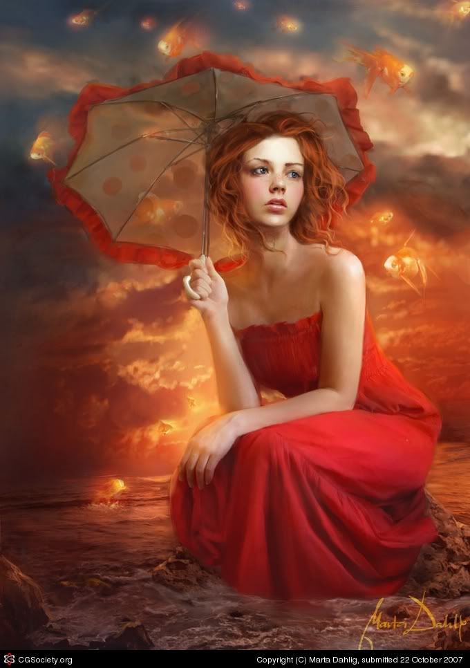 "Umbrella Sky" by Marta Dahlig
"Well, that's a quite old piece originally done for ImagineFX Issue 22. It can also be seen in the upcoming Exotique 3. :) This version, however is quite different, as I came back to the painting after a longer while and reworked it a LOT. Overall, it took many hours in Painter and Photoshop. I also used some references (especially for the fish and the sea)."
Now If only I can paint like that! While talking about it won't improve my skill, I like to whine, so there! This is a blog remember? A place where I can put in my innermost thoughts and desires... Okay, shutting up.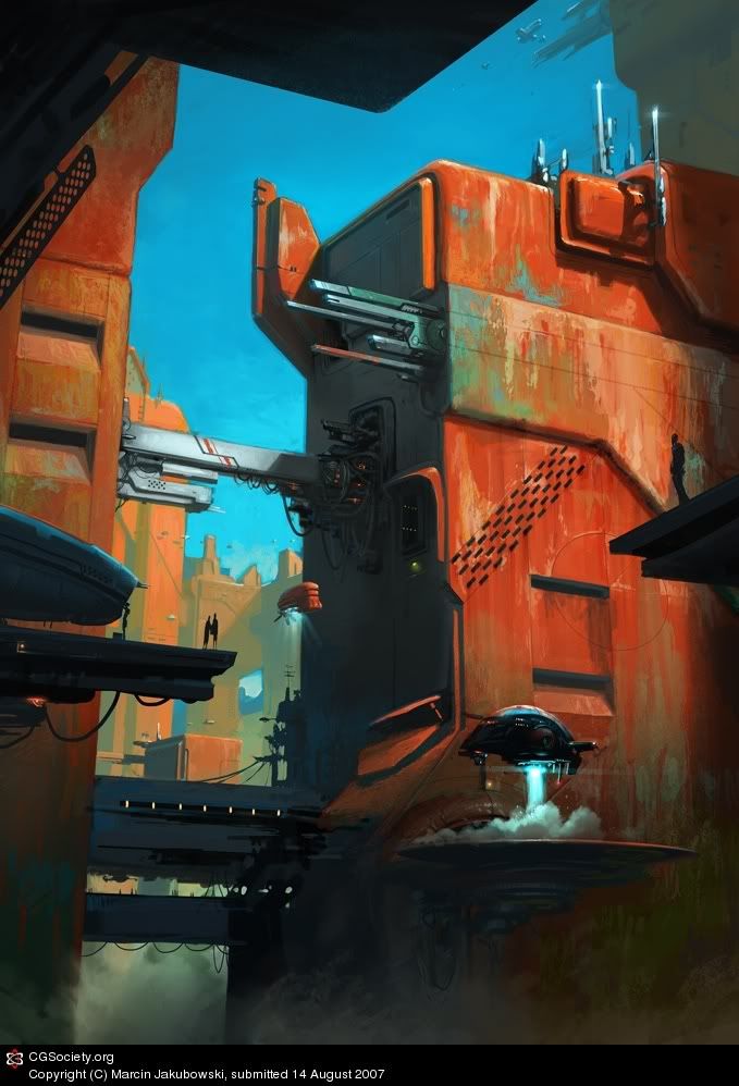 "Outpost" by Marcin Jakubowski
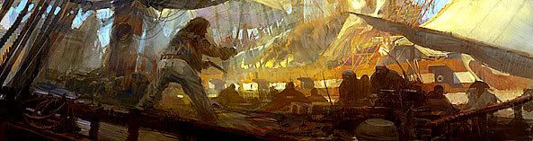
"hello, I'd like to present my attempt in the sci-fi environment field. I wanted it look like a cover illustration for some classic s-f book. Strong colours are intended. One of the forum mates called it "a big sewing machine" :) Photoshop and about 12 hours of work."
Whatever this man's inspiration, is - this piece is certainly... inspired! Brilliantly warm use of colors, with great composition as well to tie the image together.
"Oiran" by Srisuan Skan
"OIRAN" was created for S magazine japan in oiran theme issue, Oiran is high class prostitude in EDO that wearing a georgeos clothes. This piece was done photoshop 7 and ball mouse as I used to do for long.... this piece make me think of further progress for my works and make me decide to use wacom. welcome for any comments and notice, thank you."
This piece was created by an artist based on Thailand. Wow. I don't live anywhere near the States, so like... cool. The girl's face isn't the focal point of this picture, which I find odd - it is a bit of a mess but whatever - if I ever had a technique like that...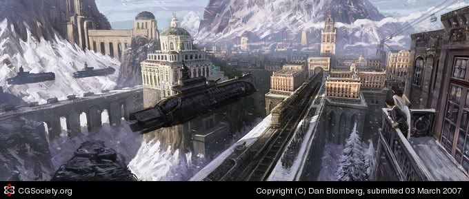
This, you damn Void, is "Iron Grip: The Invasion"
"Here's a piece I did for the Iron Grip project by Isotx.
The scene takes place in a baroque/industrial like world yet with with powerful "next gen(?)": ) ww2-inspired machinery. Props goes out to Keith Thompson who did the airship-design. He's been doing some great concept work so it wasnt a problem working after this design at all. But I wouldnt mind doing my own take on this myself. As refreshing it might be doing all sorts of freelance projects, sometimes I wish I could spend more time with certain projects following them from beginning to end.
Hope you like!"
Oh, I like floating subs! Sort of reminds me of a show called "The Southern Cross"! Hell yeah! A unique and refreshing take, especially for this particular era, which is kind of languishing or something... "Waterfall City" by Luis Melo
"A sudden idea, which resulted in a combination of references. Some slummy architecture on a cloudy day in a dream place. Took a long time, considering my attention span capacity :\ hehe"
Oh, I love Photoshop/Painter pieces about cities that make me feel like the insignificant insect that I am. Beautiful, I feel so small right now, and you Void. Oh, why do you do this to me?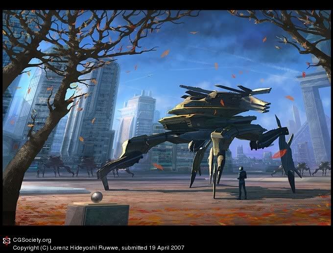 Ominous Winds by Lorenz Hideyoshi Ruwwe
"Heyho, I haven't been active on CGtalk for quite a while so I reckoned it was time to change that! :) This was started back in autumn last year, hence the theme of the image.
I had been practising 3D modelling in the hiding, so this is one of my first combinations of 3D modelling and painting. The tank was modelled in Wings3D which is a very powerful but free tool! All the rest and overpainting was done in Photoshop. I like the pilot... :)
- around 15-20 hours maybe, no reference"
You hear that? A true German-based artist! No visual reference to help him out in perspective or texturing of this piece! I wonder... can I achieve that? Huh, can I?
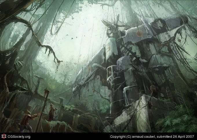 "The Plane Idol" by Arnaud Caubel
"Hi! This one comes from my WIP called "An Improbable Travel". I had fun with the jungle 'trip'... I hope you 'll like it! Pencil sketch, Psd, approx 7 hours.."
This is what you get if you spend your whole life just making art. While you wither away, something beautiful or grand appears on screen or on canvas. That is the beauty of art - And I have no idea what made me think of it that way.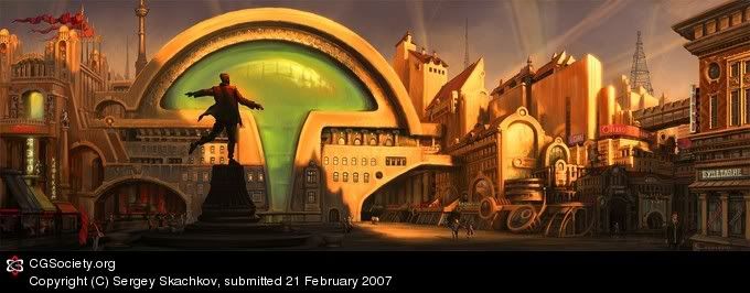 "Poet's Square" by Sergey Skachkov
"This piece is my new image from "Utopias" series. It is my free interpretation of one of Moscow's squares. All legends on the buildings are composition names of the poet-futurist who has poetized at the beginning of the twentieth century. I created the image in Photoshop CS with custom brushes."
His interpretation? This beautifully made piece of s**t? How I envy you! Your warm use of colors, your grand use of perspective, its all come together, so well - and this - this is it. I have no idea what the f**k am I saying. Is nothing sacred? Can art heal the labored mind? Can it calm frazzled nerves?
So okay, that's just a small set - of art that I found most striking around the net. I ask you again, Void. I asks you'z nicely now - do you want more posts like this? Do you want anything from me? ANYTHING?! Huh?!? Answer me! (StudioMMG apologizes over this tirade, but I blame the Void anyway for this blogger's condition)
Thank you, and have a good day. Oh, and here's the old Final Fantasy XII intro. I don't play PS games so I place it here because it's pretty. So there!
 If there's one artist that I've been admiring for quite a while, its this guy. He's good. He's really good. I may have talked about him before, but I don't care. He's such an inspiration for my work, because he does that whole space marine thing so well. In fact, you may not know it, but this guy is the concept artist for Bungie - a.k.a. The Guys Who Made Halo. Yep. He's the one. But while Halo is his crowning achievement, he's also worked in other high-profile commercial projects such as the Need For Speed Underground series, the Wolfenstein remake, as well as film productions as well.
The 39 year old Californian native attended Pitzer College in Claremont for two years before studying product design at the Art Center College of Design. Mullins soon found that he was better at drawing cars, which led to 6 months at Ford in Detroit. He also discovered that his design sense was a little too weird to be of value to the car design industry and returned to Art Center to study illustration, where he finally finished his degree in 1990.
 In 2002, while working for Bungie, Mr. Mullins produced art for the cult-classic PC shooter Marathon's spinoff comic/novel thing - and as you can see in these two shot (top and bottom), it has a lot of his later Halo concept work touches (Halo 1 was released 2001)
The guy's anatomy was a little funky, since these pieces were made in 2002, but you can already see where this artist's future style is going. From this, to...
 To this. Behold, Master Chief looks better than ever. The following concept art were made around 2006, so you can see how big a difference four years made in Mullin's style - the muted colors are fantastic, the strokes are bolder and more confident - there's a beautiful painterly feel to his work for Halo - and its really a great evolution in style. (This might sound like the simplification of a lot of factors, but I will focus on his works for these two properties for now)

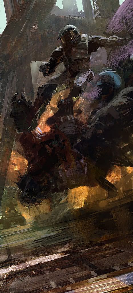 Many of these pieces were for promotional purposes, but as you can see from these concept pieces, even the overall stylings of the original Halo have been vastly improved, with more depth and focus in the designs for the Covenant aliens, the Marines, the settings - Fantastic!
 Straight from the Horse's Mouth
In an old interview from Ballistic Publishing (Folks behind the Expose Art Book Series), Craig answered some cool questions - the first being about how he developed his style:
Craig Mullins: "My style is a sum of hundreds of influences, and a few (just a few) ideas that I came up with. I think that in a way way, my everyday life contributes a little. I'm a bit of a dinosaur, and I don't want to think too carefully about the wisdom of using these great new digital tools to produce work that was cutting edge 150 years ago.

The idea of 'originality of concept' being the highest value in art is a legitimate one, but there are other ways to look at things. The master apprentice model is as good a way as any. But being labeled a 'revolutionary' is sexy. I guess I am just not."
And his influences in art..
Craig Mullins: "I like learning new things -- not just about art, but the world in general. The more I know, the better. Except composition, the more I know about composition, the less able I am to compose well!"
And then he rambles on how he got into Photoshop, and his later works and influences. He's quite an interesting fellow, and like the guy who interviewed him said, everytime you look at Mr. Mullin's art, you always "find something new and profoundly interesting"
Craig Mullins: "I had first used Photoshop to touch up some physical mattes for a British Petroleum commercial, and remarking what a cool program Photoshop was. John Knoll (the co-creator of Photoshop) suggested that I try to do the whole thing in Photoshop. Just having started with it, I had no idea of how to paint with it, or even if you could. It was an experiment for all concerned. It was pretty much kluged photos, but it worked OK.
I bought a 33MHz Apple Quadra 700 with 36 MB RAM back in 1993. My idea was to scan in color roughs (I did little paintings before committing to blocking in a huge final piece) and play with them in Photoshop. You can try so many variations so quickly.
Eventually, the computer took over more and more of the task. At first it was very hard convincing clients to accept digital illustration work. I think they had visions of a contrasty mess of procedural textures, but I kept at them. I remember driving into town to set up a clients AOL account so I could send them works in progress.
Now I am trying to stay in as many areas of illustration that I can. I think it is better for me as an illustrator and it makes good business sense as well. There is a lot of mutually supporting aspects to the different areas of work that I do."
 While I admire this artist sooo much, it also helps that he was commissioned by Bandai to do this piece (Below). Man, this is one artist I aspire to be - and will probably never end up being.
 Do you want more artist profiles? Comment! Give feedback!
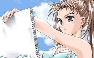 This is a companion post to my previous one on the 'Drawbacks in Drawing Anime'
Please bear in mind that I did not write this. It is a post by some frustrated anime fan, whose name I stupidly forgot to remember. While these articles are hardly related to conceptual art, I don't really care. Bleah!! It's not like this blog is popular enough to garner outrage!
So why does he say their is still a pervading 'ignorance' among the population regarding anime? While I, ChrisK doesn't really agree with a lot of points here, its food for thought by Mr. Know-it-all here. So let's go! (I will be inserting my own thoughts from time to time like this)
- The problem lies in three forms. the 1st is a problem of clarity. Terms/jargon are frequently used but not understood.
- the 2nd is a problem of media, (television, internet). All too often corporate television networks such as cartoon network market its anime in an unfavorable manner. Deviantart is filled to the brim with shitty cartoony anime. (you said it - What is this Robotech crap? Just kidding)
- The reputation of anime is further injured by its associated fans. I would like to believe that most anime fans are intelligent people with a sound understanding of art.Unfortunately, as listed below, there is evidence of the contrary especially in high schools across America.
- Thousands of anime fans who make an attempt to draw well are making shitty drawings in an attempt to mimic anime/manga style.
- Art schools and professional art communities tend to avoid anime like the plague. (Refer to my article again on Drawbacks of Drawing Anime')
- the few people who draw anime well and have fundamental technical drawing skills are ridiculed and tagged as unprofessional.
- Anime is often associated with goth poseurs or nerds who wear black.
- hot topic regularly promotes anime in the form of T shirts. I have nothing against hottopic, since I bought a "Death Cab for Cutie" shirt from there, its not a terrible place, but it adds to the problem at the same time. (This guy is confusing me...)
- the T-shirts that have anime on them are poorly designed, for the most part.

- The goth community has been injured by poseurs for a variety of reasons. Goth poseurs are attracted to anime, and that association is bad for both genuine goths and genuine anime fans. (This is getting weird, maybe he should mention 'emo' as well)
- Some non artists also shy away from anime because of its percieved association with shitty people.
- The art community is also starting to turn its collective back on a unique and truely wonderful art form as a result of media and shitty association. (Arguing in circles..?)
I disagree with the notion that not all animation from japan is anime.
Anime - a blanket term that describes all forms of animation in Japan. All animation in Japan have common elements that separate it from western animation or comics. The same elements occur in manga as well.
NOTE: exaggerated features are not one of these elements.
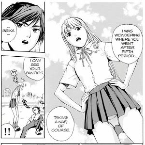 Element A - anime has an emphasis on being there in that moment, where the work has a ton of "aspect to aspect" illustrations. This is a aesthetic 'pioneered' by the Japanese. It occurs more frequently than in western animation. (uh...)
Element B - that heavy emphasis on the moment to moment representation rather than action to action. An American cartoon would be more likely to portray a man getting out a gun in 2 seconds. In anime however, would show him unzipping his jacket, wiping his hand accross his face and slowly reaching in his pocket and getting the gun out. (this is a lousy example, but I get his point. These elements are often better seen when comparing western comics to 'manga' in general, with lots of subtle and not-so-subtle actions to expand a scene, giving it more depth or character)
Soap Opera Aesthetic - most of anime is in a serialized format, with long sagas and complex plotlines. Lets put it this way, if you went a watched episode 49 of batman beyond, you would have no problems comprehending the plot. This is not the case with all american cartoons, but as a whole, they lack this serial element. However, if you were to view the anime "Last Exile" at episode 53, you would have no fucking clue as to how to make sense of the plot. (We can minus the fact that American television industry is completely different in that they want to extend a series as long as possible - look at shows like the Simpsons. Plus the fact that the general American public still sees these animated cartoons as 'kiddie fare', whereas the Japanese view anime as an alternative to live-action storytelling mostly due to tighter budgets)
Japanimation - a term used and invented by the Japanese to describe animation produced in Japan. This term was created to distinguish Japanese anime from the the more general word for animation or "anime".
Anime style (also known as manga style)- a method of abstraction which relies on exagerated eyes, etc. It is based off of the cartoony aspects of anime, it is not however, derived from animation from Japan as a whole. That is simply a [false] western perception of anime as a whole. It is a style that is apparent in certain anime, but does not apply to all.
Anime inspired - a term used to describe western cartoons, illustrations and comics that seek too mimic the design aesthetic and storytelling techniques of anime/manga.
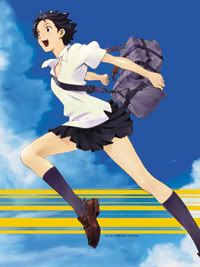
The solution
- Remove the term "anime style" from your vocabulary. (The author speaks of creating new terms for all kinds of anime. It sounds like the failed 'Metrosexual' revolution - and we know what happened to that)
- Market more anime T shirts that incorporate better graphic design and are form fitting. (This guy speaks of T-shirts, I'm thinking of the whole package of advertising)
- Convince Dolce and Gabanna and other high fashion houses to design and sell anime clothes and accessories (Ah, to allow anime to penetrate the mainstream again. It has worked to some degree in other areas over the years)
- Somehow convince cartoon network to air a huge amount of realistic anime. (I think G4 TV and other networks are doing this, and a lot of other networks)
- somehow convince cartoon network to run a yearlong documentary explaining the differences between realistic anime and cartoony anime and their relationship with cartoony american comics and realistic american comics. (Ah, that would be nice!)
- market anime to a more mainstream audience, besides nerdy people and poseurs. (Isn't anime and manga already attracting a lot of female enthusiasts?)
- Remember when everybody aside from geeks were staying up late playing Halo? The same thing needs to happen to anime. Market, market market!!!!
- Make the above distinctions widely known and accepted by the art community in every scene so artists, teachers and art school admissions would stop bashing anime due to a misunderstanding of what anime actually is. (According to Scott McCloud, comics are also facing this want to be reccognized)
- Stop telling kids anime is merely kiddie fare, and is capable of a mature form of storytelling that won't just cater to nerds.
- Realize that realistic anime/manga is to be celebrated and accepted part of American pop culture. (New York Post I think praised films like Paprika for its grown-up storytelling)
- Realize that a few good anime pieces can make an already polished portfolio even better.
- understand the differences between terms
- Realize the existance of "realistic anime".
- Begin to see that drawing realistically wont betray the anime/manga aesthetic elements.
There are "good" points, though for me the biggest problem is that I don't live in the United States - but I do know that a lot of people still regard anime as something for the kiddies, rather than being a legitimate art form. I don't know the extent of it though, and forgive me if it actually turns out that people in the States already appreciate anime in the way that this guy is ranting about. Bah!
In the mean time, why not feast your eyes on this old anime trailer?
 Similar to an old thread someone started before, I bring up this 'eye candy' thread. It's based on the theme "Grand Space Opera". By observing these images, it gives you a little idea on what makes a space opera a space opera. What are the elements of making one? Perhaps I shall leave it to you, Void.
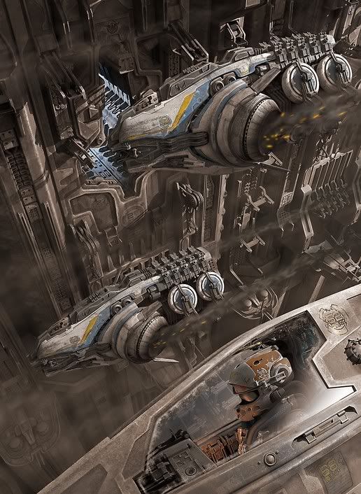 Does more spaceships mean more epic? Or is it how they are composited to a scene that makes it memorable?
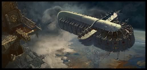 The classic ideas have always been some spaceship floating serenely high above a planet. Is this the key ingredient?
 Is it it all about perspective? The main idea? Do explosions make for an 'epic' scene?
 By adding something mundane, or something of our world, and dumping it to space (oh say... stupid whales) does that make it epic?? Does that make you the best damn science fiction writer/artist in the world because of your wildly imaginative mind??
I ask myself these questions when looking at these visually stimulating images. You can find out more about these images and the art book that was released quite some time ago...
http://www.ballisticpublishing.com/books/grand_space_opera/
This is just a discussion I found on Conceptart.org's forums. It's a thread where folks discuss how many veteran artists have deemed the 'anime' style as somewhat amateurish. I will post some of the more interesting responses for reference.
Flamedragon speaks:
- With anime, on average it's quite simplistic...like a mouth might just be a line across, the calves might just be lines curving upwards, a line to indicate the neck muscles from the front. I like seeing the muscles show, shadows...I want to get the feeling that the character is alive! That's why nowadays I've been getting back into comic books.
Kev Ferrera:
- I think the limitations of anime art are somewhat analogous to Egyptian Hieroglyphs or Persian Miniatures. It can be beautiful, but its a bit like fast food. Easy and simple and enjoyable, but often offering only empty calories.
HunterKiller:
- The reason Anime exists as it is, is because it's a style intended for animating. It necessarily needs to be simplistic.
Brendan:
- Personally, I don't have anything against the anime aesthetic. In fact it does a lot of things really well using the aesthetic. My issue with young artists placing a strong emphasis on anime is that it drives them into a stylistic and especially conceptual corner. I've seen this over and over, where young artists who subscribe to this style becomes uncreative - all of it ends up looking the same, feeling the same, reading the same - and more over, the concepts don't vary at all. I think it's really important for any contemporary illustrator to diversify, to be flexible and versatile. Subscribing purely to anime, from what I've seen, goes a long way in killing those qualities.
This is interesting - Brendan is convinced that sticking to to 'anime'-style would lead to a kind of 'stagnation' - which is true. More often than not, the only distinguishing feature amongst a lot of anime characters is through hair-type, eye-color. This blandness is dangerous and will definitely lead you to creating a lot of same looking art.


Seba boi:
- As for anime-style animation, as already said before, it's simplistic because it's made to be drawn thousands of times... But that said, there's still a significant amount of very innovative character designs from the anime world... And I'm particularly fond of some of the works in CLAMP, Ah! My Goddess, Cowboy Bebop, Serial Experiments Lain, Last Exile, and Rurouni Kenshin... And I love it when some of them tries to emulate the Mucha style like some art pieces for Wolf's Rain and X...
Nilaffe:
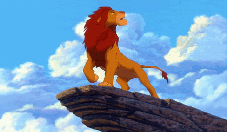
- Why does anime get all the attention? Am I wrong, or do young artists also confine themselves by emulating American comics, Disney, and whatever cartoons are playing on Cartoon Network? If you hop over to the creature-creating world, every other drawing looks like it stepped out of The Lion King, Balto, or Spirit: Stallion of the Cimarron - no appreciation for animal anatomy. I'll admit there are a lot of anime artists out there, but before anime took over wasn't everyone drawing steroid-pumped men and big-breasted women with tiny waists?
The important thing... is that anime and manga creators normally have a very strong understanding of anatomy before they begin to push it into their own style. And as mentioned, anime needs to be simpler because of the medium. That's the step that most kids miss... and if they're lucky, they'll figure it out. Otherwise, they're just going to do what most all kids do: copy the stuff they like.
 Megas Imperius:
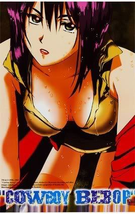
- There are certain anime that throw the stylized characters into contrast with realism, in a good way--Cowboy Bebop, for instance, has very detailed backgrounds and, though the futurescape is strange, it's handled in a very realistic way.
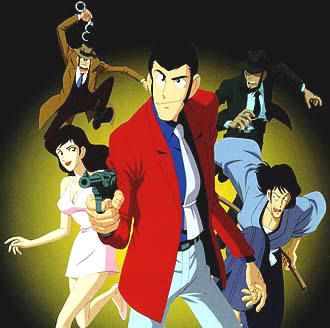
And there are works like Castle of Cagliostro which have astoundingly fluid animation--if you really pay attention to the way characters move, it looks almost mo-capped. Not to mention that Castle's environments were some of the lushest I've ever seen in an anime.
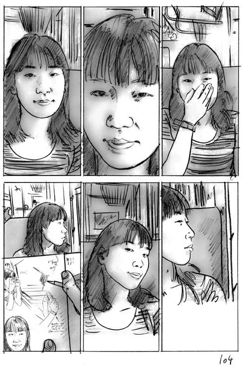
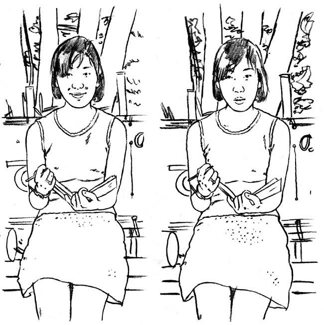 Here something. Not all Japanese artists stick with the anime style. If that's what you're thinking... http://www.boilet.net/am/mariko_parade.html
For me, half the enjoyment in researching these old and modern science fiction productions is that they expose me to things that I normally wouldn’t seek out. Thanks to this blog, I’m really trying my best to take each western and eastern properties and see how they would inspire me for my original and fan productions.
However, I sometimes get caught up in this aspect that I fail to see why I am doing it. I sometimes have to pull myself back to the basics and see why I have made this blog – which is to refine my technique, and hopefully, get The Void (my supposed audience) who is reading this inspiration as well to take up a pen and start doing your own stuff.

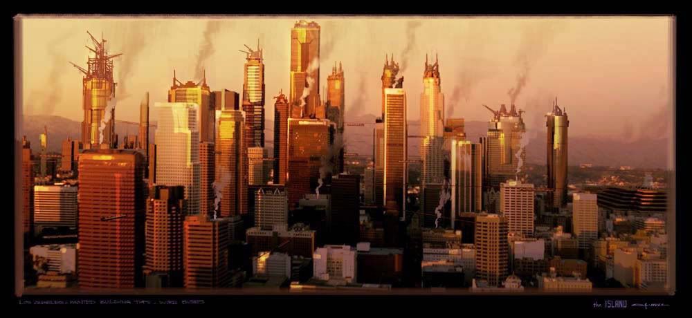
I recently purchased a really great ‘how to' books on design called “d’artiste”. The book contains a lot of material on how a conceptual artist must think in terms of forms and design. For this post, I will focus on George Hull, an artist who has distinguished himself in some notable productions such as the Matrix sequels. However crappy that franchise has become to some, the book or this post isn’t going to be about that, so keep yer' trap shut. Here are some of George’s design philosophies that hopefully everyone reading this could adhere to.

As a concept artist in the industry, George states that a director is always looking for points in the script and asks for ideas. This fact can be frustrating or rewarding in the creative process. The director would sometimes give a brief description and the artist should know where to take it. The concept artist should know the genre well or else his or her work would fall within the typical trappings of it and look generic and stuff.
The Call of a Concept Artist
When starting off with an art piece, focus with value composition first. Try producing multiple ‘thumbnails’ (small sketches) before starting on a big canvas. The point on this is to have an idea of how the overall image would look lest you wastev too much time fixing and tweaking it. This will also help in determining where the light would and dark values are for the image, so that it would look more ‘solid’ in the final product.

George Hull emphasizes that you have to have images that are bold enough to make a point in a few seconds, yet subtle enough to have depth and emotion. Note that I have shown some examples throughout this blog, yet I haven’t really tackled the subject matter itself.
Provide an art direction which helps people clearly decipher the qualities of a strong imagery. George Hull provides three basic principles in that aspect:
- Knowing the essential controlling idea of a shot
- Deciding on the focal point which will express that idea
- Designing everything in the color lighting and value composition to support that idea.
Attention paid to these steps can be the difference between dramatic, captivating imagery, and a muddy composite of great detail but poor design. This is a crucial aspect in visual effects. I think this is where my art suffers the most.
Looking at the portfolios on deviantART and Conceptart.org, and so many other sites dedicated to amateur and professional artists, you can see just how massive an impact digital art has had on so many young, talented artists and aficionados. A lot of them are pretty good at it which is why it is of utmost importance to differentiate yourself.

George Hull states that a lot of young artists can paint an image and make it "look dramatic, colourful and maybe realistic", but the market is saturated in that end. He emphasizes how having a refined drawing and design ability can help separate your work from the thousands of amateurs in the world.

Forms, architecture, design details and how to draw all of them well are key. Mr. Hull stresses that you can only do this by going beyond digital art, and spreading to more traditional means. Sketching things around you will provide you the kind of training he speaks of.
In Mr Hull’s concluding statement, it would be best to take a look at the pre-production art departments in films and games. Ah. It's a good buy. Now to apply his damn lessons.

Inspirations of George Hull:
Despite the majority of his work being based on science fiction, Mr. Hull finds inspiration in fine artists as well as photography. Among his idols are Sebastian Salgado, Steve Mc Curry, Edwin Church, Kent Willliam, Bill Henson.
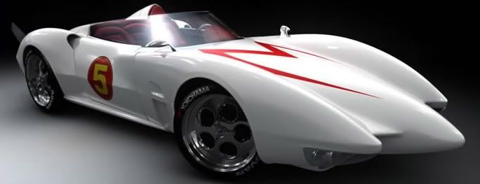
I do hope you actually learned something in this post! I suppose I'll probably gush over another science fiction property very soon. Anyway, I hear George Hull worked on some racing movie... I forget the name, but it involves this retro racer... Doh!
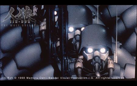 Jin-Roh is set in an alternative present day Japan, where the country is plagued with social unrest and terrorism. The occupied government has become progressively more strict. And as a result, a rather larger underground resistance has been formed. The story starts with a riot: Crowds of people, armed mobs in the city streets, throwing rubble, petrol bombs and all sorts of things at the police lines. Whatever happens after that is a mystery.
 I haven't seen the film. For all you aging otakus, you may have heard of this litttle gem - because crap, I've only heard of it today. If you have no idea what anime I am referring to, try watching this old trailer and see if it makes any sense.
Wow. Weird, huh? According to one answer site, the animated epic was "... Scripted by Mamoru Oshii (Patlabor and Ghost in the Shell to name a few), the story contains some familiar themes like power struggles inside government organisations, terrorism, back-stabbing and many others. Based on his manga (translated by Studio Proteus under the title Hellhounds) and two live action features (Akai Megane and Stray Dogs), there is plenty of depth and background in this story."
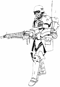 I'll take his word for it. But hey, its not the story I'm interested in, its those designs. Apparently, the Japanese seemed to have beaten the Killzone concept designer with this nasty looking supersoldier. And whaa-- This film was made in 1998! Take that, Xavier Marquis!
Gee whiz! I am so out of the times! I really have to find this film on DVD, despite what looks to be another convoluted anime story. Although this is a little worrisome... Charles McCarter mentions "This film is definitely very cerebral, and, like PATLABOR 2, has more psychological and political intrigue than all-out action." Seriously folks, I'm still trying to figure out a lot of the concepts in Ghost in the Shell. OVA and the series.
Whatever man. This is the type of design I want for my projects! If its going to be a 2 hour film with less than ten minutes of high-quality action sequences and the rest is just talking heads talking about existentialist concepts, just like that underwhelming first Patlabor feature, then so be it! Damn you, anime-otaku magazines for telling me its a classic. I almost slept through that one.
This is a strange still feature from something called the 'Last Battalion', or whatever the hell that means. It looks pretty cool. You know what I'm going to do now? Research! I'm going to look through history, and see which time period the Japanese or any other creative people haven't tampered with. Hmm... How about a... a sci-fi universe with a similar concept to Crusades! That's it! It will have over-zealous priest-like soldiers and... and... crap. Stupid Warhammer 40k. Ah, I'll find something that would give me inspiration.
Hey, these designs look so good, and they don't look so bad in real life as well. I wonder if they're selling the live action version of this Jin-roh thing...


