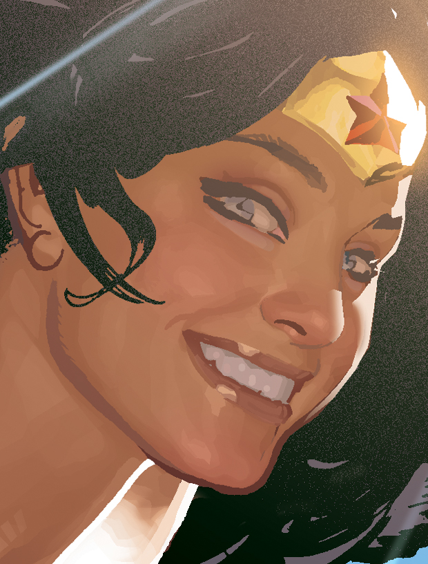
I regret I've never done a feature on Adam Hughes. You do know Adam Hughes, right? The guy who did all the Catwoman, Wonder Woman, Starwars, Danger Girl, Power Girl pinups? I figured it's time to do one. Sort of.
Y'see, I stumbled upon this ol' post at The Drawing Board forums. It's a fairly old interview with Adam Hughes his coloring technique, from his Yahoo group. I can't be too sure if his technique has changed much throughout the years, but I figured it would make a good read for the time being:
*Note that there might actually be newer Adam Hughes tutorials I've never ever seen, but I really just posted this as an excuse to get some great Adam Hughes artwork on this blog. Silly me.
Q: What version of Photoshop do you have?
Adam Hughes A: I'm still using Photoshop 5.0, because every time a new version comes out, yes they have exciting new features, but they also seem to like
re-assigning keyboard shortcuts, which I LIVE for. I've got my key board shortcuts so memorized, it's like I'm playing the piano. If I switched now, the learning curve would slow me down.
Q: What are the main tools that you use in Photoshop?
A: The Lasso Tool, the Magic Wand, the Path Tool. I do a lot of my rendering with the Lasso Tool. I select an area, then fill it with 10% of the FG color. Then I move the selection (or make a new one) a little to the left or right, and do it again. Do THAT 6 times, and you've got a nice analogous gradation.
Sometimes I'll make Lasso selections with the feathering set up to give me a soft edge. Lara's Gerber-baby cheeks in the TR piece was done that way.
I also use Lighten and Darken (regardless of the tool) a lot when applying color.
Q: Do you keep a (color) palette next to you?
A: Definitely. I keep a lot of my Preference windows up while I'm working. The Palette is VERY important to me.
Q: What general sequence (if any) you use to color with Photoshop? (Such as) scanning inked artwork. Do you save a copy with lower dpi for easier coloring?
A: I color at print size. I upgraded my PC to handle a regular-sized comic cover with relative ease. I SHOULD upgrade again, now that you mention it…
Q: Is your local color midway between the item's shadow and highlight, or more towards its shadow…?
A: Darker. I treat the flatted piece as an imprematura, upon which I go in with my 'opaque' colors.
Q: (Do you) render the shadow areas with cuts and the airbrush & paintbrush tools?
A: Render light areas after. I never use the airbrush (or paintbrush) tool. It's got that phony digital softness I can't stand.
Q: Since you say you don’t use the paintbrush or the airbrush then do you smudge a lot?
A: No. I think the smudge effect looks digital and phony. I'll post a file with a detail from WW's face so you can see what I do up close. I let the printing and the reader's eye do a lot of the final 'closure' for me. My selections look like tiles in oil or gouache painting, when seen up close.
Q: Do you use different layers or channels for rendering? Do you render certain elements first, such as skin before moving on to hair, or foreground elements first before background? Do you render certain elements completely - shadows & highlights - before moving on to other elements? Do you render from shadow to light or vise-versa?
A: It's a judgment call. Whatever the piece calls for is how I handle it. I usually only have two layers going at a time. The basic background Layer, and them the section I'm working on (i.e.;
WW's face) I save the selection of that area as a channel, that way I can get as sloppy as I want, and then I just load the inverted selection, delete the unwanted crap, and merge the layer back down to the base BG Layer.
Q: How do you go about changing the black line work in some of your pieces in Photoshop? (For example the trees in the background of the
Hammer of the Gods cover). The closest I can get is choosing "Load Selection" and using the airbrush to color the inverted selection. But there always seems to be some color that creeps outside of the selected area regardless of how tight the selected area is. Please tell me there is an easier way?

A: By 'creeps out of the selected areas' do you mean that unselected areas (non-line art) are getting colored? If that's true, then something's up with the feathering on your selection. If you mean, areas of your line art that you don't want to be colored are getting color, either de-select what you don't want to receive with the Lasso tool or don't use the airbrush tool.
When I want to change line art to color, here's what I usually do:
1. Load selection.
2. Invert the selection
3. Deselect everything but what I want with the Lasso Tool.
4. Activate the Line art Channel and delete the selected areas.
5. Leaving the selection going, I activate the CMYK channel, and Fill with whatever color I want.
This is for a PC, which is what I use. Macs have the ability to eliminate a step, and I can't figure out if it's a setting I can change in Photoshop, or it's just something that Macs do. On a Mac, you can make a Lasso selection in the Line art Channel, and it automatically 'grabs' just the black line art info.
(This image was probably NOT DONE in Photoshop)
Q: How do you do those amazing shines?
A: I do a large feather selection, then fill with a light color like a yellow or orange, set on Lighten. I do this to 'set the stage' as it were. Then I fill it again with a color like orange or red, set on Color Dodge. I then use the Fade filter to control how much the highlight 'burns'. Try it; it's fun to experiment!
Q: What do you use the Path tool for?
A: If I need to make a large gradeful color selection, such as might be found on a reflection on her armor, or on a leg or something, I'll use the Path tool to create a very graceful arc to my selection. It's also good for rendering color highlights on hair.
Q: The Lighten feature doesn’t seem to do anything when I use it?!?
A: The color you're applying (i.e., your Foreground color) has to be lighter than the areas you're trying to affect. It won't affect any areas that are lighter than your FG color. For example: a 50% magenta in your FG color selector, with your desired Tool set on 'Lighten' will only affect pixels that are 51% magenta or darker. Anything 49% or lighter won't be affected. It sounds confusing, but I stumbled upon it all by accident. I use it a LOT.
Q: How do you use the Fade filter?
A: The Fade Filter is at the top of the Filters drop-menu; it's the second from the top. On a PC, it can be keyboarded by hitting
Ctrl + Shift + F. You'll also notice you can alter your color application there, after-the-fact. This is where I discoverd the value of Lighten, Darken, and Color Dodge. In the Fade Filter, you can change the color application of the function you just completed. It's a great 'before and after' tool.
Q: Do you use any Photoshop filters in order to give your colors a particular finish?
A: I never used to, but I've gotten braver about it. Sometimes when I feel my flesh values are too high-key, I run them through the Auto Levels filter, just to see what it does to them. Sometimes I use the result, sometimes I don't.
Q: What filters do you use commonly? What would you recommend for specific effects, such as metal gleam or rain?
A: I disdain the use of filters, until you can prove you can render that stuff on your own. It's like Ian Malcolm's diatribe against raising dinosaurs with genetic engineering in Jurassic Park. If you don't take the time to master a technique, you don't learn the even more important disciplines that come with the experiences. Any decisions you make
with shortcuts are
uninformed ones, and you open yourself up to a world of
bad judgments.
And that ends this wonderful interview with Adam Hughes, brought to you by Adam Hughes Yahoo Group. Find it and
join it if you like. Oh, and before I close this one out, I stumbled upon another post about good ol' Ah! at this comic blog. It's a bunch of Marvel beauties in swimsuits. I think it was done in the early-to-mid 90's... Here we have Black Widow, the Wasp and if you're into it, She-Hulk as well...
Head on over to this
link...
And that's that!!


 It was an early education at animation and guidance from his peers did he evolve to the artist you see today.


 Aside from his animation work, he busies himself with conceptual design for commercials and Cartoon Network, as you can see in the images posted here!


 A: By 'creeps out of the selected areas' do you mean that unselected areas (non-line art) are getting colored? If that's true, then something's up with the feathering on your selection. If you mean, areas of your line art that you don't want to be colored are getting color, either de-select what you don't want to receive with the Lasso tool or don't use the airbrush tool.