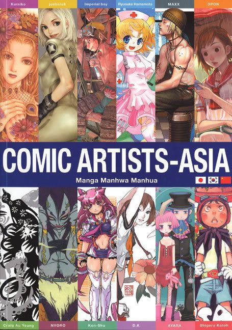
 I've always admired that manhwa and its version of the traditional 'manga-style' of drawing. There was always something beautiful and artistic about this whole manhwa thing (which I believe covers the art-style as well as its very own version of "manga-ish" books), despite being harshly critiqued as another clone of japan's manga. As far as I know, Manhwa is only beginning (at the time of this writing) to get international recognition, thanks to forward-thinking publishers from other countries.
 Still wondering what I'm talking about? Well, Wikipedia describes it pretty well:
Manhwa has been influenced by the dramatic modern history of Korea and resulted in diversity of forms and genre[1], but including a mainstream style similar to manga. Distinctive manhwa can be found in editorial comic strips, artistically-oriented works, and webcomics serials.
Typical characteristics of manhwa:
- the style of character designs - manhwa aimed at teenage girls (which make up the majority of English-translated series) have a distinctively angular style of abstraction which contrasts with the more "cute" and rounded style of their Japanese, Chinese and western equivalents. This is the most obvious difference at a glance, but does not necessarily apply to manhwa aimed at boys or adults.
- The face and eyes are often exaggerated in a cartoon style while the figure is more realistic in proportion. [2]
- the left->to->right direction of the book (still quite obvious, but not very reliable, as some manga and manhua are 'flipped' around to the western way)
- the Korean name of the author/artist - usually double-barreled and with syllables that do not exist in Japanese (usually the most reliable method, the only exceptions being when a culturally-neutral pseudonym is used, or when the artist is of Korean ethnicity but resides in another country such as the USA)
- the untranslated sound effects (not always present) are in hangul, not kana or hanzi.
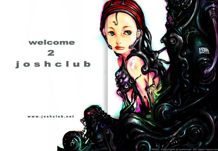
For now, I will talk about one such Manhwa artist by the name of 'joshclub'. Joshclub's characters have been described as a combination of photographic realism and a soft painterly touch. For some reason, I have found this to be more in common in Manhwa than anime. And there's that weird nose thing they got going on. I dunno, I wish a real manhwa artist would correct me on this.
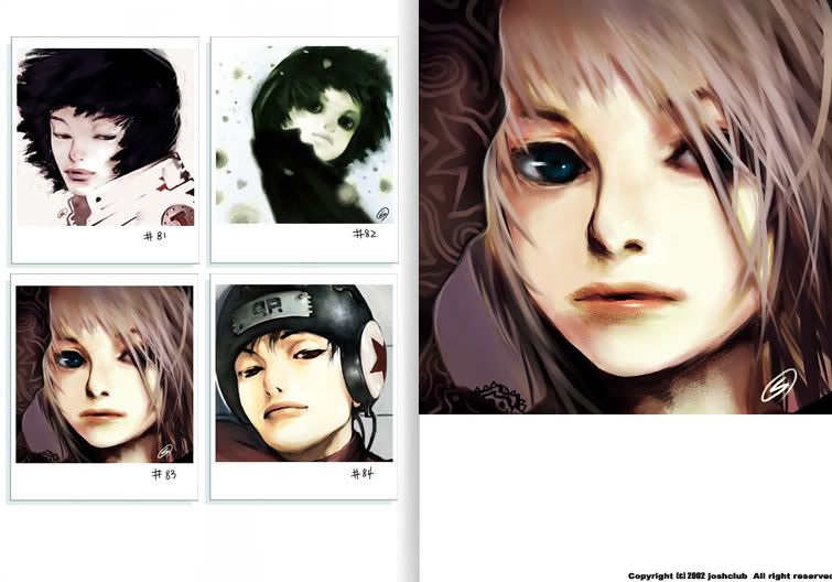
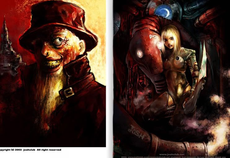 One thing I can say is that (although I know its wrong to generalize like this) many of the Manhwa artist I've seen have always adopted a more muted color palette, whearas Japan-based artist use more... wild colors?? I don't know. I could be wrong on this, but like you give a flying f**k.
 Wow. I think I'll ogle at this guy's art in the near future again. And more manhwa stuff too if you like, Void. What's that? Cat got your tongue? Yeah, I thought so.
 With the bulk of gamers still reeling from the marketing beast of the Halo franchise, I find myself wondering if there will still be a market for the whole "genetically-modified supersoldier" thing - whether it be for that one guy people call Master Chief, or a whole platoon of em' like Gears of War. Who cares what the frickin' market thinks. The "genetically-modified supersoldier" genre will never get old.
If you wanted to hear me yak about these steroid-pumped prima donnas, you should check out the rest of this blog. Today, however, I'm going to make this post, about game intros. Yes, you heard me right, Void. I will yak about the coolest science-fiction game intros I have seen in my life.
Some of these videos I will show have made quite an impact on my creative direction now. Some of these games may be bad, while others are classics and I want to share
First up, Homeworld. The first Homeworld.
It's really one of the coolest intros ever, in my opinion, and yet it almost has no whiz-bang action whatsoever. It's the kind of prologue that really immerses you in its 'home-made' universe (no fancy commercial sci-fi license here!) The visual style is clearly inspired by anime, using the whole "Moving Picture Style" with a bunch of 3D elements thrown in for good measure.
The Homeworld sequel continues that tradition with an even deeper and more epic universe. I know, the whole series isn't for everyone, but if you enjoy a good ol' science fiction yarn mixed with religious undertones / mysticism then this series is definitely a treat. And that mothership. Sheer beauty.
Next, Freelancer.
This is a more traditional science fiction story, with many ideas mixed from various science fiction scribes. It's still a good watch, because the developer of this game is none other than Chris Roberts, the guy behind those Wing Commander games - and that atrocious movie. So be my guess if you like your sci-fi chock-full of aliens, galaxies blowing up, and all that hooey.
Now, the Killzone series (one that I have admired for a while...)
Remember my post on the whole CAPO thing, and Helghast stuff? (I can't find it in my own blog, weird...) How I found the idea of incorporating the evil Nazi behavior and design with science fiction sensibilities intriguing? Yeah, here I go again, totally enthralled by this series - which now, more than ever, is blatantly ripping-off World War II on a universal scale. You may not agree these are like, the best sci-fi intros and all that, but I don't care because you won't tell me what you think is a good sci-fi intro anyway, huh, Void? I thought so.
Enjoy these two cutscenes - I've already shown you the trailers earlier in this blog, weren't those nice as well?
Liberation - sort of a typical army/shogo watching over his precious army slaughter millions in his name (another wonderful idea taken by this developer) and its also a goodie, isn't it?
Look forward for more of my "game intro specials" like this in the future! C'mon! They're fun, aren't they? (Do not respond to this rhetorical question, but I suggest you give feedback or constructive ideas, Void)
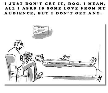 Twenty-odd years from now, and nobody cares to comment. -MMG
“I approach illustration from the position of an aid to communicate something,” says Daniel. “That something can be more or less abstract.” An object, an idea or an emotion.
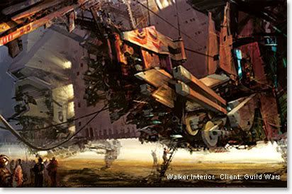 Excerpts from Daniel Docui's interview from ImagineFX. Something any budding artist should take into consideration. That means at least one of the half-dozen of you reading this might want to listen up for once.
- As an industrial designer, Daniel is trained to see three-dimensional objects, visual and do crap to em'. This also means working with a project and overseeing its many aspects.
And this brings us to something that Daniel feels very strongly about: diversity. As an art director, it’s crucial to see the big picture. “I strongly believe that diversity is the most important quality in a team… We are a lot more different than we are similar in our ways of thinking.” And Daniel believes this should be a source of strength.
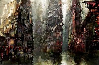
- True style is the result of all those influences that you’ve allowed to simmer over years and years,” he says. You must gather them and “distil all those fumes into something that’s representative of who you are.” The crucial thing is that it should come naturally. Affecting style in the name of cool won’t cut it with Daniel. “I think that is very shallow. I discourage that.
"You should not look for a style of your own just to be different, it should evolve over time as the result of where your true interests are.”
Example: “I’m definitely fascinated by the human figure,” he says. “But you don’t really reinvent anything. It’s just the take or the approach or angle.”
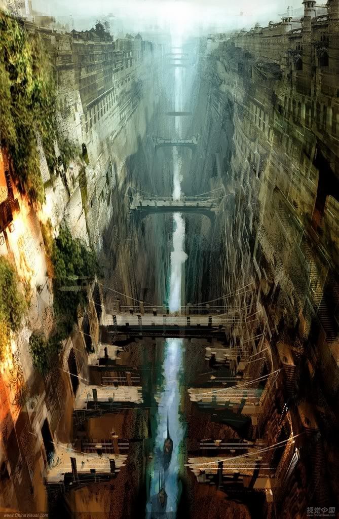
- “I think that what we perceive as talent is simply a person who has found a way to connect point A and point Z in their brain by a very convoluted path that we don’t relate to and can’t understand.”
Real talent, according to Daniel, is “effort, work and sweat.”
He thinks the regular definition is just a convenient shorthand, and backs this up with the observation that, “Talented people don’t use that excuse as much as people who lack it who say ‘I wish I had his talent’.” (Isn't that the point of this blog?? To say that I want to learn this or that?? What do you think, Void?) - However, laziness is beginning to trouble the creative industries. “Good-calibre talent is hard to find,” says Daniel. “It’s really hard to get through the hordes of people who have no business being near a pencil."
- Video games, comic books, animation – all of these are fighting a tide of graphical convergence. “The more unique or ‘far out’ your style, the more you restrict your audience,” Daniel observes.
How many of today’s artists had developed a mature style before they opened their first comic book?

- Somewhere along the line the goal ceased to be individual and became public property. It stopped being about perfecting your own style and became about who could do this style or that style the best. “I hope we are not falling into that trap,” says Daniel, adding, “Everyone says ‘yeah, diversity is good’, but I truly believe it.” Art directors should be guardians of the only weapon we have against uniformity – difference.
FlameDragon poses this question:
One person on gamefaqs a while ago criticized my drawing as not having much life in it, and I found this to be an intriguing critique. How does one make their drawing have "character" and feel alive? I know mine aren't since I was just drawing from photographs but what about in general? And what would I be able to do to get my drawings to have life?
Kev Ferrera provides his point of view:
Photographs capture the surface of things for one static moment. Art captures the artist and life force. Art exists by itself. You must invest dramatic spirit into your work. You cannot get this from a photograph because a photograph was "drawn" by mechanical means. You must feel emotional as you do art. You can be technical too, but never coldly technical.
Try to get imbalance and tension in your work. Design the smallest items to the figures to the composition as a whole to have dynamic angles, lightning bolt shapes, spirals/helixes, stepping stairs, teetering shapes... have your figures caught in the act of moving, in between one movement and another (thus off balance), have torsional twist not just to the hips, but to every limb, the wrist the neck the shoulders the jaw, etc. Of course the torsional twist does not have to be a violent twist, it can be subtle... but investing your forms with torsional twist at all, will give it life, even in poses that would normally be static.
Think of everything as silhouettes. And think of silhouettes as black ghosts in a disney film. Think how much expression, without words, a black ghost shape can have. Then apply that to every aspect of your art, from the stroke of your brush, to the largest compositional shapes in your pictures.
Give everything character. Don't just render something so it looks like what its supposed to look like. Make everything personal. And your work will become personal. And this will automatically bring life to your work.
Seedling says:
Saying that a drawing "lacks life" is a lousy critique on its own. A helpful critique will tell you something concrete enough that you can actually do something about it without consulting a mystic. Some examples of better critiques would be, “this drawing lacks life because the interesting patterns created by the silhouette of the potted plant are lost against the patterned background” or “this drawing lacks life because the figure is in a stiff frontal pose that doesn’t tell the story as well as it could if he were turning at the waist and reaching dramatically for the McGuffin”.
 Yoshitaka Amano, no reason his art is here
Creatix says:
Experience life first. This goes well beyond the idea of "draw from life". Sure, if you can sit in front of live nude models and bring a sketchbook to a park and sketch all you see that works but experiencing it is getting out there and really paying attention. Even if you don't have your sketchbook with you, just observe - constantly. Go to a club, a bar, a restaurant. Sit at a coffee shop. Walk around a mall. Go to places you don't normally go but where you still feel comfortable. Go to a Pet store and watch peoples reactions to the animals. Watch kids at play in a Chuck E Cheese. Hang around some old folks playing chess in a park.

 I have to believe that the small details and nuances of life as it goes by is rewarded at some point in your work. Just as people say the key to great communication is to shut up and just listen, sometimes you just want to stop doing and start watching. To watch though you have to be there. Don't sit in front of the tv or at a video game all the time. Don't just look at people in cool photos sitting along the beach. Drive to one and experience it. When you start drawing you will remember those little experiences and they will show in your work.
 As far as technical stuff goes, maybe focus on the hands and eyes. Hands show great emotion and are often neglected because they are difficult to nail down. Eyes show great emotion. If you draw something, think of the function behind it. Make it feel lived in and there for a purpose. Sure a gas mask is really cool but does his outfit reflect that? Does he have the marks of some chemical burn? Does his costume show his world is post-apocalyptic? A dude with a huge metal plate over his mouth might look cool and gritty but think about how he would eat? That might lead into other design choices (maybe tubes to absorb materials, etc.). Overall, it will make the piece feel more "real".
 Okay, I just added these pretty photos because I like looking at
 pretty things when I read long paragraphs.
Check out Pixar movies and their behind the scenes stuff where they talk about why they made the choices they made. They do a fabulous job of giving life and emotion into everything - fish, robots, cars, whatever.
Kev Ferrera again:
I would suggest drawing from life a lot. And from your imagination a lot.
Copying over Bridgman's anatomy books will be a great help in the latter.
Maybe experiment and try out some styles of highly varied but all "alive" artists. Like Ralph Steadman, J.C. Leyendecker , Frazetta, Mignola, Djurjevic, Sienkiewicz, NC Wyeth, Fechin, etc.
You can always go back to photography once you find out what kind of things truly interest you visually.
------------------------------
This is not to say that one can't make fantastic drawings and paintings using photo reference. But the fantastic-ness would stem from the artist, not the photo.
To just copy a photo would not bring "the life" that FlameDragon means. (Assuming I have understood him correctly). Life is manifested in art by the will of the artist. If the will is to craft a duplicate of a photograph, the consideration of the artwork as a manifestation of personal force is bound to be neglected.
Chris Benett finally says:
Take a look at some good cartoons of famous people. Absolutely full of life and certainly using reference material but taking huge liberties with where things are that do not relate to the proportions on the ref material at all. When people ask me how I get likeness it is all to do with sensing the internal rythms of the structure - if you get that working then the thing will look right no matter how odd the proportions are. Have a look at Modigliani, El Greco, Giacometti, - stuffs all over the place yet feels 'right' and alive. Nearer to home, look at some of the character designs on here - nobody has the proportions and physiques of these things yet some of them are marvelously alive and 'true'. Look at the characters on 'The Incredibles' - proportions all over the place yet utterly convincing even in the static publicity stuff.
This is even going on in a Rembrandt or a John Jude Palencar, exactly the same principle, only it is a quieter version of it.
Some artists referenced by Kev Ferrera in his posts:
 At first, Bill Sienkiewicz was an exponent of superhero-comic artists. Then he went deeper into comics. Together with writer Alan Moore, he created 'Big Numbers'. The acclaimed mini-series 'Stray Toasters' he did alone, and it became a big success (re-released by Graphitti Designs). With Frank Miller, he created 'Elektra Assassin', another successful series for which he received the prestigious Yellow Kid Award and the Kirby Award. He also produced the acclaimed artwork for the painted biography, 'Voodoo Child: The Illustrated Legend of Jimi Hendrix', published by Viking Penguin.
Bill Sienkiewicz has won many awards, received two Emmy nominations, worked on many successful films, has exhibited all over the world, and has had a major impact on the field of comic books. His latest solo work, 'A River In Egypt', is published by Oni Press. (Lambeik, 2007)

 Newell Convers Wyeth (October 22, 1882 – October 19, 1945), known as N.C. Wyeth, was an American artist and illustrator. Born in Needham, Massachusetts, he was the star pupil of Howard Pyle and became one of America's greatest illustrators. (Wikipedia, 2007)
Mike Yamada's Silhouette Tip
Everyone has their own way of using this technique to problem solve and to resolve their design. I cannot speak for them, but I can explain my approach to this technique as a design exercise/step. Let me first say that I was trained in industrial design and I first used this way of working to deal with my shortcomings with drawing the figure. By eliminating the constructing of the figure and all the little bits involved in that, it allowed me to focus my attention mostly on the design of the silhouette and to break that down into simple components - gesture, shape vocab, massing, etc. I also found by working in this method, you could work back in with white (either photoshop or real paint) to expand the same shape vocab to interior of the silhouette.
I think one of the most important things to have in mind when using this method of working is to have a distinct purpose in mind when starting your silhouette which can be accomplished by asking youself a series of questions - what proportion is it? is it angular? is it round? is it top heavy? is it bottom heavy? etc. You can also taking this exercise further and add additional values, 1 or 2. This process works extremely well with hard surfaced objects. One thing to consider is to keep what you are designing in a draft view. If you introduce perspective/foreshortening, your brain feels the need to describe form rather than focus on the design of shapes.


 Many of you may have figured out that I don't use the term "concept" so broadly, I might as well call this site "all kinds of stuff" rather than "Concept Central". (Which is weird since the former name is already the name for John Kricfalusi's own blog)
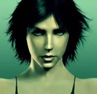
But since I'm running the blog, I don't give a frack. And right now, I want to talk more about... erm... Video game's fascination with making their games uber-sexy, and the who this whole trend to make impossibly sexy women. I mean, what's the deal with that? Is this because of the whole glamorization of the video game industry and its struggle to maintain that it is indeed a juvenile pursuit?? What the heck am I blabbering about??
Wait, let me collect my thoughts. I mean, have sexy video game characters isn't new. You got Chun-Li from the Street Fighter series so yeah, it's been done for a while. But thanks to a certain Ms. Lara Croft, the industry gained a little more ground in a fully polygonal video game babe. A lot of other wannabe videogame babes popped out here and there over the next few years, but none were as memorable or had an impact as these examples... Now, its 2007, and hell, seems almost every game's got a super hot babe gracing the box art cover, or trying to flirt with the video game protagonist, or whatever!
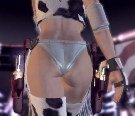 Quantum leaps in processing power and rendering technology has helped fuel this trend to push these virtual vixens out. Now women in gaming don't just look like sexy mannequins, now they're even more life-like, sexy mannequins. And now we have a nice, healthy demand from teenage boys and young adults wanting more of this stuff. Whooooa!
Anyway, you might think, the Japanese have been doing this with their videogame characters, but I say the Japanese are irrelevant because they've always been a very... "sexual" society. (As evidenced by their anime and manga alone). I guess it comes with the growing age of most gamers - and society's increasingly liberal attitudes towards this smut (That sounded weird)
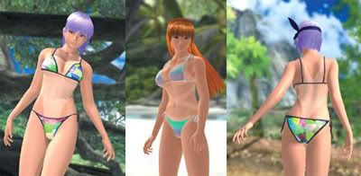 So what's the point of this post? Well, basically to ogle at this trend the entire entertainment industry is going through. Sex has always been a big seller of media, and now it has completely invaded my beloved format. Yay! Which then makes me think of the applying it to my own project! You know what that means... Crap.
 To round out this really, really weird post (minus all the other weirdness in my other posts), maybe you should watch this old list of video game vixens, and this other video intro for an old Xbox360 game that I have never played, but have admired from the distanced for quite some time. Yeah. Maybe you should do that. What do you think, Void? You wanna give feedback or something? Should I go back to talking about Robotech?
*PLEASE NOTE* Playboy don't like their crap being uploaded on Photobucket. Woohoo!
Yeah, yeah. Nobody really bothers with this blog. But hey, I'll keep posting until Robotech actually becomes RELEVANT in today's fast-paced, attention-deficit facebook/ myspace/ blogger-based society. Anyway, I stumbled upon this really great interview by a certain blogger by the name of Donata Giancola. The article discusses something that has interested me for quite a while - and its these novel/series things. You know, like the Dune Chronicles or all those other more-hardcore sci-fi geekery stuff I said I wanted to learn more about.
 Long Excerpts from the article
About great looking novel "Cover Art"
Anyone reading fantasy and science fiction knows that the genre is dominated by series. From my end of the business, series are both a pleasure and a curse. Once you get the look of a series down, its continuation is relatively easy for me -- so many decisions are already made, the type, the artist, the tone. I get a few new details and basically sit back and let the artists work.
When a series starts off looking good, it usually sails along nicely, but then, of course, the reverse can be true as well. If you don’t hit the mark on the first go you set up a sizable hurdle for the following books. Unfortunately that means rather conservative decision making up front. While I may want to try out a new artist, I don’t always feel comfortable committing to 3, 6, 12 books with someone that I have never worked with before. Not always, but often enough, I tend to stick to the guys that I already have proven relationships with. This, in turn, often leads leads to scheduling conflicts down the line -- an inevitable alignment of stars and planets will end up with a bunch of one artist’s titles in the same catalog season.
I’m glad for the ease of some series, and when they go well I really enjoy seeing the paintings as a collective whole, but I can't help but to wish we had more stand-alone books and different points of view to explore.
I asked a few artists what they felt about working on series titles:
 "Series are cool because it gives you a chance to fill out the world you're building in some more detail. I also feel more connected to my character after several portrayals. It can be a shackle when the marketing crew is sure that a particular portrayal is responsible for selling the book. It's best when the AD gives you latitude to be able to show the world from a different view each time. I also think that the tendency to "brand" authors with a single artist can make the biz of illustration tougher. Instead of book assignments, you have series assignments, and that makes the ebb and flow of work more extreme. Your flow is also greatly effected by how prolific your authors are, and that can vary enormously." DAVE SEELEY
Please note that Dave Seeley was featured artist in this blog!

"From an artist's standpoint its quite nice. You become familiar with the characters. That means less time worrying about accuracy and more time developing story." DAN DOS SANTOS
Geek fact: Dan Dos Santos makes art for the Warcraft Trading Cards game.
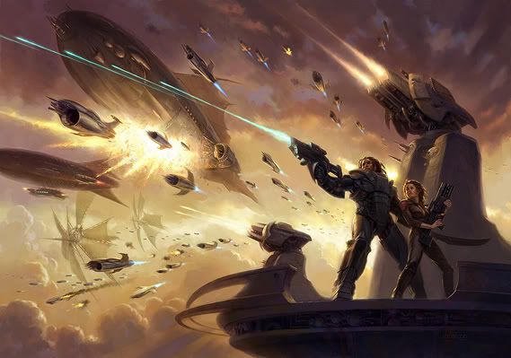 “A series is a good thing if you're an artist. You want the books to look good and do well, so you'll get the next one--that's the pragmatic, economic reason--but you're challenged to keep the series fresh, which forces you to think about the approach, to try to see things from different perspectives. Even a series has to have variety and flow. It's a restraint that can help you to grow. It also lets you explore a direction more than once. A series of books can become a collection of paintings, each with a slightly different flavor.” TODD LOCKWOOD
Geek fact: Todd's behind the great artwork for Dungeons and Dragons.
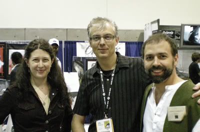 Kristina, Stephan Martiniere, and Donato Giancola at SDCC 07 Just thought you'd like to know what this Donato looks like
“Series are neither harder nor easier to undertake, as I approach each and every commission as a new start. The goal of each image is to convey a compelling representation of the content of the book, and considering the variations most authors place on the content of their novels, I do not see how it is possible to use the same approach every time. For me, continuity in a series, if there is any, tends to be more formally based than anything related to design.
One of my most successful series was for Isobelle Carmody, where the unifying factor was the scale of the figures to their architectural environment, and the passage of time 'through' the images: the beginning of the journey; the journey; and the final recuperation/rejuvenation. Each image stands alone and has very little, in terms of design, to do with the others. As a painter, I look to challenge myself and find new ways to reinterpret similar content without appearing too incestuous within my style.” DONATO GIANCOLA
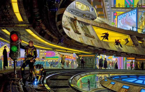

A toast, to Donato Giancola, a really talented artist! (As always.) He won the 2007 Hugo Award for Best Professional Artist. If that means something to you.
http://igallo.blogspot.com
This is yet another post which I hope I actually made you care about. I myself am just watching in the distance as this art industry plays out through this monitor. Hundreds, no... thousands of artists flock to art conventions, seminars to learn from these artistic gods, and here I am. How I wish I can be those lucky few. Anyway, enough with this ramble.
You know what looks nice though? It's that overplayed trailer for an Massively Multiplayer Online Role Playing Game called Tabula Rasa. I say overplayed because it is - it seems waaaay too hyped actually (at the time of this writing). Just because its done by some guy named Lord Richard Garriot, doesn't mean its going to be a classic. Or will it?? Who knows? Enjoy this awesome, albeit cliched trailer! Hot women abound!


It's like looking at a modern update of a classic serial poster or something. It either has something to do with the use of a lot of great photo-referencing in Photoshop, or I'm just weird. In any case, I will admit I've been a great admirer of this artist's work for quite some time now, because it looks so darn purty. Plus, he does science fiction art for Tor and other well-known publishers. That's always a great bonus.

"I'm far more influenced by modern day sci-fi noir that by illustration in the industry today" he says. Some of Mr. Seeley's greatest influences have been artists like Dave McKean, John Muth, Kent Williams and George Pratt. Of course, he also admires the works of Caravaggio, Egon Shiele, Robert Graham, and many more personalities I can't care enough about at the moment. Maybe in the future.

Damn, this guy is good.
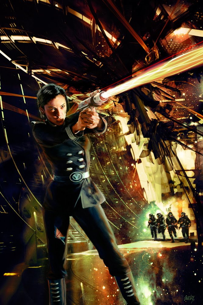

Many of these images are also found in various digital art books such as the "Spectrum 10" and "Painter". His work is definitely an inspiration. What do you think?
 Title: The blues singer leaves town
Country: Portugal
Software: Photoshop
If there is one thing I can't stand, its seeing art that evokes such depth and emotion, it makes me sick-- no wait, it makes me glad. And here is one artist that does it quite well. I'll make this a new regular thing in my blog, just a post where I can admire all the little nuances of a particular unknown artist's work. Not much is known from this Melo fellow, but as you can see, his art is simply vibrant and teeming with character.
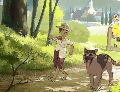 The artist described this piece:
"A little tribute to the memories from an old anime series i used to love - Tom Sawyer. Although my picture doesn't refer to the same time. It's also a celebration of music and summer."
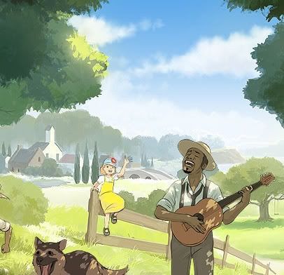 What's made me so interested in this piece is the colors. It's almost like from a Hayao Miyazaki flick or something. And the overall pleasantness of it is actually a refreshing change from all the grim and dark fantasy/dark fantasy/ science fiction pieces I see all over the net.
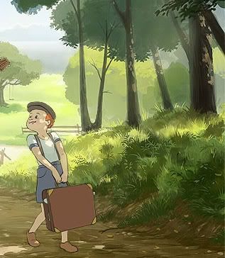 Every area is so lovingly detailed... I hope the artist pursues more subjects such as this. Oh, before I forget, he also did a piece this other piece on August 2007, called Like Summer.
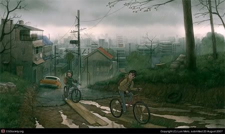 In his own words:
"Trying to go back to an animation style. I was looking for a feeling of carelessness, and of going to meet nature, when everything tries to force you to stay home."
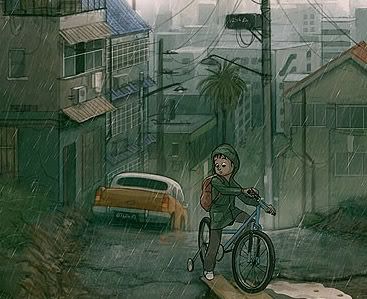 From this piece alone, taking a closer look at the fine details of Mr. Melo's works, they can almost tell you a story. They're beautiful that way, especially with his current cartoon style.
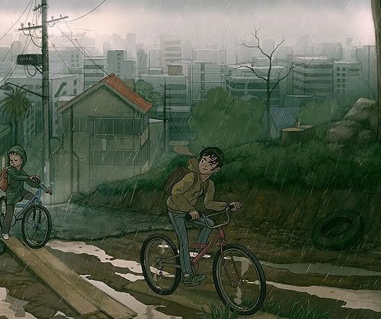 I need not tell you that this trip through the rain isn't going to end well for these two punks. Hey, how about some feedback or comments, eh?


