Do you go home, feeling frustrated, and feel this... necessity to fill the Void™ through art. Doing everything you can for the sake of expressing and communicating your darkest, most intimate thoughts? That could very well be the 'purpose' some artists have in choosing art as a hobby/passion. But what are the other reasons that compels people to create art (Aside from mortality)? What drives a person to do these things we in society have identified as creative outlets??!
I recently stumbled across this lil' video, and I gotta say its a bit of an eye-opener. Check it out:
(The DVD release of "D.I.Y. OR DIE: How To Survive as an Independent Artist")
"This film is a celebration of the artistic underdog! FEATURING interviews and performances from:
Lydia Lunch, Ian MacKaye (Fugazi), J Mascis (Dinosaur jr.), Jim Rose (Jim Rose Sideshow), J.G.Thirlwell (Foetus), Mike Watt (Minutemen), Richard Kern (Filmmaker), Ron Asheton (Stooges), Madigan Shive (Bonfire Madigan), Dave Brockie (Gwar) and more."
My thoughts:
Fascinating? Some might say the insight brought by this video is really good, and some might say... hmm. It all depends. Only recently have I been interested in seeing what or how other artists think - their thought process in the honing of their craft, be it in music, art or film. This film highlights the so-called 'underdogs' of the artistic community. The people who have gone through a lot to bring their unique craft to a niche audience, and there is something really inspiring just hearing these people talk about their experiences, rejections, and minor victories.
I highly recommend (after watching the first two videos which are kind of a pre-req to get into this) to watch Dealing with Adversity and Giving Back. I won't post all the chapters (which are on Youtube as a viral kinda thing) but I'll show what I feel is sort of helpful. It's painful, its profound - try it!
Purpose
Integrity
Dealing With Adversity
Giving Back
No matter what you do, whether it be painting characters or drawing crap, a familiar style - your style - always seems to surface. C'mon, name me your favorite artist and you'll definitely like a particular feature of his or her art - whether it be the way the artist renders characters, or the color style (fine art style or pastel or comic-book style) or any of that good stuff.
If you've drawn say uuh... fan art, like I have been for a while, you can see my uniquely odd style of drawing on my old works. It's just there. So well, why do I bring this topic up? I found this topic on Conceptart.org. I wanted to talk about it, you know - how does a person's style emerge?
Roosketch began the topic, and he sounded kinda pissed off:
How did your style come... did you just draw and draw and eventually it appeared? Did you draw something one day, notice one part you liked about it and tried that in the rest of your drawings or has it been there from the start?
I'm looking to become an illustrator and so I'm drawing as much as I can. It's not a lot really, but it's frustrating when I draw something, take a moment to look at it and end up thinking this looks like someone else could've drawn it... It's the quirky things that make a piece memorable I find... just as with photography, you have to play with light and depth of field so you get strange light effects or blurry bits as well as focused bits because otherwise it's just recording what the eye can see anyway!
filterpunk
This may not carry much weight, since i'm still very much an amateur, but i've noticed that some degree of style is just natural. Have 2, 5, 10, any amount of people draw something and i'd put money down that they'll all be different. As much as improving and evolving as an artist is technical , observation and perception lend just as much to the work we produce. Isn't style just the sum of our experiences and observations as artists?
May be there are other ways, these are the ways I can think of to develop a drawing style:
1. copy and learn from a favourite artist
2. learn from a number of artists and combine those attributes which you think work best
3. learn the basic skills and develop a style from one's own preferences
I think each way has its pros and cons.
__J_
May be everyone has some natural style which if developed will look different from everyone else (may be not a big diff, just a bit diff). The reason why it is so hard to develop a personal style is because the natural preference is somewhat not strong enough. When one copy or learn from the same artist work for a long time, some day one's own preferences will be replaced by that artist's preferences.
Seedling
For an individual artist, style, at its best, is what happens when you push your skills as far as they can go. If you try to impose a style onto your art, it will prevent you from pushing your skills to the max. So don't fret over style. Just make art to the best of your ability, and style will happen.
Kawakaze
i have found that style comes from what i am inspired from or doing a lot of. i would not be so worried about developing a style, just look for inspiration and what catches your eye, then try it yourself. naturally what works will stay with you. currently i seem to be big on vectors and fat contour lines, particularly from a lot of the work i do which revolves around cartoons etc etc. i think style has become a problem for me, trying to break out of it is the real challenge. im really into architecture and simple shapes lines these days, its starting to show through in some of the stuff i do.
most importantly surround yourself with variety. take the good parts of everything. style will find its way through and start to shine once u becoem comfortable in doing what you do.
Kuraudo
I think style always comes from somewhere else, inspiration from someone else. Nothing comes from nothing. Look at some of your favorite artist's work, try to combine some of them. I always like Tetsuya Nomura's style(FFVII, VIII,X, and
JQP
I mean, whew! How the hell do you quantify style? That's a question for the folks who've been studying and practicing art for a lifetime, phd type question. And then the answer they give would probably be incomprehensible to many.
A thought occurs, there are many different layers of style. You know, your style in drawing faces, style in drawing architecture, style in painting either, etc.
That just leads back to the inevitable question, what IS style? Is it something quantifiable, like "an artist's divergence from realism (i.e., "photorealism")" Or is it something more subjective like, "whatever is most uniquely recognizable about an artist's work - i.e., whatever it is that makes his work unmistakable, to the extent it exists at all"
Go crazy thinking about that stuff.
I think a lot of it might come down to what the artist, consciously or not, admires in what he perceives in the world (including within himself) - that will tend to come out in his work.
I know this much, I agree with Seedling that style will happen; it might be problematic to start forcing the issue.
BlueFley/Mark Brunet's Portfolio
__J_
Some clarifications:
1. Way 3 I mentioned above:"learn the basic skills and develop a style from one's own preferences"
normally doesn't mean one can really develop everything, still needs to find inspirations, but may be not as much as Way 2,
2. Way 2 I mentioned above:"learn from a number of artists and combine those attributes which you think work best"
personal preference still comes to play of course but this way is more analytical than Way 3
3. These are just some classifications for ease of discussion, I guess not many people purely do in any of the 3 ways above, just a matter of relative importance
4. Speaking of cons. No way above always work. For way 2, combining different attributes may not look good if this cannot be done seamlessly. For way 3, the resulting style may be one which is not as distinctive as one wants, or may be it's very unique but the market doesn't need, and of course it may also be a great and unique one everyone likes
My thoughts:
Well, that's style for you. Every style (save for anime in most cases) is unique. Just keep drawing, and lets see, shall we?
Hey there Void™! Found a very interesting article written by art extraordinaire Irene Gallo waaaay back in April of 2006, but the lessons stated here are priceless. They are especially useful since, at t the time of this writing, the bulk of my "work" is centered pretty much on science fiction/fantasy. I suppose I'll post large excerpts from the article and see if I have something to say or add to it.
The article is actually about making a successful commercial artist's portfolio that you can show to science fiction & fantasy book publishing and magazine companies. Ms. Gallo describes the distinction by saying that:
"While I’m sure there are some things in common, I would bet there are many differences in preparing a portfolio for comics or concept work in film and gaming."
Alright, sure! I'm sure that's an interesting debate, but another time. Lets get down to business! Here's another interesting quote in the foreword part of the post:
"... Remember, when an art director is speaking to you professionally, they are thinking about the concerns of their jobs. Art directors see TONS of work that they adore but haven’t found a way to utilize. Being hired is not the same as doing great work... I need to get all my covers past all the fickle opinions of a Sales and Marketing department, booksellers, and the readership."
My thoughts:
I suppose that is the most heartbreaking thing, isn't it? Especially as an artist, where you slave on a piece for four hours, only to have your boss reject it out right. In my position as an 'amateur' commercial artist, I (fortunately) do not really have to worry too much about market statistics or research or things of that sort. Just make great art that I feel would sell. Whether this is all a good thing or a bad thing is yet to be learned by yours truly.
Now for the rest... How do you make a good Sci-fi/Fantasy book cover??!
SHOW THE CLIENT WHAT THEY WANT TO SEE
Know who you are showing your work to. Don't show your still-lifes and say, "But what I REALLY want to do is fantasy book covers." If that's what you really want to do, then sit down and create a new portfolio. And don't offer to do a job on spec to prove that you can switch gears.
Create different portfolios for different clients. The presentation you show a card gaming company may be subtlety different than the presentation you show a book publisher.
CONSISTENCY
The “Weakest Link” principle reigns supreme. Especially when looking at portfolios from young artists just out of school a couple of years... If you have seven paintings that you really like and three that you’re not fond of, sit down and paint three more pictures. An Art Director will always fear that they could get you on a bad day. ADs don’t want to take a chance on new talent, they want to feel comfortable and excited about working with new talent.
KNOW WHO YOUR COMPETITION IS
Remember that the day you graduate, artists like Donato Giancola, Todd Lockwood, Jon Foster are your competition. You need to give me a reason to hire you instead of those guys. I don’t say this to make it seem hopeless but, rather, to make younger artists realize that they really NEED to work hard to get their foot in the door. And they need to work smartly. Look at your work critically and constantly work to improve.
My thoughts:
I figured as much. It's rare to see terrible cover art on anything the shelf these days.
FIGURES
Figure drawing, figure drawing, figure drawing! The most important thing for a book publisher is figure drawing. You may get away with faking the rest (for a little while) but you need to have 100% solid figure drawing that does not look stiff and cartoonish.
There are only a few artists who are willing to include more than one or two figures in a painting. If you can handle a crowd scene, it can go a long way to separating you from your competition.
My thoughts:
Now you tell me! This is my greatest waterloo.
BODIES IN MOTION
This is tough. Action often looks stiff or fake. The trick is getting good reference so that the pose is accurate and then deviating from it to give it some life. There are only a couple of people that I trust with real action...but when it works, it’s kick ass.
WOMEN
Yes, we constantly show sexy, big-breasted babes on our covers. BUT, there is a fine line between sexy and freakish. If you are using Hustler for your reference, you're on the wrong side of that line. Along with sexy, they usually need to look like they can kick-ass. Slave girls don't impress art directors. Book publishing does not use pin-up. And breasts are NOT perfectly spherical.
Example:
Luis Royo. This figure is sexy, strong, and in command of the situation without being obviously posed strictly for titillation. Royo explores all kinds of dark and erotic themes in his personal work but, for his book covers he is able to pull back a bit for the more conservative book publishing market.
FASHION
This applies more to artists that have been in the industry a decade or two but let this be a cautionary tale for young artists: It’s not a great idea to always use your girlfriend/wife in every painting. As people get older their sense of what is fashionable sometimes ends shortly after college.
It’s slightly painful when I see a figure in the painting whose clothing and/or hair is clearly from the 80s. (Fantasy paintings are amuck in mullets!) Unless it’s a historical piece, costuming should attempt to be as timeless looking as possible.
Looking “dated” is the kiss of death for an illustrator. (Men’s fashion doesn’t seem to be as identifiable so I don’t often see this problem in male figures.)
BACKGROUNDS
Too much detail in the background flattens the image out. Artists working in PhotoShop love to show every brick of the castle that is resting on the mountain across the valley. Not good.
Examples:
Stephan Martiniere (image above) is a master at implying detail with abstract shapes. It keeps the image alive.
We don't need to see every leaf in Greg Manchess's painting to know that there is a jungle back there.
CREATURES
Book publishing (outside of gaming tie-ins) does not show many monsters. I know that games use tons of them and they look great, but a portfolio full of monsters isn't a help to me.
Showing an example or two of some classic mythic creatures is good - dragons, unicorns, trolls - but I don't need to see tons of it and they should not be of the twelve arm, five eyeball, gooey variety. Good anatomy on animals and creatures is critical. The people are still more important, but if you can also sell me on horses and dragons, you’re golden.
BLOOD N’ GUTS
Not so interesting. Even horror books stay away from gore. Grit is fine, a little bit of subtle blood and grime is okay, but no Marketing Department will let an evisceration pass.
My thoughts:
Irene states that you gotta show this sorta thing with class. Like showing loss and tragedy and all, and not mountains of blood and stuff. Ah, I never much like drawing gore anyway.
REFERENCE
I don’t care if you have to stand on your head to make a good picture. Most likely, you’ll need reference. Use it. Don’t be a slave to it.
START WITH YOUR BEST PIECE
There’s never a second chance to make a first impression. Make people WANT to turn the page.
NEVER APOLOGIZE
If you are showing off a portfolio you are asking a busy person to take their time to look at your best work in its best presentation. Never explain why the image didn't come out as well as you hoped or how bad the print looks. It will either make me nervous that you'll run into the same problems on my job or make me wonder why you are having me look at a portfolio that even you feel is not ready.
It's surprising but people do this all the time. The best artists can point out mistakes in their paintings...but they don't. Be professional and stand by your work.
IMPRESS, DON’T EMBARRASS
I’ve had people get on their knees and beg for a chance. This kind of behavior embarrasses the art director and should embarrass the artist. Don’t chase an art director at inappropriate moments, such as an awards ceremony, while at dinner, etc.
Much of my time at work, and after hours, is spent thinking about who should do what covers. If I make the right match between artist and book, then the months ahead of me are smooth sailing. If I make the wrong match...it can be months of wrestling with the artist, killing a budget on a book by having to create a second cover, or, worst of all, letting a book go out into the world to limp along with an inappropriate cover.
Note, inappropriate does _not_ mean that the cover is bad...it just means that it is not the right cover for that particular book. There are plenty of covers that are not my favorites but they are right for that book, just as there are plenty of beautiful covers that may not be right for a particular book.
My thoughts:
Very helpful! What else can I say? I was thinking of attaching a cheesy sci-fi video game intro, but I think I'll skip it for this post. I just I actually listen to the advice given here.
There are folks who spend an inordinate amount of time in from of a computer or console during their high school or college years. Others find time to go out, and live life. Others, spend time crafting and honing their skills in well... art.
I was the guy who wasted his time in the computer.
That being said, there are a few brave souls, at this "golden age" of freedom and wasted youth, working to hone their design skills.
Drawing thumbnails on the tablenapkin while your significant other is in the restroom? Close.
Sketchbooks? Closer...
I know!

Bravo! You got it! A daily sketch group is a fairly popular activity done on the net, and the most popular of which is found in (suprise) Conceptart.org. Like I said, this lil' time killer is for folks who want to hone their art and design skills.
I myself lack all of that because I yammer on and on about weird stuff I see on the net. But it was either I spend my time typing this useless entry, or I waste on a sketch group. I can't be in two places at once.
But these guys. Damn! They got no fear, man. I salute these folks. They come up there and start drawing the topic of the month - whether it be "Killer Butterflies Raping Flower" or "Mechanized Zombie Taking a Dump" They'll do it.
Take a look at this. At least this! The art subject for the day is - BEFORE THE DUSK-LIT CASTLE RAMPARTS, A SPACECRAFT HOVERS - Artists have to take heed, as they have to follow certain guidelines:
- Are the aesthetics of the one in stark contrast to those of the other, or are they in harmony?
- Is it a meeting of two differently advanced civilizations?
- Is the mood one of astonishment, or confidence, or foreboding, or excitement?
- Is the spacecraft come from the skilled technological artisans of this very kingdom?
- Invader, defender, or passer-by?
- Some very different ways this topic could be interpreted, as usual...
 Now, lets take a look at the entries! The first is from Goran. As a first entry, it's not bad. It's got that whole black and white thing going on, so at first site, it looks "nice". "Nice" being what folks would say when they see something, then upon closer inspection they go... "wait a minute". That means... there is something not believable about the image, which sort of spoils the meaning the artist might be trying to convey. Doh! I think I just rambled again - I forget the fact that this is a daily sketch group, where people would usually not spend a lot of time double checking their paintings to see if it perfect. Ah well.
... Is that ship trying to life the fort?? Seriously now...
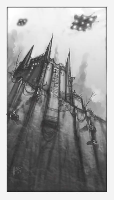 Vanvalen, as you can see here, did something a little more traditional, with a gothic spired fortress being patrolled by what appears to be evil space invaders. What is cool about this painting, despite frustration in the artist for not having a hard time getting this concept right, is that your mind sort of fills in the gaps. Look at those "space ships" on the sky (I suppose they're skyshi-- shutting up). My mind is sorta... imagining what the look like. But again, they're really just a bunch of silly shapes! Interesting entry.
 Now this piece above is by Lennybird. As you can see, its not... technically amazing. But the person who did this had guts. He spent more than two hours using GIMP to paint this. That... that dedication, to bring this concept and have it thrown to the endless Void of the internet, is a brave, brave thing to do. As you can see, the work itself shows promise. It adheres quite literally to the topic, with a visible sun indicating the time, with the ship ready to either land or board troops. Give this person a few years and we'll see.
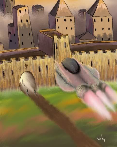 Racasdorph. Yet another brave talent. The basics of understanding perspective are here, the basics of complimentary colors too perhaps. Techniques such as how atmosphere is desaturating colors as well can be seen in the city. Again, an interesting experiment.
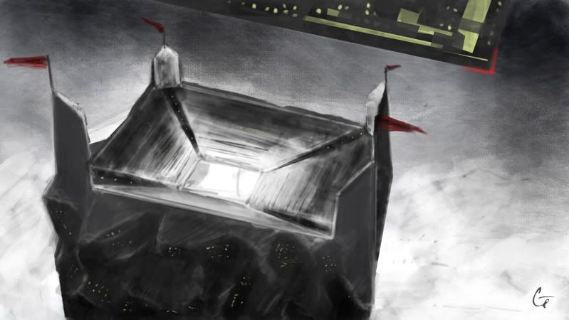 Here, Gretchen presents to us a concept. The nicely detailed 'high' coliseum-ish fort, and above it, a strange uh... thing. Everything is black and white, yet the ship is colored and the flags are red. Is the concept half-baked, or the work itself?
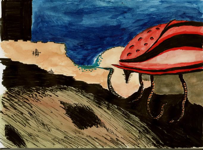 Jagehsto, made this in his sketchbook, with a marker and water color. Absolutely no "undo" key here folks! Interestingly enough, he kinda pulls it off, with a ship that reminds me of a cockroach heading towards the silhouette of what either a beach or a fort. And the cockroach robot is painting a new hole or touching water... or is it touching the sky?? Gah! Watercolors! There's gotta be a way for us digital whores to use dry media!
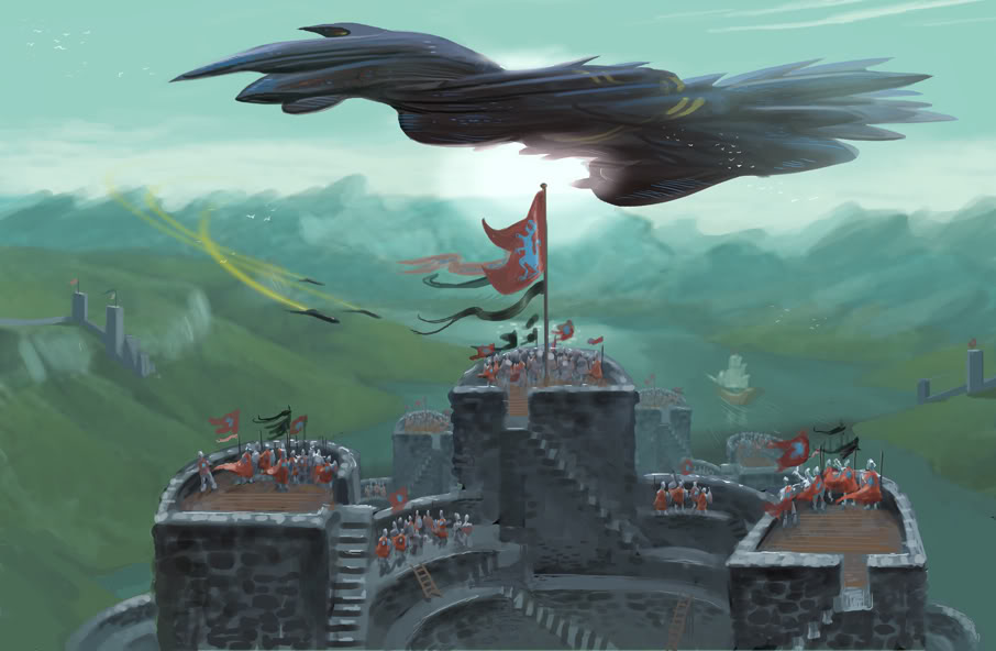 As time wears on, the sketches get better. Tommoy doesn't sketch though - the bastard paints! And its good! I think. There's something about that ship I'm having problems with. or is it the symmetry of this painting? Who knows. I'm a pretty lousy painter too.
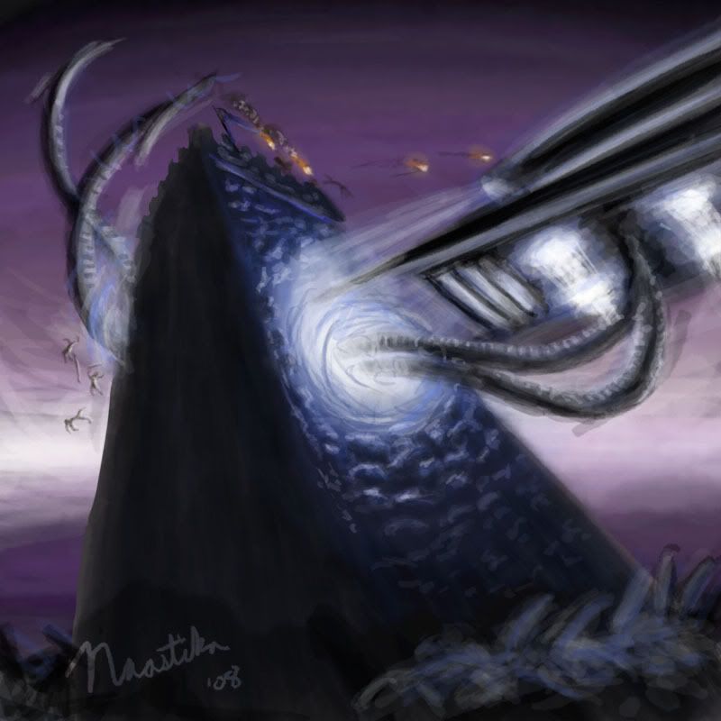 Naastika now gives us a dark twist to this concept. The robot is launching its robotic appendages and raping the castle. A very good interpretation. It is here that the artist unleashes his creative subconscious and gave us this disturbing portrait of his psyche. And also shows his frustrations in trying to get the perspective right...
 Here's another one. Looks good, with a War of the Worlds feel. This again presents the problem - just how many artists are struggling to master perspective??!
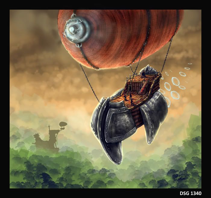 aBiliTy gives us a... blimp. I guess that's the central forest, and the fort itself is now somewhere... lost in the background. Good enough I guess.
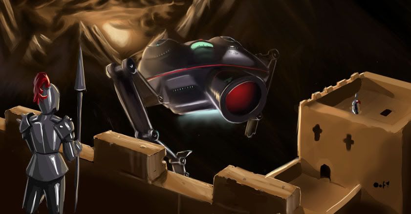 Oofnish comes up with this... He finally couldn't execute the concept or get the art right, so he just came up with this. Not bad I have to say! Technically, if I want to be cruel, its got loads of problems, but since they're only given a day to paint these, what the hell! It's okay. The overgrown camera-ship is okay, although I do worry about that medieval knight. I wish the artist could have added something otherworldy to make him match the odd surroundings.
  Finally, Apocalpyse Rex. The final entry sometimes isn't the best, but in this case, it is! When I say best - I mean at least in the technical aspect of it all. It looks pretty sweet.
Now. Now you see what a daily sketch group looks like. Not bad, eh? It's pretty cool to see how people would interpret a singular topic like this. I would certainly like to feature more here, so that at least I feel like I am learning something as I type these crazy posts only a few dozen read. Until then, stay away from septic tanks. They smell.
What do we talk about? Do I talk about... super old sci-fi that nobody cares about? Do I ramble about the differences between Science Fiction and Science Fantasy? No! Rather than waste time on those wonderful topics, lets look at this article by some guy named Philip K. Dick. I'm not sure if he's the guy who made Star Trek though.
Nah, I'm kidding. I think Philip K. Dick wrote something about Tom Cruise.
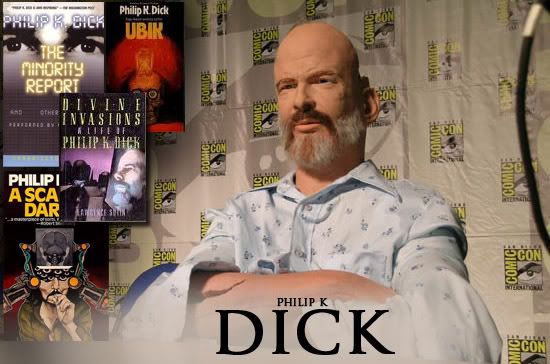
So anyway, Dick wrote this article entitled How to Build a Universe That Doesn't Fall Apart Two Days Later. It seems that back in that day (1978), science fiction was considered a juvenile pursuit and writers like Dick didn't get no respect since his work were mostly confined to those sci-fi pulp magazines. (Nowadays, people look at sci-fi like... oh right. People still look down at sci-fi). I decided not to talk the entire article not only because its too long, but it gets really philosophical and religion - something I feel would not work well with this shallow blog.
The problem Dick posed "...is simply this: What does a science fiction writer know about? On what topic is he an authority?
...The two basic topics which fascinate me are "What is reality?" and "What constitutes the authentic human being?" Over the twenty-seven years in which I have published novels and stories I have investigated these two interrelated topics over and over again. I consider them important topics. What are we? What is it which surrounds us, that we call the not-me, or the empirical or phenomenal world?"
My thoughts:
Maybe sci-fi doesn't deal with this stuff anymore. Who knows? I don't read sci-fi like this. But hey, this article is a good read, and it is sorta educating me... a bit.
Perceptions of Reality
"In 1951, when I sold my first story, I had no idea that such fundamental issues could be pursued in the science fiction field. I began to pursue them unconsciously. My first story had to do with a dog who imagined that the garbagemen who came every Friday morning were stealing valuable food which the family had carefully stored away in a safe metal container. Every day, members of the family carried out paper sacks of nice ripe food, stuffed them into the metal container, shut the lid tightly—and when the container was full, these dreadful-looking creatures came and stole everything but the can.
Finally, in the story, the dog begins to imagine that someday the garbagemen will eat the people in the house, as well as stealing their food. Of course, the dog is wrong about this. We all know that garbagemen do not eat people. But the dog's extrapolation was in a sense logical—given the facts at his disposal. The story was about a real dog, and I used to watch him and try to get inside his head and imagine how he saw the world."
Philip K. Dick's theory:
"I decided, that dog sees the world quite differently than I do, or any humans do. And then I began to think, Maybe each human being lives in a unique world, a private world, a world different from those inhabited and experienced by all other humans. And that led me wonder, If reality differs from person to person, can we speak of reality singular, or shouldn't we really be talking about plural realities? And if there are plural realities, are some more true (more real) than others? What about the world of a schizophrenic?"
My thoughts:
By golly! I mean, WTF! That some real existential crap Dick is pulling here. This is real heady stuff. Not the brand of sci-fi that involves space ships and alien crabs. Man.
Dick Quotes:
"Reality is that which, when you stop believing in it, doesn't go away."
Dick said that when this kid asked him how to define reality. Ever since, Dick hasn't been able to define it more lucidly. What do you think? Now that I think about it, this topic is really annoying considering I've had a tough week in the real world.
 Dick: "Sometimes when I watch my eleven-year-old daughter watch TV, I wonder what she is being taught. The problem of miscuing; consider that. A TV program produced for adults is viewed by a small child. Half of what is said and done in the TV drama is probably misunderstood by the child. Maybe it's all misunderstood. And the thing is, Just how authentic is the information anyhow, even if the child correctly understood it?
What is the relationship between the average TV situation comedy to reality? What about the cop shows? Cars are continually swerving out of control, crashing, and catching fire. The police are always good and they always win. Do not ignore that point: The police always win. What a lesson that is. You should not fight authority, and even if you do, you will lose. The message here is, Be passive."
My thoughts:
This stuff shouldn't be new to you folks, but coming from Dick, I guess its real profound. I suppose it wasn't really thought about back in the late 70's, that great time of social upheaval.
Dick: "So I ask, in my writing, What is real? Because unceasingly we are bombarded with pseudo-realities manufactured by very sophisticated people using very sophisticated electronic mechanisms. I do not distrust their motives; I distrust their power. They have a lot of it. And it is an astonishing power: that of creating whole universes, universes of the mind. I ought to know. I do the same thing. It is my job to create universes, as the basis of one novel after another. And I have to build them in such a way that they do not fall apart two days later."
My thoughts:
Intriguing. With the advent of the internet, that power of course, has been disseminated to the masses. Now any Tommy, Dick (I probably shouldn't use that), and Harry has the capability to craft their own reality. I, MMG, have crafted this little kingdom of the Concept Den, as a means to present my reality and perception of art and other heady concepts to you, the Void™. Hey, even the Void™ is merely another concept I created to define an audience that barely offers feedback and suggestion! Truly an intriguing, is it not?
Dick: "However, I will reveal a secret to you: I like to build universes which do fall apart. I like to see them come unglued, and I like to see how the characters in the novels cope with this problem. I have a secret love of chaos. There should be more of it. Do not believe—and I am dead serious when I say this—do not assume that order and stability are always good, in a society or in a universe. The old, the ossified, must always give way to new life and the birth of new things. Before the new things can be born the old must perish. This is a dangerous realization, because it tells us that we must eventually part with much of what is familiar to us. And that hurts. But that is part of the script of life.
My thoughts:
Wow. Stories where characters have that deep, profound realization about their reality really interest me! He's right, its always cool to see how the character struggles to deal with his or her new reality.
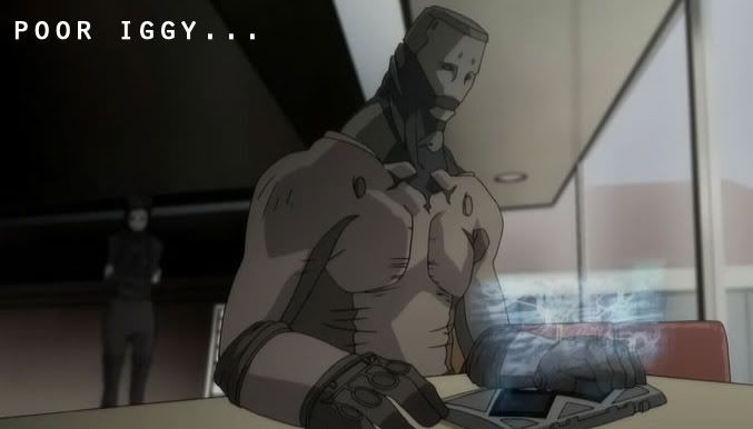 Reminds me of that one scene in (of ALL the examples to give) a anime series called "Ergo Proxy" where Iggy, the loyal android assistant of the main protagonist, has an 'awakening' due to a strange computer virus that somehow grants self-awareness. The protagonist orders Iggy to head to the city for help or something. Iggy refuses to follow orders of the protagonist and begins questioning why the protagonist is abandoning him when without him, she would be nothing. That he was there since no one else could tolerate the selfishness of the protagonist. It doesn't end well for Iggy.
So It was when that character's world (as a faithful, unquestioning companion) falls apart and begins questioning his place that really caught my attention. Maybe I should start picking up Dick's books??
Dick: "Because the bombardment of pseudo-realities begins to produce inauthentic humans very quickly, spurious humans - as fake as the data pressing at them from all sides. My two topics are really one topic; they unite at this point. Fake realities will create fake humans. Or, fake humans will generate fake realities and then sell them to other humans, turning them, eventually, into forgeries of themselves. So we wind up with fake humans inventing fake realities and then peddling them to other fake humans.
 In my writing I got so interested in fakes that I finally came up with the concept of fake fakes. For example, in Disneyland there are fake birds worked by electric motors which emit caws and shrieks as you pass by them. Suppose some night all of us sneaked into the park with real birds and substituted them for the artificial ones. Imagine the horror the Disneyland officials would feel when they discovered the cruel hoax. Real birds! And perhaps someday even real hippos and lions. Consternation. The park being cunningly transmuted from the unreal to the real, by sinister forces. For instance, suppose the Matterhorn turned into a genuine snow-covered mountain? What if the entire place, by a miracle of God's power and wisdom, was changed, in a moment, in the blink of an eye, into something incorruptible? They would have to close down.
Of course, in science fiction no pretense is made that the worlds described are real. This is why we call it fiction. The reader is warned in advance not to believe what he is about to read. Equally true, the visitors to Disneyland understand that Mr. Toad does not really exist and that the pirates are animated by motors and servo-assist mechanisms, relays and electronic circuits. So no deception is taking place.
And yet the strange thing is, in some way, some real way, much of what appears under the title "science fiction" is true. It may not be literally true, I suppose. We have not really been invaded by creatures from another star system, as depicted in Close Encounters of the Third Kind. The producers of that film never intended for us to believe it. Or did they?
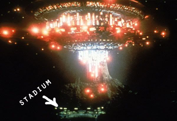 And, more important, if they did intend to state this, is it actually true? That is the issue: not, Does the author or producer believe it, but—Is it true? Because, quite by accident, in the pursuit of a good yarn, a science fiction author or producer or scriptwriter might stumble onto the truth... and only later on realize it."
My thoughts:
Okay. Whatever the hell Dick says has probably happened a million times over now that it is the 21st century. Lets read on a bit on where the hell this is all going.
Dick: "The basic tool for the manipulation of reality is the manipulation of words. If you can control the meaning of words, you can control the people who must use the words. George Orwell made this clear in his novel 1984. But another way to control the minds of people is to control their perceptions. If you can get them to see the world as you do, they will think as you do. Comprehension follows perception. How do you get them to see the reality you see? After all, it is only one reality out of many. Images are a basic constituent: pictures. This is why the power of TV to influence young minds is so staggeringly vast.
And—and I say this as a professional fiction writer—the producers, scriptwriters, and directors who create these video/audio worlds do not know how much of their content is true. In other words, they are victims of their own product, along with us. Speaking for myself, I do not know how much of my writing is true, or which parts (if any) are true. This is a potentially lethal situation. We have fiction mimicking truth, and truth mimicking fiction. We have a dangerous overlap, a dangerous blur. And in all probability it is not deliberate. In fact, that is part of the problem. You cannot legislate an author into correctly labelling his product, like a can of pudding whose ingredients are listed on the label... you cannot compel him to declare what part is true and what isn't if he himself does not know.
It is an eerie experience to write something into a novel, believing it is pure fiction, and to learn later on—perhaps years later—that it is true."
My thoughts:
You know what? Lets just cut the crap here. Dick's cool and all, but the just thought too much and its starting to get really weird. And considering this was written in the 70's. Sheesh! So Void, I'll leave it to you to think about what has been said here. If it makes absolutely no sense to you too, then whatever. I guess it was sort of a good read. Anyway, before I go on and on, I think I'll leave y'all with this short student film instead. It has sort of the same madness we are dealing with in this post. Here's 50% Gray.
What is a copyright?
In the simplest terms, "copyright" means "the right to copy." Only the owner of copyright, very often the creator of the work, is allowed to produce or reproduce the work in question or to permit anyone else to do so.
"The Artist shall retain the copyright and ownership of the image, granting exclusive rights of usage to the Client for promotional, advertising, and reference purposes only. Any additional uses of the image for anything other than promotional, advertising, and reference purposes shall constitute a new usage fee of ________."
My thoughts:
Oh, poor, naïve me! To round out what I had previously posted here, I'm going to talk a bit about various little legal stuff I've seen on Conceptart.org, my favorite source of artistic ideas.
How do you price? As one of the handful of freelance "artist" on the web who has absolutely no clue how to successfully be one, I dare to wonder how an actual contract looks like. A quick search turned up some great stuff. But lets focus first on the legal crap. Here is a list of wordings I found on a thread - an excerpt from the Graphic Artist's Handbook - and I'll post up a bit here so you, my tiny audience of the Void™ can see what it looks like.
ESTIMATED COSTS:
__ Consultation fees are estimated at a total of $ __________ or ____ see attached estimate sheet for specifications.
__ Materials costs (RC/film/neg output, scanning, project specific materials, etc.) are estimated at a total of $__________ or ___ see attached estimate sheet for specifications.
Total estimated cost of project: $____________ Project estimates are valid for 90 days from the date of estimate. Project may be reestimated if, upon receipt of all project elements, the designer determines the scope of the project has been altered dramatically from the originally agreed upon concept. Printing fees will be estimated separately and payment arrangements made between client and printer.
My thoughts:
So apparently now as a 'freelance artist', I can get paid simply by talking to a client. Amazing. What next? I'll get paid for doling out advice to troubled individuals? Sheesh. And what's this? I can get paid for "materials"? For "scanning"? Wow! You know what I use for drawing? I use the back of old insurance policies. My pencils are lousy number 2 pencils from the office! I'm not saying I'm cheap here, but how much should these two parts cost? Oh well. I think the place where I can totally cash in is LABOR. Yeah. That'd be a good place to start. But how do I know the value of my own blood, sweat and tears??
__ Payment in full or the remaining balance is to be paid upon delivery of the completed project. A cash discount of 5% of the total project labor and consultation cost is offered to clients paying upon delivery of the finished project.
__ Payment in full or the remaining balance is to be paid 15 days from receipt of the final invoice for the completed project. Finance charge of 1.5% per month (18% annually) on all overdue balances.
My thoughts:
Still figuring out how to get paid in my country. The following are a bunch of the more interesting wordings I found. The rest are pretty obvious, so I won't bother posting them here.
The client shall not unreasonably withhold acceptance of, or payment for, the project. If, prior to completion of the project, the client observes any nonconformance with the design plan, the designer must be promptly notified, allowing for necessary corrections. Rejection of the completed project or cancellation during its execution will result in forfeiture of deposit and the possible billing for all additional labor or expenses to date. All elements of the project must then be returned to the designer. Any usage by the client of those design elements will result in appropriate legal action. Client shall bear all costs, expenses, and reasonable attorney's fees in any action brought to recover payment under this contract or in which Jeff Fisher LogoMotives may become a party by reason of this contract.
My thoughts:
Well, I can't really say much about that. This is something we as an artist sort of fear. There's nothing more terrible than having your stuff not getting shown to any audience. Even if you do get paid for your troubles, its doubly worse because the client probably wouldn't allow you to post it up anyway.
Author's Alterations
This section points out that it is the customer's responsibility to pay for any changes from the original project. It should also state something to the effect that mistakes you make will be fixed free of charge.
Preparatory Materials
State who owns preparatory materials: sketches, disks, negatives, etc.
Proofs
A signed proof is necessary before work can be completed. Requests must be made for revised proofs. You cannot be held responsible for errors if the customer doesn't return a signed proof, or if the customer asks for changes without the submission of proofs. Here is also where you state that there may be some variance between color on a proof and color on a finished job.
Ownership of Artwork
Perhaps one of the most important sections: who owns the artwork is explained here. I also include a paragraph that states I have the right to use this work for design competitions, future publications on design, educational purposes, and marketing materials.
My thoughts:
I'm a bit like the Japanese. I have no clue as to the value of copyright. But I'm learning. Cool! I can get paid for alterations in my art work!
But They Won't Sign It . . .
If the prospect won't sign your contract, then they don't become your customer. I've only had one instance in seven years where a customer even questioned my contract; they did eventually sign. I've even worked with a variety of law firms, and none have ever refused to sign, although some have made slight variations.
One of our forum members says that he does have trouble getting customers to sign contracts. Instead, he includes his terms in his proposal or estimate. Here are some interesting threads from the forum on contracts:
Digital Signatures
President Clinton signed a bill into law that gives “digital signatures” the same legal validity as handwritten ones. I was thinking of the implications this has for commercial artists.
"I, for one, have gotten “burned” often enough to believe in always using a contract, and have found it to be a good way of preventing “misunderstandings” with clients. Unfortunately, in the fast-paced world of publishing, and especially digital publishing, it is not always practical to hold up a project until papers can be sent in the mail, even by overnight delivery.
I've been using faxed project agreements for over ten years and recently started using emailed PDF files agreements with no problems. If anything, my project agreement often scares off potentially flaky customers."
My thoughts:
Ah, what do I know. A lot of the stuff I've done is purely honor-based at this point. I must see the value in all of this. My experiences before should be telling me that I should take this thing seriously!
So there you have it - the wordings you see here seem to give a vague idea how to 'price' myself. I have to find out how much I'm worth, otherwise I'll just be the same free-of-charge fan artist you know on deviantArt. Agh!
Exceptions... Yeah, lets talk about that for now - what are exempted from this freelance artist's compact?
The only exceptions are (Thanks to Wikipedia for its info!):
- Fan art which depicts material that is in the public domain or which has been released under a 'free' license that allows derivative works:
- Art which depicts everyday objects of utilitarian use; e.g. cars, clocks, clothing, which are not artistically unique. You can draw a picture of an Astin Martin without it being subject to the copyright of the James Bond movies, but the Batmobile from Batman is a unique artistic creation and fan art of it would fall under the original copyright.
- Photographs which fall under freedom of panorama. If the Batmobile from Batman were permanently installed in a public park you would then be able to freely re-use, but not alter, photographs of it according to the copyright laws of some countries.
- Diagrams which inform on the content of a work of fiction in a non-artistic, straightforward manner. You can highlight the regions of "Oceania", "Eurasia" and "Eastasia" from Nineteen Eighty-Four on a world map, but you cannot "redraw" the map illustrations depicted in copies of
Therefore, fan art which appears on Commons needs at least two copyright justifications. First, it must establish that the image meets one of the four exceptions listed above for portrayal of a derivative from a copyrighted work. Second, it must indicate that the creator of the derivative then releases that image under a free license. Theoretically, a derivative of a derivative could require three or more copyright justifications.
My thoughts:
Got that? Ah, lets talk about pricing next time. I'm dying to talk about something else that doesn't make my brain go blank after a few sentences. Good day to you all! Be vigilant.


