The Media Mapping Guy™ now presents another hair-pulling, narrow-minded point of view only he could provide: The Baddest Bad Guy.
Disclaimer: All this is just my opinion. A follow up article may be made with more research.
With bland-ish heroes currently occupying the nooks and cranny of popular modern visual culture, only a really “colorful” and “interesting” villain can really save the day. (Bad guys are more often than not, uninhibited by the so called ‘blandness quotient’; whereas anti-heroes are an entirely different story) Note that when I say colorful, I don’t mean the villain has to be gay. And when I say interesting, it means what it should mean. (Wow, that was really weird)
The kind of bad guy I’ve sorta enjoyed seeing in print an on screen is the bad guy who… isn’t exactly the “bad” guy at all. The only reason they’re considered “bad” is due to the Judeo-Christian belief of what is supposedly ‘right and wrong’. You know – angels and demons and all that. These guys aren’t bad. Just… misunderstood.
Added depth?
This is the kind of bad guy writers write to "challenge" the audience... to let them decide for themselves if they truly are villains in the first place. From comics to televised media to novels, these a**holes supposedly give a certain amount of ‘depth’ to the story. What do I mean? Well, here’s a few that I remember from the top of my head:
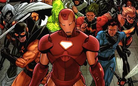 Ex. 1: Iron Man™ – The Marvel™ Civil War™ began because Iron Man wanted superheroes to register their secret identities. Those who fail to do so get arrested. The American people have had enough with freelancing heroes failing to take responsibility for the destruction they cause when performing their superhero activities. Obviously, Iron man fights against Captain America and his cronies because of freedom and rights and all that. Marvel fans naturally sided with Cap, and Iron Man is seen as a bastard.
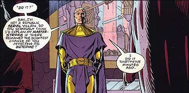
Ex. 2: Ozymandias of Watchmen – It is an alternate 1980’s, where the American-Russian Cold War reaches subzero (Hardy har har). A retired ‘superhero’ (or costumed adventurer) turned billionaire known as Ozymandias orchestrates a plot to destroy a part of New York City in order to prevent the coming Nuclear War with the Ruskies. Ozy’s plan is… successful – Peace between the two countries is achieved. The protagonists grudgingly accept this new reality.
 Ex. 3: Trevor Goodchild from Aeon Flux- A complex "villain". His plans vary from episode to episode in the innovative animated series Aeon Flux. One episode 'Demiurge' had him trying to 'deliver' a real live God to the world, but Aeon, the "good guy" wouldn't allow it because its existence would jeopardize how she may have to live her life. Who's the selfish one now?
Moment of clarity
Most folks like these jerks cuz they give that weird “No way!” feeling, when the villain starts discussing his plans to ‘improve the world’ or some “face reality” crap. Naturally, the master plan would involve something unthinkable like the deaths of millions, in order to save billions.
The really good bad guys are the ones that convince you that it’s the good guy’s cause that is wrong! These stories really deliver an impact, and have me thinking about the ramifications for days.
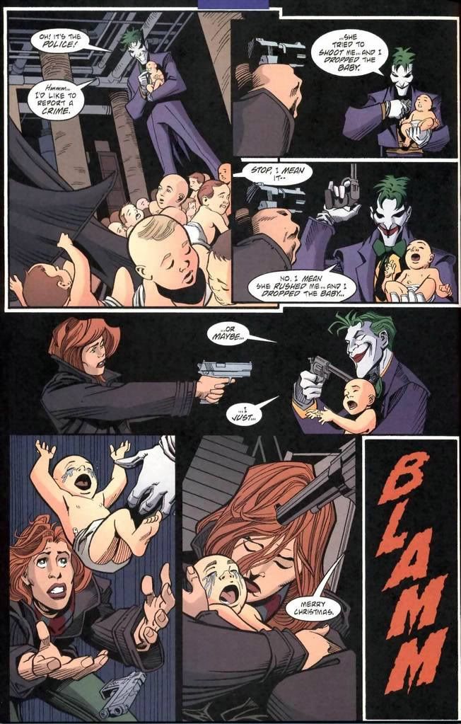
Of course, there are times when you just wanna sit back, and have a villain that’s bad, for bad’s sake. You know… the kind who wouldn’t think twice in raping the protagonist’s mother (I can name a few in my country’s House of Congress). They’re cartoon-y and pretentious, and they don’t give a f**k what you think. The best examples can be found in animation such as Megatron from Transformers, The Joker from Batman and Khyron from Robotech. The classic comic books has its share of crazy megalomaniacs and brazen killers/crooks. No depth. They’re just bad.
How about the hybrid villain type? The one that combines both types of bad guys?
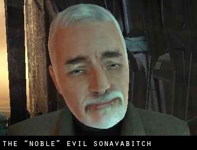
When it works, it’s great. The bad guy who does bad things cuz’ he’s an asshole, and yet still believes he’s doing something for the “sake of society”. They’re delusional, and I think it Half-Life 2’s Dr. Breen fits this very well.
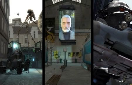 Dr. Breen is the (George Orwell’s novel, 1984) “Big Brother” of the video gaming world. Dr. Breen’s plan involves taking humanity ‘beyond the stars’ to achieve enlightenment… at least, that’s what his alien overlords say. This jerk’s vision doesn’t sit too well with the remaining populace on Earth, so the good doctor orders systematic genocide. His other evil deeds include: Repressing humanity’s biological urge to procreate, contaminating the water to make people forget the past, turning insurgents into mindless flesh creatures and forcing people to live in oppressive military-controlled cities.
Believe it or not - the guy is likeable! (as far as villains can be...) He doesn’t look over the top, like many comic-book cartoony villains. He is just an old coot, which makes him all the more menacing. (P.S. If you aren’t seeing the point I’m trying to make, I apologize)
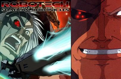
The villain that hands down fails to achieve any kind of likeability hails from a forgotten comic-movie-tie-in entitled “Prelude to the Shadow Chronicles”. It’s a five-part comic series based on an 80’s show called Robotech, and it features a villain named Thomas Reilly Edwards or “T.R. Edwards”. This guy has had quite a history back in the 90’s in an obscure comic release called “Robotech: Sentinels”. I won’t go into detail on that since it may be irrelevant. Lets just say he’s the bad guy, and his motivations stink.
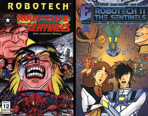
The Prelude comics were made a decade after the release of the 90’s Sentinels comics, and a new T.R. Edwards is a revamp of the classic character. In the original 90’s version of Edwards (the laughing maniac in the two covers above), he was a power hungry commander with a grudge against one of the main characters named “Rick Hunter”. Everything evil that Edwards did, he does because of his hatred towards Hunter. Y’see, Hunter supposedly left him to die while the base was being evacuated. He carried that grudge years and years later, until the two rivals were more or less “equals” in terms of rank.
He was never really a compelling villain, so people thought the new comic-movie-tie-in would update his motivations and make him a more effective and believable villain. People were wrong. The update made people realized just how cartoon-y this loser was. And the added “depth” just added insult to injury.
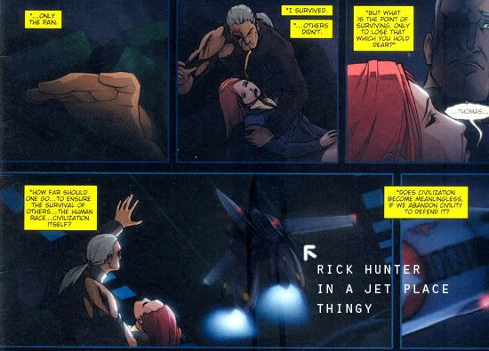 The updated T.R. Edwards retained a lot of the elements from his predecessor. However, there were notable changes. A big change was that this Edwards guy was left behind by Hunter again, but this time, Edwards wasn’t alone – he was holding his dying girlfriend. This little “change” has helped elevate the new Edwards to new heights of lameness.
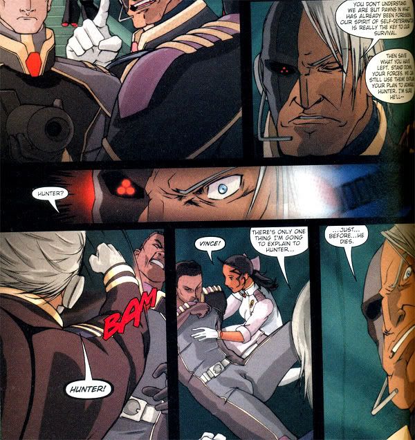 Click the image to read the 'unbelievable' dialogue. Edwards even preaches about how self-determination is what is preventing humanity from doom and blah-blah-blah!
Also note that this event happened twenty-odd years later after Hunter supposedly "abandoned" Edwards and his dying girlfriend!
The writers also thought they could add an element of humanity to Edward’s evil choices by having him say that he did everything to save the remainder of mankind from other marauding alien invaders. This pretension is shattered as his age-old grudge with Rick Hunter comes back in full force. Hunter and Edwards fight each other in a way that only seems possible in the magic of sequential arts.
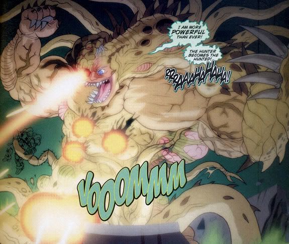 Edwards eventually falls into a mutating pit of goo and turns into this...
God, forgive the writers, for they do not know what they are doing.
One of the hallmarks of a great villain is delivering snappy comebacks at appropriate times. “The Hunter becomes the hunted!” is not one of those lines.
The story comes to a conclusion so bad and contrived; it makes a filler episode of “Naruto” episode seem Shakespearean in comparison. This type of schizophrenic writing totally ruins great villains. And guess what? The people who wrote this garbage are veterans in the comic industry! It pains me to see how crap like this reflects badly on these writers.
*Phew!* The question now is… will I be able to adhere to all these points I covered today? Who knows? Maybe?? We shall see.
Now, I conclude this inane article, with something of substance. It’s James the Nintendo Nerd’s top-ten list of the Baddest Bad Guys of all time!
We are plagued by a corrupt polity which promotes unlawful and/or immoral behavior. Public interest has no practical significance in everyday behavior among the ruling factions. The real problems of our world are now being confronted by those in power. In the guise of public service, they use whatever comes to hand for personal gain. They are insane with and for power. – Frank Herbert
Note that this quotation above has no bearing to what will be posted today. I just saw this quote alongside a piece regarding that a**hole Marcos, so I thought what the heck - Frank Herbert (creator of the classic Dune series) said it.
Today's topic is going to be another artistic rant. If that idea turns you off, Void, then by all means - I banish you! Ha ha ha... Nah. Please stay. I was only kidding. Lets get down to business shall we?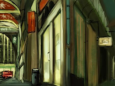 After a rousing three-part series of posts aimed at helping me build my confidence in digital painting, I feel that I a failure. Yet again. This time, it has something to do with perspective. As you can see in the image above (I drew and painted that!), the perspective is lousy. I don't know what went wrong. I followed the whole line rules to achieve a nice distance effect, but the whole thing turned out awful.
I realized my mistake later on - its a mistake I've known for quite a while actually - "proportions". Now why the heck didn't I think about that? Uh... I don't know... Maybe you were too distracted with real life or something? Bah! In any event, I made this image far too angly for its own good, and now it looks horrible. To top it all off, my line art is a mess. Hmm... The only way I see in improving this is too *gasp!* make STILL-LIFE PAINTINGS!! Aaaaaaaaaaugh!
F**k this perspective sh*t! Here's my second attempt. This time, i tried to stick with a concept:
I pondered this very thought for 15 whole minutes. Can you believe that? I could've spent that time laughing at my pathetic viewcount! But no. I wanted to do something new and creative (for the first time ever, in some cases). So I tried to conjure up images of my most inspiring movies of all time.
I could only imagine the amazing vistas of Ridley Scott's Blade Runner, Luc Besson's Fith Element, and the fantastical bits of from the Heavy Metal adult comics. I also imagined a setting which made extensive use of airships. Why these helium-filled deathtraps? I don't know. All I know is that Hayao Miyazaki may have had something to do with it. That man and his freakin' airships and steamcrafts and whatnot...
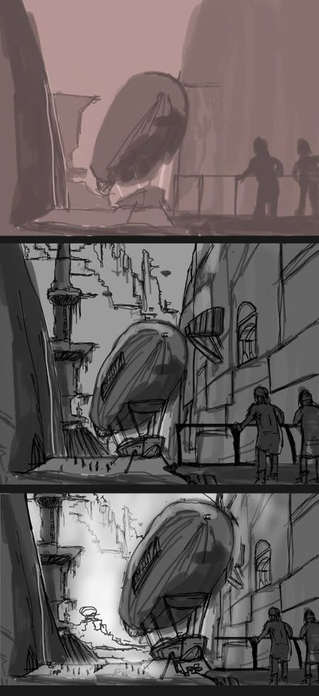 So I tried sketching the overall concept. It was going to be a science-fantasy type setting, with impossibly huge towers filling the sky, with scientific towers and shopping districts and crap. The lower and mid levels are for the burgeoning masses. Yeah, yeah - you've heard this before. But hey, if you ask me, nothing beats the ol' classic juxtaposition of poor and rich elements. Now that I think about it... The Frank Herbert quote may have something to do with this after all.
HAHAHAHA. How pretentious. Forget I mentioned it. I began this painting with "value"/balance checking - to see if there was harmony in the thumbnail...
Note that on the three image above, there are "two versions" of the line-art images. I figured that the bridge where the blimp lands was too short on the middle image, so I decided to expand it. I also increased the size of the blimp so it would be a focal point or something. But then, I took a closer look at both versions... And somehow, I felt that I liked the middle one more! It conveyed the vertical cramp-ness that I liked.
 I began adding coloring. The difficulty lay on the fact that the my line art sucked ass. It was too sketchy, so I had to think of a way to hide it. Easier said that done, as you can very well see. Why? Why?? This foolishness has gone long enough...
 The final product is uh... Ah what the heck. I say its a good first attempt, after not having painted in a while. It's got a million problems in it, but I'm happy. As an exercise, its kinda worthless because I knew what my faults were already, and I failed to act on em'. But this is still pretty good in conveying the idea I wanted for a setting in a sci-fantasy story. Yeah... I wonder if I make a story about this girl that lives in this place as a uh... uh... a window washer for the rich folks?? And she uh... she lives in this particular district where a lot of poor people live... Yeah! And the story will be about her life in this impossibly fantastic setting. The aim of the story is to disgust you in its filth. Yeah!
Forget it.
Well, like my art or hate it, go and watch this classic cult 'toon from the 80's. It's Heavy Metal, that's what it is. Try coming up with stories starring jerks like that!
 During the lifetime of this blog, I’m pretty sure I’ve blabbed about the so-called “Science-Fiction Troopers” phenomena for a while now. Its enduring status throughout the decades reached a fever pitch with (at the time of this writing) the release of videogames based on original properties like Halo, Killzone, Starcraft, Doom, Mass Effect, Armies of the Southern Cross, Gears of War, Quake, Crysis and Unreal, and popular licensed franchises like Starwars (Republic Commando, Dark Troopers), Battletech (Elementals) and Warhammer 40k.

 I always liked the idea of the “Science-Fiction Troopers” and its cousin, the Space Marines. Wikipedia describes these cowboys (and girls) as “…fictional soldiers that operate in outer space. Space marines are common in military science fiction-themed action movies and action games. Historical marines fulfil amphibious roles: ship defence, landing parties, and general high-mobility deployments. By extension, space marines defend spaceships, land on planets and satellites, and deployments that require rapid deployment throughout space.”
My thoughts:
Anybody who knows his or her science fiction knows all this crap. But since I have an almost nonexistent audience, I am under the belief that all this redundant data is for my viewing pleasure only (*rolls eyes* - Void™). Anyway, to fully understand these space jockeys, I’ll have to consult with good ol’ Wikipedia again.
Wikipedia:
“Heinlein's Starship Troopers is considered the defining work for the concept; for example, the actors playing the Colonial Marines in Aliens were required to read Starship Troopers as part of their training prior to filming.”
My thoughts:
I guess that’s my cue to pick up that Heinlein classic. I’ve seen it just sittin’ on that damn shelf, along with that ‘Ender’ series of books I also promised on reading. Or maybe even that Warhammer 40k ‘Horus Heresy’ series of books. At the time of this writing, I’ve only read a bit of Frank Herbert’s Dune series. I’m currently wondering whether I should discontinue reading the Starwars: New Jedi Order series of books… But damnit! As old and un-Starwars-like as this series is, I can’t seem to put em’ down! It’s just like that last time I got hooked on reading those (*gulp*) Starcraft novel tie-ins! I should be spending my time reading the classics!!
Wikipedia:
“Marines are usually equipped with a science fiction assault rifle, similar to a modern firearm only superior in some manner, or some form of fictional man portable laser rifle. Fireteams often include an automatic rifle, such as the M56 Smart Gun. Flamethrowers may be deployed against aliens with a susceptibility to fire. Sniper rifles are seen more rarely.
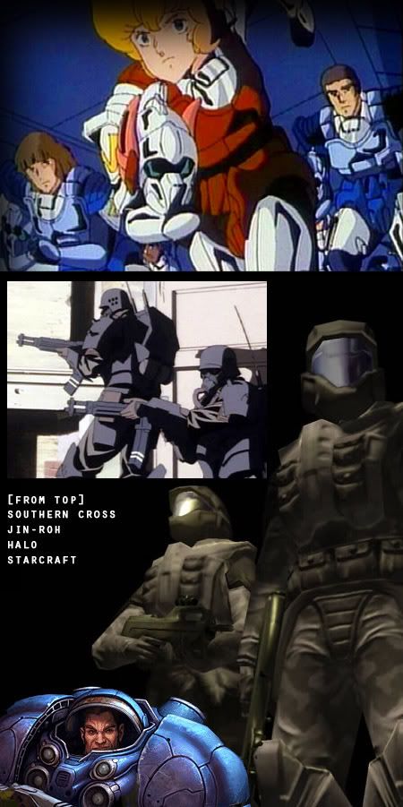 Clothing ranges from spacesuits and powered exoskeletons to battledress similar to that worn by contemporary armed forces.”
My thoughts:
So this is what I wanna talk about today. I want to design my own Science Fiction Trooper. Unfortunately, just about every interesting design / combo has been used up! With thousands of extremely talented artists trying to find their voice in this competitive art industry, it’s impossible to claim something as new anymore. Xavier Marquis stated that the secret was to take elements you loved about something, and craft it as your own. Leaving a personal mark is what’s going to set you apart (I’ve said this before, but its hard not to repeat myself all the time)
I’m going to try and study these types of designs I’ve encoutered in my short lifespan - There are only three types I've seen so far.
- Stocky, heavily stylized Marine Type -
Gears of War, Starcraft, Warhammer 40K, Unreal franchise, Fallout
- Lightly armored, heavily armed troopers -
Starship Troopers (Movie), Aliens, Halo, Troopers, Armies of the Southern Cross, Halo
- Inspired by World War 2 or other real-world conflicts -
Killzone, Resistance: Fall of Man
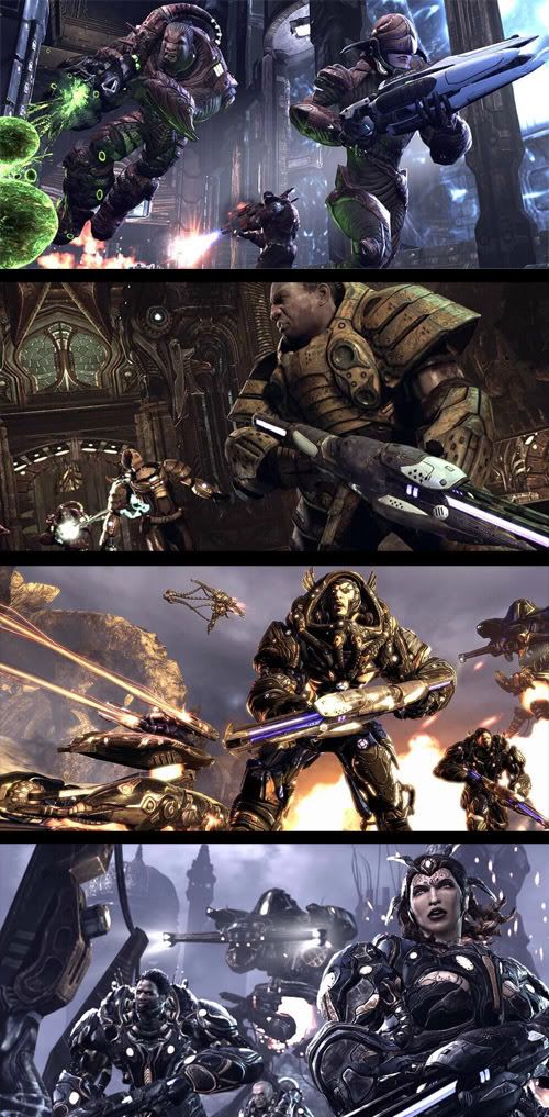
For this short post, I will be looking at concept images from game franchises such as Gears of War, Unreal, and Starwars, and trying to figure out what makes a these designs work… or I would just praise the designer to no end.
 A common reference professional designers use (maybe not only for this project) are Japanese Samurai armor, medieval knights and insects. The metallic cross-hatching patterns and sometimes organic-look of some of these designs leads me to wonder what other things would be great as reference material.
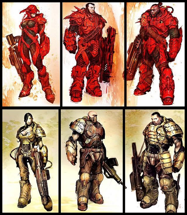 Elaborate body tattoos and exposed private parts have also been design mainstays for the Science Fiction marine. Unreal’s designs applied some of these conventions, though honestly, it’s all pretty tame compared to other properties I’ve seen. The ‘Flesh Factor’ or the amount of skin exposed isn’t high enough to make people wonder… “Why?”
 The boys from Lucas provided some visually interesting twists with the regular Stormtrooper and Clonetrooper. It’s great how the expanded color palette has allowed designers to transform these classic designs and come up with bold new coor schemes.
 The addition of high-tech equipment, complex utility belts and ‘battered armor look’ definitely brings something new and exciting to the table. The days of super-sleek, almost dull designs are long gone.
 And this ends another very interesting (at least to me, I don't know about you, Void) look at my favorite artistic fodder. Now, how do I apply these lessons?? Grrr! It's one thing to scrutinize someone's work, its an entirely different matter to step into their shoes and try it yourself! Ah, but that's the beauty of of this hobby/passion, because practice makes perfect! Har har har har! Shutting up.
Well, to close out this media-heavy topic, I think I'll... umm... How about... a space battle! I'd show a Space Marine cutscene thing, but I thought I'd rather have this old yet cool video on my humble blog.
There was a time when I never cared for comic books. I somehow felt the whole comic book thing was a lowly kind of art form, not worthy of mainstream attention. I also never understood the whole Marvel and DC superhero culture and stuff. That perspective changed as time went by… In 2005, curiosity got the better of me and I started sifting through a bunch of old comic books. I ended up buying a couple of issue. What’s odd was that I didn’t start with the comic classics of Marvel or DC… No, I began by picking up these comic book tie-ins for a 1980’s series called Robotech. Damn, they were lousy! The art and story of these tie-ins were pretty pathetic (most tie-ins are, as I later learned). However, they did manage to instill in me a… sense curiosity about the medium.
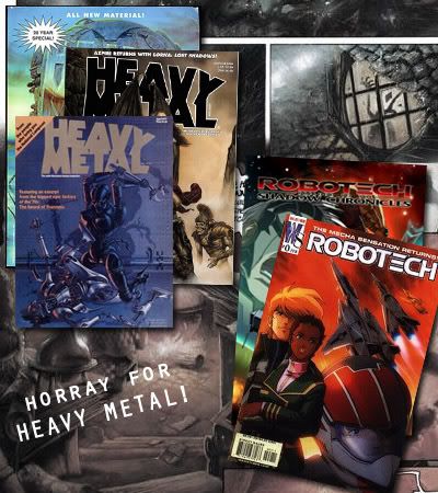 This is when I realized that 'tie-ins' are more often
than not, uninspired, forgettable, or just plain bad (Well, duh)
I also learned European comics are really weird
By 2006, I began picking up this Heavy Metal "adult" comics. While they were pretty cool, with naked chicks with big guns and gratuitous violence in each page, I always felt the stories were a little… out there. (I guess it’s because they’re European) That’s when someone recommended to me a comic by some hairy dude named Alan Moore. It’s called Watchmen. It was then that my myopic view of comics changed. I didn’t exactly rush to the store to by all the Neil Gaiman, Frank Miller and Alan Moore stuff, but it really made me respect the medium a hell of a lot more. (odd though that these guys I mentioned also makes stories that are pretty out there)
Familiarizing myself with the medium…
To truly understand something, you’ve got to try it out. Therefore despite my genuine lack of artistic skill, I decided to learn a bit more on how to construct a good comic book. I began wondering “What does it take for a shmuck like me to make something cool?” I also weighed in the possibility of some kind of profound learning I could derive from doin’ this thing. Will pursuing comics make me a better artist? What are the skills one needs to be a good comic artist?
 I searched ConceptArt.org’s forums for an answer to this question (I am aware of the millions of tutorials on this subject). I managed to stumble upon this topic about how comic books could be the ultimate test for an artist.
A member by the name of Famedragon began the topic:
Well not the ultimate test for an artist, but working on a comic book really does require the artist to use everything he's learned in art and observed in life. He/she practically has to be able to draw the human body in any conceivable pose (and the faces with myriad emotions), from any conceivable angle (I'd rejoice the day I reach that stage!).
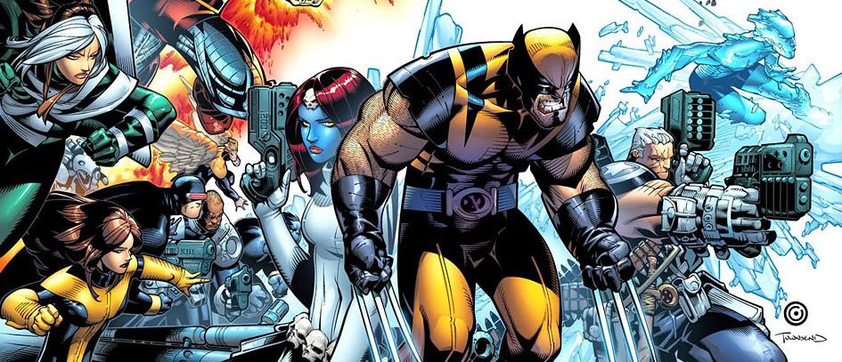 I read Marvel: Civil War in a friend's house. It was the first time I've read a Marvel
comic in a long time. I always feared new Marvel comics wouldn't be "user-friendly". Good thing I still remembered the cartoon... Who the heck is Emma Frost?? Who are these Runaways?! Was Iron Man really like this? Well, at least after reading the damn thing, I was more familiar with the universe and crap
He has to be able to many different items as well (though usually weapons), and the scenery/backgrounds! They have to be done detailed enough that you actually feel as if you are inside that world. Especially things like drawing regular people in the background going on about their life.
Most of these have to come from imagination, as the script only goes so far (that UDON Street Fighter issue that is all pencils and shows you the exact script really gives insight). You have to have good composition, cropping, perspective, and other different art techniques such as speed lines for each panel so as to convey the story the best to the reader.
You really have to mentally record everything you've encountered in life. And you have to do all these things about 100 times (4-5 panels for about 20 pages)! That's why I feel each panel can stand on its own as a piece of art. I remember seeing an interview where the artist said that this one panel alone took 25 hours! I think Jim Lee said it best when he said it's like a movie, except the artist is the camera man, the props guy, the lighting crew, the one who picks out the outfits...
Bowlin replies
I agree with you Flamedragon! If only the general public didn't look down on comics, often referring it to something childish, it'd still be thriving. What get's me is that most adults will look down on you if you mention your favorite movies are ones made from comics. Even though they went to see them for themselves and probably bought them, most people won't admit it. Lord of the Rings won most academy awards, grossed an unreal amount of money.... but yet, your still a nerd if you even mention you liked it.
My thoughts:
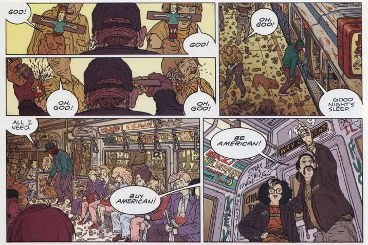
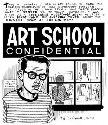
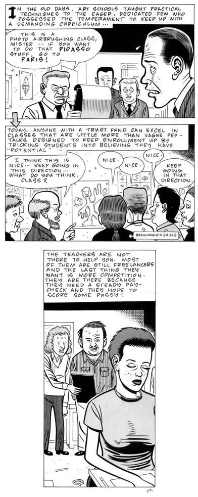
Yeah. what he said... Well, at least now, I know a bit more about what I need to make my own comic. If that ever happens. Damn work. I leave you with the continuation of 'Art School Confidential' - a comic which pokes fun at the pretentiousness of art school!
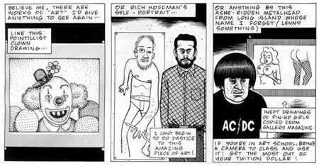 Click on images to get a better view
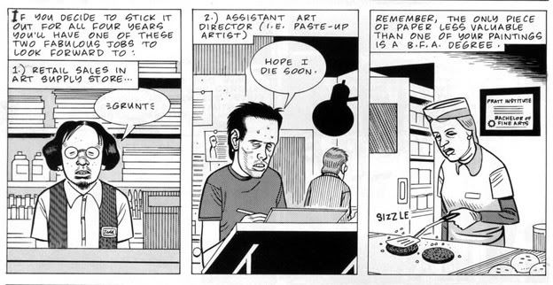
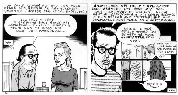 According to the comic, you could end up being retail sales guy, a paste-up artist, or a person flipping burgers. A good friend of mine ended up being a paste-up artist for some local newspaper.
I have never enrolled to any licensed ‘Art School’. That short weekly class during high school doesn't count. I honestly haven’t the slightest clue how to teach myself art – properly.
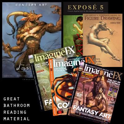
I've composed a short list of books that I’ve bought over the years that I’ve used in my so-called 'Art Education':
Basic Composition
Drawing Realistic Figures
ImagineFX magazines
Various “Learn How To Draw” books
Inspirational material:
Ballistic Publishing
Expose Four, Five
The Art of Videogames
Heavy Metal magazines
Various Hayao Miyazaki artbooks
These books are great, no question about that. However, there were times when I wondered whether I should’ve blown my cash in getting a real art education / degree. I mean, wouldn’t it be great to have a real knowledge about art history, philosophy, proper design and all that jazz? Being self-taught is fun, but it will only get you so far. That’s how I’ve come to understand things. There’s a serious lack of guidance, despite reading all these great advice.
So I was scouring the net to get an idea of what they teach in real art classes. You know, getting to know about those theories and whatever pretentious crap they’ve teach. That’s when I saw this old post on Conceptart.org, where this art professor was asking forum goers for critique about an essay he was planning to hand out to his students. This professor came with good intentions – to explain to his students his philosophy on art, as well as an overview of his upcoming lessons.
His original speech was around five or six paragraphs long (He has since updated it), but I will post his original un-edited version. This is so you can see how this Professor’s art class would’ve turn out if he had gone through with showing students his raw ‘masterpiece’.
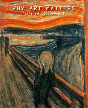 ”Before explaining my philosophy on art education, I feel I should discuss what I believe art is and why art matters, for those who study it and the world in general. As an artist, I see the importance of art every day, but I know that not everyone sees the world as I do. I define art as any means of communication between the maker and viewer, which has been thoughtfully and carefully designed and executed. Art can be a painting, a book, a movie, a song, etc. Every work of art has something to say, whether it is a historical photo, a novel, or a simple shard of pottery. Now, you might look at a piece of pottery, see a bit of decoration, and think nothing of it. But, as Jared Diamond notes in his book Guns, Germs, & Steel, with a trained eye, you would know where it was made, when, which culture made it, when they arrived in that location, where they came from, and something of their religious beliefs, icons, society, wealth, and level of technology. Every work of art holds a wealth of information about the person who made it, and the culture and time period the person came from. More importantly, for many past cultures, their artwork constitutes the only clue as to how they lived and what they believed.
I believe that art education has the same goal as other educational fields, which is primarily to develop skills that students can use throughout their lives, in college, in professions, and on their own. For me, the main question of art education is what skills should be taught? What skills are most beneficial for young artists today? Unlike some other subjects, art making encompasses not one skill or body of knowledge, but rather an endless list of related skills that build off each other. These skills include drawing, painting, photography, ceramics, computer graphics, animation, film & video, architecture, and many others. Although these abilities may not seem related, any artist will tell you that mastering one will influence all your work in the others. This is because working in one medium, say printmaking, will lead an artist to different kinds of lines than they would make by drawing with charcoal, and might result in this artist trying new kinds of line with charcoal, or pencil, or later in Photoshop, or jewelry making.
I believe the most appropriate skills to teach beginning students are drawing from observation, sculpting from observation, studying human anatomy, and mastering the intricacies of color theory, all the while incorporating art history, criticism, art theory, aesthetics, reading, writing, vocabulary, and research. I consider these four skills most important because they will enhance the work produced in all other arts. Anatomy alone allows for art involving people, portraits, illustrations, etc. Even if a student decides he/she wants to go on to make art unrelated to the figure, the familiarity he will gain with the materials, and the precision she will develop to perceive shape, size, proportion, and color will allow the artist to pursue any and all future projects. Ultimately, all the different fields of art are all founded on the same aesthetic principles of composition, emphasis, balance, rhythm, pattern, contrast, juxtaposition, color, etc, and by having students work in a variety of mediums, they will gain a greater sense of what these aesthetic principles mean. Also, as Phillip Dunn explains in his book Creating Curriculum in Art, from the NAEA Point of View series, these four artistic abilities also develop certain cognitive skills such as visual communication, visual literacy, speech and debate, hands-on learning, longitudinal thinking, problem solving, and making qualitative evaluations through critique and self-assessment.
 I believe that any art course should first focus on developing students’ skills. In any beginning art class, there will be students of varying development and ability. Most will need to go through a series of technical exercises before they will be ready to try real projects. It is crucial with each skill set to break down the difficult concepts into short, manageable, learning activities for students to complete – and that students can complete. Giving them a weighty project on the first day that they feel they cannot do, will only bog down the class and erode students’ confidence, and I have seen this happen in other teachers’ classrooms. It is also important for students to know the difference between a work of art and an exercise. A work of art is a means of self-expression. So long as the work truly communicates what the artist intends, it cannot be wrong. It becomes infallible. It also cannot be marked over, as that would infringe the voice of the artist. When student work becomes art, it is therefore difficult to criticize and correct, and for students to open their minds to what they might learn from their teacher.
A technical exercise, on the other hand, is not about self-expression, but rather is a test to see whether a student can do a certain task, such as a realistic still life drawing, with objects chosen by a teacher solely for their educational value. In a technical exercise, it is not so important what students make as what they learn from what they make. These studies are like scales in music. A musician would never perform a scale before an audience, but must practice them every day to improve the real pieces. Given enough exercises, students in any art subject will feel confident, and be knowledgeable enough to begin real art projects of their choosing. When, on the other hand, an art teacher expects students to complete excellent drawings in the first assignment, and will not let students move on until they are excellent, this is like expecting a beginning musician to pick up a violin and play a Brahms concerto on the first try. It is an unreal expectation that creates a gap between student and teacher, and leads some students to doubt if the subject is right for them.
Art is ultimately a means of communication, and some thought must be put into what students are saying through their art. Beginning students should be introduced to art-related topics and concepts to debate, such as, what is art? Is art something you make for others or yourself? How do you know when a work of art is finished? Why make art, anyway – what makes it important? If a student goes on to become a professional artist, these questions will come up again and again, and any artist must be able to respond to them intelligently, and articulately. It is not enough to know how to make art, one must be able to talk about it. I believe any art class should cover these types of questions – but always allowing students to come up with their own answers. I have seen classes where teachers try to force their views on students to make the work meaningful, and almost always to a negative result. The work no longer belongs to the students, who constantly check and change their work to what their teacher wants. What these teachers need to learn is that their students do not have to make one large body of connected work, all centering on a theme chosen by the
 teacher. Who cares if it makes a more cohesive exhibit? The primary focus of art education is not to show exhibits, but to teach skills students can use in future work. All a teacher needs to do is know each individual student, and figure out what they are really interested in doing, that they would benefit by doing.
All art courses must allow for students to say something of their choice, throughout their educational experience. A crucial role of the art teacher is to motivate their students, finding subjects and issues that inspire them, when their own inspiration is lacking. For me it is not important that students make any particular kind of art, but rather that their senses are refined enough to truly create what they want. A student might have a fascination with motorcycles, and by allowing that student to make art about motorcycles, he will work harder than he ever has in his life, make incredible work, and have a portfolio piece for college. Motorcycles might not be intellectual, or linked directly to politics, ethics, etc, but I hesitate to tell any student that their passion is unacceptable in my classroom. My ultimate goal as a teacher is that students will want to take what they have learned in my classes and go on to make great art and continue to study the arts throughout their lives.”
My thoughts:
Huh? Where am I? Damn! I dozed off! Did you honestly read that? Crap! If real art class was this boring, I’ll stick to my books thank you! But as long as ol’ ‘War and Peace’ is here, I might as well show you what a certain Kev Ferrera said about this overlong art class-grade stuff meant to him.
 Kev Ferrera:
As far as your philosophy goes... You either need to go deeper or more general.
In your first paragraph you seem to indicate that Art only has value as historical or autobiographical artifact. Then you don't explain why such characteristics have value themselves. Yeah, it tells about the time period it was made. It tells a bit about the guy who made it. But why is that important? This question will lead you deeper.
"Art is a designed communication" - Does that make journalism art? What about the use of accidents?
"Every work of art has something to say" - Rhetoric. Define your terms.
You say "I believe the most appropriate skills to teach beginning students are drawing from observation, sculpting from observation, studying human anatomy, and mastering the intricacies of color theory,"
Since these are all technical matters, i must disagree. One of the fundamental things about observation based art is the synthesizing of Content and Aesthetics. Thus, it seems to me, these elements should be taught side by side. How can you even place a figure on paper without some discussion of design? Art is a gestalt mechanism, and it should be taught that way from the start, IMHO.
You write: "A work of art is a means of self-expression. So long as the work truly communicates what the artist intends, it cannot be wrong. It becomes infallible. It also cannot be marked over, as that would infringe the voice of the artist. When student work becomes art, it is therefore difficult to criticize and correct, and for students to open their minds to what they might learn from their teacher."
You don't explain that you are setting up a comparison in this section. You are making implied comparisons between the relative merits of having the students learn by making art for your critique or learn by making studies for your critique. But I didn't figure this out until I began re-reading your paragraphs. You should use "on the other hand" or "conversely" to begin the next paragraph, so we know you are setting up some comparison that demonstrates your superior teaching philosophy versus the straw man explained earlier.
My thoughts:
So good ol’ Kev eviscerates this Professor’s good intentions. Ah well, those are the strokes. Was it really a mistake to talk about art like this? Are my blog posts falling into these traps? I don’t know! I don’t care! Not all of us can be a Kev Ferrera!
Speaking of which, Kev decides to end his criticism on a positive note:
 Kev Ferrera:
”Personally, I think this idea of your is horrendous. We learn what we practice. If we practice making art, that is what we learn how to do. If we make studies, we learn how to make studies. It seems you have found a rationale for not getting little Kimmy's panties in a bunch by subjecting her to serious art criticism. In this age of simpering PC aggrievement relativist bullshit, I guess I understand your fear.
But you can sidestep this whole percieved problem by simply switching back and forth between study and art making. And you can crit their previous art works, through current studies... with the hope that they will figure things out for themselves. ie. Have them do a portrait... then have them do some studies of facial muscles and bone structure and the masses of the head... and then have them do another portrait. And then you can compare their successful studies with their unsuccessful portraits. So, in effect, they crit themselves.
Anyway... I'll leave it there.”
My thoughts:
Well, call me a Tommunist! This is great idea for lesson plan! Taking up art education in some college seems irrelevant now! I’m starting to think it’s my lack of commitment that makes me end up in these stupid dilemmas. Why, oh why?? I could give you all the excuses in the world on this lack of passion that I’ve been feeling (at the time of this writing). My drive for art has slowed down significantly since the beginning of the year. Could it be these goddamn 8am-6pm work hours? Is my lousy routine of my life is zapping my passion?
MMG: Who? Who is that?
Voice: I AM ZOR.
MMG: Zor? Like that guy from Robotech?
Zor: SHUT UP, YOU WHINY BITCH! STOP DWELLING IN USELESS ARTISTIC DILLEMAS SUCH AS THIS!
MMG: What… but what would you h—ha-have me do? This… This is a blog you know. And I like to dwell on cra—
Zor: SILENCE! ARE YOU AN ARTIST WHO BLOGS, OR A BLOGGER WHO POSES AS AN ARTIST?
MMG: I-I don’t know. I-I-I like to blog and all, but talk about artistic stuff in the process! Isn’t that good? I guess that makes me you know… an artist that well… blogs!
Zor: IF THAT IS SO, THEN WHY DO YOU CONSTANTLY BITCH TO THE VOID™ ABOUT THESE THINGS? YOU SPEND MORE TIME BLOGGING THAN MAKING GREAT ART. YOU ARE A HACK! YOU ARE NOT AN ARTIST! NEVER WAS, NEVER WILL BE.
MMG: No… noooooo… that’s impossible…
Zor: SEARCH YOUR FEELINGS, YOU HACK.
MMG: Aaaaaaaaaaaaaaaaaaaaaaah!
StudioMMG’s Concept Den apologizes for these turn of events. We also wish to apologize for those who failed to see any point in this post. To make up for this foolishness, I wish to present 'Art School Confidential'. A comic that is sort of related with what was discussed today. I will be posting this short series bit by bit, when the post calls for it.
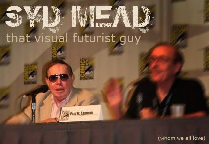 Beginning today, I’m going to jumpstart a short series of posts based on the life, art, and philosophies of the infamous ‘Visual Futurist’ – Syd Mead.
And here I thought the “Peter Chung Special” series of posts was tough to write due to the wealth of material written about him! It would appear that writing about Syd Mead would be a much more difficult challenge. Why? Because possessing a much larger body of work, it’s hard to actually talk about good ol’ Mr. Mead. His works can render you speechless at times... but more on that later.
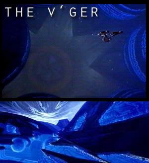 Star Trek: The Motion Picure. That thingy on the top is the alien
designed by Mr. Mead
 Tron still looks pretty... nifty now, but
the image of Jay Maynard a.k.a. the "Tron Guy"
will forever look like crap.
Ah, how does one get to know good ol' Mr. Mead? Why, through his film projects! We’re talking about the guy who designed the V'ger entity for Star Trek: The Motion Picture. He’s also the man who played a role in fleshing out what “Virtual Reality” looked like in that 80’s flop “TRON”!
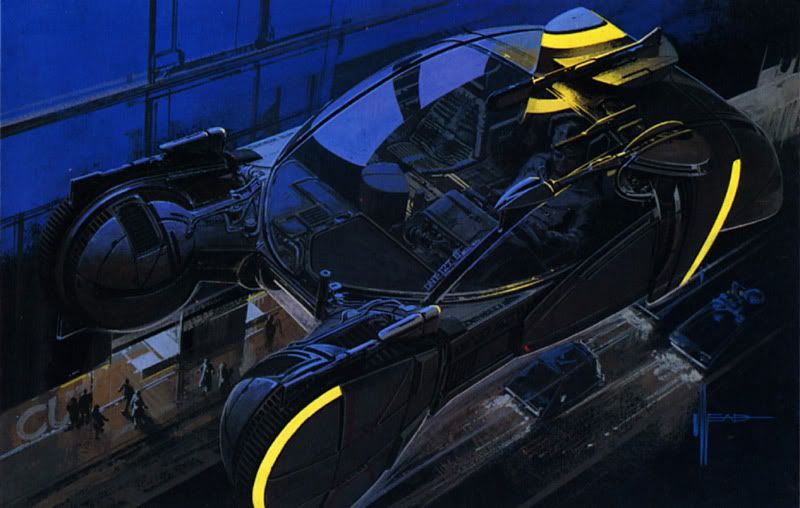
 But it was really Mr. Mead’s involvement in Ridley Scott’s cult-classic, Blade Runner, where the visual artist’s career took off. He followed that up by contributing some stuff on the 1980’s James Cameron’s Aliens ‘flick’. C’mon! Does any of this ring a bell??
Of course it does. I also assume you know this guy more than I do. (All this info came from older Syd Mead articles) But we’re not here to talk about what you know about Syd Mead. We’re here to talk about what I know and have researched about the guy. Okay? Sheesh!
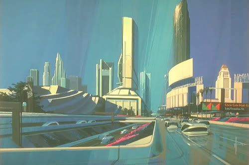
Now I could say that Mr. Mead influenced a generation of artists with his work both in Hollywood and in concept design. I could also say that he’s the most prolific and renowned concept artist of our time. But I won’t... for the moment at least. Let the Man’s work speak for itself.
According to an article on ThePlace.com, it spoke in detail (and with a far more eloquent use of the English language) how Syd Mean developed his artistic philosophy.
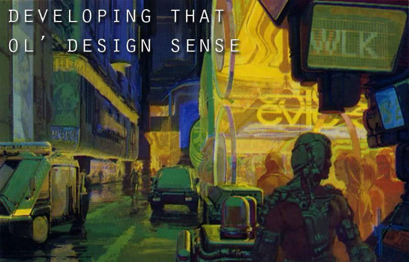 The article fascinated me because it spoke of how this Mead ArtistGuy (wow!) achieved his boundless creativity. It insinuated that growing up in a big, crowded and over-commercialized cities tended to stymie a child’s creativity. The hustle and bustle of city living somehow manages to spoil their young minds because all the “answers” were there. There was no ‘design’ dilemma, so to speak.
Mr. Mead however, grew up in a quaint rural-ish town, where the vastness of the country managed to cultivate the young boy’s imagination. It alleged that he spent days on end imagining, drawing and conjuring up fantastical images in his spare time.
According to an interview with Ballistic Publishing, Mr. Mead began as early as age six constructing scenario with perspective. Imagine that! A kid drawing scenes with vanishing points and all that jazz! By high school, Mr. Mead could draft the human figure and animal figures very accurately. He 'sold' his first artwork in fifth grade, and so on and so forth. He later worked for Ford, then went on to form his own design company.
Here’s my history with art. By 20, I can draw skinny anime chicks that look like a 15 year old drew them. By 21, I felt more confident in drafting big set pieces, but the perspective was awful and it hardly utilized the basic elements of art. Now that I’m 22, I have come to the conclusion that I may never reach the skills of Syd Mead. Or Peter Chung for that matter. Drat!
Buck Rogers and Flash Gordon stories influenced young Mr. Mead. The sleek, stark designs supposedly made quite an impression on the young lad. In fact, traces could probably be seen in some of his work today.
 Chelsey Bonestell, who worked on the 1940’s classic “Citizen Kane” and on the first paintings that captured a realistic moon and Earth, and John Berkley, a renowned commercial artist, were a couple of old school science fiction artist that also made an impact on the young Mr. Mead. (all these were referenced from BladeZone) I’m sure Mr. Mead had a ton of other influences in his youth, but I won’t talk about that anymore. Bleah!
He worked for various companies since then, and I’m honestly not really in any mood to elaborate on them. It’s just that by the 1970’s, good ol’ Mr. Mead began designing stuff for Hollywood. All the while, he designed a lot of other stuff for theme parks, hotels. That kind of stuff. Stuff I hope to ‘cover’ in a future post.
Basics on Design
While Mr. Mead’s beginnings seemed almost ideal for him to become whatever he is today, it was also attributed to plain ol’ hard work. What? Did you think Mr. Mead became what he is today through sheer brilliance and talent? Well… maybe that helped. I mean, you can like train to be a good artist, but there’s a fine line to be a really great one. Anyway, forgive me for this senseless babble.
So while I hype up this Mr. Mead fellow, you might wonder what makes him unique? You might be saying right now, "This guy's art sucks! All the colors are washed out! His designs look out of date!" If you asked this very question, then you don't know Mead. Why has his work inspired so many artists until this very day? Is it because he draws women in thongs and various skimpy outfits? No! He's more than that!
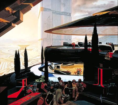 What really has set Syd Mead from the rest has always been his ability to make the fantastic look possible. Mr. Mead definitely brings concept designing to another level.
Rather than rely on practical and real-life based designs, Mr. Mead approaches his work with vivid, almost surreal shapes and colors, and yet you feel like you could actually live there. (hence the ‘Futurist’ title) Many have said that this is what it should mean to be a true “Creative Designer”.
 Of course, it helped that Mr. Mead was eduted in industrial design (both consumer product and transportation) In an interview by Illusion TV, Mr. Mead said, “I learned rotational and volumetric rationale. The trick is to create something absolutely startling (that's the end goal) that is recognizable for what it is, and that it looks like it would actually 'work' within the parameters of the technological world in which it exists, even if it is only a picture.”
My thoughts:
Wow.
Syd Mead: “If you understand mechanical design, you can 'overlay' a mechanical rational onto anything you come up with and people will see it and say to themselves' ‘hell, that looks like it would work that way.’”
My thoughts:
So none of that crazy Starwars fantasy claptrap? No over-the-top Flash Gordon-esque designs? (duh.)
Syd Mead: ”If left to my own curious devices, I first am usually inspired by a techno-article, a new investigation into some weird technological experiment or development. I then match that to a made up story of my own and come up with a visualized combination.”
 My thoughts:
Why do these ultra-gifted artists always use very ‘duh’ philosophies behind their extraordinarily beautiful work? They always make em’ sound so profound and crap! Gah!
And so ends my first post regarding the great Syd Mead. I hope this has inspired you to take up your pencils or tablets, and start drawing something out of this world! If it hasn’t, then you're either not in the mood to draw, or I am simply talking to a Void. A Void which refuses to provide feedback and suggestions.
In any case, I could show you right now that five-minute preview of some old film about the life of Syd Mead. I could, but seeing as everybody who's written about Mr. Mead has already done that, I think I'll show something different... So how about this, a short battle sequence for a 2004 Korean film called Natural City? It's directed by Byung-chun Min, and I haven't heard about it until today.
This clip seems to be about these Troopers getting clobbered by a cheesy looking baddie that ran amok (It's in Korean, damnit!). B-movie sci-fi at its best!
