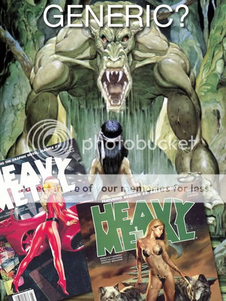
While it's been a while since I've posted on this blog, I managed to stumble on a topic at ConceptArt.org that demanded my attention... Yes, it's everybody's favorite topic - the cliches of science fiction and fantasy art!
 The topic today is brought to you by J Wilson. He asked:
"which design elements in sci-fi/fantasy art are you just sick of seeing? Or at least want to see someone do a new take on it if they are going to do it?"
It's not that he hates all these generic ideas! On the contrary, these so-called generic ideas are a great starting point to create something inspired, possibly original even! But as J Wilson pointed out, he's "...just tired of seeing them as "go to" design elements, showing a certain lack of real inspiration. They can be done well, and done in an exciting way, but 90% of the time if I see those elements I groan and kind of roll my eyes."
So, what designs are people tired of seeing? Let's see what the good people of the forum have to say:
J Wilson goes first, declaring :
"I'm getting tired of seeing generic looking gun arms. Or the one big powerful arm. Tribal tattoos. Forest or jungle scene with large stone heads overgrown by the jungle."
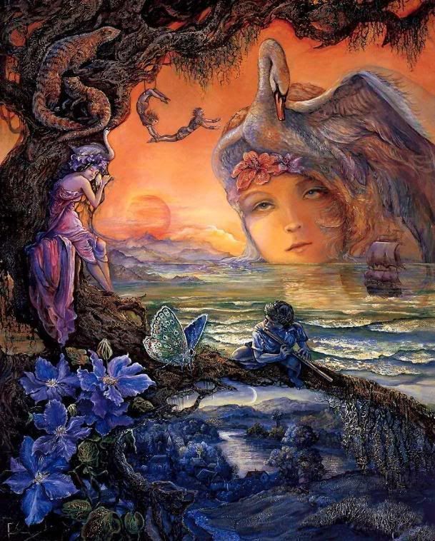 Young, impressionable artists such as myself can't resist recycling old favorites in their respective genres... Are we really bankrupt creatively?
Flake, another discerning member of the board, throws in his thoughts:
- Giant Space Boots
- Swords 8 feet longer than the user / hand held artillery
- Bikini armor / Stealthy ninja chicks in heels.
I don't get his second one, really... Did this whole 'sword bigger than the user' trend begin with Final Fantasy? I'm not too familiar with this enduring trend in young artist's design. Never really liked it actually.
Massively over sized boobies...
Rob Liefield cliches
Scantily Clad Women in snow (I am guilty of that one myself)...
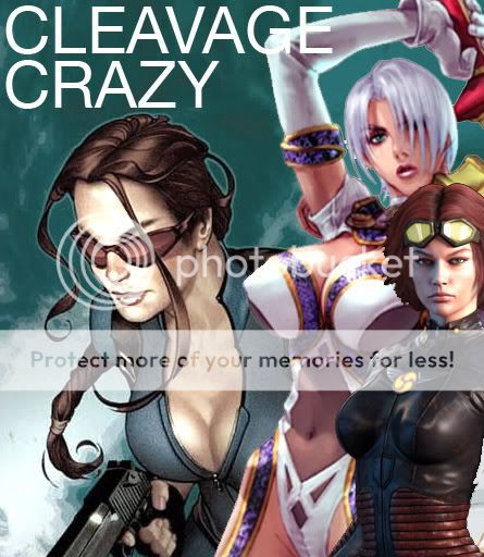 Thank you, professional concept artists of old, for giving the public what they want in the first place, but somehow in retrospect seem to regret...
Mirana declares her annoyances:
Most clothing choices for gals, usually a variation of the bikini or a plug suit (Damn you, anime shows like Evangelion! -ed) Laaaaaaaaame. I'd also like to see variety in body types of women AND men.
Amaranth goes straight to the point:
"Female supermodel soldiers. I highly doubt Paris Hilton or a female with double Z breasts can wield a huge sword or gun in full-fledged combat even though they look good. If functionality and looks are both considered, they could at least look like Gina Carano. Of course, I can't say I am absolutely sick of this, just slightly annoyed."
...Bikini armour. This one I'm sick of. It looks good but I think it's too much of a "go-to" design to make females in armour look good, not to mention it completely sacrifices any functional purposes. How is it hard for anybody to just slash the stomach area of the female?"
Zirngibism comes up with a perfectly worded rant:
- That same old floating city where underneath the city is sort of a long upside-down mountain of earth. Yeah it's been done in some popular video games, and yeah it's kind of a cool concept, but aren't there other ways to make floating cities without that giant mountain of dirt under them? How about spheres with their own gravity and the city radiating around them? How about floating water instead of earth with steel "bubbles" inside as the buildings?
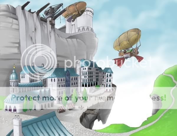 Epic, right? Blimps? City from Lord of the Rings? Floating rocks? Mix all together and what do you get? I'd rather not say...
- Desolated, bombed-out post-apocalyptic cities
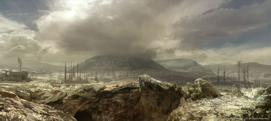 Post-Apocalyptia done right with the 'Fallout' game franchise. Great concept work can be found here.
- Jetsons-style cities (I really love futuristic cities in illustration, and they're my favorite when approached originally.) I feel like a hypocrite because so many cities are in my deviantArt favorites folder, but hey...
- Big blobby monsters with arms coming out of their stomachs, possibly plants growing out in random places, with flabby sagging bits. I've seen some really awesome drawings of these, but the concept itself is getting old to me.
- Gunners with visored masks.
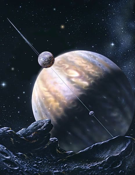
- Most Space Art... you know, often-desktop art where two planets are colliding and there's all this swirly stuff from brushes people downloaded from deviantArt... It all looks the same. Sure space is cool, but not that kind of art when it's all the same. It's like Thomas Kinkade, just in space. Go to dA, you'll see what I mean.
 Spider mechs (one of Masamune Shirow's favorite design fallbacks), nearly all heavy bipedal mech designs known to man, and much, much more!
- Mech warriors that look like so much like Gundams. Sure, as humans we identify with bipeds. We like stuff that reminds us of us. But that's not really a great design when it comes to machines. Especially when they're SO top-heavy like some of the designs I've seen. How about multiple legs (like that "bigdog" robot they're developing now), or or the use of both wheels and legs?
- Just about 95% of sci/fantasy illustration I see features people ages 18-25. Sure, I understand why this is. We don't usually see 60-year-olds fighting battles and what not (unless they're a male wizard, often cliched). But in a place and time where magic or technology play a key role, I would think people could transcend the limits of age. By the way,I think older people are awesome, there's so much more depth to them. I plan to try to feature them in my own illustrations. I guess the audience of such art tends to be in the younger range and identify with younger characters... but still.
- Little children interacting with large, ugly monsters in friendly gestures, like they're a friend. The child might be giving something to the monster or touching it. It's a neat concept and I've seen some great work portraying it, but seeing a lot of the fanboy art using this concept makes it seem a little old now.
- And I've got to agree with everyone about the bikini armor being one of the biggest ones. I don't know, I'm not a guy, but don't you guys get BORED after awhile, even if you're attracted to the girls in that art? Don't they start looking the same to you?
- Tribal Sci-fi. I still think they are cool when done-well, but it's getting kind of generic.
My thoughts:
I can't believe he doesn't like gunners with funky visored masks. It's a good thing for some that the generic cyberpunk era died in the 90's... although a revival could always be around the corner. As for the rest of her statements, I think they're spot on. That's all I can say really. Totally agree with the first statements though, I can't help 'fave' well rendered generic floating city art!
sodAP gives his views on:
- Derivative of the derivative. Some guy who has no idea how real XV century armour looked like, so he draws what he thinks it could have looked like (why research?) and then there's the other guy who has no idea how real XV centruy armour looked like so he bases his work on the work of the first guy. There's the third, fourth, and fifth guys, and then World of Warcraft tier 6 armours appear. Oriental+Occidental. Guys with full plate, a bandana and a katana... facepalm.
PsiBug goes on with his own caveats:
1) a lone timeworn robot standing among the ruins of the civilization that created it. (Wall-E, Laputa)
2) a close-up of an embryonic creature gestating in a bottle of bubbling fluid
3) a skeleton in a space suit... often with an alien weapon or plant sticking out of it
4) an old lady chasing a cat down the street with no bra on (What? -ed)
BrightDreamer has this to say, which is pretty interesting:
- Impractical anatomy: the overly-musclebound barbarian who should go down with his own weight, or the DDD-chest-size woman who thinks she can run, let alone fight, without a bra.
- The Brooder. You know the one. Crushed by the weight of their own soul in a dark and unforgiving universe, they stare darkly inward whilst pondering the void of their reality. They often wear dark capes and/or trenchcoats, sometimes some manner of hat (to cast moody shadows over their moody faces), and most need their hair hacked off, or at least brushed out of their eyes. While I understand that many sci-fi/fantasy characters have good reason to brood, I get sick of watching them do it so incessantly, especially when they seem to pick such impractical places: the edge of an impossibly high skyscraper or craggy, storm-torn cliff, or even in the middle of a gory battlefield.
- The Generic Epic Quest. A gathering of vaguely Tolkien-esque humanoids in a range of sizes and shapes and vaguely medieval outfits travel through a Vast Landscape, more often than not passing Grand Ruins and Soaring Spires. A side-cliche I find overdone is the Generic Epic Quester, someone on some manner of generic epic quest who might as well be on a nature walk for all their posture and expression conveys.
Wickeddiana has thing to say... which I unfortunately agree with *sniff*:
- Pretty much everything from Heavy Metal Magazine. I am totally sick of seeing this. Probably the biggest cliché in erotic fantasy art.
- Ethereal fairy-like females in some kind of magical environment/forest. They are usually very beautiful, almost goddess-like and they are gazing dreamily out into the distance. I have to admit that I am guilty of having done this myself. But I just get really tired of seeing it.
Mr. Kev Ferrera throws his hands down and declares boredom over:
- 96% of the covers to Heavy Metal.
- Post-Apocalyptic Beach Bodies.
- Main figure strikes and holds an iconic yet undramatic pose for the camera.
- Huge swords. Overly pointy armor and helmets.
- Over-rendering of incorrect or meaningless anatomical detail.
- Incorrect cultural references - including no knowledge of the mythology or symbolism used, appearances (vikings didn't wear horned helmets to war), political stereotypes, and especially the use of writing in random ways!
- Making vampires and werewolves mortal enemies. In a folklore sense, they have absolutely nothing to do with each other.
Opillione finally closes out this post with an all-encompassing reply:
"I take the opinion that everything's been done in some form before. It's not what the content is, but how it's executed. "
In Conclusion:
The question now is, how do you create fresher ideas? With every idea known to artists taken and exploited, what is left?? I leave that to you, or maybe to me, if I find the time to make a post about developing new ideas for well worn concepts. In the meantime, I suggest you guys stay away from adding scars over you over your characters eyes. It's been done before, trust me.


