
Since I can't read Japanese, and all I can find are toy-related articles, it seems there's really only so much one can say about the notorious Shunya Yamashita.


Like some of my favorite Heavy Metal artists, all he seems to draw is sexy nymphs.


Sure, he'll draw the occasional big, badass dude, or as you can see above, the nymph with a big gun/hairdryer thing, but that's all part of Mr. Yamashita's appeal.


Finally, you might come across this conservative looking illustration below, with a heading called "rick-o-sound". I'm not sure why Japanese likes naming things like this, but it seems its his personal toyline.


Fung Chin Pang is another one of those talented Chinese illustrators that has developed a nice little niche in the international market. Like Benjamin Zhang Bin and fellow Hong Kong-er Lokman Lam, they draw girls of legal age pretty well. Cute, innocent, vulnerable... Nevermind.

The guy racks up at least a minimum of 100,000 hits per illustration in deviantART. There's nothing that says "You're popular!!!!!" if you get that sort of attention for your work.


I should know. It said on his deviantART profile. Amazing, isn't it? He's also worked on a book entitled "鶯~EROTICA". It depicts pretty, young things wandering around picturesque neighborhoods...


http://cellar-fcp.deviantart.com/gallery/
Oh, I forgot he did concept work for some game studio...

Let's revisit an infamous artist known saucy women with barely-there outfits, twisted anatomy – The one, the classic Hyung Tae-Kim.
Hyung-Tae Kim (born February, 1978, Seoul) is a Korean manhwa artist. He has designed characters for video games such as the Magna Carta series, and the later installments of War of Genesis series. He also's worked on OXIDE series of artbooks.

As a manhwa artist, he specializes in a weird deformation technique where the artist disregards anatomical accuracy to achieve a specific feel to the character. This is an interesting point because this is what makes manhwa, well… manhwa. Honestly, despite my being new to the wide world of anime and manga in general, I have yet to see another artist with the style this guy has.

Hyung has also made some stuff for Udon Studios. Notably for the Street Fighter, "Robot" and the "Apple" artbooks. Pretty slick stuff.

According to a fansite, “Hyung-tae Kim designs his characters with perfect structures, including stylish and dazzling outfits.” The exemplary use of colors helps flesh out his characters well beyond most conventional anime-style artists. Hmm... I did see one of Mr. Kim's art pieces where there was a fat guy...

Kim's body of work has achieve such worldwide acclaim that he was even hired for various art commissions in Japan! Can you imagine that?? An artist so good even the Japanese would take notice!

He’s also done some work in a Ragnarok Online art book. For those unaware what I'm talking about, Ragnarok Online is a game that kick-started the Massively Multiplayer Online Role Playing Game culture in my home country. I actually haven't seen Mr. Kim's art for this game or the book, but despite his familiar style not being in the game per se, the manhwa art-style is still prevalent, from character designs and to the items, etc. I forget to mention the 'muted' color palette that manhwa artists seem to love so much.


Yeah, maybe his art isn’t for everyone. Maybe some of you cynical artists want an artist prefer more... anatomically possible characters, or they just hate the "anime" style. (a term of derision among many artists) I don’t know, whenever I see this guy’s art, I get all inspired. There’s something to this guy’s style that is just surpasses most other anime artists I’ve seen in the past. Seriously!
Anyway, It's time for me to end this post, with a video that might actually be relevant this time! My dear, Void, I leave you with the promo video for Blade and Soul. See for yourself if Mr. Kim's designs were translated well to 3D. Go on! Watch if you have nothing else better to do!

Here's what I know about Geco Hirasawa: She's known as "Hira Geco" in deviantART, and is said to be living in Tokyo, Japan.

According to her recent journal post, she draws her linework in pencil and colors the whole thing in Adobe Photoshop. The whole process takes about two to three days, depending on her mood...


Some of her major influences include photgraphers Robert Capa Van Der Elsken (could explain the fascination with perspective?). She apparently doesn't have a favorite artist (besides the obvious Tezuka and Miyazaki) and takes inspiration more from real life (TM), various photography books, and the like.

She's been honing her skill for the past five years, and dreams of becoming a professional illustrator. Unfortunately, she laments that her style doesn't suit the Japanese market that well.

To see more of Hira Geco's work, check out here deviantART profile! If you like her stuff, then by all means support her!
Remember back in the day (around late 2007) when I was salivating over this manhua thing, beginning with artists like Hyung Tae-Kim and later stuff from Imperial Boy? Yeah, those were ... innocent times.
So here I was, looking for the next 'big' art inspiration (or in my case not so big, since I rarely update and thus don't keep up with the times) and lo and behold, I found Benjamin.
I think I will drop my job for a few seconds as I upload some of the most striking, elegant digital paintings/illustrations I've ever laid my eyes on. I've always loved works from artists that manage to elevate the mundane, you know? Put that ol' artistic spin to it and make it look all mysterious, sexy and all that good stuff.

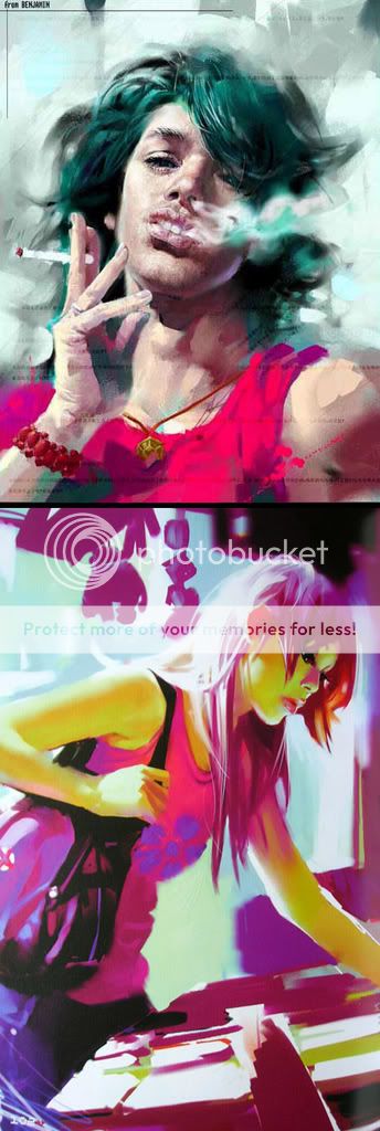

So I read one interview with ol' Benjie, and they asked him something regarding his 'style'. He graciously replied:
"Ah? You’re talking about how my illustrations are more realistic, right? Originally my comic characters were even lankier; recently I’m already very restrained. That kind of lanky, exaggerated body is better to draw, producing results quickly. Comics are always rushed and the amount of work huge. No choice. If it’s an illustration, I use sufficient time to pay attention to the human body, to find the aesthetic sense in more realistic proportions."
My thoughts:
I was lucky enough to buy Benjamin's ORANGE manga, (That's how I discovered the guy's work) and he's right - a lot of his stuff is done quite quick, though his skill as an artist makes his rough stylings easily identifiable. He excels depicting his subjects, mostly disgruntled youth-types, in the most beautiful and vibrant manner possible. He clearly uses Corel Painter, which helps sell the painterly effect of his work.
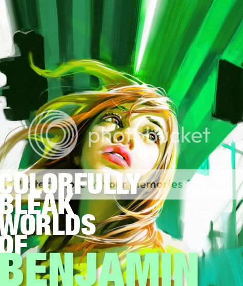
 The sequential image shows off ORANGE's dynamic stylings
Looking at these illustrations and even the sequential images, a lot of people might have trouble describing what makes it different from stuff from Japan and other parts of the world.
Yishan Lee, a Chinese UK-based artist, had this to say: "...people probably will realise it is hard to tell what is a Chinese comic just by looking at the pictures. Actually, Chinese comics are so diverse in styles. They have been influenced by European, American, Japanese comics and yet carried on some traditions from traditional Chinese drawings. For individual artists, they have their own preference. It is only easier to tell which one is Chinese Manhua when it comes to the story. Chinese artists do have their own way to look at the world."
 Me thinks the guy in the image above is disappointed in what life has to offer...
I don't live in Mainland China, but Benjamin's ORANGE (set in Taiwan I think?) paints a beautifully decadent world where the youth are finding it hard NOT to rebel. An interview asked this question - why are many of the protagonists of his comics a bunch of vain, emotionally distressed teenagers?
"Actually, I find that everywhere, young people are no longer believing in anything, no longer having faith, totally at a loose end psychologically and feeling really insecure. These young people can't cooperate or fit in with society, and especially for those who have had a relatively high level of education, for them this psychological void is even more serious. In most cases, they hardly have any trust in their parents (for someone Chinese that's the absolute minimum of morality) and also don't trust either their partners or friends."
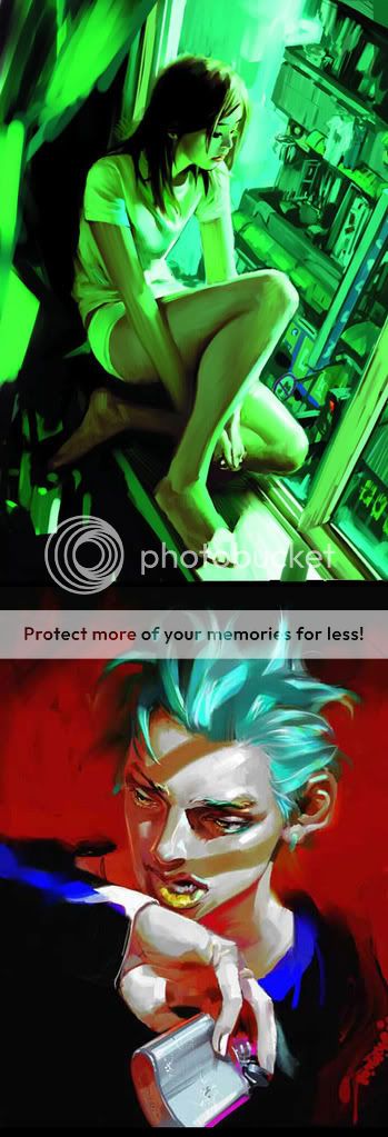 Angry, rebellious teens... in China?? Really? No way.
Whatever the case may be, I'm going to go hunting for this guy's work. I don't care if you say his work might be a tad uninspired. There's just something about the Chinese stylings of the story that makes it feel fresh... and all dirty inside despite being depicted in the most beautiful, stylized way possible. Here's an interesting little snippet from the interview I found interesting:
Do you feel that using this kind of exaggerated comic style expresses your story’s mood, etc. better?
"Readers like this kind of style more actually. I dare say if I use my illustrating style in my comics, all my efforts will only raise questions amongst the readers. They’ll say my comics aren’t as good as before. But I’m just about to take this risk, to draw my comics in my illustrating style…"
Read the full interview here.

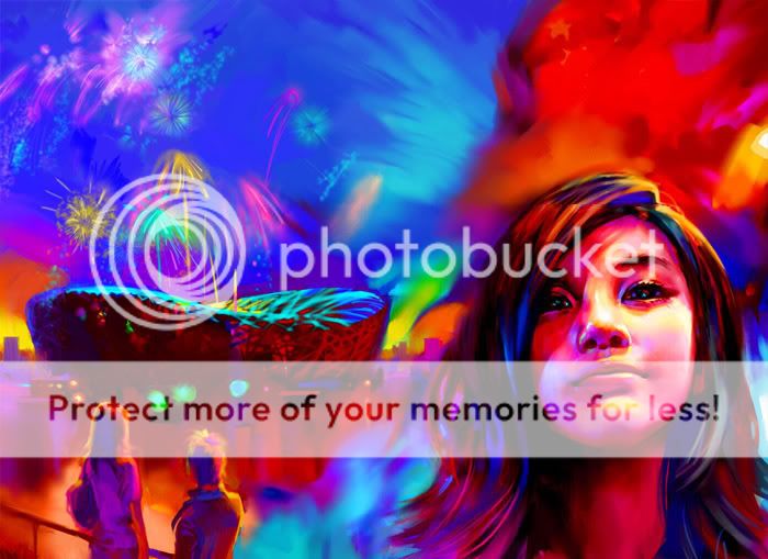 Yeah. so like I was saying - beautiful. Hmm... I wonder how many times have I described his work with that adjective..? Ah, it doesn't matter. One of Benjamin's goals in life was to be that of a world-class painter. That and to travel the world. Great guy, great art - I'll be watching.
Oh, if you can spare two minutes, maybe you can watch this video showcasing this Manhua/Manhwa craze. Which I missed in 2008. Just watch it, okay?
Also, check this article/interview about Chinese Manhua. Good read.
ink everyone has said everything that could be said about the god-like landscape artist, Imperial Boy...

Face it, his work speaks for himself. I've said it before so I may as well shut up. Besides, I've spoken about the guy in the past. I probably said the same thing too.
This was the very first piece by Imperial Boy that I saw. I wasn't that into art as I am now, but this image certainly made an impression on me. I recall the book which had this image saying Imperial Boy wanted to evoke cramped avenues of Hong Kong or Japan, and give that weird rush people get when they go to these seedy joints.

He has a way of drawing his characters as well. They're not exactly the musclebound anatomically accurate human figures of Da Vinci, but they do the trick. They're kind of cute actually! :-)
If you click on this image, you will note just how painstakingly detailed every area of this image actually is. It's not just crappy photomanipulation and cheap Photoshop tricks, mind you. Every art trick in the book can be seen in his stuff.

It's got High Dynamic Range Lighting, perspective, cute anime characters, muted color palette, 3D references, and a whole lot of other technical jargon nobody cares about. A weird gimmick Imperial Boy uses in the Robot artbooks are these pieces, where they scream "Look at all my overly complicated detail!!!!!" or at least, something to that effect.

The guy likes making these fully realized fantasy worlds. Staring at some of his images makes you just wish you were there. His beautiful cityscapes and impossible architecture defy any kind of sense, but who cares?

You don't think when you look at these images sometimes. They're cool and fun to watch, but inject any kind of logic to some of his stuff and you might as well just hit yourself with a sledgehammer. There's one image in one of the Robot books which is literally a school, where each classroom is hung in one giant ferris wheel. Now that's... weird.
How could you? How could you, Void?! I take you in, I treat you like family, and this... this is how you repay me?! By... by treating me like a lampost?! A dead stump?! A discarded tissue paper with your leavings?!
Anyway, I've been feeling weird lately - partly because I haven't entered anything in Justy Ueki's Robotech Photo Contest (my fault) and because Robot: The Digital Manga just looks so f**king beautiful.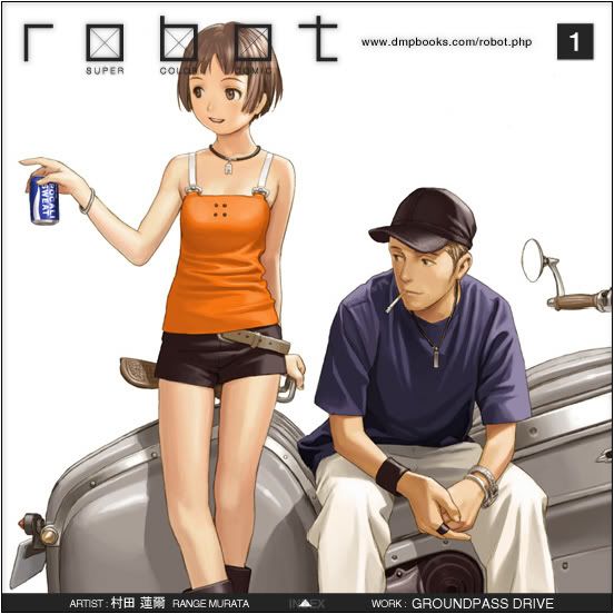
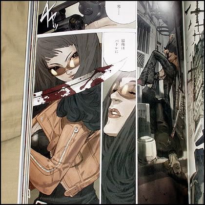
Gosh. So okay, what the hell is robot manga anyway? Here's Wikipedia again! To solve all my problems.
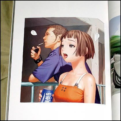
robot is a series of books containing the art of various Asian artists. The series was created by Range Murata as a way for upcoming artists to get their work published. Volume 1 was released on the October 21, 2004. The series is currently at 8 volumes.
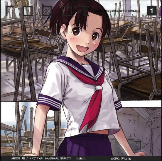 Digital Manga Publishing is responsible for the North American release. The first volume was released August 6th, 2005. Due to recent developments in talks over publishing negotiations breaking down, DMP will not be publishing any future volumes past volume three. Rights to publish at least Volume 4 have been picked up by Udon Entertainment according to amazon.com preorder info.No wonder its overpriced. I might as well buy that highly acclaimed book by Ashley Wood.
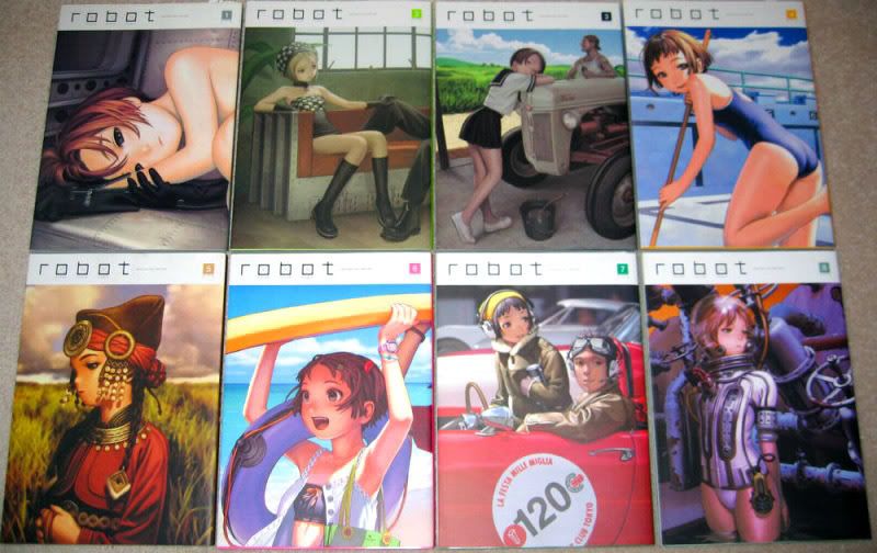 "Stunning, dark, exhilarating and disturbing, Murata's collection of contemporary Japanese comic art gives an inside view of the explosive work happening there today."
Do I dare believe the hype? Moving on, I also want to ogle at the impossibly, insanely, whatever-adjective-you-can-think-of art by Imperial Boy. An artist whose amazing use of perspective should be admired by all. I don't care why, it should happen.
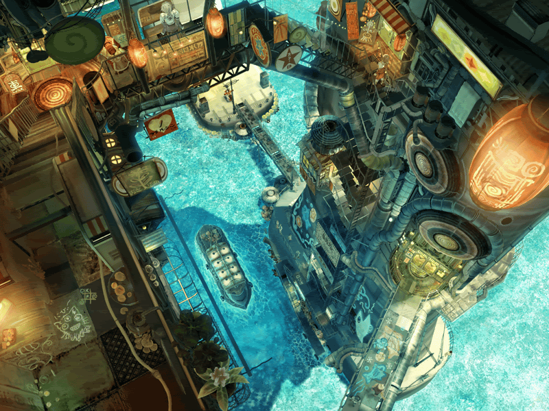 C'mon, this piece is just oozing with atmosphere, brilliant color palette and unique composition. All the essential elements in digital art today.
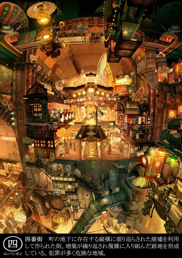 Beautiful, eh? Well, shut it. Gaddamnit. I knew I shoulda named this blog 'The Angry Artist'. Oh well. To close out this post, and to open the gates for a full-scale invasion of manhwa and all that other Korean art stuff, I present to you the amazingly disturbing, funny and brilliantly animated Achi-wa Ssipak. A Korean film that kicks Robotech: Shadow Chronicles nuts. Hard. (If you have a thing for that Robotech movie, erm... well, tough luck - I didn't like it)


