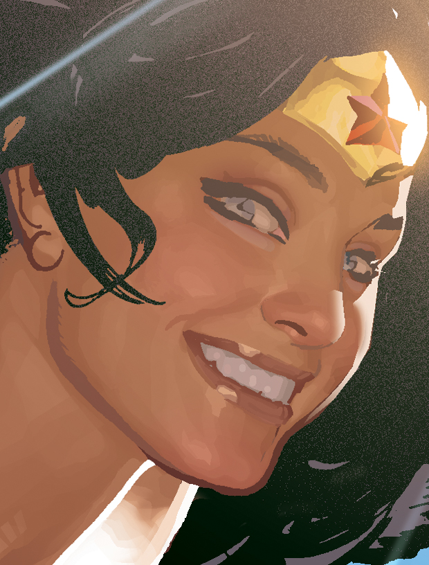
I regret I've never done a feature on Adam Hughes. You do know Adam Hughes, right? The guy who did all the Catwoman, Wonder Woman, Starwars, Danger Girl, Power Girl pinups? I figured it's time to do one. Sort of.
Y'see, I stumbled upon this ol' post at The Drawing Board forums. It's a fairly old interview with Adam Hughes his coloring technique, from his Yahoo group. I can't be too sure if his technique has changed much throughout the years, but I figured it would make a good read for the time being:

Q: What version of Photoshop do you have?
Adam Hughes A: I'm still using Photoshop 5.0, because every time a new version comes out, yes they have exciting new features, but they also seem to like re-assigning keyboard shortcuts, which I LIVE for. I've got my key board shortcuts so memorized, it's like I'm playing the piano. If I switched now, the learning curve would slow me down.

Q: What are the main tools that you use in Photoshop?
A: The Lasso Tool, the Magic Wand, the Path Tool. I do a lot of my rendering with the Lasso Tool. I select an area, then fill it with 10% of the FG color. Then I move the selection (or make a new one) a little to the left or right, and do it again. Do THAT 6 times, and you've got a nice analogous gradation.
Sometimes I'll make Lasso selections with the feathering set up to give me a soft edge. Lara's Gerber-baby cheeks in the TR piece was done that way.
I also use Lighten and Darken (regardless of the tool) a lot when applying color.

Q: Do you keep a (color) palette next to you?
A: Definitely. I keep a lot of my Preference windows up while I'm working. The Palette is VERY important to me.

Q: What general sequence (if any) you use to color with Photoshop? (Such as) scanning inked artwork. Do you save a copy with lower dpi for easier coloring?
A: I color at print size. I upgraded my PC to handle a regular-sized comic cover with relative ease. I SHOULD upgrade again, now that you mention it…
Q: Is your local color midway between the item's shadow and highlight, or more towards its shadow…?
A: Darker. I treat the flatted piece as an imprematura, upon which I go in with my 'opaque' colors.
Q: (Do you) render the shadow areas with cuts and the airbrush & paintbrush tools?
A: Render light areas after. I never use the airbrush (or paintbrush) tool. It's got that phony digital softness I can't stand.

Q: Since you say you don’t use the paintbrush or the airbrush then do you smudge a lot?
A: No. I think the smudge effect looks digital and phony. I'll post a file with a detail from WW's face so you can see what I do up close. I let the printing and the reader's eye do a lot of the final 'closure' for me. My selections look like tiles in oil or gouache painting, when seen up close.
Q: Do you use different layers or channels for rendering? Do you render certain elements first, such as skin before moving on to hair, or foreground elements first before background? Do you render certain elements completely - shadows & highlights - before moving on to other elements? Do you render from shadow to light or vise-versa?
A: It's a judgment call. Whatever the piece calls for is how I handle it. I usually only have two layers going at a time. The basic background Layer, and them the section I'm working on (i.e.; WW's face) I save the selection of that area as a channel, that way I can get as sloppy as I want, and then I just load the inverted selection, delete the unwanted crap, and merge the layer back down to the base BG Layer.

Q: How do you go about changing the black line work in some of your pieces in Photoshop? (For example the trees in the background of the Hammer of the Gods cover). The closest I can get is choosing "Load Selection" and using the airbrush to color the inverted selection. But there always seems to be some color that creeps outside of the selected area regardless of how tight the selected area is. Please tell me there is an easier way?
 A: By 'creeps out of the selected areas' do you mean that unselected areas (non-line art) are getting colored? If that's true, then something's up with the feathering on your selection. If you mean, areas of your line art that you don't want to be colored are getting color, either de-select what you don't want to receive with the Lasso tool or don't use the airbrush tool.
When I want to change line art to color, here's what I usually do:
1. Load selection.
2. Invert the selection
3. Deselect everything but what I want with the Lasso Tool.
4. Activate the Line art Channel and delete the selected areas.
5. Leaving the selection going, I activate the CMYK channel, and Fill with whatever color I want.
This is for a PC, which is what I use. Macs have the ability to eliminate a step, and I can't figure out if it's a setting I can change in Photoshop, or it's just something that Macs do. On a Mac, you can make a Lasso selection in the Line art Channel, and it automatically 'grabs' just the black line art info.

Q: How do you do those amazing shines?
A: I do a large feather selection, then fill with a light color like a yellow or orange, set on Lighten. I do this to 'set the stage' as it were. Then I fill it again with a color like orange or red, set on Color Dodge. I then use the Fade filter to control how much the highlight 'burns'. Try it; it's fun to experiment!
Q: What do you use the Path tool for?
A: If I need to make a large gradeful color selection, such as might be found on a reflection on her armor, or on a leg or something, I'll use the Path tool to create a very graceful arc to my selection. It's also good for rendering color highlights on hair.
Q: The Lighten feature doesn’t seem to do anything when I use it?!?
A: The color you're applying (i.e., your Foreground color) has to be lighter than the areas you're trying to affect. It won't affect any areas that are lighter than your FG color. For example: a 50% magenta in your FG color selector, with your desired Tool set on 'Lighten' will only affect pixels that are 51% magenta or darker. Anything 49% or lighter won't be affected. It sounds confusing, but I stumbled upon it all by accident. I use it a LOT.

Q: How do you use the Fade filter?
A: The Fade Filter is at the top of the Filters drop-menu; it's the second from the top. On a PC, it can be keyboarded by hitting Ctrl + Shift + F. You'll also notice you can alter your color application there, after-the-fact. This is where I discoverd the value of Lighten, Darken, and Color Dodge. In the Fade Filter, you can change the color application of the function you just completed. It's a great 'before and after' tool.
Q: Do you use any Photoshop filters in order to give your colors a particular finish?
A: I never used to, but I've gotten braver about it. Sometimes when I feel my flesh values are too high-key, I run them through the Auto Levels filter, just to see what it does to them. Sometimes I use the result, sometimes I don't.

Q: What filters do you use commonly? What would you recommend for specific effects, such as metal gleam or rain?
A: I disdain the use of filters, until you can prove you can render that stuff on your own. It's like Ian Malcolm's diatribe against raising dinosaurs with genetic engineering in Jurassic Park. If you don't take the time to master a technique, you don't learn the even more important disciplines that come with the experiences. Any decisions you make with shortcuts are uninformed ones, and you open yourself up to a world of bad judgments.
And that ends this wonderful interview with Adam Hughes, brought to you by Adam Hughes Yahoo Group. Find it and join it if you like. Oh, and before I close this one out, I stumbled upon another post about good ol' Ah! at this comic blog. It's a bunch of Marvel beauties in swimsuits. I think it was done in the early-to-mid 90's... Here we have Black Widow, the Wasp and if you're into it, She-Hulk as well...


And that's that!!
Do you like animation? Do you dream of making your own animated short or showreel, that could rival professional studios? Then you've gotta hit the books. Or you could enroll at Les Gobelin...

This particular French "visual communication" school caught my eye after I featured one of their amazing alumni turned world-renowned concept artist in another post. Here's a sampler of what students are churning out at the academy. This is an opener to some festival several years ago:
You can check out their website at http://www.gobelins.fr/index-flash.htm. If you don't speak French, then maybe this promotional video can help you out:
It features good ol' Eric Riewer (who?) describing the school's various program and the selection process for new students, as well as what makes a good student film. Fascinating stuff, and it could help if you really do plan to enroll!
With that out of the way, lets watch some student shorts! Now I know the very mention of the word 'students short' might suggest weird, highly experimental, and amateurish pieces, but I assure you... their work is amazing. If you've seen some of the embedded films in my last post about that alumni-turned-concept-artist feerik, then you might know what to expect.
The first entry is a simple film called "Sébastien". A story about paper airplanes, and some deeper message about doing what you love.
Next, is Fenrir. Presented in the International Festival of the Film d' Animation (FIFA) d' Annecy 2009. By Nuno Alves Rodrigues, Usama Bouacheria, Alice Dieudonné, Aymeric Kevin, Ulysses Malassagne. It's about this a Fenrir that is awakened by the rays of the sun. The fenrir climbs this ancient tree Yggdrasil to attack the sun and some kid stops it. Or something like that.
Next is a film by Lucrèce Andreae, Julien Chheng, Tracy Nowocien, Rémy Schaepman, students of the formation Design and realization of films d' animation (2nd year) called Dodudindon. Something about letting loose.
And here is a favorite by some 2nd year students called Monstera Deliciosa. A film that celebrated the year 2009 through references to l'Allemagne or through "dance". Someone help me out here.
And now for something different. Jelly Sunday, which features little Gretchen her new friend “Jelly”.
Well. When are you going to send your application!?!?
He's French, he likes the hip-hop culture, and his art kind of objectifies women. His day job at Steambot Studios has him working on the most interesting franchises out there. He's Joel Dos Reis Viegas.

He studied at prestigious Les Gobelins, an experience he describes as "...something unique for anyone who wants to be an talented artist". He said it's known as one of the best animation schools in the world.


Well, guess what happens when someone who has a background in animation enters the concept art world. Yep. His drawings are full of beautiful gestures and powerful emotions!!!!

He uses all kinds of apps, like Artrage for color blending, Painter for those large, painterly strokes, and Photoshop for everything else. He also has above average 3D skills (which greatly complement his work), thanks to the wonderfully intuitive Mudbox. What a guy.


According to an interview at CG Channel, one of the most important skills an artist can learn is to control one's creativity, as a flow, and to be productive even when inspiration goes up and down. That's discipline for ya'!
"I have a fascination for explosive and controversial characters and I love to paint these. It could be a punk, monster, warrior or serial killer; I‘ll try to paint with the most appealing rendering possible" The guy never runs out of inspiration. Deform reality, observe, and all that jazz.

"...Hip hop is my culture, I grew up listening to rap music and looking at graffiti. It still influences my art. Sci-fi is everywhere, all the concept artists I know already painted sci-fi in the past, so I thought mixing both universes could make something interesting." That quote, my dear readers, was directly lifted from CG Channel.

His advice to all you wannabes and amateurs. A little something he learned from all those conferences and setting up his own lil' studio with a couple of concept art heavyweights: "Teamwork is the key when you start a structure with your friends. Its important to be able to see their skills and to learn from them."

"The other advice is be respectful with your friends, don’t think because you are friends you can be less organized or use less clear communication. You should treat each other like colleagues to keep good working relations. This is the key to succeed in creating together."
Interested? You might be. So go rummage through the archive through his blog (doesn't get updated often), or better yet, his deviantART.
Oh, and just so you're aware of what other graduates of this "Les Gobelin" churns out, why don't you watch some of these animated shorts?
Voodoo. Exquisite animation. It is what it is!
The classic Pyrats, which I featured already once in this blog. I didn't know it was animated by grads from this school. Took seven months, and was shown on an animation festival in 2006. Still awesome.
Traintamarre. Great mood. You may have not noticed, but I love 2D animation.

People have been "pimping" this article for a while now, but for those of you who haven't heard or read it, here's an excerpt:
When you're an artist, people try and take advantage of you in ways they wouldn't if you had a conservative career (though whenever you're self-employed, people will generally try and take advantage of your skills).Full post:
They don't know they're doing it, because in a society that doesn't value art for the most part; it's normal not to value artists. And artists often don't know it's happening, because they're part of that society and the trend of devaluing their own work. [...]
That is the culture of art and artists in Western society. People on my friends list are guilty of it. People I meet and hardly know, and people I know very very well are guilty of it. I'M guilty of allowing it (though you can probably tell I'm getting reaaaaaally sick of it now). Friends of mine who are artists participate in this 'I will sell myself short because I'm an artist and you expect me to sell myself short' culture.
It's the expectation that bothers me. It's not like I don't freely give my art as gifts, occasional pro-bono book covers, or haven't sent pictures in the past. I do and have. I genuinely want to.
It's the expectation that because I'm an artist, I exist to do art for others, for free, or for nothing more than a 'gee, you're so talented' (I know that, that's why art costs money, because it's a rare and desirable skill that not everyone can do - even with training). It's the assumption that I am some bohemian who basically wants to spend her entire life sharing my creativity with others, but never making money off it - because bohemians live on tea and noodles and tuna and don't want for anything more than that if they have art in their lives. Right? Wrong. Or at least, certainly wrong in my case. Doctor's appointments, art supplies and a mortgage aint cheap.
http://moonvoice.livejournal.com/1075184.html
It's a universal problem, probably more so where I live. If you've got 90% of the population that's barely scraping over the poverty line, who's gonna care about your sketch or painting? Nearly everything here's either pirated or shown for free, so paying for a drawing or even a painting seems ludicrous and a tad hedonistic.
Of course, there's hope. One reply referred to an interesting book you probably should seek out and read:
"... It (the post) reminds me of a book called The Talent Code that proposes that it's not so much about raw talent but passion, drive, opportunity, etc. Without those, even the most talented individual may get nowhere. Worth a read, especially if you see it on sale."Agreed, you need passion, skill, but most importantly exceptionally wealthy parents / spouse to back your career up. I've met a few successful artists who got where they are because of these benefactors. The rest are probably slaving away at some dull, demeaning desk job staring at the office clock.
I think I'll do a touchy-feely artist post today. Hmm... Let me scan ConceptArt.org for something I can talk about... Ah! Here's one: "Why do you draw?" Perfect!!

So why do YOU draw? Oh right... You don't respond. But the people in ConceptArt sure do! They're a nice bunch. G A I A originally posted the question because she didn't know drawing was simply a habit or some kind of a addiction that doesn't seem as fun as she would like to believe. I have days like that.
Sebastard said:
"In the words of the immortal Nietzsche, conflict and strife (including inner conflict and personal strife) will shape a man into something better then he once was... Why do i draw and write? To eventually become one of the greatest fantasy/fiction artists/authors this world has ever seen - that simple
 . No telling if i'll ever achieve this goal, but i believe in setting lofty ambitions because: "Man's grasp exceeds his reach." To me, it doesn't really matter whether drawing is fun or not. Goals do not need, indeed will often not be enjoyable or fun 100% of the time - that's part of the "conflict" bit. To preservere through the times that are harsher then others and may not be as fun :p.
No, nothing is really "just" a hobby to me.

Blackspot said:
It's an itch and I need to scratch it. It gets worse if you ignore it.
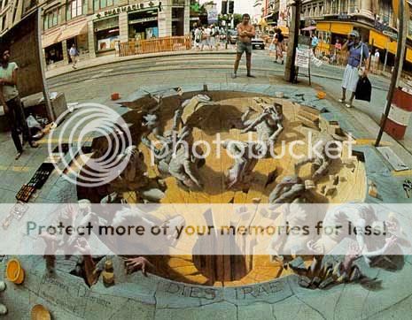
Crass said:
Because I want to make my inner worlds come alive, for me and whoever else that wants to see.

The Original [E] said:
Other then because if I don't draw and get my ideas out then my mind will overload me with ideas and I won't be able to focus on much until I get them out.
The other more important reason is, to me art and my creativity is like a muscle, you have to keep working it out and constantly give it stimulation or it will atrophy and die. Thats why I draw and paint every day for hours on hours. Have you ever known a person who used to draw and stopped because of one reason or another?
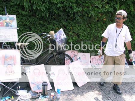
FranciscoShreds then said:
I guess it's because I have the exact opposite mentality as you. I always want to draw, everything I see in life makes me want to draw, makes me want to reproduce what I see or expand upon it. Only times I feel like shit is when I don't draw and I could have. If I slept in, if I forgot my moleskine or sketchbook and I see something very interesting.
Wow! Yeah! Cool! I wholeheartedly agree! Saying anything would be redundant. Maybe making a list would suffice. Okay, so it seems artists draw because:
1.) It's fun and addictive.
2.) We're all gonna die sooner or later.
3.) It's a form of escape.
4.) To capture / realize imagination. (Hmm...)
5.) Money (Eh?)
6.) Self-Improvement / Therapy.
7.) I heard this from Artgerm in Singapore - "I just want to draw something beautiful"
And as a very odd aside, I decided to embed several videos of artists and their "moleskins". (Some dating back to 2006)
This one's kinda funny.
Here's a nifty one from a real fine artist.
Buy your moleskin today and feed your art addiction!! (That's a plug right there...)

A simple enough question. What does the denizens of ConceptArt.org think of "tracing" as a method of learning?
Gocke posed this question in the forum, and noted three ways to look at "tracing"
- I read that tracing an image teaches you a lot more than simply referring to the image by looking at it.
- Others claim it will hinder your progress and will not really teach you anything about drawing.
"First of all is learning your mind that things ain't off when doing foreshortening. I did a foreshortened beak of a bird of prey a couple of weeks ago and my mind complained a lot about stuff being off. It's only at the end that things fell into place and turned out to be ok. When making various partial traces of such an object it's possible to learn your brain that those 'odd' lines are actually ok.
The second usage is for quick setup of things.
If I want to practice values, shading and rendering I could trace the same image a couple of times to try different things.
Last and not to be underestimated. Tracing can learn you to make steady single lines. Doesn't matter on sketches, but when you are going to ink something you might want to have a steady hand..."
Arshes Nei pointed out the possibility of confusion with the subject:
"I refer to what you're talking about "Eyeballing"
Tracing is well actually going over the lines. If I for example, made some pencils and wanted to ink them, I'd get my lightboard and trace over the image. Does that count as cheating?
I want to make that distinction because it tracing and eyeballing are two different things in my opinion. It's one thing to trace over an image using a projector or light board, it's completely different to learn how to see spacial relationships to learn better control through observation and eyeballing.

It also irks me because n00bs will interchange the term when I'm saying "ok gotta trace this" and I'm referring to my own works and they scream "cheating" when I have to explain to them. No, I'm inking, and I want to keep the original pencils around in case I mess up."
joyproject simply states:
"Tracing is fine for learning, but don't end up using it as a crutch."
OmenSpirits concurs:
With tracing, one can learn about the landmarks on the body.
The rest more or less said its cheating. Still, you can read more at http://conceptart.org/forums/showthread.php?t=154586 or http://www.conceptart.org/forums/showthread.php?t=113058 which is an older thread on the same topic.
My thoughts
So what do I think of tracing? Is it good or bad for an artist's development? Let me put it this way... it... depends.
Many artists believe that anyone caught tracing a reference photo shouldn't even be called artists. That this whole tracing business should be left to kids. Not so for the legendary DC/Marvel artist Neal Adams, who believes tracing is one of the keys to better looking art. According to a section in Neal Adam's webpage, he was quoted saying that "...if they really want to learn to draw better. The first thing you need to do is get yourself a tracing pad and some solid and clear photos from magazines and anywhere you can get them. Trace, trace, trace. Trace some more. Make it a regular part of your drawing process. You will learn more by tracing than anything else. When people hear this their immediate reaction is 'I'm not gonna trace, that is cheating.' It is not. This is how you will learn."
So like I said... It depends.
Ralph Bakshi... Now there's a name I haven't heard in a long time.

I was introduced to Bakshi's work when I saw the 1978 animated version of Lord of the Rings animation on VHS. All that rotoscoped animation (see: animation that is literally traced from live action movement) was a pretty cool gimmick, but it sort of wore thin. Since then I haven't paid much attention to the guy until recently.
Fire and Ice, a movie which where Ralph Bakshi collaborated with fantasy-art master Frank Frazetta
On a whim, I decided to check the Bakshi since I was getting tired of hearing folks reference his infamous 1972 animated feature 'Fritz the Cat'. I haven't seen Fritz yet, but I've seen some of his shorts, such as the 1981 animated short 'American Pop'. Try it, it's pretty interesting.
One video that really got me riled up was this passionate rant by Bakshi to the artists of 'this' generation. Meaning US - the young, impressionable artists who possess all these fantastic tools at our disposal. Go out there and do something!
It doesn't matter what you're into - whether it's traditional, flash, or #D animation, digital art, game design, whatever. Ralph Bakshi tells it like it is. Get out there and get creative!!
When you're really studying art and stuff, you may have come across this term: "Negative Space".

What the hell is Negative Space..? No, not the weird Negative Zone from the comic books. It's... I don't know. That's why I go to the place that has all the answers. No, not Wikipedia! ConceptArt.org!
Seedling, a longtime forum-goer describes the "Negative Space" as the the white space that surrounds the silhouette of a character.
Armando goes on a little more by defining "Negative space as a result of drawing a shape on the paper. Becoming aware of it initiates you into composition. One of the elementary things to do in drawing is to separate figure and ground, figure being things(people, cups,shapes, whatever), ground being the air that surrounds them.
On your piece of paper say you draw a square, the paper contained within it's contours is solid, all the paper outside of it is negative space. By moving the square around you'll find that you can change the shape of negative space: a rectangle with square hole in it, an "L", a "c".
Positive and negative space are ambiguous until they are defined by some cue, usually in our work the cue will be recognizable things like people and whatnot.

My thoughts:
Wow! With all this free data on the net, why waste a fortune on artbooks and all that jazz?? Ugh. I have no idea. Since I have a day job, and have got some cash to spare (since this is my hobby after all) why not? Why waste money buying a new cellphone, or electronic peripheral when can survive with the old one?! Anyway, going back to the topic at hand...
Here's a picture and then the same picture with all the negative space filled in...

Armando then points out this lil' tidbit: "Whatever is not intended to be a solid form is negative space. Take some steps back from the screen, or change the zoom level and you should see that the silhouette is clearer on the white background.
Basic composition, there is more contrast between black and white, than gray. Notice how the muscles form convex bumps. Even if you didn't know those were ape men, you would know they were the figure and the white the ground, even if you were to make them white and the background black the relationship would be the same.
When we first start drawing we only pay attention to the shape we enclose within the lines, ignoring that big shape that's surrounding it, but it's all just dividing the picture plane. Sketch little frames on a piece of paper, add simple shapes within them, but instead of looking at the area contained within the shape look at the area that surrounds it.
Sometimes positive and negative shapes become ambiguous, modern art tends to take advantage of that, it adds dynamism and complexity because there are mutiple ways of looking at the picture."
My thoughts:
You get it right? Do you get it? I'm asking you, Void. Answer me! What? Kev Ferrera has provided examples of excellent use of Negative Space? Coo!
So cool. As Armado would later say: "Now that the question "What is negative space?" has been answered, I'd like to ask, How does negative space become expressive? I can see the negative space in the examples, but I find myself paying attention to the subjects in the picture, the subject carries the expression, the negative space just seems like coincidence."
More of my brilliant comments:
Alrighty then! Thank you, Armado! Does anyone dare to step up into the plate?? How does "Negative Space" become expressive?
Ah... what's this? I see... oh! I see Mario. Mario, what do you have for us today?
"Negative space (in painting/illustration) is known as whitespace (black type has a white background) in typography/graphic design. That could be useful for finding more information although it has a different meaning for macro and micro typography.
Negative space, like most other compositional elements, depends on contrast (or lack thereof). You can use contrasting values to amplify or similar hues to unify something and all the hues depends on each other for effect.
The same goes for negative space and it works with the values in your painting. High contrast values (black silhouette against white background) create negative value while softer transitions reduce the effect of element separations. And if you have very similar values then you probably will have a hard time finding anything that looks like negative space.
So how does it become expressive. Not at all. It is part of a composition and creates a desired effect with the rest of the painting. It only appears in combination with the rest and is not an isolated something.
You could as well ask how does some hue influence mood in a painting. This only happen because each element depends on the rest to function properly.

My thoughts:
Good! Good! That clears things nicely. But hold on, lets hear what Kev Ferrera has to say about the topic - this one's good:
Kev Ferrera: "The main use (of negative space) is to clarify the pictorial statement... that is, to help the viewer "see" or "read" the actions of the figures easier. Clarity is important in storytelling.
Shapes *always* have meaning... Every shape has expressive meaning (artistic handwriting, shape-character as well as metaphoric reference). It is possible to tell one artist's work from another by use of negative shapes alone. For instance coll and Frazetta have a very different kind of character to their negative shapes, than Dean Cornwell or Leyendecker or Brangwyn or Fechin or Shiele or Klimt or Rembrandt.
And of course, all of them are different than artists who aren't even aware of the expressive power of negative space shapes. Often artists who aren't aware of the expressive potential of negative space aren't aware of the power of shapes in their works in general.

My thoughts:
Well well. Come on, folks. Lets give these people a warm round of applause. Great stuff! Great stuff.
Okay. Back to work.

Still, it makes you wonder why so many schmucks like us do this sort of thing. I guess we just like pretty pictures...
For today, lets I'd like to point out to you a very interesting link from an art site - a link which leads you to about a hundred other links. It's called "75 Artists You Must Know, and Where to Find Them". Intrigued? You should be.
You'll find artists like Adam Rex, popular for his work on Magic: The Gathering.
Or perhaps the amzing works from this Greg Spalenka chap. The fellow has really covered a very broad spectrum of subjects, all done in that weird aged art style.
And voila. You'll also find stuff about Dean McKean, the man that practically invented the look of Neil Gaiman. I'm could be wrong about that, but I assume there's another more well-researched blog out there who talked about this stuff anyway.
What are you waiting for?? Check the link out, and try to at least get inspired by one of these guys. Come
I had no idea what I was doing when I first tried to design a layout. My design sensibilities were... still are pathetic. I thought Times New Roman was God.

Yeah. Typography. Lucky for this generation, thousands upon thousands of font faces are readily available to all of us in a single click. Anyway, that's typography - how you arrange your type not only in an aesthetically pleasing manner, but also in a sensible order that would fit the material at hand.
One of the more interesting thing about Typographers is how they take their stuff very, very seriously. They sure can criticize a font! It all depends on the application of course, whether the font used was too round or too thin, or when it was kerned right and all that jazz.
I was quite amused to hear that just about every designer hated the Comic Sans font (among others). I sort of recall a funny story back in high school when people really abused that crappy font.
Another thing I took notice of was European design. Swiss design, to be exact. An integral part of this style is the font known as "Helvetica". Heard of it? This has been the choice font for every designer, for almost any kind of project, be it a design bible, concert poster, you name it!
The font has a... legibility to it that has attracted folks for fifty odd years. The only problem is that for all Helvitica's popularity over the past decades, people have come to define "Swiss Design" as freakin' boring. It's too clean, too orderly for some designers.
Other fonts that gained some popularity were the Univers (45, 55 type) and Akidenz font types. People loved using those too for all kind of stuff. I probably won't go into too much detail about all of this though. I just wanted to give you a very basic idea of what Typography, and what I've encountered so far when reading up about it.
Now, let me discuss in brief, the role of the Graphic Designer. What does they do, exactly?
Disclaimer:
This article will focus on magazine design, since I mentioned this was something I'm reading about earlier.
The person who runs this gig is usually the Art Director. The Art Director is the guy who manages the overall design department and design of the (in this case) the anthology. He fixes the publication's format, oversees work of other senior and junior designers, and even designs some of the pages himself.
Freelancers are usually hired to support personnel to meet "...excess creative and production needs... Freelancers are hired to do secondary design, while skilled freelance designers are often assigned to work on primary components of a publication." (How to be a Graphics Designer)
The thing to remember when designing is that Content always dictates Style. According to Chriswell Lappin, art director for Metropolis Magazine, "Content of the story often dictates approach. So the visual look of a section varies from story to story. The rest of the magazine is more standardized."
The goal, according to Lappin, is to help the reader understand the story, thereby making it the first priority. The voice of the designer would come naturally as you continue to solve these styleproblems.
Read this article later. Click the pic.
The worse that can happen, according to Nick Bell, Creative Director of Eye Magazine, is when a magazine's content competes with the design of the magazine. "...A magazine is by definition a collection of different things, so if there is no sense of variety when you flick through it, the design has failed."
Typography is king, and things like color are secondary. It's all about the sense of completeness and coherence that would help keep the pacing just right. From what I've heard, people have done everything to solve this problem. Some have tried injecting fine art techniques in order to establish harmony in the overall design. Some try to take things from real life, and inject it into the design.

The conundrum of magazine design is that it's always got to be fresh to look at, and yet thematically similar. Rhonda Rubinstein noted that new content, new interpretations, new collaborations, new structures and new contexts helps do this. It doesn't have to organized too, mind you. Disorganization, according to some designers, are actually quite enjoyable when done right. Area Duplessis puts it simply, "No concept, no real guide, just great intuition."
So how about magazine covers? How important are they in the design process? Cuz' I've gone through like five redesigns, and nothing seemed to satisfy me. For Arem Duplessis, Art Director for the New York Times Magazine, the cover tells a person whether the magazine is actually worth picking up. But wait, in the world of design, you can have the most beautiful cover ever, but the most disappointing content possible.
If your content sucks, or doesn't have a lot of market appeal, then you should at least, according to Tod Lippy, editor of Esopus, try to make it attract customers with strong visual design. "That said, the design is never meant to overwhelm or obscure the material it frames." Funny though that I've seen some magazines obscure certain text descriptions...
So, as one's design techniques grow over time, he or she usually develops tricks to fall back on. Some would smash type toger, some would make a cacophony of upper case letters floating all over a page, others would create little sidebars and stuff to make things a little more interesting.
So anyway, this is the end. I might as well finish with an irrelevant video. Bask in the glory of...
- Tom Wolfe

Do you ever get that feeling you’ve got this new job that you somehow get tongue-tied trying explaining what it’s really about? Then people laugh at you and go “What??” Well, that’s sort of what happens when some decided to open up a discussion regarding…
Are you a fine artist, or would you consider yourself an illustrator? For fun or profit? Is one better than the other?
Yes folks, I will warn you in advance that this is likely going to be a fairly pointless discussion. Still, I do hope that towards the end that you might have learned something.
The topic began when forum-goer Andabatae posted that he was doing some research for a paper about the differences between Illustration and Fine Art - How they clash, why and who mainly focuses on concept art” and “Does comic art go against art the likes of old master paintings and modern fine art?” The usual.
Additionally, Anda’s notes that he’s been receiving some flak during his fine art classes that most of his work blatantly shows his influences to be mostly from illustrators and other artists whose work has a big presence of narrative and reason.
Meridiani, a helpful forum-goer, begins with the well-meaning reply that, “... there are only a few things that distinguish illustrators from fine artists (and they're blurry at best.) One has to do with order of payment; illustrators are contracted first and then do the work. Fine artists do the work first and then struggle to sell it (though commissions really throw a wrench in this distinction.)
“Another has to do with the preeminence of the story or 'product' (in illustration you can't make dramatic changes to these simply because it makes for a better image.)”
Additionally, Meridiani supposes that gallery owners pimp artists to the pretentious upper crust, whereas publishing houses will whore you out to the increasingly image hungry masses and “… Chances are you're going to get fucked either way, and yet in the fine art world, everyone is a necrophilia, so there's an added bonus that they'll try to fuck you again after your dead.”
The discussion’s off to an interesting start, eh? Andabatae agreed to most of what was said, however he states that there’s a lot more to the debate than that. Apparently, a lot of the criticism that he got was directed at how his worked mimicked the so-called ‘comic book style’.
“It gets at me a lot when that happens because surely, illustration is just as emotionally valid as fine art as it’s done with fairly similar intentions. Does it not more rely on the artist themselves?”
Kev Ferrera, one of the senior members of the forum, offers some… interesting advice:
“Fine art is sold in a Fine Art gallery. That is its definition. If illustration gets sold in a gallery it becomes fine art.
Fine Art was a distinct category from everything else. It was a political distinction drawn by ideologues circa 1900-1920, coinciding with the rise of illustration... The camera also played a part because ideologues can't see the poetic components of art; they just see the literary components, which dovetail with their "social realist" interests. Thus they could not see a significant distinction between, say, Waterhouse's Lady of Shallotte and a photograph of a similar event.
If you read Howard Pyle, Harvey Dunn, or Robert Henri's notes, they make very plain the difference between photography and illustration.
The depression and the rise of films effectively killed illustration as the bete noir of the "fine art community". Since the fine art community is ideology based, they simply have chosen new "oppressors" to rail against as time has marched on.
The Fine Art community has now effectively hated on everything it could get its hands on, including itself. And now we are at the end of the cycle.
Which is why the distinction between Fine Art and Illustration is falling away and "realist" work is becoming popular again. There was never a distinction in the first place, only a false one.
Read Thomas Wolfe's the Painted Word. This is not to say that the twentieth century wasn't a marvelous time for the invention of new decorative schemes. All of which have been taken up by Architects and Fashion designers for their work.”
Wow. Thank you, society! People just love to put name everything, don’t they? And people sure do love to argue. Laqueatores, another forum-goer, has this to say about the subject:
“I agree with everything you said, just not quite on this one… I don't think that fine art is necessarily confined to 'gallery space' - so to speak. In my view, Fine Art has as much to do with the spirit of the piece (as most dictionary definitions will echo) as the way it is commercialized.
This, of course, makes it more fuzzy.
In fact I think separating the two terms (Illustration and Fine Art) is in itself very problematic, and taking a "vs" slant on the whole thing is, as far as I can see, going to end up as something polemical rather than academical.”
Andabatae then offers his perspective:
“If you take that look. You kinda start to realize that even most gallery artists would fall under commercial artist as its in their intent to sell their work and gain profit. Boxing ones self into an area once they realize what the consumer is looking for and sticking to reproducing similar looks. Self marketing.
Art in general carries with it emotional ties. Whether its dictated by a publisher or dictated by the market at the time. So saying there is in some way more emotion or depth to "gallery/fine art" (which is typically what ive heard) is downgrading the planning and executing that goes into commercial art.
I produce work for my own personal release (when i have time) and for profit and publishers. I'm an artist. I don't need to add another label and I'm comfortable with my own position in life to not to need to feel like I’m better than anyone. You get flak from both sides. People in commercial art criticizing gallery artists and gallery artists criticizing commercial artists. There is a lot people can learn from both sides and they can get past their egos."
Just when things were getting pretty good now, Dimacheri offers his clearly annoyed perspective in the mix about what Kev had said about the false distinctions of Fine Art and Illustration, the rise of "realist" work, and how the 20th century became host of decorative art. Or something:
“Ahhhhh...I never had it explained to me so clearly before. Since it's apparent… that this "reconnection" can occur only when all work is "realist," supported by the implications in the that "non-realist" work is basically a bunch of new
"decorative schemes". I guess I'll have to start referring to my earlyinfluences and references to my own learning process as interior decorators or gift-wrap designers...
So as not to confuse any one in the future, Klee, Arp, Johns, Duchamp, Miro, Nevilson, Pollock, Klein, Shawn, Tanguay, Picasso, Matisse, Rothko, and maybe 3-4,000 others, as well as every other artist of any stripe that they ever influenced in any way (including probably 25,000+ professional illustrators), will be immediately removed from my reference list of "artists" to refer to.
And I hope all of you learned a lesson from this finally. You have been told over and over that the only "true artists" are those who adhere religiously to strict "realist" work or "realism," but none of you ever seem to learn.
Ah, things get weirder. Laqueatores defends his position, stating that not every artist can have the same comparison as being merely “decorative”. “... Just some Miro, most Pollock, most Rothko, most of Arp, most of Klein, not so sure about Shawn or the rest.
And so-called "realism" casts a very wide net indeed. So I wouldn't exactly call it exclusionary.
And there is absolutely nothing wrong with decorative art. I happen to believe that all art is poeticized versions of life, so even Pollock is offering us a narrative. I consider the distinction to be related to the generality of the aesthetics of abstractionist work.
Because these works have no specificity (not even to themselves, because their styles are easily duplicated by a competent craftsman), they apply rather poorly to our specific experiences in life. They are expressive and beautiful without being tethered to realism. This makes them emotionally associative works, like wordless classical music.
Classical music can be associated equally well as background for a Hollywood melodrama, a bugs bunny cartoon or a commercial for diapers.
Modernist decorative schemes are the same way. They can work for furniture, clothing, architecture, magazine layout... or any other thing where blank or boring surfaces are an integral part of the utility of an object. There is definite merit in that kind of creativity. I am not knocking decorative art. But it is, by its very nature, a surface-oriented art. It is not deep, despite all the verbiage spilled on its behalf.
Meridiani offers us some MUST READ ARTICLES regarding the topic (but won't be up for discussion here):
http://www.artrenewal.org/articles/2004/Illustration_and_Art/art1.asp
According to Meri, the following articles show the folly of it all. The first article is about “… illustration being celebrated/plagiarized in the Fine Art sphere.”
Despite the fact that they’re both being the same picture! But “… when you engulf one in ideological smoke and mirrors...” Meri then says:
“I suppose the text book difference is that fine art serves it's own purpose, but illustration does exactly that - it – illustrates it's point, i.e. it's a describing process there to aid someone understanding a page of text from a novel for example, or to aid someone to imagine the pro's of buying a product in advertising.
That is not to say that illustration cannot become fine art or the reverse, it's just that illustration on paper (excuse the pun!) is there to perform a task I suppose.
I did a similar essay at college about Mervyn Peake, who was a fantastic fine artist and an even better (in my opinion) illustrator.
I suppose we, with the mind of 'artists' find it difficult to say the piece is fine art, and that isnt, but I often come across people who enjoy 'hang on your wall' artwork, but have no interest in illustration (these later are the repulsive
people who do not buy illustrated editions of the same book by different artists... for shame.”
Ah, I think we have enough for the topic. It’s been very edu—what’s this? Provocator, another forum-goer, throws his two cents:
“In my isolated opinion… Illustration should now be called “commercial art" and often is and "Fine Art" should be renamed "non-commercial art”, thus removing any value judgment inherent in these titles and subsequently thus all the ego bumping. Learn what there is to be learned from both very different disciplines, then recombine and cross-pollinate with lessons learned form both and other disciplines as well.
Interesting, but unfortunately, this didn’t sit well with some people. Elwell laughed his head off by this point in the discussion. I think it was when he knew people reading this thread had enough.
“I was being facetious... trying to point out the silliness of caring about these labels.... and its a given that no one will really re-name anything ... I’m sure you remember all too well, a recent mammoth thread about the futility of the whole debate.”
Well, yes. What else is new? People love labeling everything. When discussions go as far as this, I am reminding me of how people once debated about the distinctions of goth, emo-goths, and all these other weird stuff people keep coining generation after generation.
Anyway, the last few statements aside, I do hope you learned something. Apparently, the origins of this age-old debate go way back. And what’s with 20th century art? Can this debate ever be put to rest?