Remember back in the day (around late 2007) when I was salivating over this manhua thing, beginning with artists like Hyung Tae-Kim and later stuff from Imperial Boy? Yeah, those were ... innocent times.

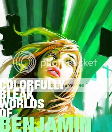
So here I was, looking for the next 'big' art inspiration (or in my case not so big, since I rarely update and thus don't keep up with the times) and lo and behold, I found Benjamin.


I think I will drop my job for a few seconds as I upload some of the most striking, elegant digital paintings/illustrations I've ever laid my eyes on. I've always loved works from artists that manage to elevate the mundane, you know? Put that ol' artistic spin to it and make it look all mysterious, sexy and all that good stuff.

Who is this Benjamin chap? Okay, let's see... according to a number of blogs that talk about this guy (many of which are in French), his full name is Benjamin Zhang Bin' who hails not from Japan or Korea, but from China. He's a Manhua (Chinese Comic Book) artist, and a damn good one too. (
Told you Manhwa/Manhua would catch on sooner or later! -Ed)

The
French can't seem to get enough of this guy, and a lot of Benjie's stuff was first published there. He's published a lot of stuff over there, and some time in 2008 he began getting stuff out through TokyoPop, the American Manga house. It saddens me that I may never see his stuff translated and released in my country, but at least I get to ogle at these breathtaking covers. Click on the image to get a slightly better look, whydontya?

Some time in March 2008, the entire Manhwa/Manhwa phenomenon got a really big push from all sorts of creative types, with events being held across the globe. There were Digital Art/Manga competitions, conventions held at London and around Europe, and books being published Stateside. Lots of great stuff all around, and for some inexplicable reason, I missed it. Oh right, I live in the Philippines.

So I read one interview with ol' Benjie, and they asked him something regarding his 'style'. He graciously replied:

"Ah? You’re talking about how my illustrations are more realistic, right? Originally my comic characters were even lankier; recently I’m already very restrained. That kind of lanky, exaggerated body is better to draw, producing results quickly. Comics are always rushed and the amount of work huge. No choice. If it’s an illustration, I use sufficient time to pay attention to the human body, to find the aesthetic sense in more realistic proportions."

My thoughts:
I was lucky enough to buy Benjamin's
ORANGE manga, (That's how I discovered the guy's work) and he's right - a lot of his stuff is done quite quick, though his skill as an artist makes his rough stylings easily identifiable. He excels depicting his subjects, mostly disgruntled youth-types, in the most beautiful and vibrant manner possible. He clearly uses Corel Painter, which helps sell the painterly effect of his work.


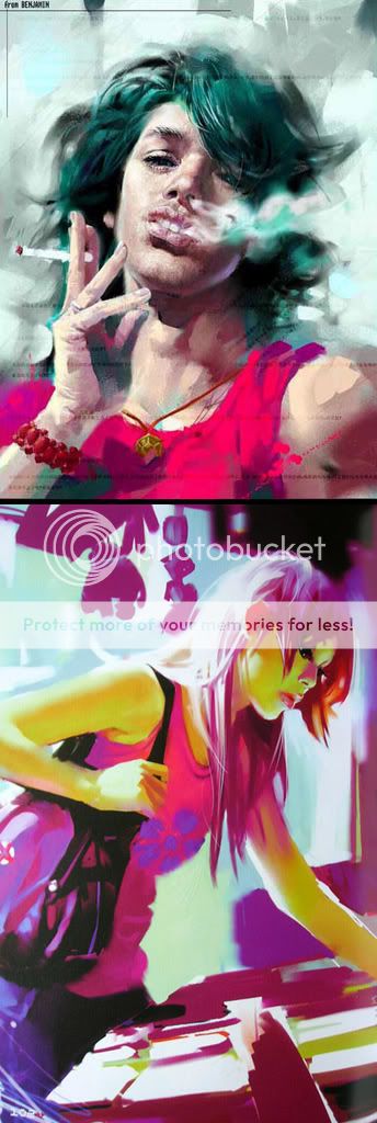
The sequential image shows off ORANGE's dynamic stylings


Looking at these illustrations and even the sequential images, a lot of people might have trouble describing what makes it different from stuff from Japan and other parts of the world.

Yishan Lee, a Chinese UK-based artist, had this to say:
"...people probably will realise it is hard to tell what is a Chinese comic just by looking at the pictures. Actually, Chinese comics are so diverse in styles. They have been influenced by European, American, Japanese comics and yet carried on some traditions from traditional Chinese drawings. For individual artists, they have their own preference. It is only easier to tell which one is Chinese Manhua when it comes to the story. Chinese artists do have their own way to look at the world."


Me thinks the guy in the image above is disappointed in what life has to offer...


I don't live in Mainland China, but Benjamin's
ORANGE (set in Taiwan I think?) paints a beautifully decadent world where the youth are finding it hard NOT to rebel. An interview asked this question - why are many of the protagonists of his comics a bunch of vain, emotionally distressed teenagers?

"Actually, I find that everywhere, young people are no longer believing in anything, no longer having faith, totally at a loose end psychologically and feeling really insecure. These young people can't cooperate or fit in with society, and especially for those who have had a relatively high level of education, for them this psychological void is even more serious. In most cases, they hardly have any trust in their parents (for someone Chinese that's the absolute minimum of morality) and also don't trust either their partners or friends."


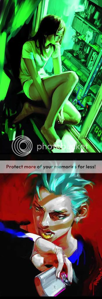
Angry, rebellious teens... in China?? Really? No way.


Whatever the case may be, I'm going to go hunting for this guy's work. I don't care if you say his work might be a tad uninspired. There's just something about the Chinese stylings of the story that makes it feel fresh... and all dirty inside despite being depicted in the most beautiful, stylized way possible. Here's an interesting little snippet from the interview I found interesting:

Do you feel that using this kind of exaggerated comic style expresses your story’s mood, etc. better?

"Readers like this kind of style more actually. I dare say if I use my illustrating style in my comics, all my efforts will only raise questions amongst the readers. They’ll say my comics aren’t as good as before. But I’m just about to take this risk, to draw my comics in my illustrating style…"

Read the full interview here.

Yeah. so like I was saying - beautiful. Hmm... I wonder how many times have I described his work with that adjective..? Ah, it doesn't matter. One of Benjamin's goals in life was to be that of a world-class painter. That and to travel the world. Great guy, great art - I'll be watching.

Oh, if you can spare two minutes, maybe you can watch this video showcasing this Manhua/Manhwa craze. Which I missed in 2008. Just watch it, okay?


Also, check this article/interview about Chinese Manhua. Good read.

While it's been a while since I've posted on this blog, I managed to stumble on a topic at ConceptArt.org that demanded my attention... Yes, it's everybody's favorite topic - the cliches of science fiction and fantasy art!

The topic today is brought to you by J Wilson. He asked:


"which design elements in sci-fi/fantasy art are you just sick of seeing? Or at least want to see someone do a new take on it if they are going to do it?"

It's not that he hates all these generic ideas! On the contrary, these so-called generic ideas are a great starting point to create something inspired, possibly original even! But as J Wilson pointed out, he's "...just tired of seeing them as "go to" design elements, showing a certain lack of real inspiration. They can be done well, and done in an exciting way, but 90% of the time if I see those elements I groan and kind of roll my eyes."

So, what designs are people tired of seeing? Let's see what the good people of the forum have to say:

J Wilson goes first, declaring :

"I'm getting tired of seeing generic looking gun arms.
Or the one big powerful arm. Tribal tattoos. Forest or jungle scene with large stone heads overgrown by the jungle."


Young, impressionable artists such as myself can't resist recycling old favorites in their respective genres... Are we really bankrupt creatively?

Flake, another discerning member of the board, throws in his thoughts:

  • Giant Space Boots
  • Swords 8 feet longer than the user / hand held artillery
  • Bikini armor / Stealthy ninja chicks in heels.
My thoughts:
I don't get his second one, really... Did this whole 'sword bigger than the user' trend begin with Final Fantasy? I'm not too familiar with this enduring trend in young artist's design. Never really liked it actually.


Tomwaitsfornoman shares his peeves:

Massively over sized boobies...
Rob Liefield cliches
Scantily Clad Women in snow (I am guilty of that one myself)...


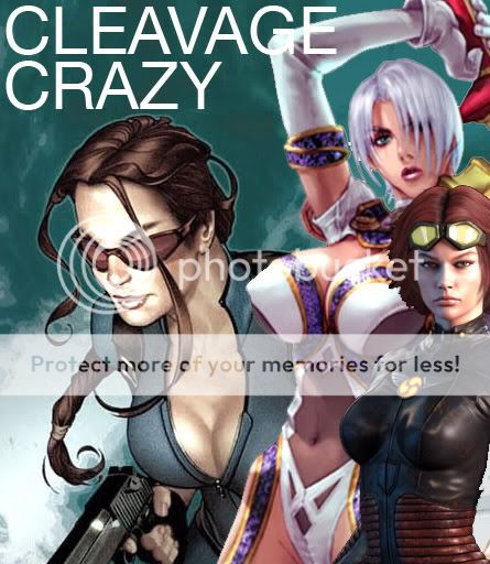
Thank you, professional concept artists of old, for giving the public what they want in the first place, but somehow in retrospect seem to regret...


Mirana declares her annoyances:

Most clothing choices for gals, usually a variation of the bikini or a plug suit (Damn you, anime shows like Evangelion! -ed) Laaaaaaaaame. I'd also like to see variety in body types of women AND men.

Amaranth goes straight to the point:

"Female supermodel soldiers. I highly doubt Paris Hilton or a female with double Z breasts can wield a huge sword or gun in full-fledged combat even though they look good. If functionality and looks are both considered, they could at least look like Gina Carano. Of course, I can't say I am absolutely sick of this, just slightly annoyed."


Practical.


...Bikini armour. This one I'm sick of. It looks good but I think it's too much of a "go-to" design to make females in armour look good, not to mention it completely sacrifices any functional purposes. How is it hard for anybody to just slash the stomach area of the female?"

Zirngibism comes up with a perfectly worded rant:

  • That same old floating city where underneath the city is sort of a long upside-down mountain of earth. Yeah it's been done in some popular video games, and yeah it's kind of a cool concept, but aren't there other ways to make floating cities without that giant mountain of dirt under them? How about spheres with their own gravity and the city radiating around them? How about floating water instead of earth with steel "bubbles" inside as the buildings?
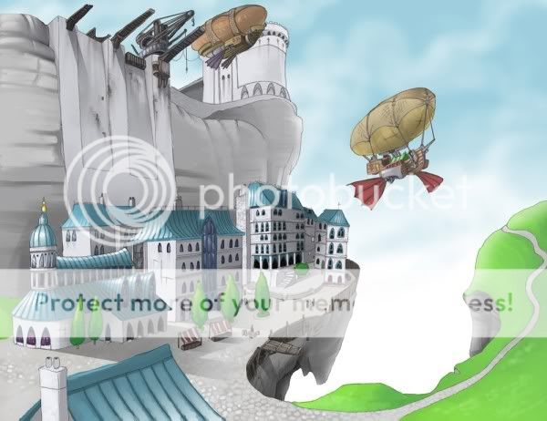
Epic, right? Blimps? City from Lord of the Rings? Floating rocks? Mix all together and what do you get? I'd rather not say...

  • Desolated, bombed-out post-apocalyptic cities
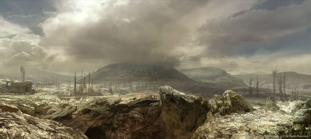
Post-Apocalyptia done right with the 'Fallout' game franchise. Great concept work can be found here.
  • Jetsons-style cities (I really love futuristic cities in illustration, and they're my favorite when approached originally.) I feel like a hypocrite because so many cities are in my deviantArt favorites folder, but hey...
  • Big blobby monsters with arms coming out of their stomachs, possibly plants growing out in random places, with flabby sagging bits. I've seen some really awesome drawings of these, but the concept itself is getting old to me.
  • Gunners with visored masks.

  • Most Space Art... you know, often-desktop art where two planets are colliding and there's all this swirly stuff from brushes people downloaded from deviantArt... It all looks the same. Sure space is cool, but not that kind of art when it's all the same. It's like Thomas Kinkade, just in space. Go to dA, you'll see what I mean.
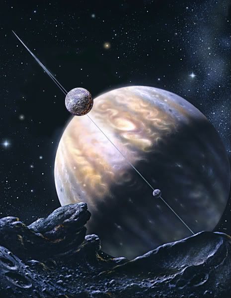
Spider mechs (one of Masamune Shirow's favorite design fallbacks), nearly all heavy bipedal mech designs known to man, and much, much more!

  • Mech warriors that look like so much like Gundams. Sure, as humans we identify with bipeds. We like stuff that reminds us of us. But that's not really a great design when it comes to machines. Especially when they're SO top-heavy like some of the designs I've seen. How about multiple legs (like that "bigdog" robot they're developing now), or or the use of both wheels and legs?
  • Just about 95% of sci/fantasy illustration I see features people ages 18-25. Sure, I understand why this is. We don't usually see 60-year-olds fighting battles and what not (unless they're a male wizard, often cliched). But in a place and time where magic or technology play a key role, I would think people could transcend the limits of age. By the way,I think older people are awesome, there's so much more depth to them. I plan to try to feature them in my own illustrations. I guess the audience of such art tends to be in the younger range and identify with younger characters... but still.
  • Little children interacting with large, ugly monsters in friendly gestures, like they're a friend. The child might be giving something to the monster or touching it. It's a neat concept and I've seen some great work portraying it, but seeing a lot of the fanboy art using this concept makes it seem a little old now.
  • And I've got to agree with everyone about the bikini armor being one of the biggest ones. I don't know, I'm not a guy, but don't you guys get BORED after awhile, even if you're attracted to the girls in that art? Don't they start looking the same to you?
  • Tribal Sci-fi. I still think they are cool when done-well, but it's getting kind of generic.

My thoughts:
I can't believe he doesn't like gunners with funky visored masks. It's a good thing for some that the generic cyberpunk era died in the 90's... although a revival could always be around the corner. As for the rest of her statements, I think they're spot on. That's all I can say really. Totally agree with the first statements though, I can't help 'fave' well rendered generic floating city art!


sodAP gives his views on:

  • Derivative of the derivative. Some guy who has no idea how real XV century armour looked like, so he draws what he thinks it could have looked like (why research?) and then there's the other guy who has no idea how real XV centruy armour looked like so he bases his work on the work of the first guy. There's the third, fourth, and fifth guys, and then World of Warcraft tier 6 armours appear. Oriental+Occidental. Guys with full plate, a bandana and a katana... facepalm.
I'm going to say... inspired. And sexy.


PsiBug goes on with his own caveats:

1) a lone timeworn robot standing among the ruins of the civilization that created it. (Wall-E, Laputa)
2) a close-up of an embryonic creature gestating in a bottle of bubbling fluid
3) a skeleton in a space suit... often with an alien weapon or plant sticking out of it
4) an old lady chasing a cat down the street with no bra on (What? -ed)
BrightDreamer has this to say, which is pretty interesting:

  • Impractical anatomy: the overly-musclebound barbarian who should go down with his own weight, or the DDD-chest-size woman who thinks she can run, let alone fight, without a bra.
  • The Brooder. You know the one. Crushed by the weight of their own soul in a dark and unforgiving universe, they stare darkly inward whilst pondering the void of their reality. They often wear dark capes and/or trenchcoats, sometimes some manner of hat (to cast moody shadows over their moody faces), and most need their hair hacked off, or at least brushed out of their eyes. While I understand that many sci-fi/fantasy characters have good reason to brood, I get sick of watching them do it so incessantly, especially when they seem to pick such impractical places: the edge of an impossibly high skyscraper or craggy, storm-torn cliff, or even in the middle of a gory battlefield.
  • The Generic Epic Quest. A gathering of vaguely Tolkien-esque humanoids in a range of sizes and shapes and vaguely medieval outfits travel through a Vast Landscape, more often than not passing Grand Ruins and Soaring Spires. A side-cliche I find overdone is the Generic Epic Quester, someone on some manner of generic epic quest who might as well be on a nature walk for all their posture and expression conveys.

Wickeddiana has thing to say... which I unfortunately agree with *sniff*:

  • Pretty much everything from Heavy Metal Magazine. I am totally sick of seeing this. Probably the biggest cliché in erotic fantasy art.
  • Ethereal fairy-like females in some kind of magical environment/forest. They are usually very beautiful, almost goddess-like and they are gazing dreamily out into the distance. I have to admit that I am guilty of having done this myself. But I just get really tired of seeing it.
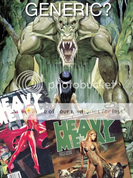
Raaawrrrr! Which reminds me, I have to do a piece like this for my portfolio. Bye!


Mr. Kev Ferrera throws his hands down and declares boredom over:

  • 96% of the covers to Heavy Metal.
  • Post-Apocalyptic Beach Bodies.
  • Main figure strikes and holds an iconic yet undramatic pose for the camera.
  • Huge swords. Overly pointy armor and helmets.
  • Over-rendering of incorrect or meaningless anatomical detail.
Volchiha throws in some new ideas: (or old depending how you want to perceive this thread)

  • Incorrect cultural references - including no knowledge of the mythology or symbolism used, appearances (vikings didn't wear horned helmets to war), political stereotypes, and especially the use of writing in random ways!
  • Making vampires and werewolves mortal enemies. In a folklore sense, they have absolutely nothing to do with each other.
Right...

Opillione finally closes out this post with an all-encompassing reply:

"I take the opinion that everything's been done in some form before. It's not what the content is, but how it's executed. "

In Conclusion:
The question now is, how do you create fresher ideas? With every idea known to artists taken and exploited, what is left?? I leave that to you, or maybe to me, if I find the time to make a post about developing new ideas for well worn concepts. In the meantime, I suggest you guys stay away from adding scars over you over your characters eyes. It's been done before, trust me.

"No Art Director Ever Asked To See My Diploma"

Article by: Daniel Pelavin

The education of many a successful illustrator takes place quite handily outside the bounds of any certified program or academic course of study. The most important, perhaps only credentials of any significance in this field are the portfolio. While a portfolio of student samples may be quite handsome in presentation, it is rarely an accurate indicator of one's ability to effectively solve actual problems, under true deadlines while the exigencies of real life intervene. It is no wonder that school work is quickly purged and replaced by assignment work as soon as possible in the portfolios of those fortunate few to get work. If the ultimate goal is to distance oneself from all traces of "school," something more than a diploma must be offered to those who intend to work in the field rather than simply go back into teaching.

An online portfolio template. "There are thousands like it..."

An honest appraisal of the odds might be a good place to begin. Although it might not be the biggest boon to enrollment, letting people know just how competitive the field of illustration is would certainly help sort out those who potentially have other or better options. Illustration as a career is most successfully pursued by those to whom no other option is acceptable. It takes that kind of motivation to overcome the inevitable and constant stream of obstacles. Some frankness about the nature of the illustration market and the people an illustrator will have to work for would go a long way in discouraging all but the most foolhardy and desperate from pursuing this glamorous and enviable career.

Good luck! This artist gig better be what you want...

Every illustration student should know that even the most brilliant art director, say one who can dial an entire phone number including area code without having to look it up again, actually believes he could do your job if he wasn't so busy. While fostering the ideal of creativity, perhaps we could also foster the reality everybody remotely involved with your illustration feels perfectly comfortable taking credit for it.

This next item may seem like a very odd notion for institutions of higher learning but, how about showing some respect for students and some recognition for what they already know. Rarely will a nascent illustrator have arrived at college age without already having worn out his share of pencils. Don't treat him like he just hatched and for heaven's sake do your share to put an end to this myth of "artistic talent" which fosters such deep contempt among the lay public for those "gifted" souls who appear to have it so easy. True artistic talent is the ability to pursue your goals and not give up until you succeed, whether it is on the second or seventieth try.

"The Poor Poet" by Carl Spitzweg (1808 - 1885) Click the image to learn more about the hidden symbolisms that depicts the so-called "Starving Artist"

While we accept that most people can be more or less literate with enough effort, we are still rather behind in recognizing that the same thing applies to visual expression. A little less emphasis on inspiration and more on perspiration would seem to apply here. While it seems that working illustrators would be the obvious choice as illustration teachers, the axiom "those who can do and those who can't teach" may have actually been invented in the illustration field. Rarely do you find an illustrator who actually has teaching skills, can find the time and regards students as more than just potential studio interns. All too frequently what you get are semi-illustrators with too much time between jobs and underfed egos.

This image was taken from popular art blogger/critic Irene Gallo regarding one the 2007 Annual Scholarship Competition

The gruesome result of this ill-advised practice is the annual scholarship competition, where we honor the "best and brightest" for their pitiful imitations of illustration styles of the past. The crowning irony of this grotesque spectacle is the mention of these instructors in the exhibition credits, ostensibly, I guess for doing such a laudable job of helping students deny their own individuality. The next generation of great illustrators will come into being despite this circus but, it would be far less degrading if we didn't treat them like little monkeys.

Imitation may be the sincerest form of flattery but, ethics aside, it is primarily the province of bottom feeders in the illustration field. Give a student the ability to imitate Bernie Fuchs and you've given him a good shot at the CA Illustration Annual for 1974, give him skills to negotiate, promote and run a business, and he may actually be able to make a living. Enough with this baloney about oil washes and techniques of the "great masters."

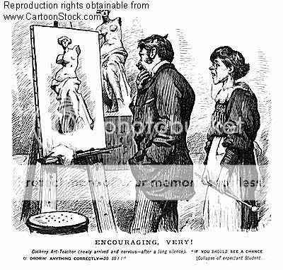
There is a great deal to learn from the history of illustration but, it ought not be confused with technique. True style comes from within not from copying someone else. It is not disposable nor a fad of the moment, ie. the fashion industry.

A good device for remembering what's really important here is the three "D's," drawing , drawing and drawing. Drawing from life, drawing from memory and drawing from inspiration are good. Tracing over photographs doesn't quite get it and plays you right into the hands of those who have no respect for honest effort in the first place. Illustration is a business, not to be confused with fine art, which is also a business (only a much more complicated and ugly one.) Those who commission illustration aren't "benefactors of the arts," they are skilled negotiators with a clear vision of the bottom line.

I gotta get me a life drawing class...

An understanding of usage, rights and how to determine fees does not hamper creativity, it gives an illustrator the freedom to be creative. Techniques in marketing and promotion change and evolve as quickly as illustration styles. You haven't taught promotion by telling students to send postcards. Ask any art buyer how many postcards he receives daily, before you suggest that direct mail even gets noticed any more.

Norman Rockwell's "Art Critic" (1955)

If you don't recognize illustration as a business and concentrate on the required skills, you are shortchanging those foolhardy enough to believe in you and after all, they don't really need that diploma to get assignments any more than Dumbo needed his lucky feather to fly.

My question:
Do you agree with this article?

Ralph Bakshi... Now there's a name I haven't heard in a long time.


I was introduced to Bakshi's work when I saw the 1978 animated version of
Lord of the Rings animation on VHS. All that rotoscoped animation (see: animation that is literally traced from live action movement) was a pretty cool gimmick, but it sort of wore thin. Since then I haven't paid much attention to the guy until recently.


Fire and Ice, a movie which where Ralph Bakshi collaborated with fantasy-art master Frank Frazetta

On a whim, I decided to check the Bakshi since I was getting tired of hearing folks reference his infamous 1972 animated feature 'Fritz the Cat'. I haven't seen Fritz yet, but I've seen some of his shorts, such as the 1981 animated short 'American Pop'. Try it, it's pretty interesting.


Youtube describes American Pop as "The story of four generations of a Russian Jewish family of musicians parallels the history of American popular music in the 20th century."


One video that really got me riled up was this passionate rant by Bakshi to the artists of 'this' generation. Meaning
US - the young, impressionable artists who possess all these fantastic tools at our disposal. Go out there and do something!


It doesn't matter what you're into - whether it's traditional, flash, or #D animation, digital art, game design, whatever. Ralph Bakshi tells it like it is. Get out there and get creative!!


ink everyone has said everything that could be said about the god-like landscape artist, Imperial Boy...


Face it, his work speaks for himself. I've said it before so I may as well shut up. Besides, I've spoken about the guy in the past. I probably said the same thing too.


This was the very first piece by Imperial Boy that I saw. I wasn't that into art as I am now, but this image certainly made an impression on me. I recall the book which had this image saying Imperial Boy wanted to evoke cramped avenues of Hong Kong or Japan, and give that weird rush people get when they go to these seedy joints.


He has a way of drawing his characters as well. They're not exactly the musclebound anatomically accurate human figures of Da Vinci, but they do the trick. They're kind of cute actually! :-)

If you click on this image, you will note just how painstakingly detailed every area of this image actually is. It's not just crappy photomanipulation and cheap Photoshop tricks, mind you. Every art trick in the book can be seen in his stuff.


It's got High Dynamic Range Lighting, perspective, cute anime characters, muted color palette, 3D references, and a whole lot of other technical jargon nobody cares about. A weird gimmick Imperial Boy uses in the Robot artbooks are these pieces, where they scream "Look at all my overly complicated detail!!!!!" or at least, something to that effect.


The guy likes making these fully realized fantasy worlds. Staring at some of his images makes you just
wish you were there. His beautiful cityscapes and impossible architecture defy any kind of sense, but who cares?


You don't think when you look at these images sometimes. They're cool and fun to watch, but inject any kind of logic to some of his stuff and you might as well just hit yourself with a sledgehammer. There's one image in one of the
Robot books which is literally a school, where each classroom is hung in one giant ferris wheel. Now that's... weird.


I am the last person you should ask about the Warhammer 40,000 universe. I haven't read the Horus Heresy novels, and was only mildly entertained by some of the comics I found on a bargain bin. I haven't played the pricey tabletop games, nor do I plan to any time soon and I unfortunately avoided all the PC games. Why?? I don't know!


But if there something I've always like about Warhammer 40K's universe, it's those blasted Space Marines, and nobody seems to illustrate them better than Clint Langley.


There's suprisingly very little that can be said about Clint Langley's work, other than than that he's superb when it comes to rendering the facial features of his subjects. I've browsed through "The Art of Clint Langley: Dark Visions from the Grim Worlds of Warhammer" and his stuff is pretty photorealistic. To a point where it's kind of creepy-looking. Think of renowned comic-book artist Alex Ross' stuff, where you can almost imagine some beefy model making a weird uncomfortable pose, while Clint's painting. Yeah... kind of like that.


The guy primarily works for role-playing game stuff, having done Battletech, the original Warhammer fantasy franchise. I did read a while ago that he did stuff for the infamous Britisgh comic company 2000 A.D. Most notably "Judge Dredd". Too bad my only memories of Judge Dredd are from the silly flick by Stallone back in the 90's. Wow!

Of course, with his kind of skill, he worked on stuff for companies such as Marvel as well. Man, his covers are just gorgeous. Makes me almost wish they were in a higher resolution, so we can appreciate it in all its glory.


And now since I've got nothing better to say about dear ol' Clint Langley, I think a video is in order. Perhaps one relating to Warhammer 40k?


Welcome! Let's talk about art again! (What else?) You might not be asking: What are paint overs?

It's when... It's when when some newbie artist would post his or her fugly art piece on a blog or message board asking for comments or suggestions, and a more experienced artists would come along and start painting over it to point out mistakes. And no, I'm not talking about directional arrows and notes on where to improve (though that's technically a paintover itself) - I'm talking literally painting OVER the piece, changing colors, adding figures, changing poses, and essentially ruining any chance for the 'student' to learn anything valuable to add to his artistic repertoire.

Anyway, I wanna start this weird new segment here where I'll spotlight certain art pieces from ConceptArt.org and show how they transform into masterpieces (or technically proficient art). I know, I know! It would be so much better to show MY OWN art pieces getting makeovers, but that'd be too much work. HAHAHA!

Uh... let's begin?


Nico's original "Robot" piece


Nico: "Hi everybody, this is an image i'm working on, i would like to hear comments & critics from you about the image in this current version Right know i'm only working on values, i will work on colors later ( The robot will be in reddish tones, and the set will probably be in brown & green tones ). I will also add some rust to depict a dirty set, and some smoke on the ground. Some modifications that i will do: the foreground will be a little bit more readable, and a soft light from the right will highlight the foreground and the robot, also the black outline of the whole image will be more overpainted"

So if you have any suggestions to improve the image and correct some mistakes, don't hesitate"

My thoughts:
Wow!! I wonder what this guy has in store... This piece already looks very promising, but the comments are right - it is a little hard to read what is going.

I do not understand what is going on in this image really...I have a robot thing that I think is getting interrogated or something...I think if you attached some sort of narration you would get a better response...

ConCrete
The values and edge control are gorgeous though...I would toss some mids in the lower right to give the eye something to look at in that corner.

So Nico explains that the story is about how "..the little robot is imprisoned into the engine room of an hospital, where experimentations are made on robots. He is daily tortured, and what we can see in the image is that his torturers are coming back ..."

ChrisBennet gives Nico's piece the benefit of a doubt, stating:
"There is nothing really wrong with this at all apart from a tiny ambiguity concerning the robot's right arm: The big nut he is wearing as some sort of bracelet (I think) is not recieving the light in a way that puts it far enough away from his elbow - if you see what I mean. Other than that marvelous!

Can I ask you a question: How do you proceed with the colouring phase - do you just tint everything with glazes or do you paint opaquely over everything? Perhaps you use a combination of the two?"

So Nico explains his process:
"I understand what you mean about the bracelet, but it is intentional that it looks this way because it is supposed to be this big.

About the colouring phase, my method is not the best: i fill the screen with a medium colour, and then i add shadows and highlights and finally i paint over the dark line which i should not have work so precisely because we won't see it in the end

As someone in the Cgtalk forum told me, the highlights were not consistent, so i correct them and gave more contrast to the shadows and highlights of the robot ( the robot is a bit more shinny in some parts ). I've also added the shadow of the buzz saw on the cylinder. This is the new version:"


My thoughts:
The change is very subtle, but effective nonetheless. ChrisBennett eventually states that "It's not the size that is causing the problem but that the way relates to the robot's shoulder in terms of lighting making it look nearer to your eye than the shoulder itself. This then thows the elbow out of kilter because assuming the forearm and the upper arm are the same length, the fact that the bracelet nut is nearer than the shoulder doesn't make perspective sense in this instance."

Nico acknowledges this, and takes on the challenge. The results are marvelous:
"This is another version, not the final one as everything is subject to change. What has changed from the previous version, apart from colors:

  • Some smoke between the robot and the big cylinder ( this is a rough smoke taken from a low-res version of my image, that's why its shape is different from the robot profile ).
  • The backlight on the robot
  • Some contrast to the foreground lighting
  • A test for the rust ( or blood ) on the big cylinder
  • Some dust glow on the left of the image
  • The tiled floor
  • The blur on the foreground chain
On a previous version, the robot was more shinny, i will try this again. As I am searching for colors, if you have any critics about this current version, i'm ready to read them, thanks !"

Above is another quick try on colors, i've replaced the blue with a green to depict a sick environment. I've also inclined the camera, please tell me if it's a good idea or not, thanks !

My thoughts:
Brilliant! The top version is amazing! The blue and red version now makes me want to hurl. Who knew changing a few values can change the entire mood and narration of the piece? Bah. Of course you knew this. And that's it for now! Be sure to check out the thread if you want to see what happens after - but definitely this artist is someone to watch!


"...From a standpoint of taste and content: I photograph whatever pleases me. Consequently, this gallery may contain things that don't please you."

Excerpt from Marcus Ranum's Stock Photography site

Can't draw the human figure? Feel a sense of inadequacy when you realize that you fail to understand what has to be the most essential skill in art? In understanding the lights and darks and all that value study stuff?!

Well, you needn't fret so much! You'd be surprised how a lot of talented and professional artists USE photos as reference when drawing people. A lot of budding comic and digital artists would often use themselves as models and pose on photos when drawing and painting. Believe it!! (Eww) Some would say using stock photos helps you figure out the perspective of the figure without wasting all your time with "fundamentals". (Whoever said that deserves a medal -ck)

I would assume classically-trained artists hate this sort of thing. They prefer artists today should know how to render a realistic a figure, and sometimes use real life models in art workshops. Some argue that part of the problem with using photos as reference in art is that it tends to look flat. Whether that is true or not sometimes depends on the artist I suppose...

Stock Photos?

Anyway, where was I? Ah, yes. Setting the debate aside, here's what I have to say for this post - Many thanks to ImagineFX, the pricey digital art magazine I buy on occasion, which led me to discoverd this rather odd photography site. It's run by Marcus Ranum, a photographer with... interesting tastes.

Rendering photos on canvas is only as good as the photo reference, and Ranum certainly doesn't disappoint! He's got really neat stuff here, stuff I feel would be perfect for fantasy and sci-fi artists looking for a particularly pose and can't quite nail em since they never bothered to take formal figure drawing classes. :)


Yes, you can draw a Slave Girl!

You can see how light would affect certain fabrics and materials. Perfect if you suck at that sort of thing. You can see women doing strange sometimes tasteless acts in some of these pictures. Priceless, right?!

Ah, but never fear. There's some neat classical nudes, if all this weird stuff makes you think funny thoughts. These nudes are great, and if you can stand staring at the monitor while drawing, then good for you! I highly recommend you check out the site! (Link below)

Did I mention Ranum's site's got Cat Girls? If you ever fantasize of rendering realistic looking "Neko Gals", then this is your one and only chance.

Visit http://www.ranum.com/gallery/index.php for meow--more details. Damnit!

Blogumulus by Roy Tanck and Amanda FazaniInstalled by CahayaBiru.com

Followers

About Me

ChrisK
On and off blogger.
View my complete profile